Forsaker Advanced Painting Guide
Scott Hockley

Hi all,
This is a second installment of pinup painting guides. The last guide gave a full and in depth blow by blow direction of going from new mini in a box to finished display mini, with a lot of explanation about the theory and techniques involved. This guide will be a bit slimmer, but I shall refer you back to the larger guide for any specific techniques.
Preparation
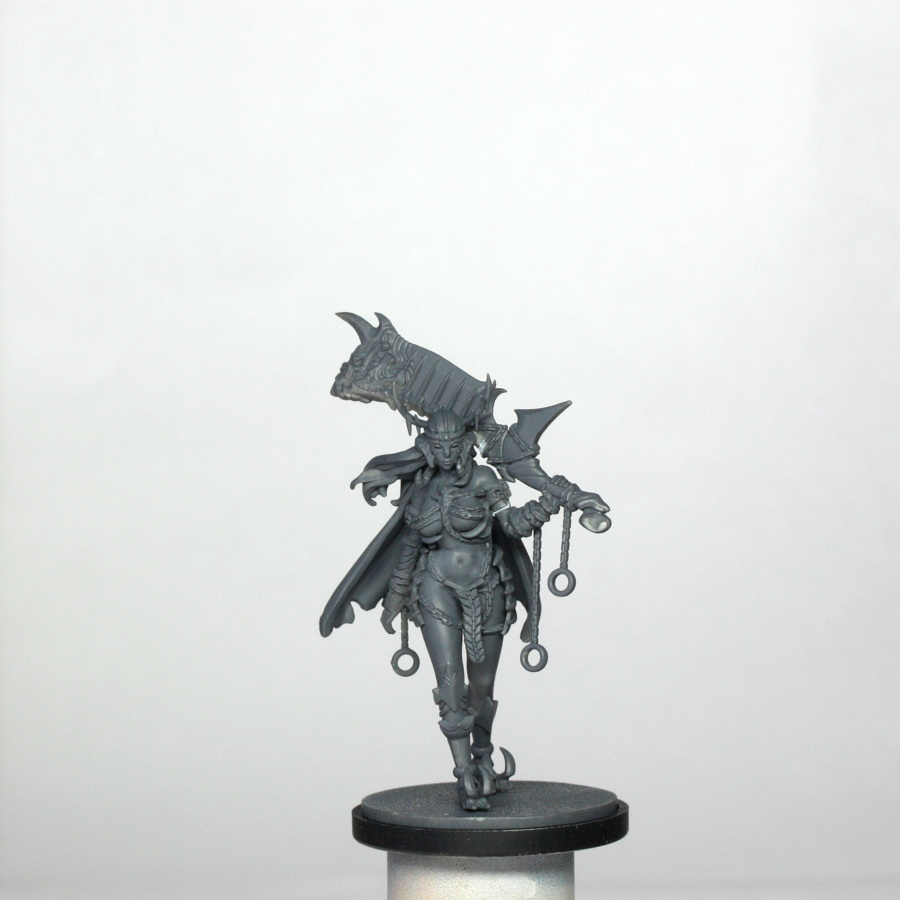
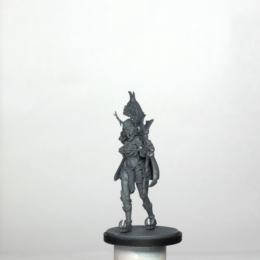
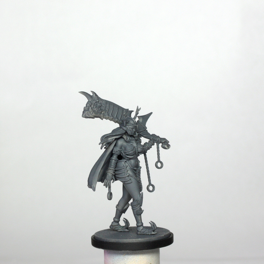
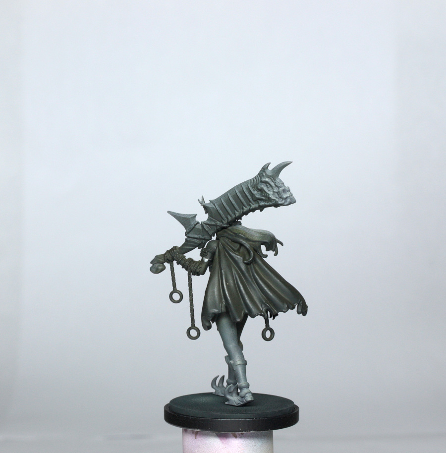
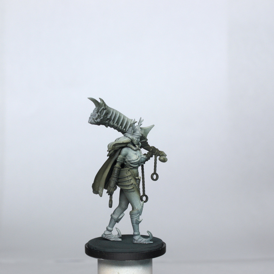
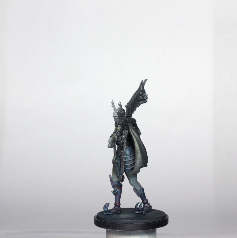
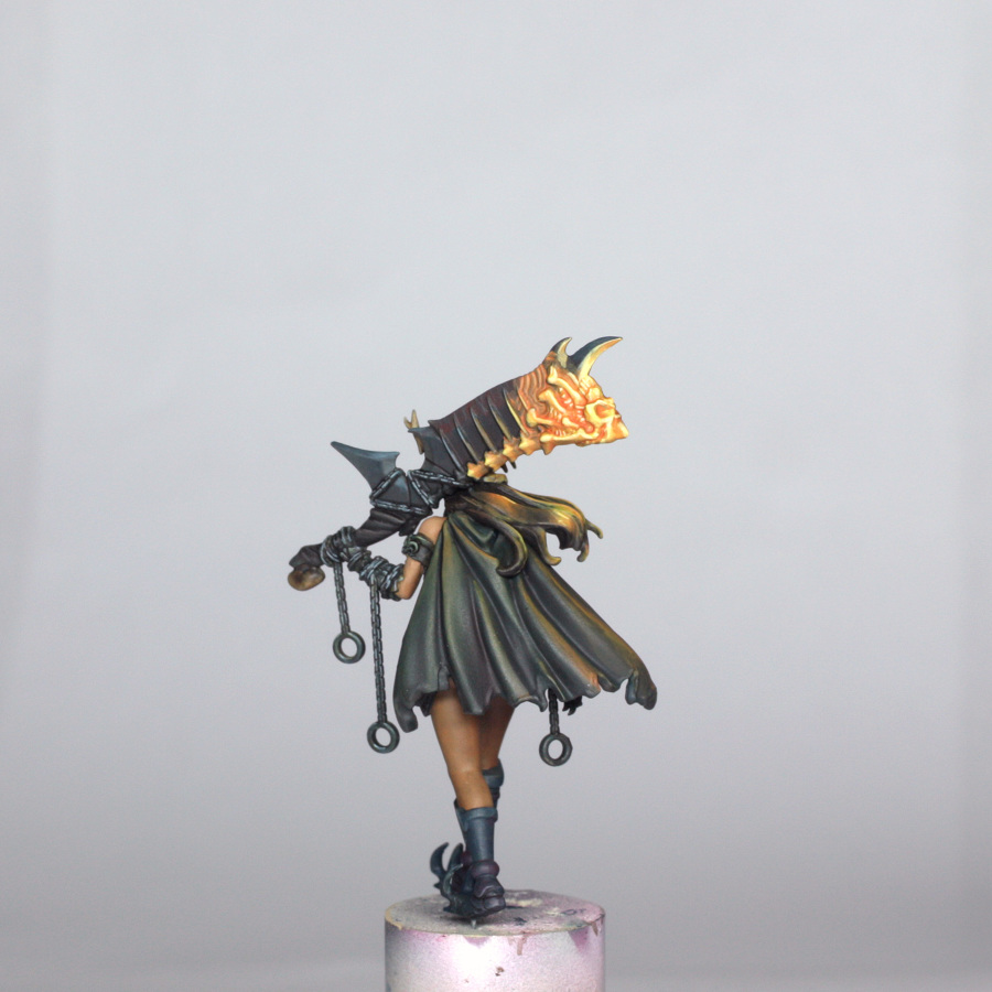
The new plastic Forsaker is a totally different sculpt from the original resin version. The 8 miniatures in the box are arranged on individual sprues attached in groups of 4 to a master sprue. I clipped the Forsaker sprue off and set the rest aside for later. The individual parts of the model were in turn then removed from the sprue and popped into a little box (see previous guide about losing bits!!). Each part was then trimmed with a knife to remove mould lines, and lightly sanded with some fine sandpaper/manicuring board. The feet were then drilled to accept a 0.5mm pin in order to allow easier fixing to the base later. The rest of the model doesn’t need pinning because I am gluing the majority of it together prior to any painting.
For these models it is best to use plastic glue. My glue was just a proprietary one that I bought at Salute, but most polystyrene cements will work perfectly.
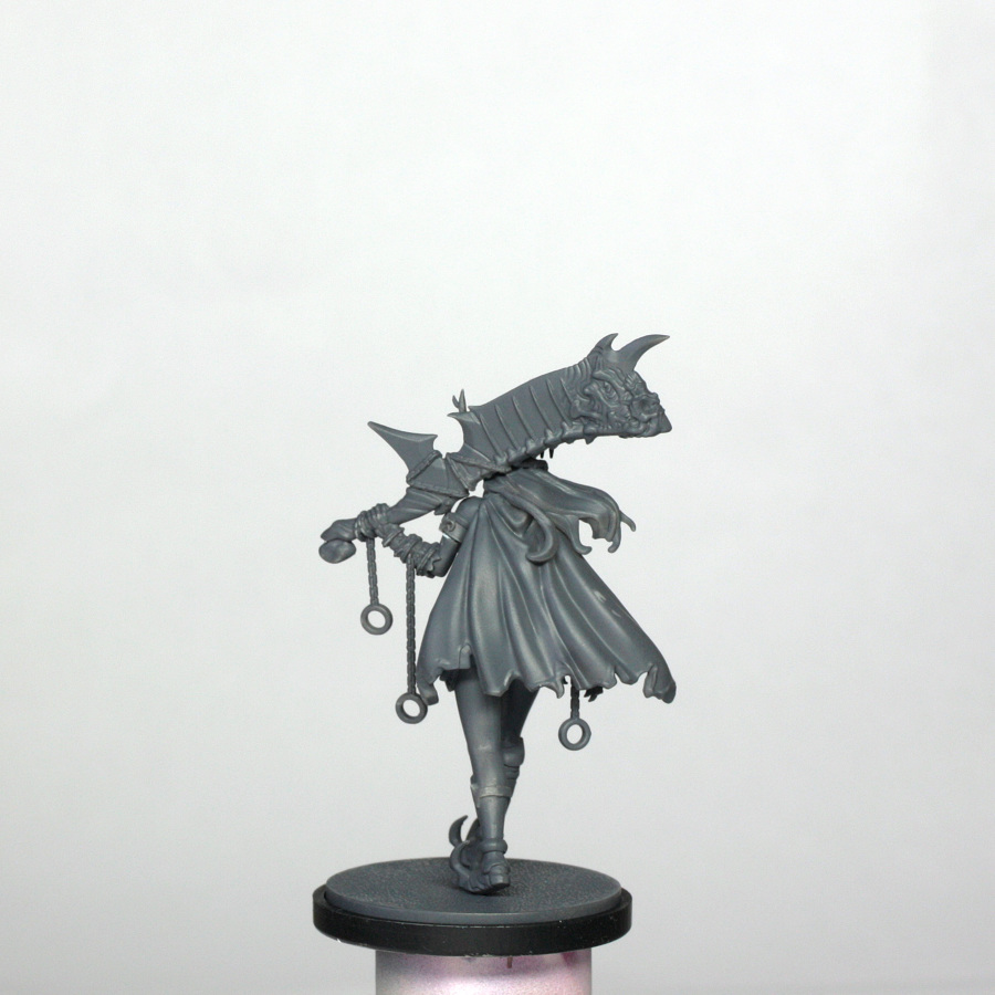
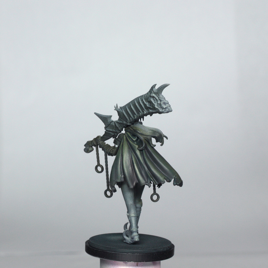
In order to best prime the model, I assembled it in 3 parts – torso, legs and right arm in the first (and main assembly)/ head, hair and cloak in the second/ left arm with big sword and some chains in the third assembly. The reason for this is purely for access to as much of the model as possible, as the cloak drapes over most of the back and the sword covers the back of the head and much of the hair. The joining points were covered with a tiny blob of blu-tac immediately before priming, so that I can still use poly cement to join them after priming.
The amazingly innovative way that the models were deconstructed in designing them for plastic manufacture means that assembly requires next to no filling if you are careful assembling the model. There is just a small line above her right boob, and a line on each arm to fix. The left arm was fixed with a little filler after initial priming.
I airbrushed on a grey primer (just like the Architect), and then airbrushed a light covering of Tamiya Deck Tan to the head, sword and torso from above to create a bit of initial highlighting.
Colour Scheme
We are working to the concept art again for the Forsaker, and in this case I will show another life hack that I sometimes use to help determine which paints I will use on the model.
I took the concept art and opened it in MS Paint (I’m sure that far more advanced programs will do the same job, and probably better, lol!). I then drew a load of empty boxes to the right of the image and typed in the key for each set of boxes, as you can see. I then used the dropper feature on each important part of the model, with a base highlight and shade being picked out.
Once done this gave me a nice variation of tones and a good idea of what I shall need for painting the model.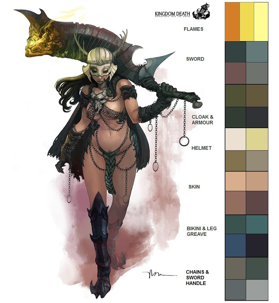
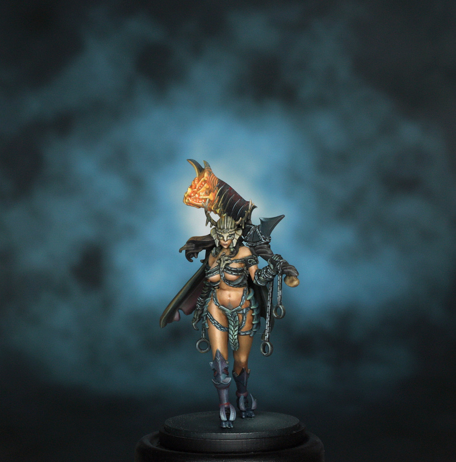
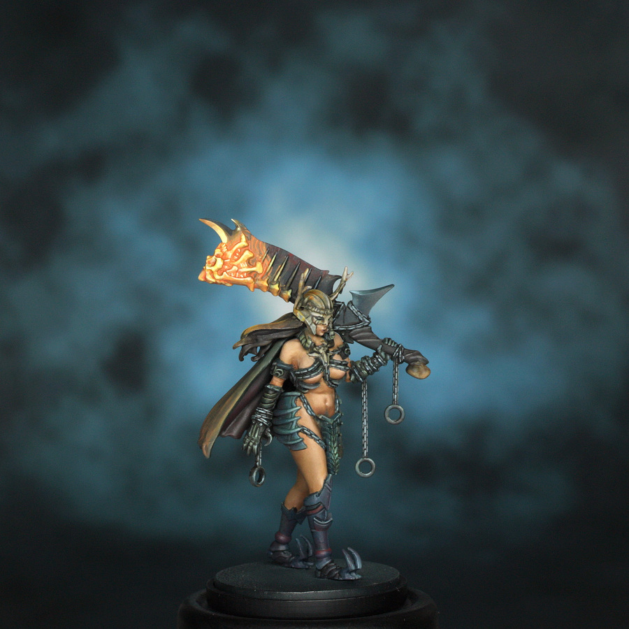
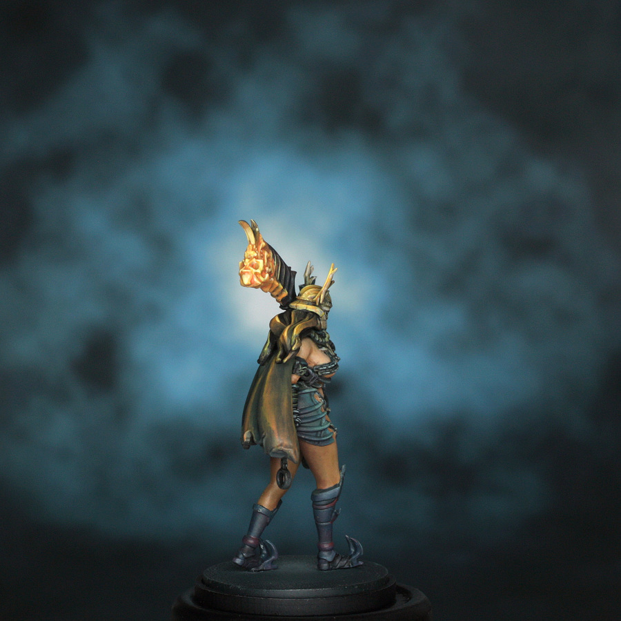
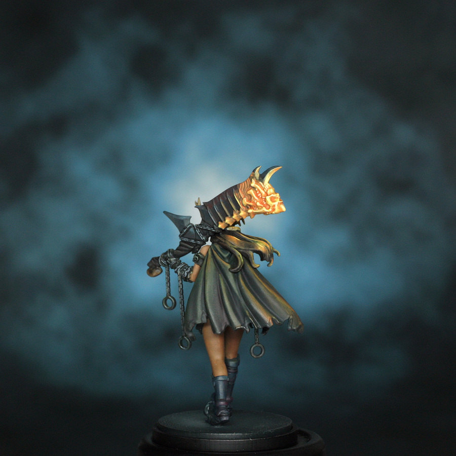
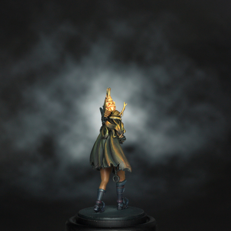
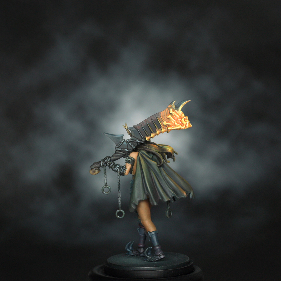
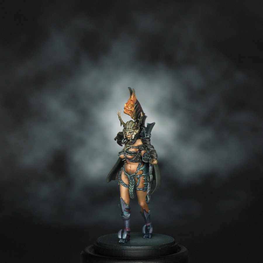
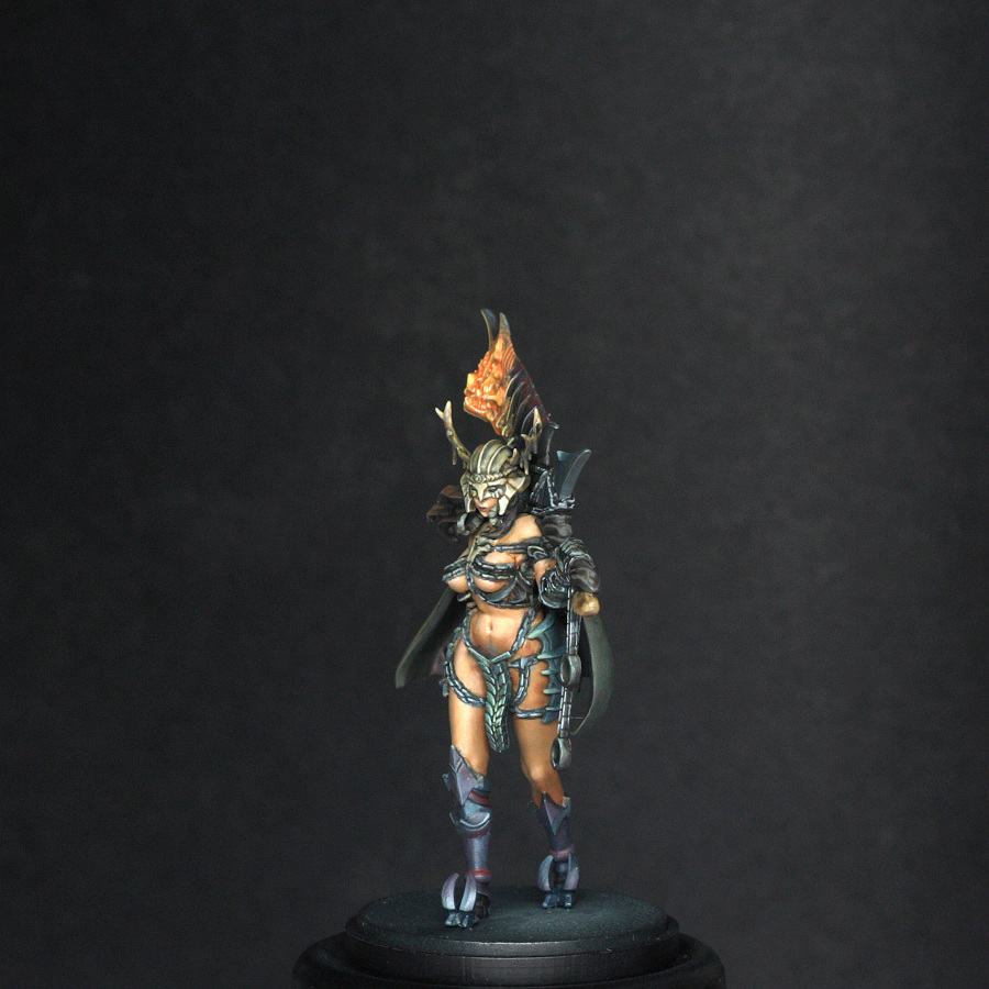
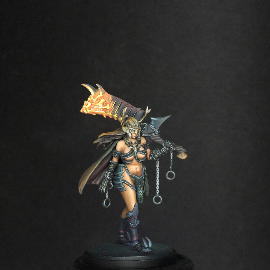
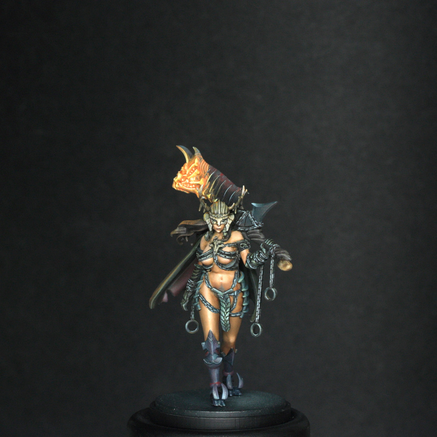
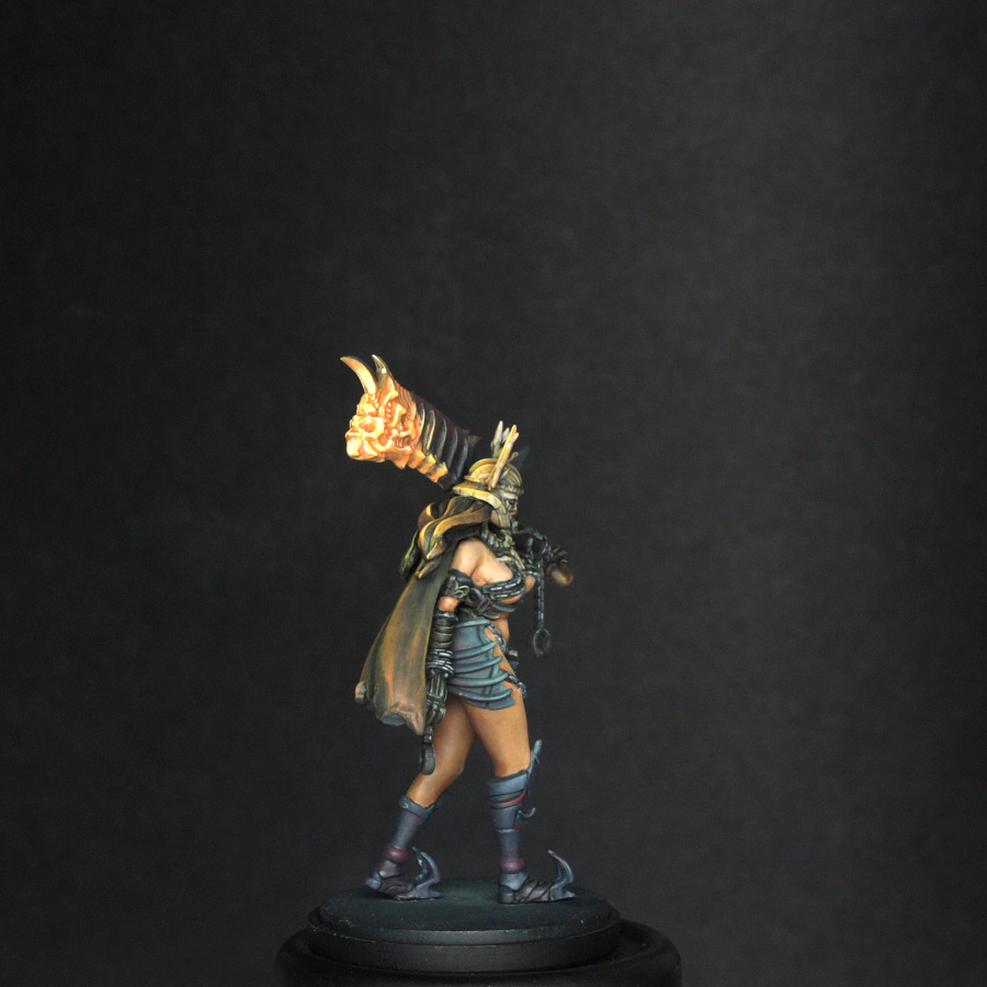
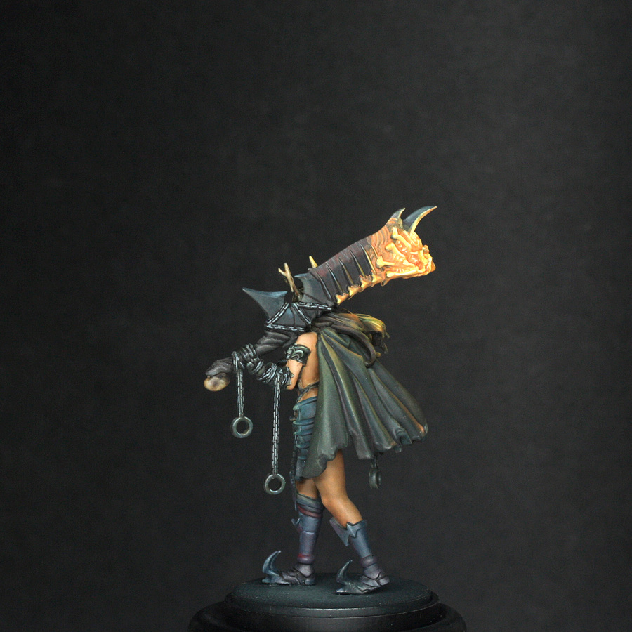
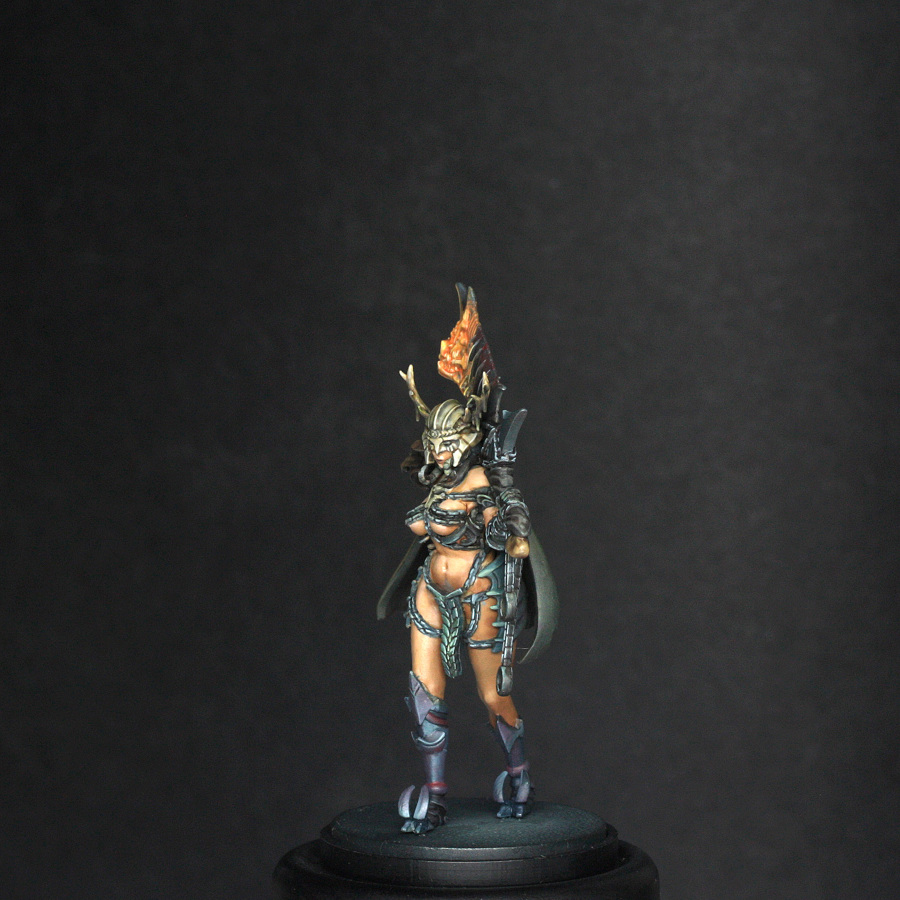
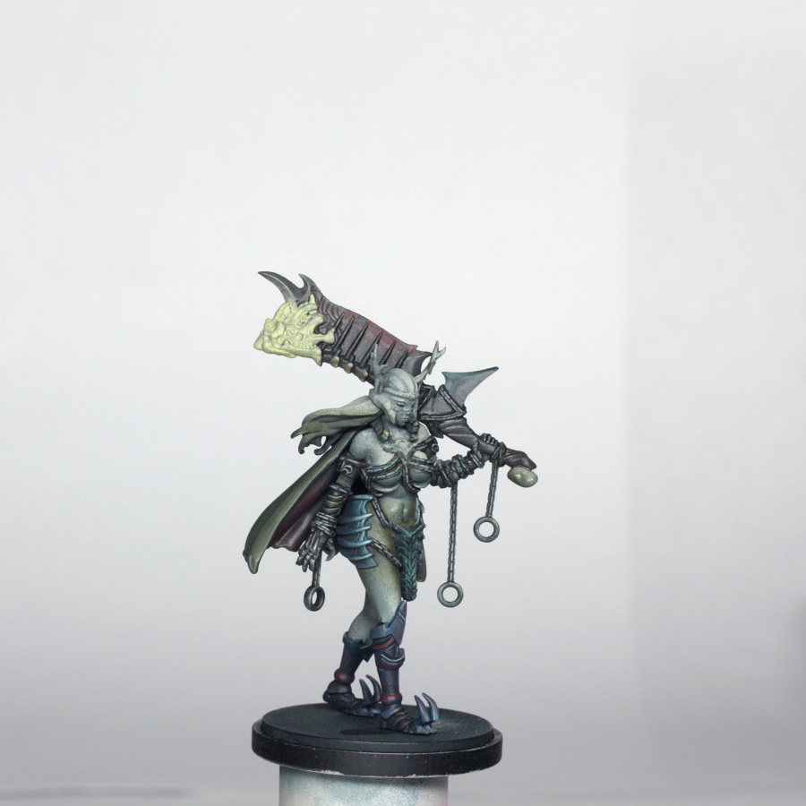
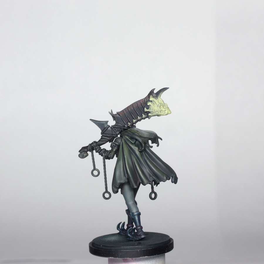
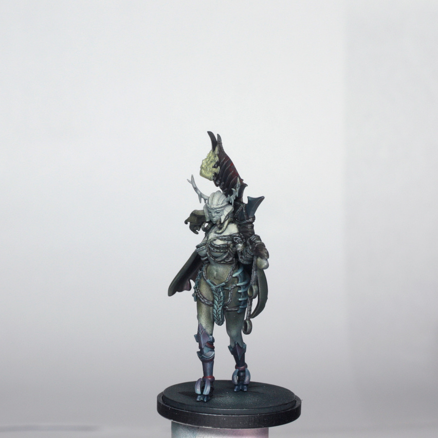
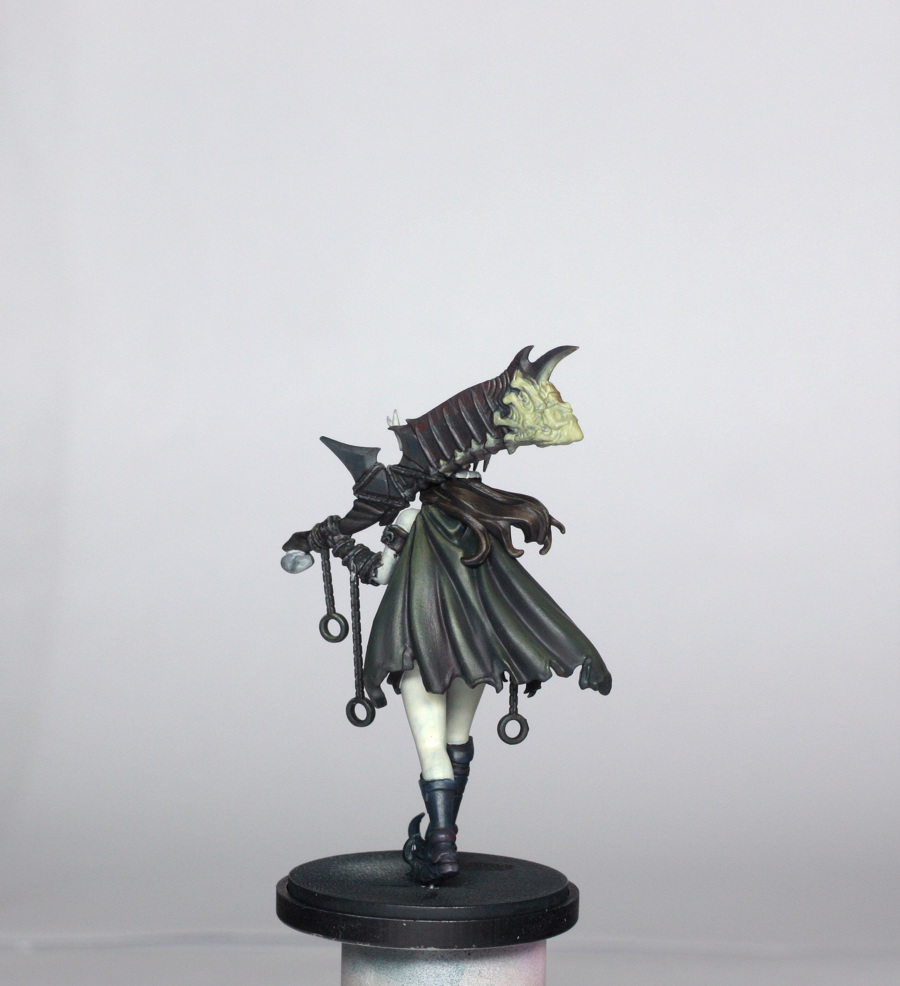
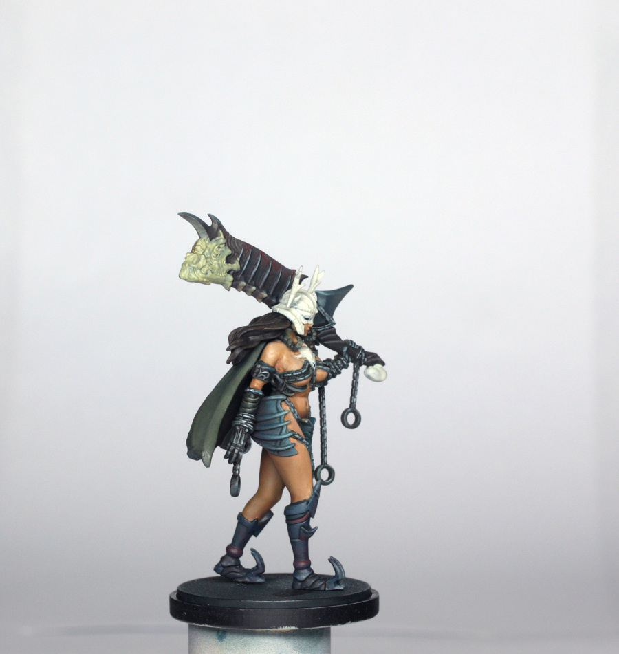
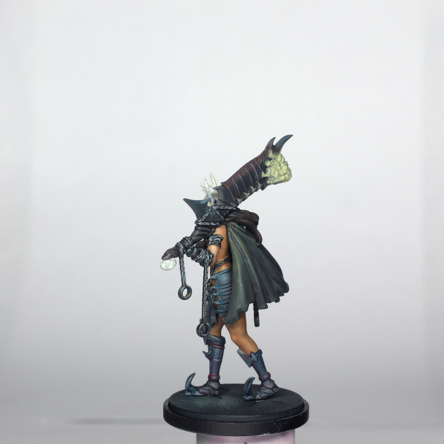
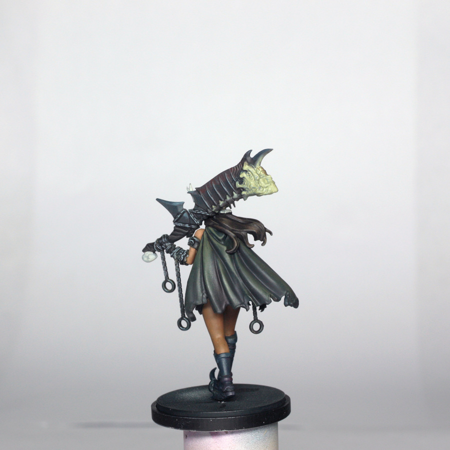
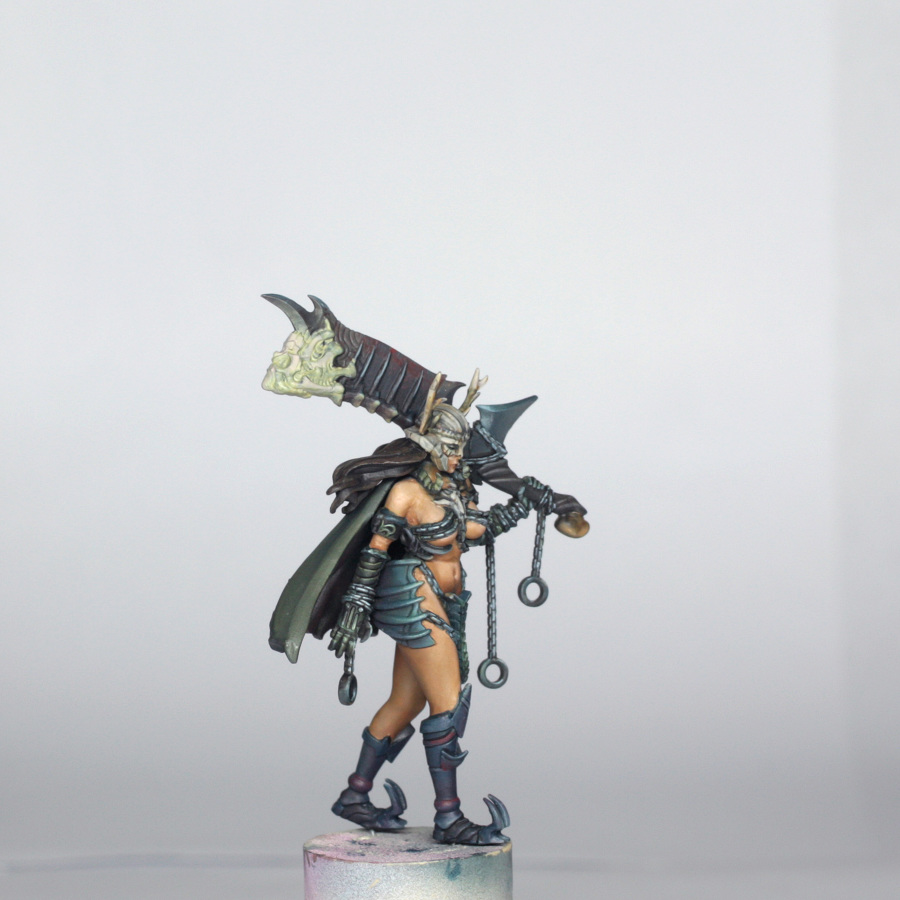
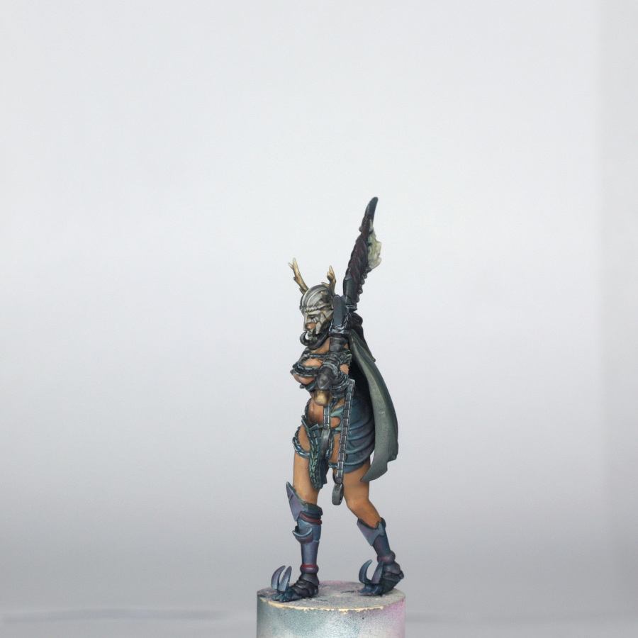
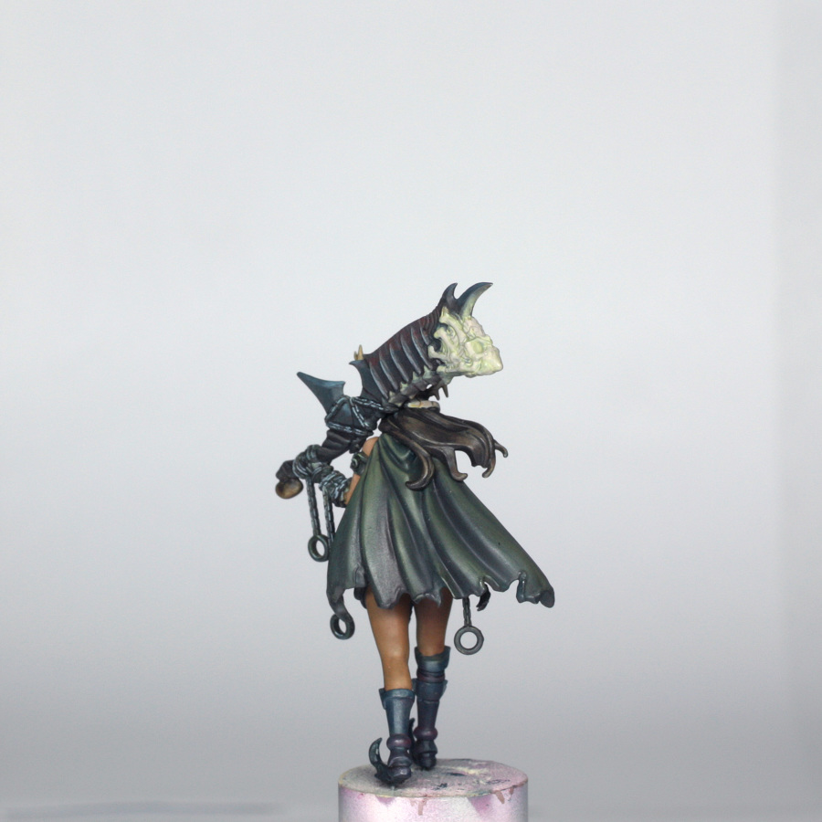
The Forsaker is the darkest of the models in the pinups box, and the colours are mostly quite muted. She has an olive skin tone, kind of Latin American I guess; the chains and armour are a dark teal and green/brown; the cloak is a dark green with a dark red underside; the metal of the sword is a dark steely grey with dark blood speckles; there is a lighter bone coloured helmet and skull necklace; and the only real colourful area is the flames at the end of the sword.
Armed with this break down of colours I set about painting the model…
Painting Preface
I will mention GLAZING a lot throughout the article. Generally my glazes are around 1 part paint to about 4 or 5 parts water, and often with a drop of glaze medium to keep the blends smooth. Stronger colours are generally MORE dilute in glazing, weaker colours LESS dilute. You can read more about glazes in the Architect guide.
I also mention SPRAYING with my airbrush. You will have your own feel for dilution of paint if you have an airbrush, but I tend to work around 1 part colour to 2 parts water and 2 parts thinner. Just like normal brushing, it is always better to have 2 or 3 thin coats to cover nicely than 1 thick coat, and you are less likely to clog your airbrush!
If you don’t have an airbrush, just brush on as usual. The airbrush just helps to speed up some of the less enjoyable base coating…
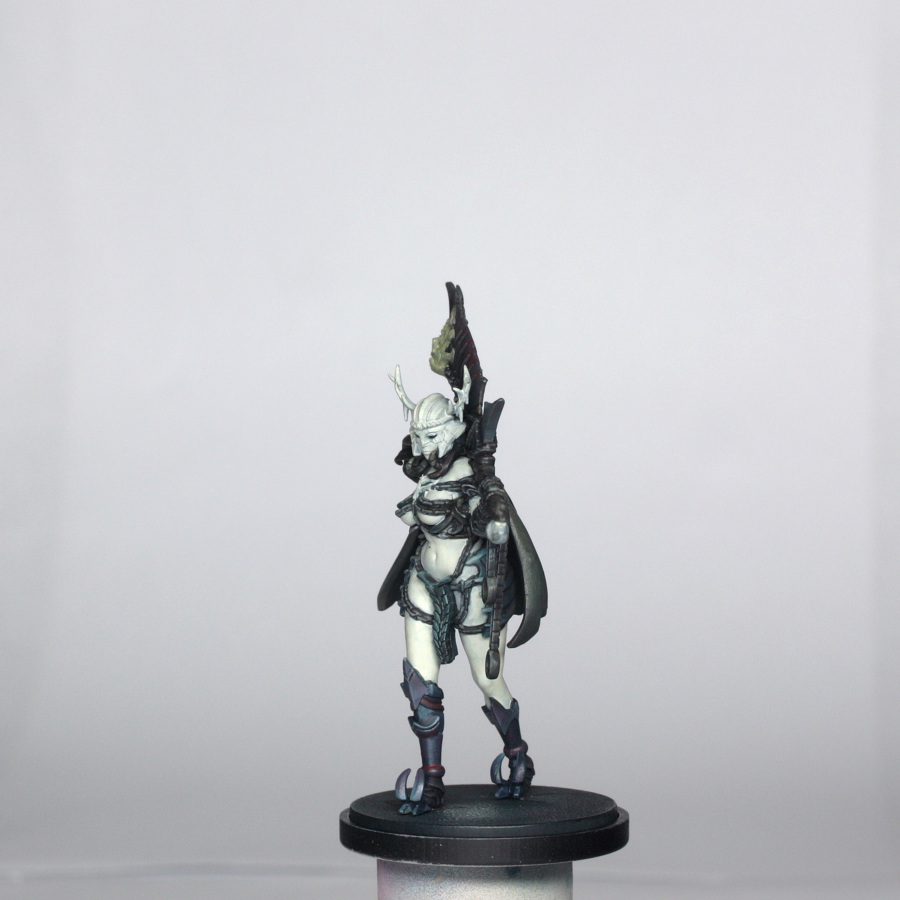
Painting the Base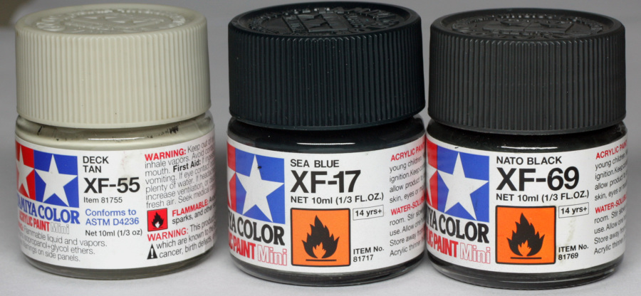
The base was painted in exactly the same fashion as the Architect model, with a point of light between and slightly in front of her feet. The lightest point was sprayed with deck tan, shading done by successive thinned sprays of sea blue and then Nato black around the edges. The outer rim was just painted in black.
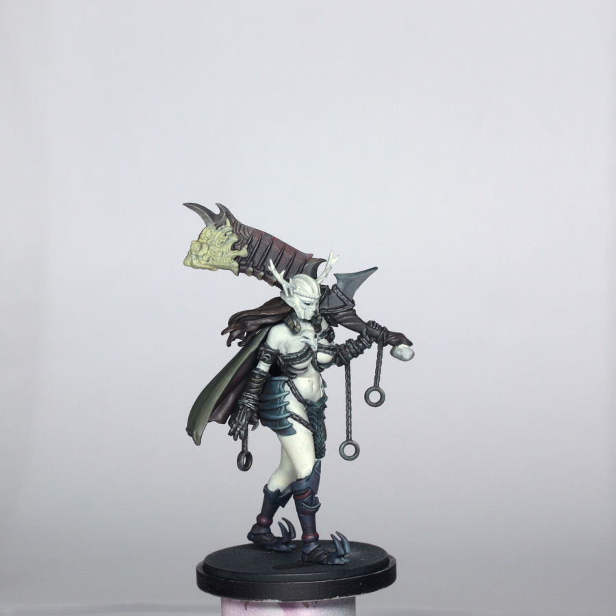
Painting the Cloak
The colours used for the cloak are shown below…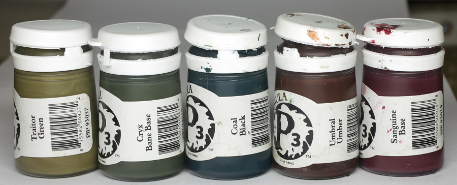
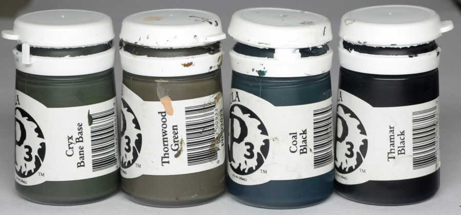
First of all, a 1:1 mix of traitor green and cryx base was sprayed onto both sides of the cloak. While I waited for it to dry, I also quickly sprayed it onto the chains and arm guards as a base for later.
Once dry, I got the brushes out and glazed a bit of pure traitor green onto the highest highlight areas of the outside of the cape before glazing back with the base mix. Shading started by adding more cryx base in a couple of passes, then I added some coal black to deepen the shade, before a quick glaze of 1:1 sanguine base and coal black as a final shade. This mix gives a rich “black” to the darkest recesses.
The underside of the cloak was shaded as above first, but not highlighted like that. Instead, the whole underside was shaded, with shading increased the closer it got to the neck. Then once I was happy with the shading I glazed in pure sanguine base in several passes to the folds that were going to be visible, and then a mix of traitor green and sanguine base to the highest parts of these folds.
The little curved horns either side of her chin were painted with the base colour of the cloak, shaded with coal black and highlighted with pure traitor green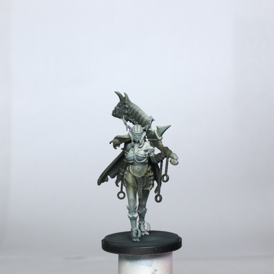
The Bikini Tabard and Hip Plates
The bikini or tabard is an interesting mix of teal and greenish metal tones. So I used the colours below…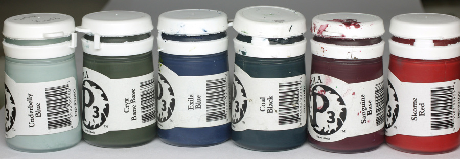
First of all, I painted a base tone mix of Coal black and Cryx base, approx 1:1.
I then used a glaze of the base plus some Umbral umber and glazed over it all so that it gathered in the recesses nicely, and shaded the whole thing nicely too.
Next I toned the slightly darker areas with a mix of coal black and umbral umber. This was done as a glaze, but I had to be especially careful to not over load the brush as any flooding of the recesses just means lots of tidying up! Once I was happy with this shading, I took the base mix and lightly glazed the areas to highlight before adding a touch of Cryx highlight. Then some thin glazes of pure Cryx highlight, concentrating on just the “lit” section in the middle, and the edges. Final highlighting was done with Underbelly blue, concentrating mainly on the edges. Edge lights were done with slightly thicker paint, but the lighter part in the middle was only done with tiny glazes. At this point the whole thing looked teal coloured, so to get the green colouring added in I made a really thin glaze of Ordic Olive and applied it to some of the links of the tabard to provide the variation.
The hip plates are like a pair of bat wings curved around her and are bluer than the tabard. For this I substituted the Olive green for a deep blue and the umber was swapped for the dark red …
The base colour was painted in the same as the tabard, and shaded the same, except the sanguine base was added to the first shading coat. The toning shade was then a mix of coal black and Exile blue, with additional shades of sanguine base mixed with the toning shade and then pure sanguine base into the darkest areas – closest to the cloak. This gives the impression that there is a kind of dark reflection of the dark red inside the cloak too.
The highlighting was much the same as the tabard, first a base tone was re-established to the ridges and the parts of the plates most exposed. This was done in thin glazes to avoid blocky transitions.
Then a mix of Cryx highlight with a touch of the blue was added and glazed on in successively more focussed areas. Underbelly blue was added to increase the highlights, building up to pure underbelly blue at the lightest points. This whole highlighting process should be only about 6 or 7 smaller and smaller passes from mid-tone to final highlight if dilution is correct. If it is too stepped, just glaze back the transition with the next darkest/lightest colour until happy.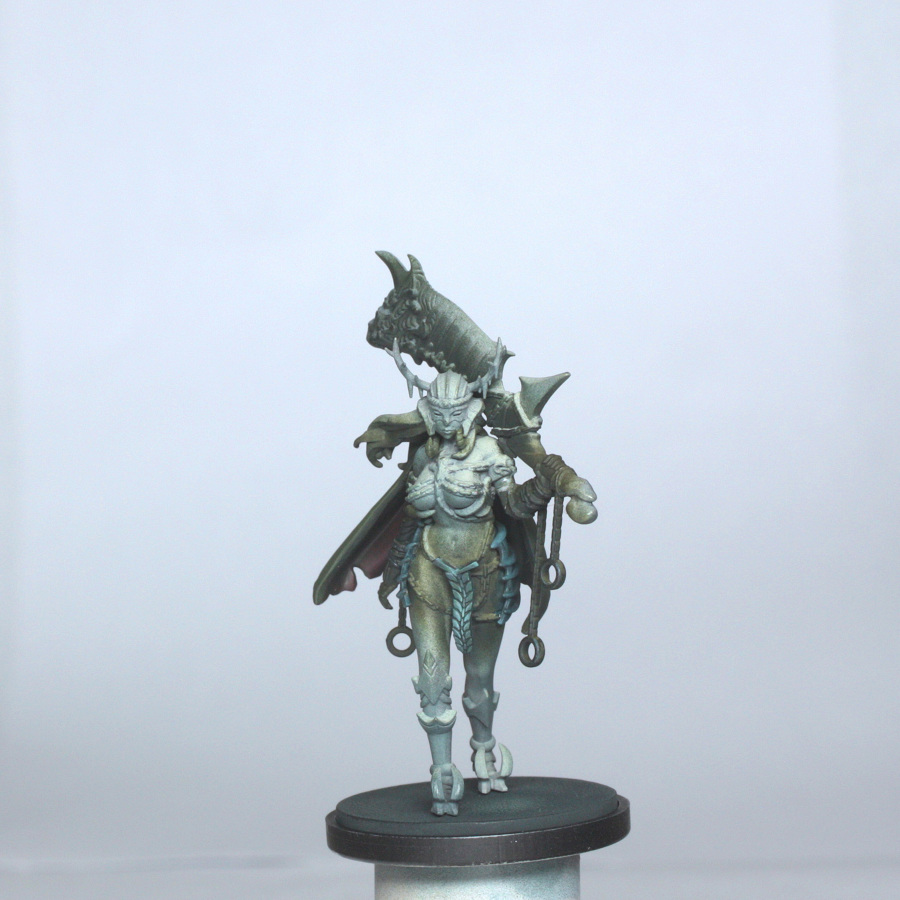
The Boots
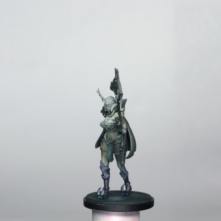
The colour of the boots is essentially the same as the hip plates, with just the addition of the dark red rings around the ankles and calves.
The base colour was a mix of Cryx base, coal black and exile blue, which I painted over all parts of the boots. The shading was done first with glazes of coal black, then coal black mixed with sanguine base. Because the “red” parts were near to the darkest areas, I then painted these with pure sanguine base, quickly shaded underneath with coal black and sanguine base 1:1 for that nice “black”, and highlighted with a 1:1 mix of sanguine base and Skorne Red. I didn’t go far with the highlights, as this is a dark part of the model, and didn’t want the rings to show up too much.
The highlighting of the actual boots was done by adding increasing amounts of underbelly blue, up to a final edge highlight of pure underbelly blue. I found that it looked a little too light at the end, so I decided to glaze the entirety of the boots with a really thinned glaze of pure exile blue.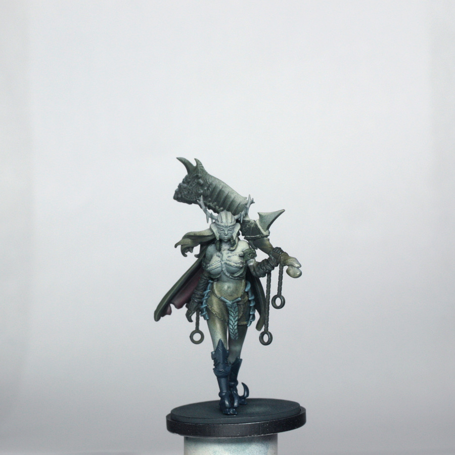
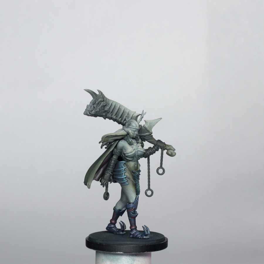
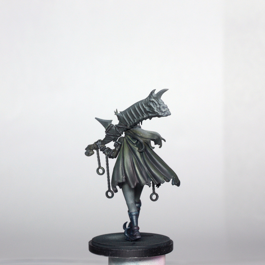
The Chains, Gloves, Armbands and Sword Handle
The chains are a bit of a mixture of colours, depending on which part of the model you are looking at (and what light is affecting them accordingly). The gloves and armbands are a dark metallic greenish brown. The colours used here are shown below…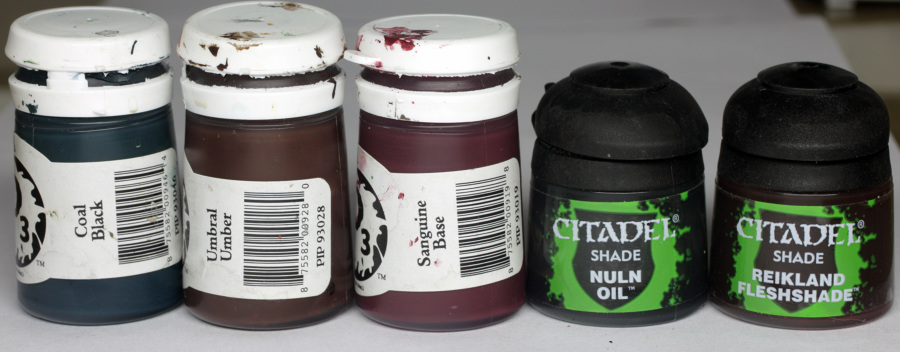
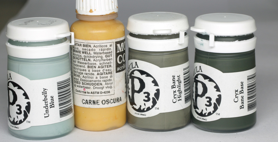
First of all, the chains were given a base colour mix of cryx base and cryx highlight, while the gloves, sword handle and armbands were painted in pure cryx base.
Highlighting of the chains was done by either 1:1 base colour with VMC dark flesh or 1:1 base colour with underbelly blue. As a rule, the more yellow highlight was used on the areas closer to the flame of the sword and the bluer highlights were used in the darker sections.
Final highlights which were mostly the edges and upper most areas of the links were done with pure underbelly blue.
The highlights to the rings at the ends of the chains were added to the upward facing surfaces only.
The armbands, gloves and sword handle were all highlighted with a glaze mix of cryx base, dark flesh and underbelly blue. A final glaze of this mix plus additional underbelly blue was applied to the highest areas and any edges. Again, like the boots, these are some of the darkest parts of the model, so I didn’t want to get too light with the colour.
Shading of the chains was first done with a thin glaze mix of coal black and umbral umber, concentrating where possible on the undersides of the links. The rings and lower areas also had some thinned glazes of sanguine base and pure umbral umber, particularly on the chains dangling from the sword. All parts of the chains were then CAREFULLY washed with Reikland Fleshshade, to add the ruddy iron look, with a couple of thin glazes of Nuln Oil to the darkest points, like the underside of the rings, and where the chains come into contact with the gloves and sword handle.
The chains are done before the skin so that I didn’t have to be so careful about over loading the shading and getting it onto the lighter areas. As a result there was a little bit of repairing to do to the chains later when the skin was painted, but as I mentioned in the Architect guide, it is almost always easier to fix dark colours than light colours!
Anywhere that I felt may have been too dark after this painting and washing was just given a fine edge highlight of pure underbelly blue, using the flat of a well blotted brush.
Shading of the armbands, gloves and handle were done using a mix of the cryx base and first Reikland fleshshade, and then Nuln Oil. Recesses were glazed with pure Nuln Oil.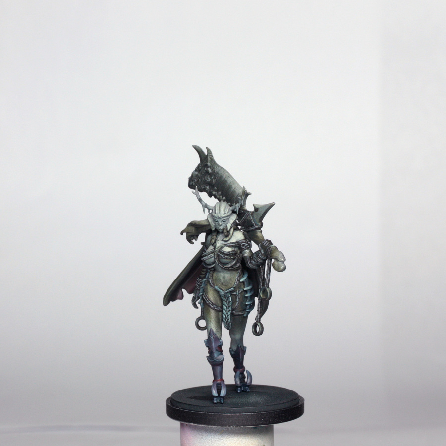
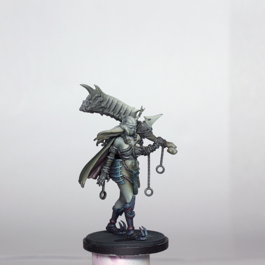
Sword Blade
The fiery glow to the sword is the final piece of the paint job to the model, but I quickly coloured in the area involved with VMC dark flesh.
The rest of the sword blade already had some highlighting and shading from the airbrushing earlier, so I relied entirely on glazes to paint this section.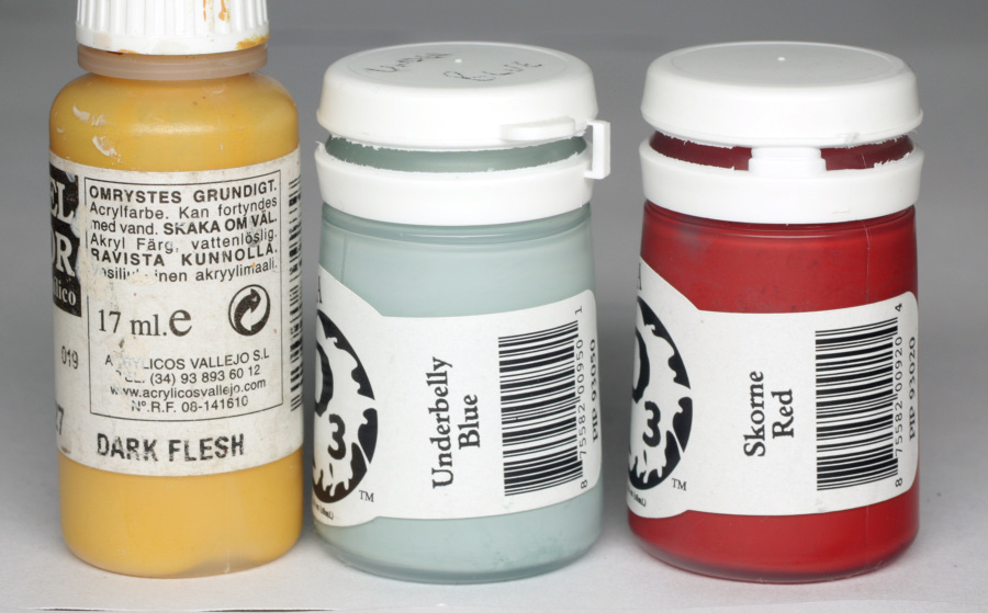
The underside was glazed all over with thinned coal black then additional glazes of coal black and “normal” black (in this case thamar black). The shading was concentrated towards the “spine” of the sword – I call it a spine because the fiery bit at the top is shaped like a skull and then has vertebrae like details running down the back – with the coal black used more towards the front edge of the sword, plus the extra spike near the handle.
The topside of the handle was similarly shaded, but less intensively with the black. The blade is very dark, like much of the rest of the model so far, and there is some blood spatter to add. I glazed in some coal black mixed with Cryx Base and Thornwood green as a first highlight, and then added some underbelly blue to the mix in slightly increasing amounts, just to pick out the ribs on the blade, the edge of the blade and to create a dark to light transition on the spike near the handle. This was not done in as high contrast as I might do for “clean” or “shiny” NMM, because of staying close to the concept art. I have talked more about different NMM in the Architect guide though.
Once I was happy with the colours I stippled on some Skorne Red for the blood speckling. This was done using an old, small brush and only slightly diluted paint.
Stippling can be done several ways – some use specific stippling brushes with stiff separated brushes – but in this instance I needed fairly close control, and not too much of the blood effect, so I just dipped the tip of the brush into the paint, tested a couple of dots onto my paper towel (to also blot off the worst of the paint load) and then applied it to the blade. Typically I would get up to 5 or 6 decent stipples before I needed to reload the brush.
This technique can quickly ruin a brush, so don’t use a nice new brush to do it!
Last thing I did was applied a quick glaze of the 1st highlight mix (cryx base, thornwood green and coal black) over the blood to stop it looking too stark, as if the blood has dried up and got old on the sword.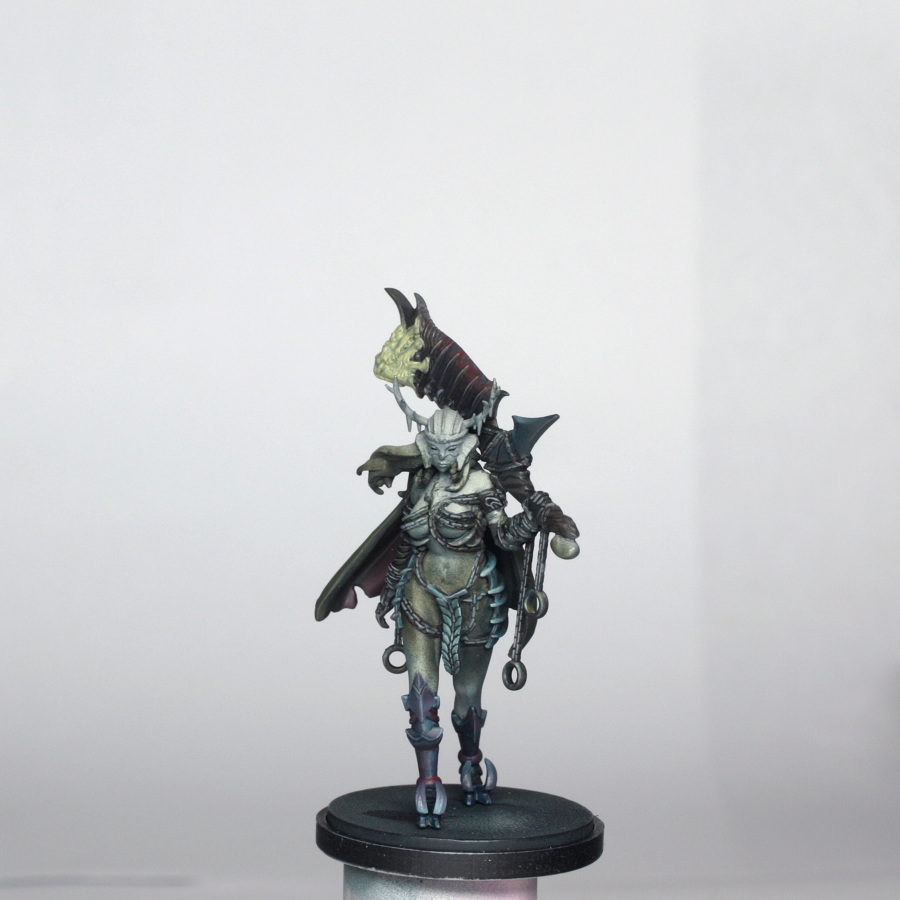
Hair
The hair didn’t take very long to paint at all at this stage. The reason for this is that the majority of the highlighting wasn’t done until I applied the glow from the sword later on. The colours used here are below.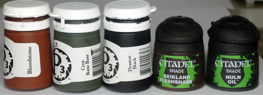
The base colour for the hair was a mix of Cryx Base, Bloodstone and a touch of black. I painted this over all surfaces, and then washed the whole area again with some Nuln Oil, concentrating on the underside surfaces of the hair. The lighter areas were then glazed with the base mix plus some additional bloodstone. I did paint in some individual strands of hair using pure bloodstone, and highlighted a few of the edges of the hair too, but felt that this would look too stark, so I glazed back over the hair with Reikland Fleshshade. The rest of the highlighting, as mentioned before, was then left until later.
At this stage I decided to tidy up the model by painting all of the remaining parts of the model with deck tan. This takes a lot of hard work out of getting the flesh in particular to be nice and clean looking.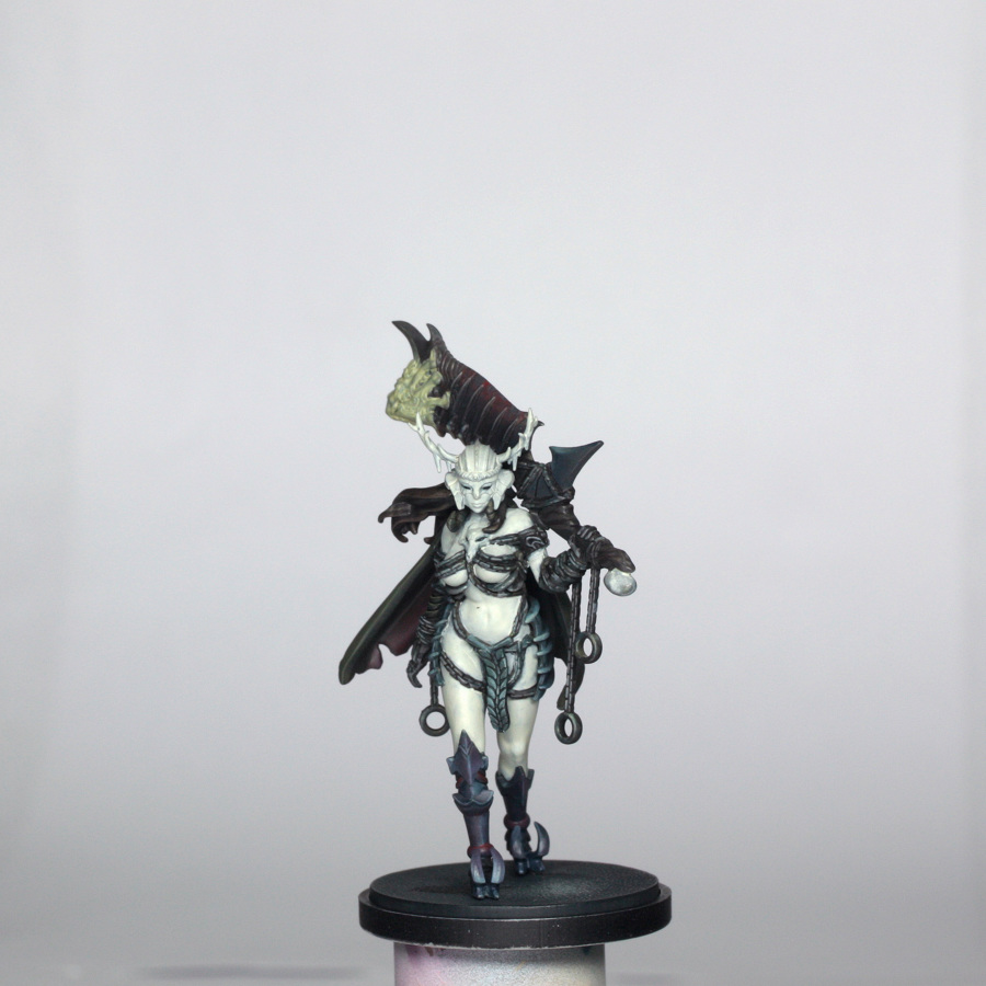
The Skin
The skin for the Forsaker is quite olive toned, and coupled with the darker feel from the artwork meant that I decided to start a bit darker than I might do normally, making the shading blend together more easily, and placing slightly less emphasis on the highlights.
The colours used here are shown…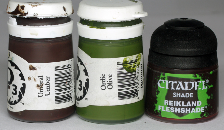
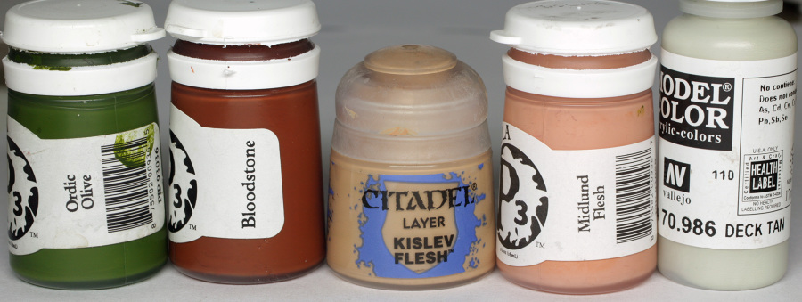
The base colour of the skin was a mix of Kislev Flesh and Midlund Flesh with a touch of deck tan, ordic olive and bloodstone. By introducing all of these tones to the base colour it allows for me to alter the tones of the skin more easily when shading and highlighting.
I applied this base colour to all visible areas (and just about accessible areas behind the cloak!) in several thin layers, until I had good coverage everywhere.
I then added some Ordic Olive and Bloodstone (approx 1 drop of each), and began shading her. The whole of the backs of her legs were shaded, plus the buttocks, insides of the legs, accessible part of the back, undersides of the arms, under the boobs and ribcage, and down into the pelvis. I then added some more Olive and repeated the shading in slightly smaller areas. The final shading was done using the shade mix plus some Reikland fleshshade. This I applied thinly to the folds under the buttocks, between the buttocks and then everywhere where the skin is in contact with other surfaces, such as the chains, with an emphasis on any underside areas. The skin of the back was liberally painted with this mix to fully shade the part under the cloak.
Highlighting was started by blending glazes of the base colour back in, where the shading was initially a bit blocky. Then I added a bit more midland flesh and glazed this into all areas to highlight. This gave it a slightly more pink tone to start off with, to add a bit of “life” to the skin colours. Once I was happy with this, I added a drop of deck tan and concentrated the highlights on the front of her right leg, top of the stomach and hips, fronts of arms, top half of the boobs, and the face.
The face didn’t need too much attention, as the top half is inside the helmet, and the eyes are too deep set to paint anything other than black. I just highlighted the tip of the nose, chin and jaw line.
Finally, I made up a thin glaze of olive that I applied to the darkest shades and another glaze of bloodstone which I used to help smooth out the dark to light shift in places like the stomach.
Last detail was the bit of visible hair above the tabard. I just used some thinned Umber and Coal black and stippled it on before glazing it with the bloodstone.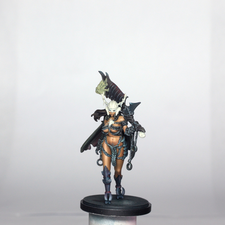
Helmet, Necklace and Handle
These sections look like they are all a kid of bone colour. I used the following…
Most proprietary bone colours are a bit yellow or orange for my own personal liking, so I tend to use the old favourite, deck tan, as the base tone.
Shading quite simple, I just took a touch of Coal black and added that to a drop of deck tan, and applied it to the recesses of the helmet, necklace and the bit of the sword handle that looks like the top of a thigh bone. The helmet shading was done to mimic the shading of the artwork, but also to help pick out some of the details, like the laurels and the lines in the cheek areas. Extra shading was done to the horns of the helmet.
Next I shaded all of the areas with some sepia wash. This added a bit of yellow tone (that I just moaned about in bone colours!), but it is just as a bit of a filter as once it had dried I added some Agrax Earthshade, and pushed this right into the edges and recesses. Final shades were done with a thin mix of Agrax earthshade and coal black, again applied to deepest recesses and undersides.
Once this was all done, I took some thinned deck tan, with a drop of glaze medium, and started to glaze the different larger areas that needed to be highlighted, slowly building up the transition to a final highlight point in about 4 passes, allowing it to dry in between. While I waited for this to dry, I VERY carefully highlighted all of the tiny details of the laurels, the ribs of the helmet, the spikes of the antlers, the details of the necklace, and the very edges of the helmet cheeks, paying close attention to the edges beside the lines and cracks of the helmet and necklace.
The model is now effectively “painted”, with the only thing left to do being the glow from the sword.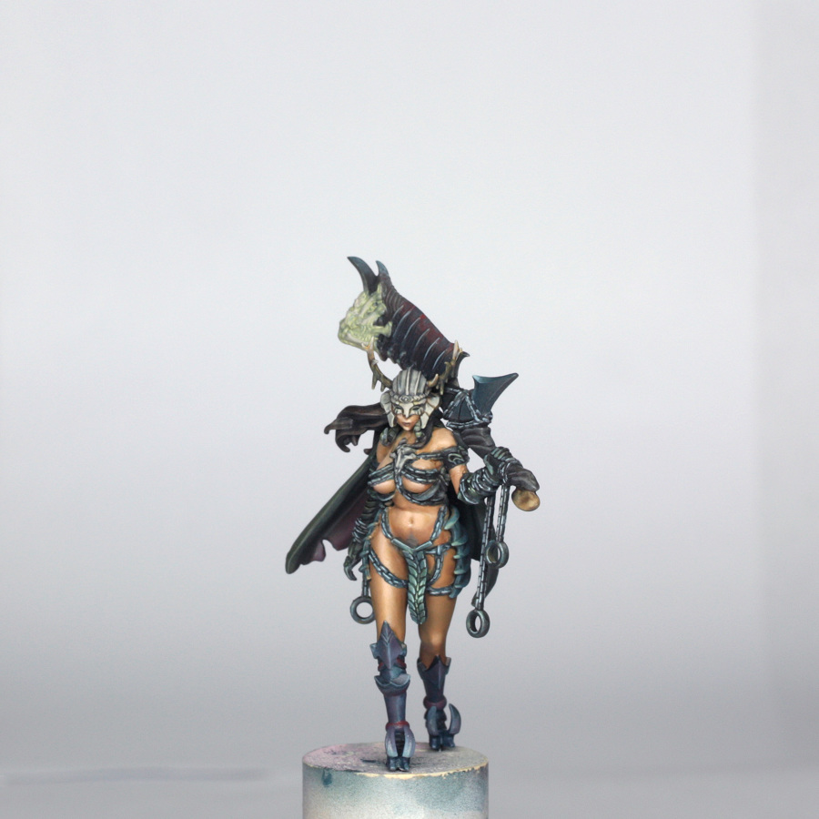
OSL (Object Source Lighting)
Different painters have their own approach to object source lighting, or “glow” on their models. My technique isn’t necessarily “right”, but it works for me! ☺
These are the colours that I used for this model…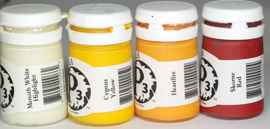
Before I start painting any OSL on models, I always look at what parts of the model will be affected, and how much. I then look at what colours are to be used and work from “dark” to “light”, or perhaps more accurately “least intense” to “most intense” glow.
My method might be a bit more time consuming than say painting in the brightest glow and then blending in the transition, but I feel that it gives me more control over how much I do and allows for easier correction if I go too far.
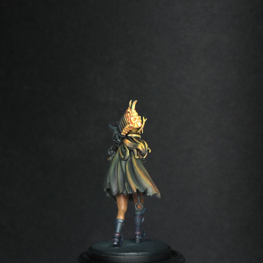
So, first colour used was some thinned Skorne red. Which I applied to the raised folds of the cloak, hair, spine of the sword facing towards the flames, back quarter of the helmet and the details of the sword itself. This also helped to pick out all of the flame parts in the sculpt. To this red I added some Heartfire and started to build the effect in the appropriate areas – working towards the flame, so that only a small amount went on the cloak, but more went on the hair and helmet.
Once happy with this I made a glaze of Cygnus yellow and Heartfire and applied this in smaller amounts in the flame itself and to any details and edges close to the fire – like the hair and helmet.
Final “highlights” were done using Menoth White Highlight with a touch of Heartfire (I used this to keep the orangey tone bright. These were applied to all of the upper details in the flame itself and a couple of tiny touches to the hair. Any parts that I wasn’t happy with got a quick glaze of heartfire, with a hint of Skorne red added if I wanted to deepen the detail volume a bit.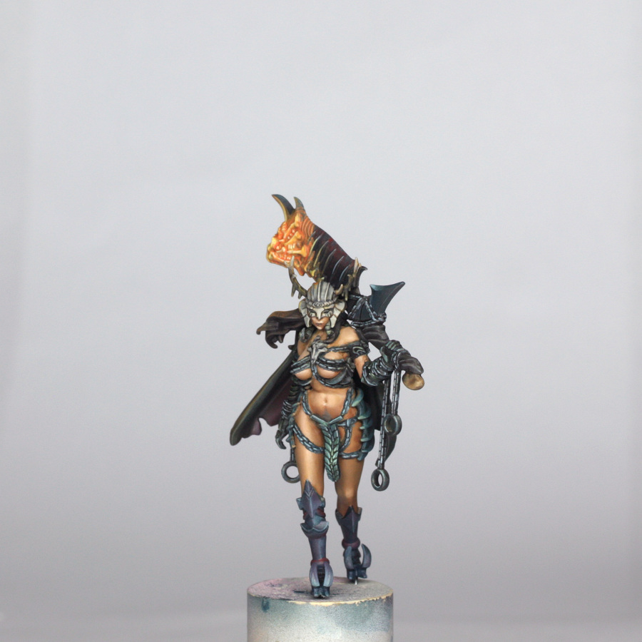
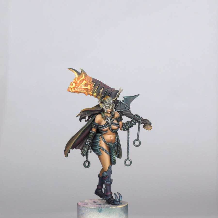
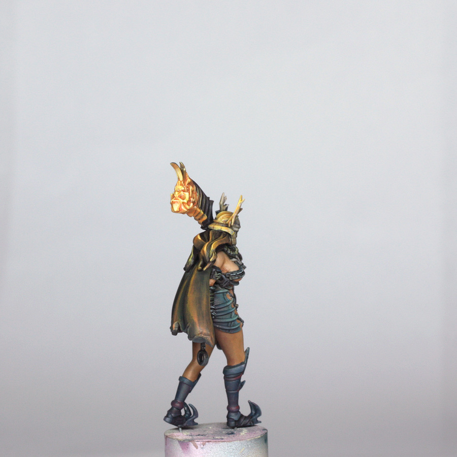
Final check over the model, with a couple of fixes where paint wasn’t where it should be, and I felt that the OSL on the cloak was a bit too much. I then glued her to the base properly, let that dry and applied a spray coat of matt varnish.
I have mentioned in my blog and various forums that I now use Winsor & Newton UV matt varnish. P3 paints have a satin finish on the whole, so aren’t ideal for photography without being matted down, plus any varnish helps to protect the paint finish. I used to use Testors dullcote, but this has recently become less consistent in the UK due to reformulation to make it less toxic to use (which is fair enough!). I had been on the lookout for an alternative that I could use in my airbrush, and this when thinned 1:1 with Tamiya thinner goes on superbly flat, dries enough to take a second coat within a few minutes if applied thinly, and once fully dry gives a wonderfully smooth and matt finish without too much of the dangerous vapours too!
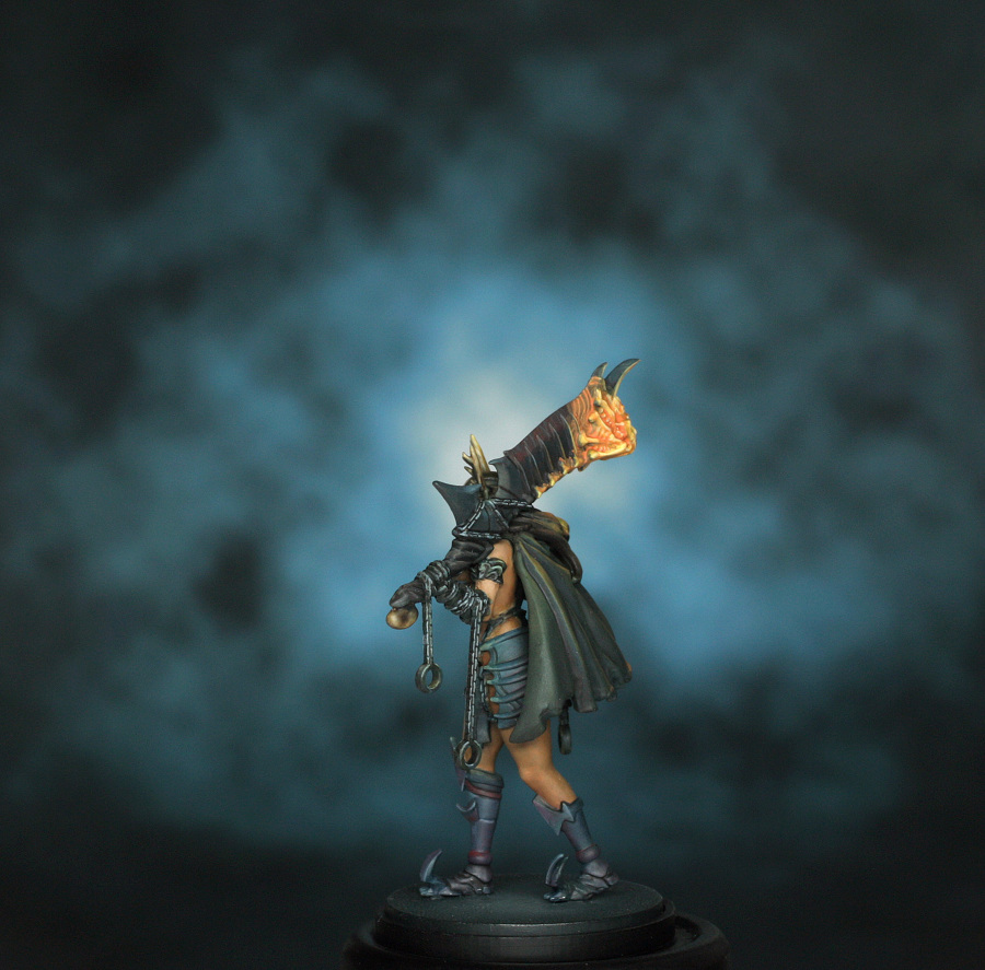
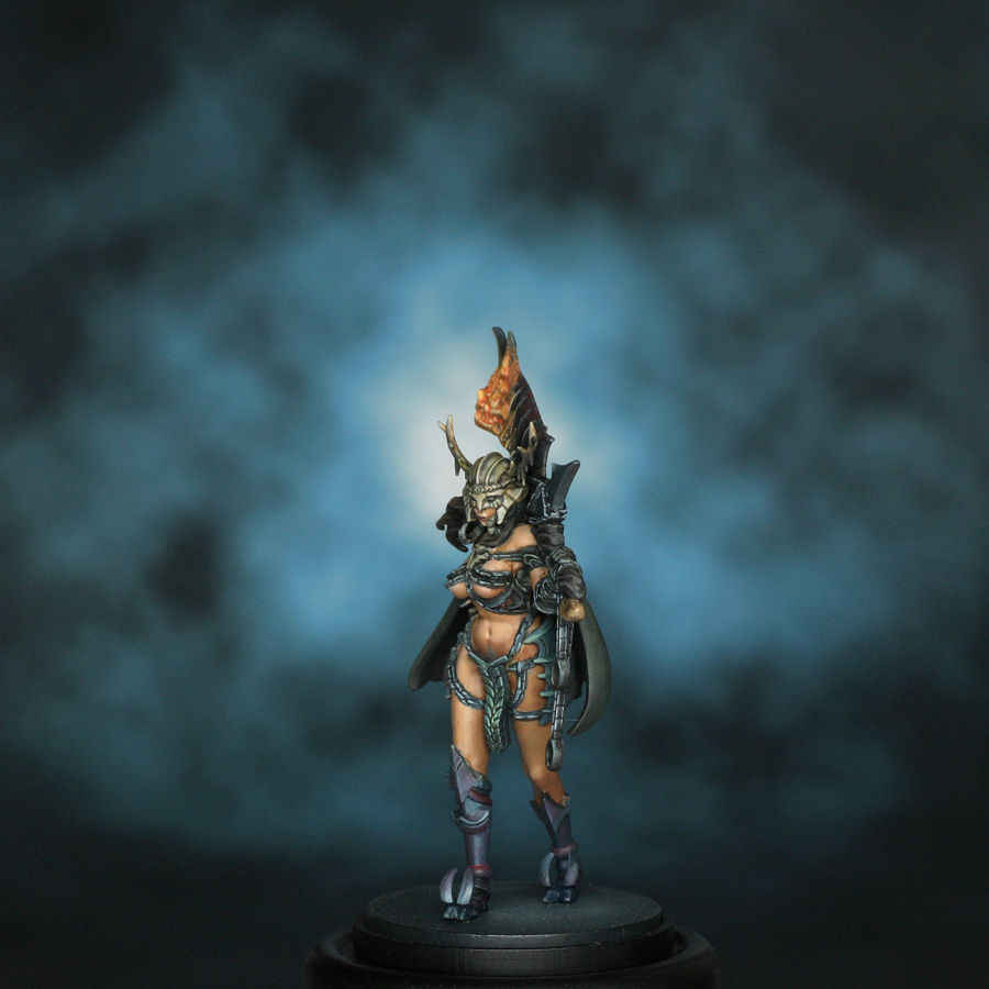
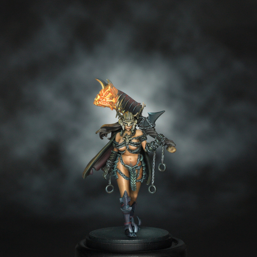
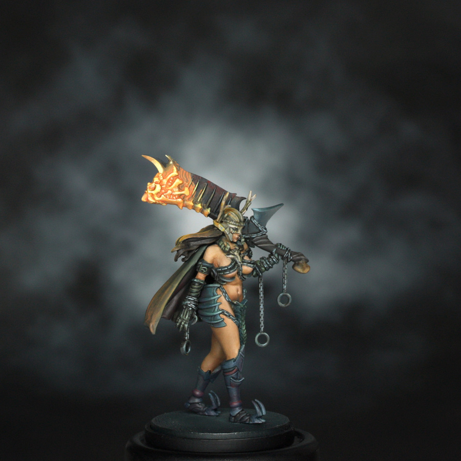
And that is that. I find that when taking photos of models with OSL glow, a darker background will usually give a better show of the effect, and so took lots of shots with different backdrops to highlight this.