Pinup Architect Painting Guide
Scott Hockley

Hi all.
Well, many of you know that I’m not shy about poking my oar into discussions about minis, paint or gasp real life stuff. But one thing I keep “meaning to getting around to” is a series of articles on how I might prepare, build and paint my own models, plus some of the thought processes on how I might prepare myself for these pieces too. To that end I have been asked to produce an article specifically about the Kingdom Death Architect Pinup.
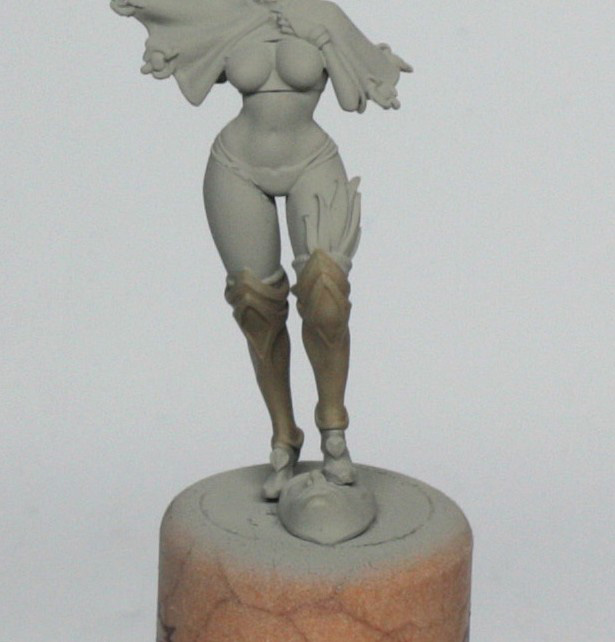
I have always loved the distinction between the Pinups and the proper KD characters, and the wonderfully strong accompanying artwork from Lokman Lam. Normally for any piece that I paint I will do a bit of storyboarding, which usually involves a little collage of images from books, Google searches, or in this case Lokman’s original image. This pre-preparation gives me a feel for the colours that I might choose, any special textures and any designs that I might use for freehand painting later on.
Typically, right at the beginning, I will select what I plan on using as a plinth, decide what kind of base I will set the model(s) in and start test fitting everything. This I shall cover another time though, because the brief for this model is to build and paint it exactly as the kit comes, and as close as possible to the concept art.
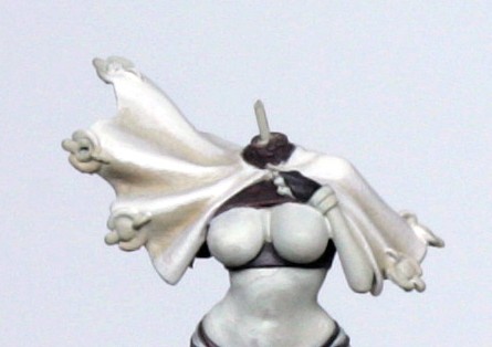
For this article I shall concentrate almost entirely on the “concept” version of the model. I do have, however, the second version too, so it will appear in some of the photos, especially during the preparation stages.
So, let us begin with the preparation…
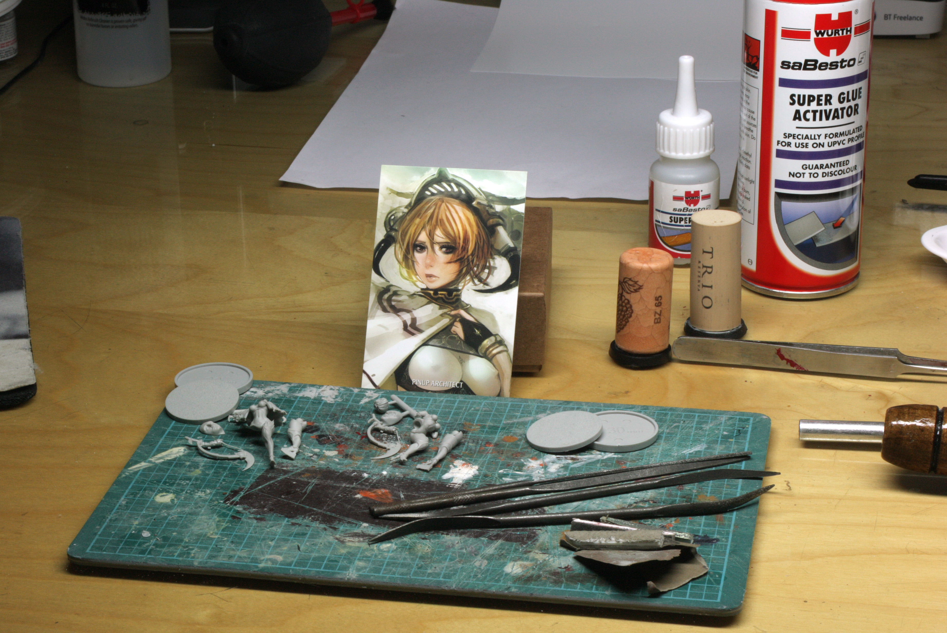
Tools
Scalpel, with a nice new blade – I can’t stress enough how much easier it is to prep with new blades, but do be careful because I also can’t stress enough how much new blades like to extract flesh and blood from unwary fingers!
Clippers – I have an old pair, which I use to snip parts from sprues (not too close to the actual parts of the model), and also to snip the metal that I use for pinning later.
Razor Saw – For cutting off those blobs and blocks of resin around the feet and such, where using a scalpel becomes either too dangerous to the model, or more likely to cause injury. Resin models are notoriously fragile, so any additional pressure often leads to lots of broken bits to repair.
Cutting Mat – I should use it more myself, but I always use it for when I’m sawing!
Files – I have lots and lots of all sorts of shapes. The main thing here is to get some fairly fine ones, as the rougher ones make re-finishing the model harder later. The rougher ones tend to be better on metal models though.
Sanding paper and sticks – I have a wife who is a nail tech, so I have a cheap source of manicuring tools. However, a trip around the makeup and nails section of your local department store/supermarket/pharmacy will often yield plenty of cheap solutions. The sandpaper that I use is about 1200 grit, and I tend to tear it up into smallish pieces, then roll into a cone and use the pointy end to polish up.
Super Glue and Activator – I use a brand that I liberate from the works stores, but it is no better than other brands. The activator I just find invaluable because I’m impatient to get on with it!
Pin Vice with 1mm and 0.5mm drill bits – KD human models are mostly very fine, so a fine drill bit is essential for pinning some bits together. That said, a lot of the models can be just glued together. However, if you don’t fully assemble models prior to priming and painting, then pins are essential, because supergluing paint to paint doesn’t give strong bonds!
Paper Clips and 0.5mm steel wire – For pinning…. Paper clips are the most readily available source of 1mm steel rod and will suit most resin models over 28mm. The 0.5mm wire was used here more though, because the arm, and neck are very fine. The larger pin is used to fit the stone face to the base.
Liquid Green stuff (and/or dissolved standard Milliput) – To fill any gaps when the model is assembled, plus any odd bubbles in the casting process.
Old Brush or colour shaper – To apply the liquid green stuff. Don’t use your finest Kolinsky sable to put this stuff on unless you’re a lottery winner…
Corks – I glue them to standard old GW bases, cos I have thousands of them! I then mount the assembled models on them , ready for painting.
Some textured paint – GW do a range of these, as do Vallejo, but in this case I’ve used some Tamiya Concrete paint, which is very fine, and I shall just use it to blend the stone face into the base, which already has some texture to it, and saves the need for any gap filling when the time comes.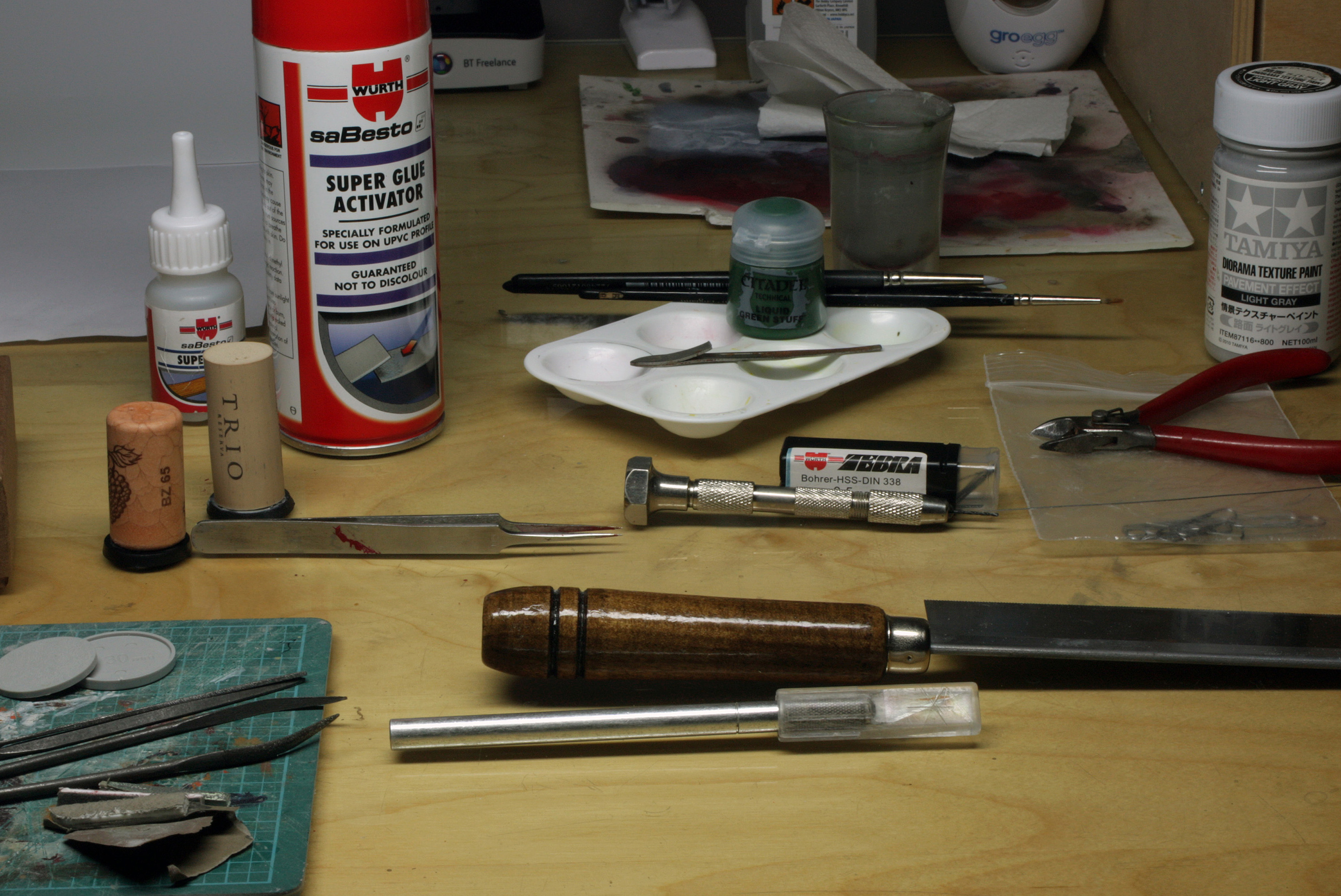
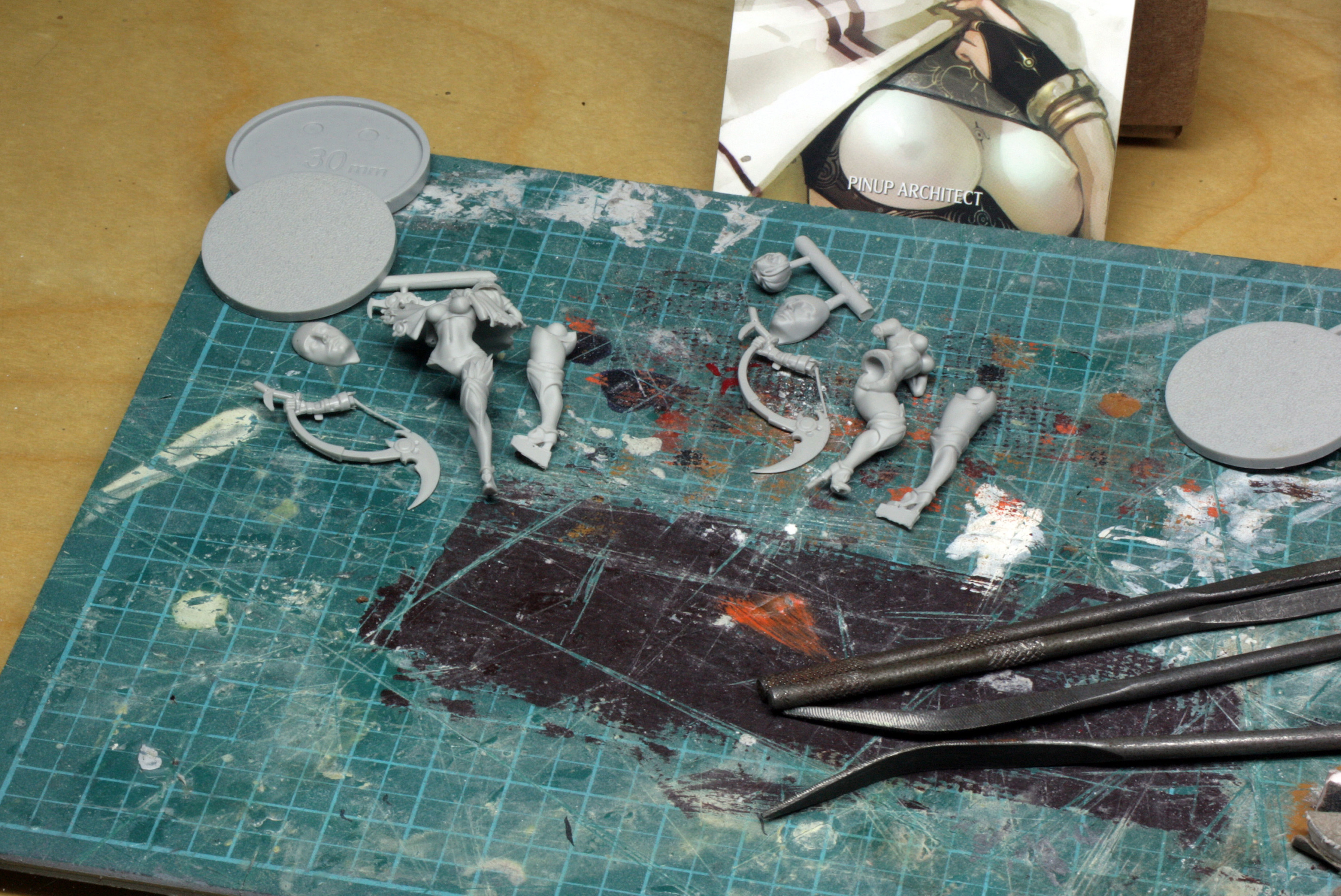
Physical Preparation of the Pieces
Take some time to separate each of the pieces, check them over for any bubbles, miscasts or mould lines. With KD models you get a lovely box with the model. I tend to cut up the parts and pop them back in the box while I check and test fit everything. The reason for this is that the little tiny pieces are a nightmare if you lose them in the carpet, or accidentally lean on them while reaching for something else. So, word to the wise, keep them where you can’t lose them! 😉
Once you have done this you’ll have a rough idea of what needs to be done. My own copies were pretty good casts, with minimal mould lines down the arch of the back and along her right leg on the main model, a couple of fine lines on the weapon thing and arm, a very fine line on the helmet, and a little line down the back of the other leg. The stone face had a blob of resin on the back which I sawed off and then sanded completely flat
I quickly took these off first with the flat of my scalpel blade, and then with my buffering sticks and sandpaper.
Once this was done I glued the leg on to her and, placing the stone face on the desk, I then glued her foot to the eye recess of the stone face, using the desk to ensure that she was upright.
Normally I might pin through the feet, but she has very fine heels and feet, and a quick attempt led to a hole in the foot! So I opted to repair that and glue her instead.
I did drill the arm and neck though, and a couple of holes into the back of the stone face (before I glued it!!). Then inserted some 0.5mm wire into the arm and neck, with 1mm wire (paper clip) in the base, and glued them in place carefully – DON’T use too much glue or you won’t get a good join when you fix the parts in place!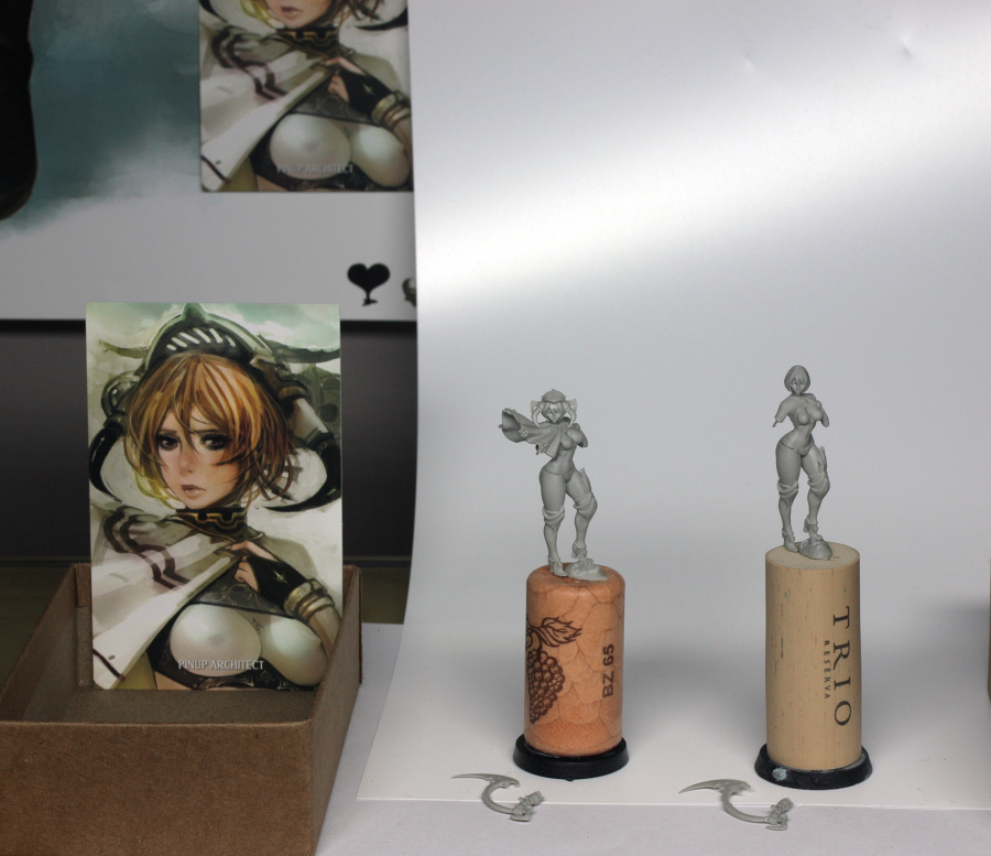
The arm and head will either be painted separately, or glued on after other parts are complete. I find it incredibly frustrating if I fully assemble a model, only to find crucial areas that are no longer accessible with a brush, or there are delicate parts which are likely to break off during handling.
Once the parts are appropriately pinned and glued we need to do a bit of filling. Like I said, there was very little in terms of mould lines to fix, but there were a couple of tiny bubbles to fix, and the join between leg and groin needed a little filling once it had been glued up. I used liquid green stuff exclusively on this model, but I more often use a little standard Milliput, mixed up and then dissolved in some water, particularly when doing the next part, which is to smooth over any sanded areas that I may have been a little rough on during the earlier preparation.
The main thing to remember is put thin layers on, allow it to dry a bit, before adding more. This will avoid you obscuring any details, or giving yourself a load more sanding to do when dry.
Once the green stuff has fully dried, give the areas a very fine sand, to level everything out. I would then suggest that you wash the model carefully in warm soapy water and if you have access to a hair dryer, then blow everything dry using the cool setting (using the hot setting is likely to bend the resin!).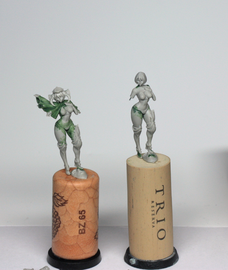
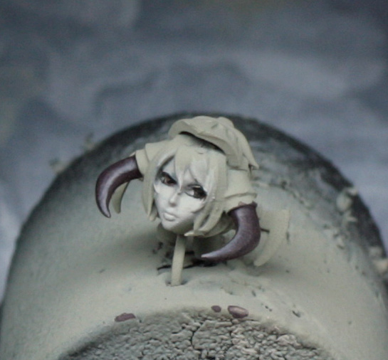
Finally, mount the models and parts onto corks ready for priming. I have kept the head and arm separate from the main model. This is because the helmet horns and parts at the back sit quite low, so accessing the neck and shoulders, plus the underside of the helmet, would be difficult if already glued to the torso. The arm has a long thin weapon attached, which I can guarantee will break if glued to the model when in my hands! So I’ve left it separate, if you want to glue it on and are confident that you won’t bust it then great.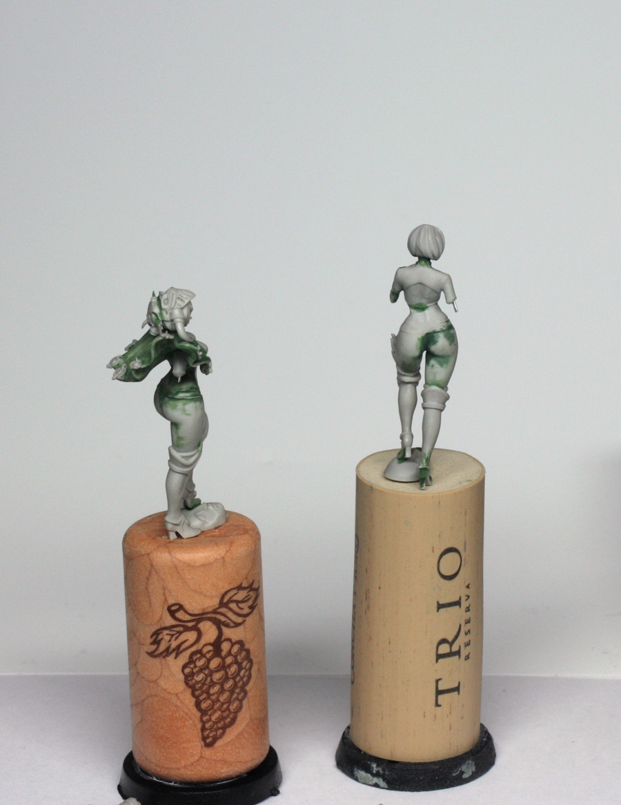
Priming
OK. At this stage I should explain the priming options available, and the choices I might make when preparing a model for painting.
There are essentially two types of primer available to us – brush-on and spray primers.
The spray primers available vary massively in quality, but often people make the mistake of using spray paint in place of primer, especially those who use the GW sprays, which I can confirm are PAINT and NOT primer. Spraying paint onto models without primer is liable to all sorts of issues, so try to get a proper spray primer for model kits – I use Tamiya Fine Spray in light grey or white when using aerosol sprays – you can sometimes use automotive spray primers also, but I’ve had such mixed results that I just don’t trust it on fine resin pieces (metal pieces are easier to strip and scrub if priming goes wrong!).
The other option is to use brush-on primer, and for single model pieces I would tend to recommend this. I have Army Painter black primer and Vallejo Game Colour white primer, which I tend to mix together to give me a nice grey not too dissimilar to the bare resin.
I should also own up at this stage to going one step further because I have an airbrush. I use my airbrush now to prime all of my models, and it gives additional flexibility for pre-shading the models if I want to introduce contrast before I start painting. I will often do this for display models as it helps to increase contrast in the paint later, but it can be a little problematic when painting lighter coloured models – such as this one – so in this instance I have just sprayed the model grey.
A quick explanation of pre-shading is that the model is sprayed grey, then turned upside down and sprayed from directly underneath with black, before turning the other way up and spraying straight down the model in white. What you can also do with this method is establish a light source if you wish. This is helpful for instance when doing a dark model lit perhaps only by a lantern… ^_-
Because I used an airbrush, the mix for priming was:
1 part black/4 parts white/5 parts water/1 part airbrush thinner
If brushing on, just mix equal quantities of water to paint, no need for the thinner.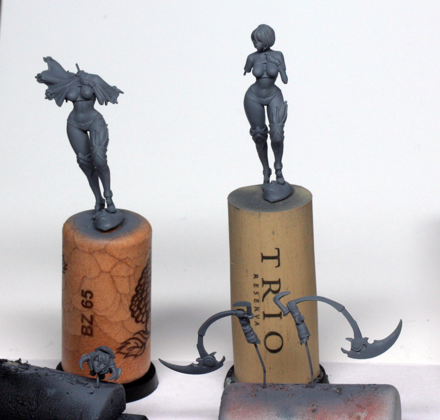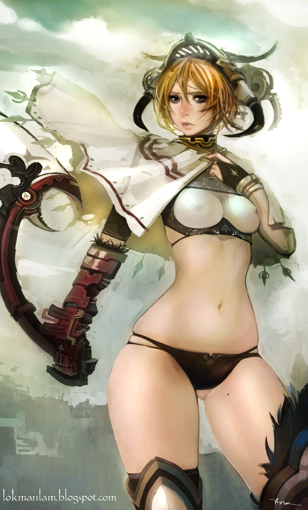
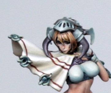
Colour Scheme The concept art for this model is quite desaturated, by which I mean that the colours on show are not strong colours. There is a pale, pink skin tone, the red of the weapon and patterning is dark, the brown of the panties and boots is also dark, the cape is pale, as is the mask part of the helmet. The only splash of colour, as such is the hair, which is still a dirty blonde colour with a hint of orange, so we aren’t going to be using too many bright paints for this model. There are lots and lots of ranges around, but I will use mostly paints from 3 ranges. The first is GW whose paints I tend not to use too much of other than skin tones. I intend using some of their new and old flesh colours here. The second is the P3 colour range. I really like the pairings of colours that P3 has available, plus some nice desaturated earth tones, so some will get used here. Finally are Vallejo’s Game Colour and Model colour ranges. I shall use some Game Colour for altering tones here and there mostly, while I’ll use the Model Colour for more earthy tones, but also for one particular colour which I intend to use for creating colour harmony throughout the model, which I’ll explain in the colour theory part in a moment. A special mention will go also to Tamiya model paint too though, which I use exclusively in my airbrush. It is fantastic for spraying, but terrible for brushing onto models, which I think may be due to the fact that it is solvent based (though still water soluble apparently), rather than water based. The reason that I mention it is because I use it at the earliest stage of painting, but also for an early stage in the base painting. Colour Theory Colour Theory is a difficult thing to explain without going on and on forever about all of the different aspects and why some things work and others don’t. However, in the simplest terms, the more limited the number of strong colours in use on a model, the more impact you can create with those colours. At this stage it is worth mentioning a site which helps me when thinking about colour – http://colorschemedesigner.com/ The site mentions some of the most commonly used aspects of colour theory, such as complementary colour (directly opposing colour), analogous colour (colours directly next to each other on the colour wheel) and so on, but I am going to use a TRIAD system, with a cool teal colour used in opposition to warmer desaturated red and yellow (see images).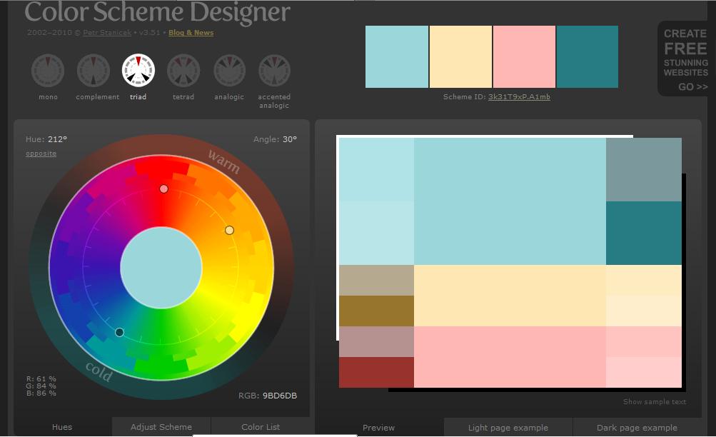
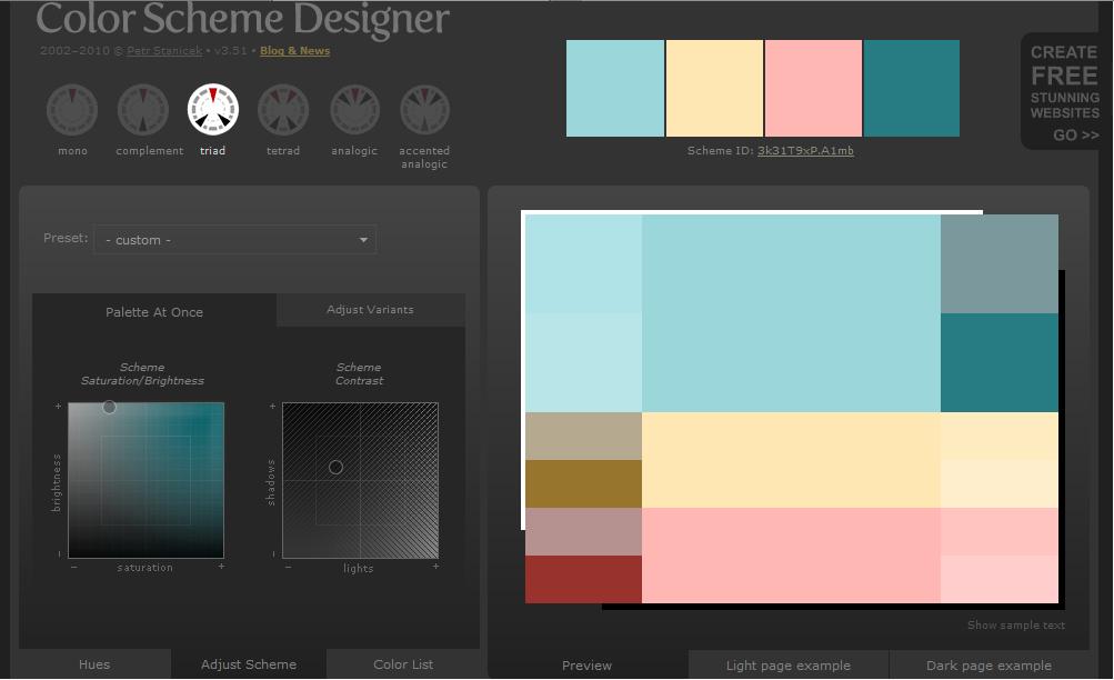
As you can see, the pink of the skin is picked up by this, as is the hair colour, and a colour for the metal parts, but the accents thrown in match quite nicely with the glove and weapon, panties, boots and even the cape.
So, colour choices established, we need to translate this to real paints. I am sure that there are means of doing this via digital means, but I just have loads of paints at home, so I shall just pull a few out to match by eye.
However, I mentioned earlier that there is one colour that I intend on using everywhere for this model to create colour harmony. Essentially colour harmony is a method of painting where one specific colour is mixed in with every other colour in play, to create a consistent tone across the model. This is not something that I do all that often, but when I do, it tends to give a lovely smooth feel to the paintwork, and I want that feeling with this Pinup model as that is mostly what I feel when I see the concept art.
The colour that I want to achieve the effect with is Vallejo (or Tamiya) Deck Tan. It is one of my own personal favourite paints. I hesitate to call it a colour as such because it isn’t really much of a colour, but if I were to describe it then I would call it a cool cream. If you are following this and don’t have the colour (and don’t feel like adding it to your set), then you can take a cream colour and add a hint of very pale blue/grey. This will get mixed in with each of the other colours as we go, or will serve as a base tone to be highlighted and shaded to suit.
To this end, I have decided to base tone the entire model with Deck Tan. I’ve used the Tamiya version, purely so that I can airbrush it on, rather than brush on, but the benefit of this is that I end up with a lovely smooth base coverage, with just a hint of texture because this Tamiya airbrush paint is particularly matt, which is ideal as a key for the paints and glazes to grab onto. Too much texture (which is often seen when using GW white spray paint) and the paint will look terrible and grainy, too little and the primed model is shiny, so thinned paints don’t stick very well, and so rub off more easily.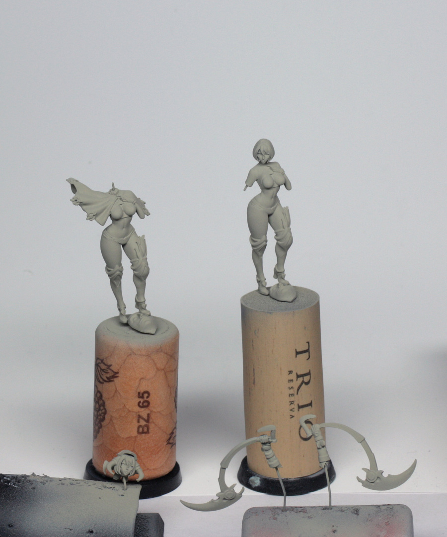
Painting
Right, well, we have a nicely assembled, nicely primed, plain and flat model. I guess that she needs some colouring in! ☺
We have already established the colour scheme in the previous section, so it is time to start converting theory to real paint.
Now, I often use a wet palette, which is fine for some situations, but in this instance I am going to go back to a painting method which I am more practiced in, and should yield slightly smoother results, in line with the concept art.
For this I am going to use well palettes – which are easier to take photos of anyway! – with plenty of glaze medium, some matt medium and of course some paint.
I’ve set out a few wells with a drop of matt medium, a couple of drops of glaze medium, a drop of deck tan and about 6 to 8 drops of water, then given them a stir. To this I’ll add the paint. It will be difficult to say how much as I tend to just dip a mixing brush into a pot with P3 and GW paints, but I guess that I am adding approx 2 or 3 drops of the first base colour, then successive additions are approx 1 drop at a time. This model doesn’t need large quantities of paint, and the pre-basing with the deck tan will help accept what will be essentially successive glazes to build the colour. The use of matt medium helps to reduce the amount of shine that you can get from P3 paints in particular. They have a tendency to be a bit plasticky in finish, which is fine when the model is dullcoated at the end, but not very helpful if I am taking photos as I go along!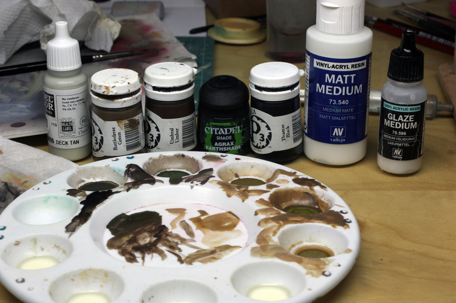
It is worth pointing out at this stage that I am going to assume that the light falling on the sculpt is similar to the concept art, and so it is above and slightly to the left as we look at her. This is helpful with the shading that I will be applying throughout the model.
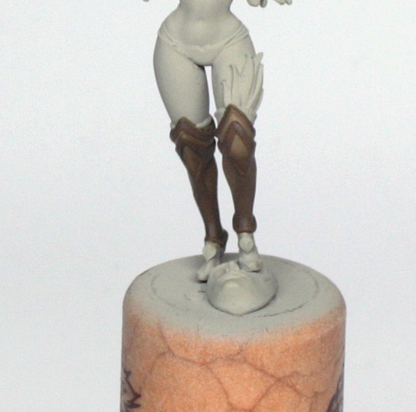
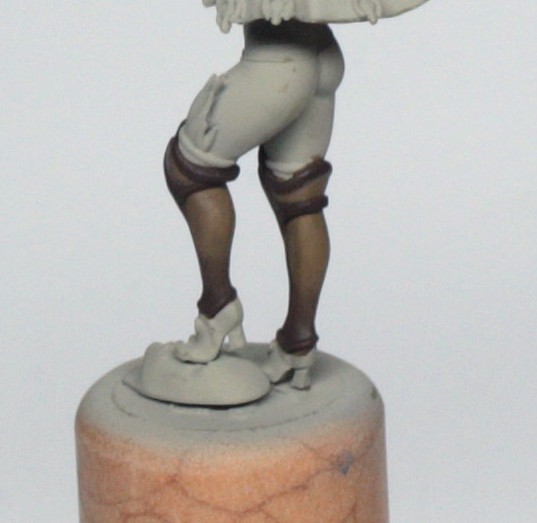
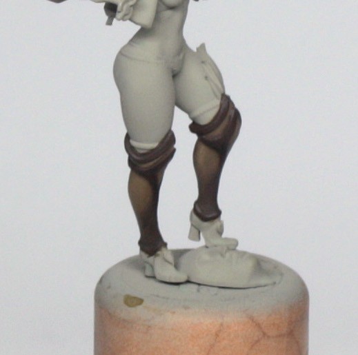
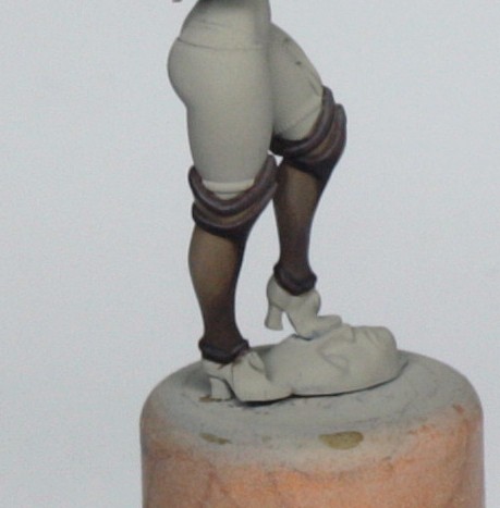
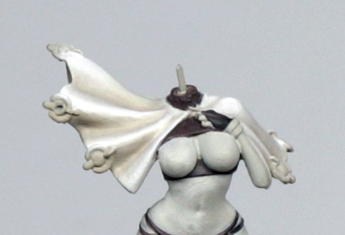
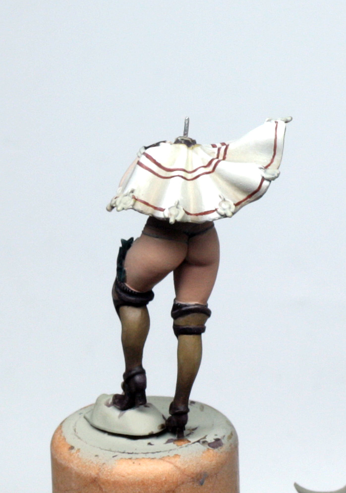
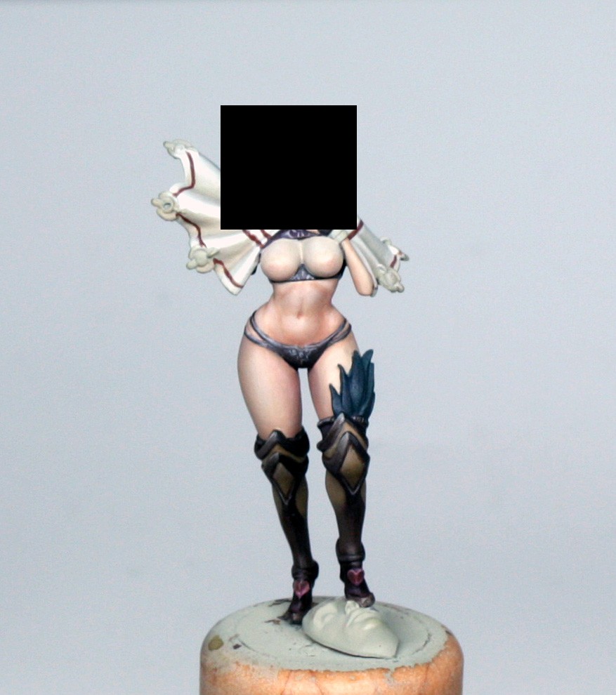
We will start with the part of the concept art that is missing! That is the legs below mid-thigh, which consists of some kind of shapely one piece stocking/armour combination, plus her shoes.
I think that that larger area (the legs) need to be done first, and then the shoes, as there is a kind of cuff at the bottom of the stocking/armour that separates the shoes up nicely.
For the stockings, on the full sized concept image, we get a bit of the colours in use, which is a dark reddish brown and a kind of fawn-like colour. The two colours go together quite nicely, and due to the sculpting detail, that is helpful because I am going to have to blend the hard and soft areas together as one continuous blend.
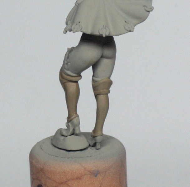
To achieve this I painted the fawn colour first using P3 Battledress Green, which is not really green at all, and reminds me more of a milky coffee colour. Mixed with the base mix above that gives a nice tone that I covered the entire area with. To do this I used a well blotted brush – dip the tip in the paint mix, touch the whole flat of the brush to some kitchen roll for a second or two and you will have a nicely loaded brush – and painted the area with 2 coats, allowing each leg to dry before adding the next layer. At this stage, I also used the same colour to paint the underside of the cape. This colour can be seen in the concept also (slightly more yellow, but not a major problem if I need to tweak it later) and helps with the whole colour harmony thing. Once the legs have dried, I added a few more passes with the same colour to the areas that would be either in shade, or will eventually become the (darker) hard parts of the stockings/armour. Next I added a drop or two more Battledress Green to the mix to make it a bit stronger, and worked on the same parts as before, but in slightly smaller areas, to start building the richness of the shading. Time to get another colour into the mix, so I used P3 Umbral Umber, which is a lovely, rich dark red-brown (GW scorched brown is very similar). First I added a drop to the previous mix and painted the same parts, this time painting all of the hard points and ribbing, and adding shading where these hard points become a part of the stockings. It was important to keep the paint thin here, so that the blend was nice and soft between the two areas, and not like a stripe. This needed at least two coats to be sure of coverage, but I had to make sure that the paint dried fully between passes, because the Umber becomes more opaque as it dries, so it can leave tide marks if not careful. After this I made up a glaze of Umber, water, glaze medium and matt medium without the deck tan. I used this on all of the hard areas, paying particular attention to the shaded areas. I also used this to start any dark lining needed at the edges of the stockings. This was built up in about 3 coats. I did also do a little extra shading with GW Agrax Earthshade, which made little or no difference, but it did help to make the areas a little more matt. The last bit of shading that I added was a mix of the Umber glaze and some black paint (I used the P3 one for convenience, but any black paint will do). This I used to increase the final shades, and help to define the crease on the shaded side of the knee guard area.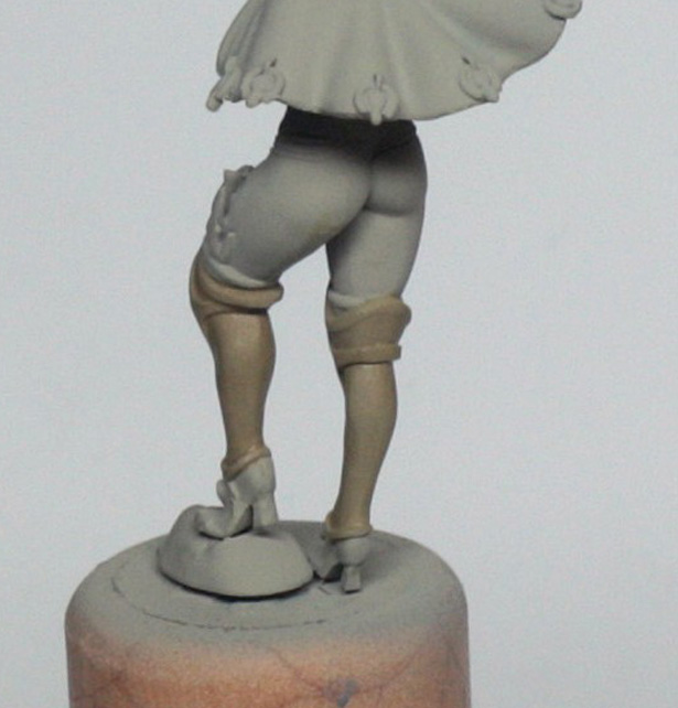
To help emphasize the shade in this area, and to any areas of the hard parts that needed a highlight or two, I took some of the Umber paint and mixed it with the deck tan glaze mix. I used this on the high points and again particularly next to the black shaded area on the knee pads.
A quick final edge highlight here and there in near pure deck tan, with just a hint of the umber on the hard areas, and a hint of the battledress green on the softer areas, and a couple of really thin glazes to bring everything together and the legs are nearly done.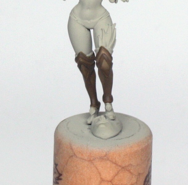
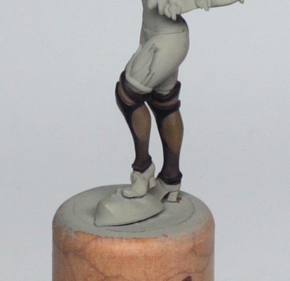
We still have the feathers, the ribbed under-stockings that are peeking out at the top, and the shoes to do, but I’m quite happy with how it looks so far, and any toning glazes, additional contrast or highlights that I may feel are needed later will be assessed when the rest of the model is done.
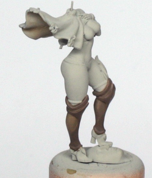
Addressing the shoes next, I will use the colour of the shoes and carry this on to the panties, shirt (not where the boobs are, of course), and gloves.
Painting the shoes, panties and shirt parts was pretty straightforward. First I needed a warm kind of black colour. For this I mixed up a base of the deck tan/matt medium/glaze medium (of course) and added some of the umber from previously. To this I added a blob of P3 Sanguine base and a dot of black. This gave me a deep, desaturated dark red brown, which I painted onto the shoes, little glove, panties and shirt.
It is important to try and be quite careful with the painting of the thong strings and the areas of the shirt which are going to come into contact with the skin and cape later, as otherwise there will be a lot of correcting to do. A little more time taken with blotting the brush and taking 2 or 3 passes to establish the colour is worth it to avoid the 4 or 5 passes cleaning up later, believe me!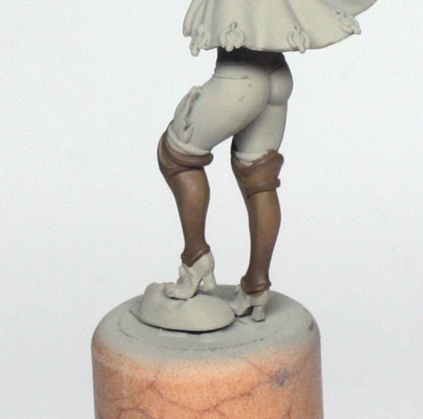
So, the base colour is established after 2 or 3 thin coats. Try to get it nice and even, with no under colour peeking through, as it will make the shades feel more rich and less flat, as we are building up successive glazes of translucent paint.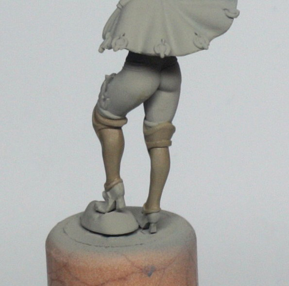
After this I added a bit more deck tan to the mix and highlighted any edges or areas where there would be a bit of natural shine on the shoes. This was established in a couple of thin coats, and a final shine was established with a dot of deck tan glazed on with a wet brush.
Not the easiest of tasks, but essentially you touch a dot of paint to the brush, quickly dip it in your water, then onto the model. You have to make sure that your brush is not too wet, so if you see excess water before you touch the model, touch the sides of the brush to your kitchen towel to absorb the excess.
Once you touch to the model you need to be quite quick to spread the tiny piece of paint and blur the edges of it. It needs a bit of practice to get right, but looks effective when you get it down.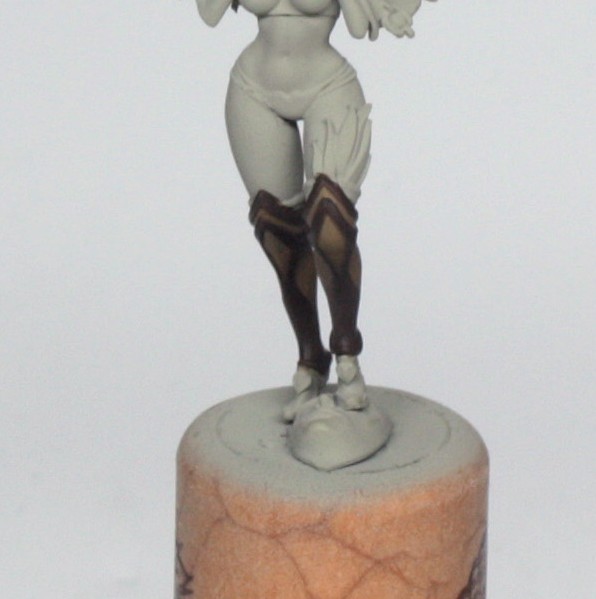
Once happy with the highlights – if not happy, just glaze a bit of the base red/black colour over and re-establish the final highlights if necessary – I moved onto the shading, which was pretty quickly done. First I took a small amount of GW Agrax Earthshade and pushed that against the details in the shoes to help emphasize where the highlights are. Then I used some more to further shade the shoes, always brushing towards the shadows and away from the highlights.
Last thing I took a dot of black and mixed it with some of the earthshade, then glazed this right into the lines and details to fully sharpen the shadows.
The shoes have a couple of hearts on them which I will go back and paint properly when I do the armoured glove and weapon, but for now I quickly painted it in a mix of Sanguine base and deck tan, which made an interesting raspberry colour…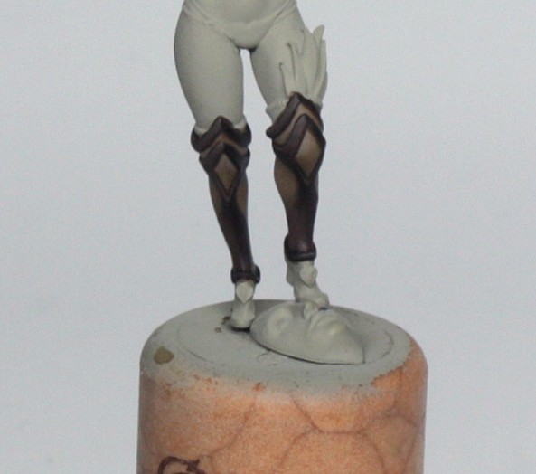
The shirt, little glove and thong panties were painted the same way as the shoes and I quickly painted in some of the freehand designs that are on the concept art using some of the deck tan base mix. There’s no easy way to explain how I did this, other than saying that the paint was slightly thicker, and I made sure that the brush was well and truly blotted before I painted the designs on. I test the line on my glove hand before I touch the model, and I make sure that I use the brush with the best point, which in my own case is actually a size 1 brush, but equally could be done with a 0 or smaller, if the point itself is good. I’ll go through a bit more on drawing freehands when I come to the cape next though… Which leads nicely onto… the cape (duh).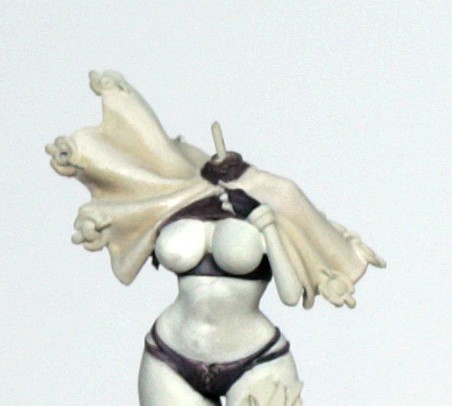
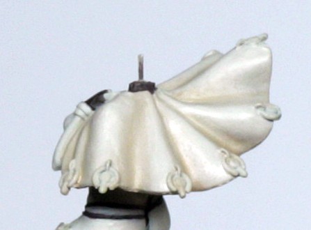
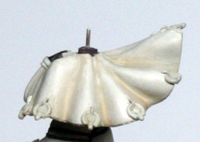
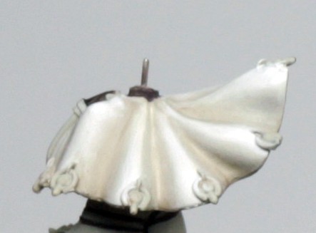
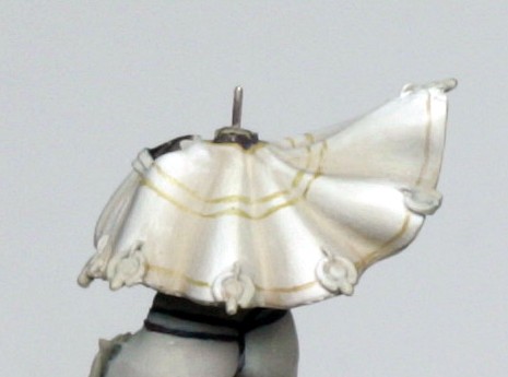
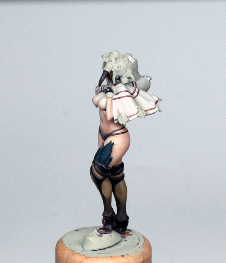
The cape in the art is a soft white colour, without too much contrast, so this is a part where I had to rein myself in a bit and avoid going too heavy with the shading.
So, to start with I had already used some Battledress green mixed with the deck tan base as a shadow under the cape, so I used the same mix and glazed this thinly into the folds of the cape. I then added some more deck tan and started glazing away from the folds and up onto the high parts of the cape. Next, pure deck tan base, glazed again in a couple of coats in a decreasing area, brushing towards the highest points. Next, I made a glaze of the deck tan base plus approximately equal quantity of Vallejo Silver Grey and applied this in a couple of further decreasing coats, starting to get close to final highlights. Next to last was a quick pass of thinned pure Silver Grey mixed with glaze medium. Final highlights were done in the absolute uppermost areas and edges of folds with a 50/50 mix of the Silver Grey glaze and some white paint.
At the end of all this I felt that there needed a little bit of glazing back in places to get the transitions smooth – a common thing particularly with black and white blending – so I used some of the deck tan as a first glaze and then some of the battledress green mix, to re-establish the shading and cover up any missed brush strokes. I also glazed the deck tan mix very lightly to the fold of the underside which would be visible when the model is photographed at the same angle as the concept art.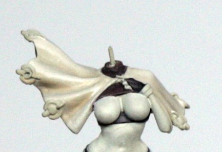
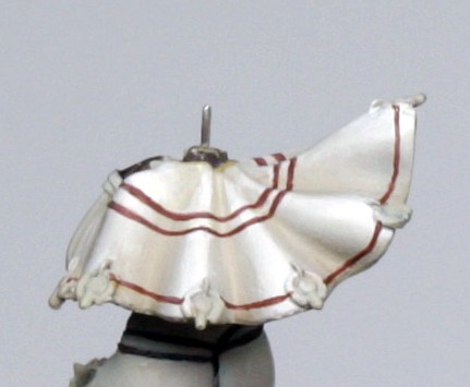
Now, the challenging part… Freehand lines!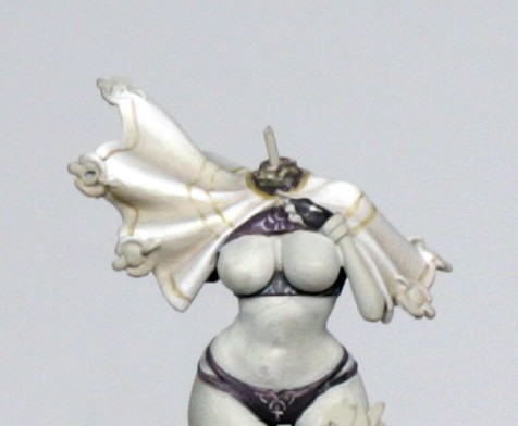
Some find freehand lines easy, others hideously difficult. With a steady hand and a planned attack it shouldn’t be too hard though. There are lots of folds to the cape, which can be a help or hindrance. The help is that you can paint a section, stop, do the next part, and so on, with less worry of going off line. The hindrance is that the actual folds can make parts of the line difficult to do. Before starting to draw lines on the carefully blended cape, I strongly suggest that you practice drawing fine lines with your best brush. The secret for me is to get a strong, steady, comfortable hand position, usually with the side of the model holding wrist against the edge of the desk, palm up, and model in hand. Then rest the paint brush hand against the other hand, with the heel of each hand in contact (almost like doing a “handcuffs” action). This gives ME enough space to work happily, but I have fairly big hands, so find your own comfy spot! ^^ I tend to draw lines by painting towards me and angling the model so that the brush stroke will take the model out of contact with the brush, rather than closer to it. This will encourage a finer line and stop me blobbing the lines as I go. Due to the folds, I tended to do half of the line until it became difficult to reach, and then turned the model upside down and continued the line more comfortably.
So, the actual lines… First, I used a drop of battledress green, mixed with a drop of glaze medium and a dot of water. I need it fairly thick to draw with sharply, but not so thick that it dries too fast, so the glaze medium helps slow the drying enough. I then painted the 3 lines, starting with the one at the edge, and then the paired lines. I kept these lines really thin, trying to concentrate on being as correct as possible. Using the battledress colour means that any corrections at this stage if you go badly wrong are far easier to fix than the reddish colour.
Lines established, I took some Vallejo Game Colour (or GW) dark flesh , a drop of glaze medium as above, and just moistened the brush before loading the paint on. I did this because the Game Colour paint tends to be quite wet to begin with. I then VERY carefully followed the previous lines in a couple of passes. At this stage any roughness to the lines was corrected using the appropriate colours left from painting the cape. Again this was done carefully and I made sure that I was happy with the positioning and consistency of the line. That done I quickly mixed some of the battledress with the dark flesh to create a highlight colour, which I applied to the high points of the folds of the cape. Nothing too strong, just a hint of lightening of the colour. A final tidy and the cape is just about done. I will come back to the tassels later when I start on the metals.
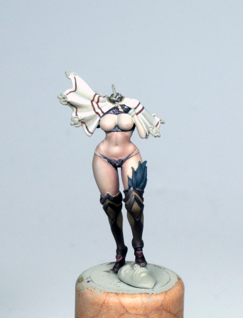
At this stage I quickly did a little bit of placeholder painting of the feathers tucked into the leg armour and those poking out of the armoured glove, just using some P3 Coal Black, which is a fantastic teal colour that I use extensively on models. The reason for this is again because when the skin is painted it will be a lot easier to fix a few stray brush strokes of skin on the teal, rather than the other way round.
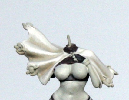
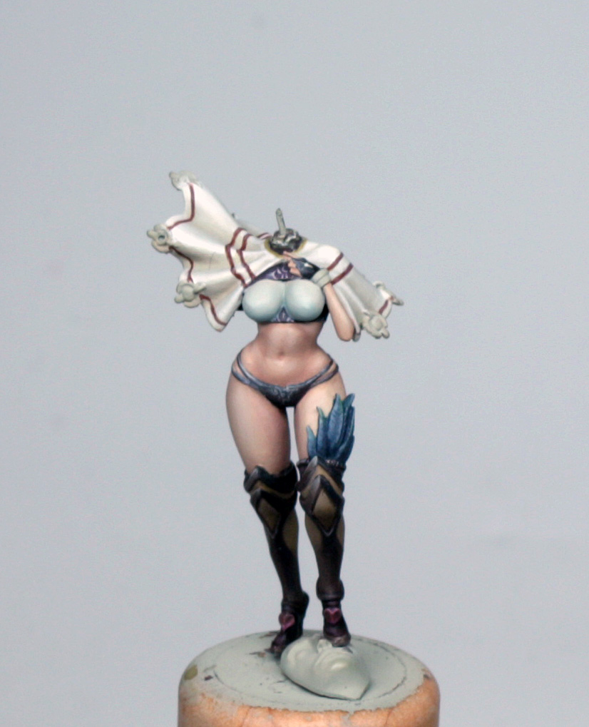
So, now the model is starting to take shape and I reckon that it is time to move onto the largest, and most important part of the model, which is the skin…
Painting – Skin
Now, skin is a part of the model which I often get carried away with, creating extra areas of interest in light and shade, along with warm and cool areas. As a result I will often use a whole range of colours, throwing a bit in here and there, and beavering away like some nutty professor, sometimes repainting entire areas until I am happy with the finish.
In the case of this model I bought a couple of the new GW skin tones, mainly to replace some old ones that have just about gone, but also because credit where it is due, and as a personal preference, I really like the look and feel of GW skin tones (even if I don’t paint them in the style that GW does!) . The concept art has very pale, pinky coloured skin, without heavy shading, so I worked on that basis.
So, I’ll list the colours used and go through how I approached the skin here. I actually did something that I don’t normally do, and painted the face before the rest of the skin with this model. My reason was that I wanted to test the colours before I applied them to the model, and the head was separate, so if it all went wrong I could easily fix it!
Colours:
Vallejo Deck Tan base mix (1 drop paint, 2 drops glaze medium, 1 drop matt medium, approx six drops water)
Vallejo Game Colour Pale Flesh
Vallejo Model Colour Salmon Rose
GW Cadian skintone
GW Tanned Flesh (old colour but I think Vallejo Game Colour do the equivalent)
GW Kislev Flesh
GW Reikland Fleshshade
GW Pale Wych Flesh
First of all I mixed up a base mix that went into every tone, which was the Deck tan base plus a drop of the Kislev Flesh. Kislev flesh is like the old Elf flesh, and on its own is too peachy for this model, but works as a nice softening tone to the pinks of the other colours, or else she would look like she had bad sunburn!
In a 10 well palette I made up this base mix to the wells, ready for the paint, then to the first I added two drops of the pallid Wych flesh, the second had 1 drop of Wych flesh and 1 drop of Pale flesh, the third 2 drops of pale flesh, fourth 1 drop pale flesh and 1 drop Salmon Rose, fifth 2 Salmon rose, sixth 1 salmon rose and 1 Cadian skin, seventh 2 Cadian, eighth 1 Cadian and one Tanned flesh and ninth was 2 Tanned flesh. The final well I used eventually to mix some Reikland shade and the tanned flesh mix together, but I didn’t use the deck tan base here.
Once the 9 wells had their paint I stirred each in turn, starting with the darkest and moving up to the lightest, and then back down to the darkest again, without cleaning my mixing brush off in between. The reason for this is to do a little pre-blending before the paint goes on the model, and I can decide which colour I will start with.
I decided to start with the 3rd well, which I painted onto all of the flesh areas, starting with the legs. The thin consistency of the paint again meant that this was effectively a glaze onto the pre-sprayed deck tan, so 3 or 4 coats were carefully applied, trying to avoid damaging the paint work around it, mostly by blotting the brush before applying to the model – which also allowed the paint to dry nice and flat onto the model after each coat.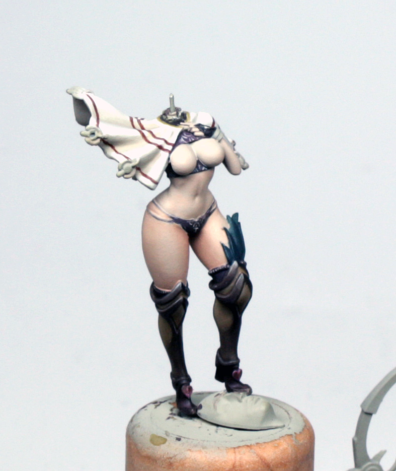
Once on, I decided that it was a bit too pale as a base colour, but this was no problem, because I then painted over everything with a couple of coats from the 4th well. This might sound like a waste of time, but what the paint looks like in the palette and then on the model can sometimes be quite different, and as I mentioned previously, the building up of the colour adds richness to the colour.
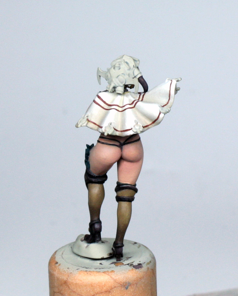
Happy with the new pale skin tone, I started the shading of the legs. First I decided where the light would fall on the legs, which was on her right hip and down the outside of the thigh, with some light falling on the inside of the left leg. I worked away from these light areas in decreasing spaces looking to add volume to the skin tones.
So I did another couple of passes of the 4th colour into the shade areas, then a couple of slightly smaller glazes of the 5th well. By this time I was concentrating on the underside of the buttocks and the rear parts of the legs, as well as where the skin came into contact with the boots and thong strings.
Successive, and ever decreasing, glazes from the 6th, 7th, 8th and 9th wells fully established the shades nicely. The final shadows for the crease of the buttocks, and right up against the boots were done using the Reikland shade mixed with the tanned flesh.
After this I felt that the transitions needed some smoothing out, so I worked back and forth, using small quantities of the paint from the 4th, 5th and 6th wells, and placing them where the colour shifts were a bit blobby. This is all down to how thinly and how controlled I was with the shading. A few loose brush strokes can look a real mess, and then clean up as easy as anything, but a balance has to be kept between tidying up and painting the shades out, so be careful.
To highlight, I re-used the paint from the 3rd well to glaze into the parts that I had already decided would be the light areas. A final highlight from the 2nd well was the end of the painting on the legs. I hadn’t used the 1st well at this stage as I felt it was too pale for her, but I had plans for this later…
After the legs I worked on the midriff and her left arm and hand. I used exactly the same method as before, but the abdomen has some nice areas of interest to apply highlights to, as you can see. I’ve shown some shots of the abdomen before I did a final tidy up to illustrate what I mentioned above, but it was a nice easy fix.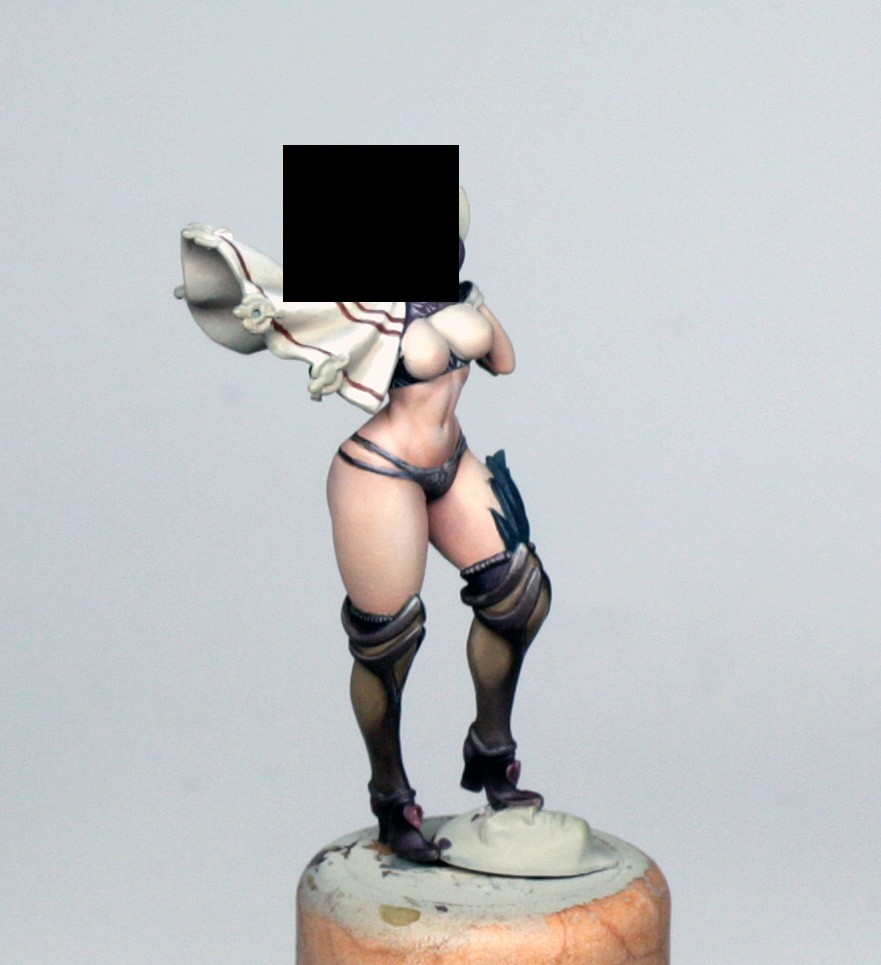
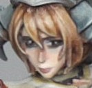
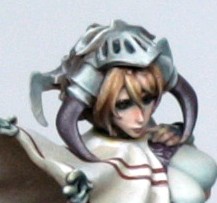
Painting – Face and Hair
I would usually paint the face and hair last on a model, but I decided in this case to paint her face before the rest of the skin, purely because I was experimenting with the skin tones that I used on the rest of her. So, the recipes in the previous section apply exactly the same with the face, and I’ll refer to the same wells in the palette as before too.
The Face
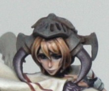
With a face, I will always start with the eyes. The reason for this is that I don’t want to meticulously blend the skin tones to the face, and then ruin it with a stray brush stroke painting in the eye!
So, the first thing I did was establish the position of the pupil and outline the eyes. Because she has heavy mascara in the concept art, and the sculpt itself has two lines above the eyes which are too low to be brows, I marked in just under these and blobbed the pupil position in using the red/brown mix that I used earlier for the thong/shirt/tops of boots (always thrifty with the paint I use, and helping with harmony in the long run!). A bit of careful refining and shaping and I have the shape of the pupils about right – this needed a bit of touching in with deck tan to tidy up. I then took a dot of black and a dot of the red/brown and, using the very tip of a well blotted brush, I very finely lined the eyes, dotted in the pupils and filled the top lashes. I then added a bit of brown highlight, which was a mix of deck tan and battledress green (again!) to the side of the pupils and a final specular reflection in the form of a tiny white dot. This is something that needs some practice both in terms of brush loading and paint dilution, and in terms of technique and steadying your hands. I can only say to try it on your thumb nail or a bit of card to get the feel right before touching the model.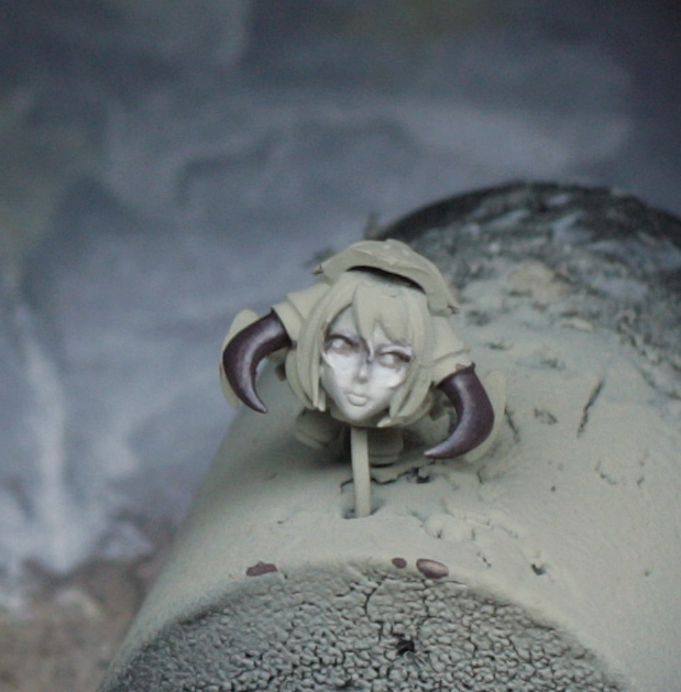
The face itself was painted really quickly after this.
First I put a base colour coat down, using the paint from the third well on the palette – which I had deemed to pale for the base colour of the body if you remember? This part was why I had painted the rest of the skin the same, but I am usually quite happy to make my faces at least one tone lighter than the rest of the skin to accentuate the focus onto the face.
The base tone took two or three passes to get on nice and flat, and the paint used on the brush was minimal because I didn’t want to flood the edges or more importantly the eyes!
Once I had the base colour in place I did the first highlights, which was from the second well. I painted under the eyes, down the length of the nose and each nostril – my technique for this is a well blotted brush which I use the flat of to run along the edges of the nose – just above the brows, lightly above the top lip and philtrum and a hint into the part of the chin that forms a V between the corners of the mouth and the point of the chin.
Second highlight is really fine, concentrating on small amounts just under the eyes, directly beneath the pupils – to draw focus – along the edge of the top lip, the end of the nose and the tip of the chin.
Next, a very quick glaze over the cheeks and chin using a mix of the third and fourth well to bring it together before shading. This glaze must be thinned and ideally applied nice and quickly to avoid any stripes in the skin tone.
After this, and once the glaze is DRY, I glazed beneath the cheek bones, under the chin and neck and up towards the hair line on the forehead using first the paint from well 4 and then from well 5.
Because she is fairly low on contrast, the only other toning was done across the nose using the paint from the second from darkest well. Again this needed to be REALLY thin, and was applied from cheek toward the nose on either side. I say this because if I had painted it from the ridge of the nose down towards the cheeks I would have got tide marks and pooling.
The lips were filled in using the same colour, less dilute, and then the darkest colour on the palette was used on a very fine brush to line just under the bottom lip, between the lips, under the nose and all around the edges of the face to divide it from the hair and helmet.
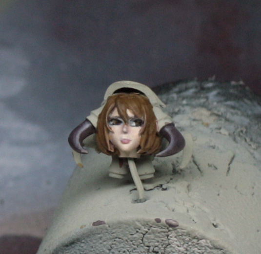
This is basically the end of the face. The shot with the hair blocked in still looks a little rough, but that is because I wanted to get the head fixed to the model before I did any tweaking.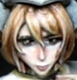

I didn’t really do any progress shots for the hair, partly because the area is so small and partly because I find that painting hair can tend to be rather organic in method, although technique is pretty much always the same.
First of all I blocked in the hair with Battledress Green mixed with a hint of tanned flesh. The paint here was a touch thicker (about 50% paint and 50% water). The important thing here is just to be careful around the edges!
Let that dry and then glaze all of the hair with two thin coats of agrax earthshade to fill the grooves in the hair mostly, but also to reinforce the shading near the edges next to the skin.
As a final shade I used some GW nuln oil and just pushed that into the lowest folds and underside of the hair where it was textured.
Next, using the original paint mix, I re-established the raised areas of the hair, concentrating on the top half of the hair, and using the flat of the brush mostly. I only used the tip of the brush for the parts of the bobbed hair that flicked out under the chin, or were partly hidden under the visor.
The first highlight was a 50/50 mix of the base colour and P3 Rucksack tan. This was applied up to the area I call the “halo” on the head, which I’ll quickly explain…
The best thing to do right now is look at a photo of some models with nice shiny hair like in a L’Oreal advert…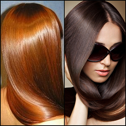
The area that I call the halo is the shiny bit that you see around the curve of the head. As you can see, the lightest part is there and not the top of the head, where you might expect; then the parting of the hair is dark, as is any area under the chin that isn’t facing forward; any bits that flick out are highlighted in a similar way to the halo.
Applying this to the miniature, the highlight line of the halo is halfway down the fringe, so I painted – again using the flat of the brush – from dark to light in a couple of decreasing layers.
Next highlight was more of the same with pure rucksack tan in a smaller couple of layers. Third highlight was 50/50 rucksack tan and deck tan in a smaller area still, then a final small highlight – almost a point – of pure deck tan.
Any tidying up was done after this and the final thing done was a thin glaze of GW gryphonne sepia. This just gave the hair a more yellow caste to knock back the highlights a touch, and to bring it all together.
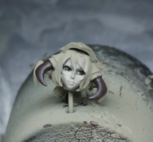
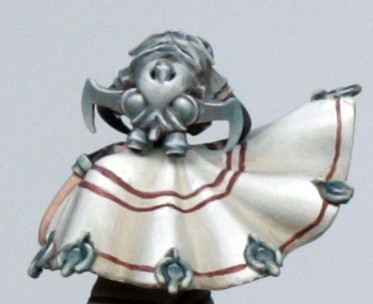
And that is the hair and face. No doubt throughout this part you keep seeing the horns on the helmet and you are thinking “what the hell did he do there, and why hasn’t he explained?”! Well, this was simply the dark red/brown from earlier, shaded with a couple of coats of Nuln Oil, and highlighted with deck tan, using the flat of the brush to get the combination of the edge highlight and increasing sized highlight at the point of the horns.
Painting – Non-Metalic Metals
Non-metallic metal painting is a technique that makes some people nervous, but it really shouldn’t.
There are reasons why “true” metals can be more advantageous to paint with, most specifically if you want a quick finish on tabletop pieces and also on larger models where any change in lighting can dramatically alter the effects of the model. However, at less than 54mm scale I think that non-metallic metals (or NMM) can be perfectly acceptable and possibly better at creating a high impact look to the metals, especially if you are not just doing silver/steel or gold finish.
What NMM always needs though is high contrast from dark to light, an appreciation of the “gloss” of the metal involved – i.e. it it a dull or polished metal – and some impression of where light is falling upon the model.
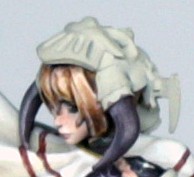
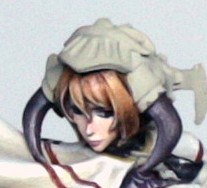
The way that the concept art has been coloured looks like she has a metal helmet/mask which isn’t glossy, so I’ve decided to treat that a bit like brushed steel, without too much high reflection allowing me to concentrate on the complicated surfaces, and to get some interesting colour in to avoid the metal looking too flat and grey. There are tassels on the cloak which got the same colour treatment, along with some little metal toecaps to her boots and her bracelet to her left arm.
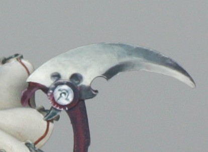
Her right arm has a more glossy red metal effect, and this colouring is carried into the weapon stem, but less shiny looking. Instead we have linear designs and icons along the length of the handle.
Finally, the weapon blade is very “white” – what we can see of it – so I’m going to assume that this is a high reflection blade.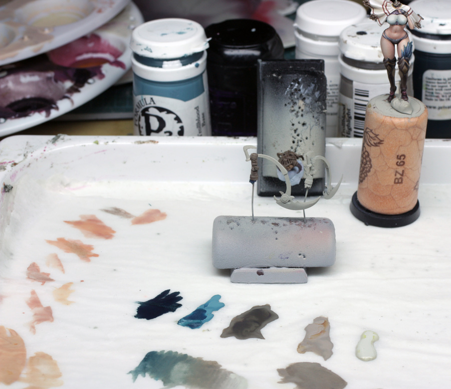
The colours for the helmet, tassels, bracelet, toecaps and weapon blade were the same, but just applied in a slightly different manner in each case.
Those colours were as follows – P3 Coal Black, P3 Trollblood Base, P3 Trollblood Highlight, P3 Bastion Grey and VMC Silvergrey. Other than this I used some Agrax Earthshade wash, Nuln Oil wash and some white for final highlights. You can see the transition that I quickly blended out on my wet palette before I started. If I were a watercolour painter I would perhaps look at these colours to paint a stormy sky, which is sort of what can be seen in the background of Lokman’s concept art.
We’ll start with the helmet…
The first thing that I did was paint the whole of the helmet with Bastion grey that contained a hint of Coal black. This was a fairly rough couple of coats, done using reasonably thin paint, concentrating on making sure that I was extremely tidy where the helmet was in contact with the hair and skin, because I really don’t feel like repainting my faces! I didn’t add glaze medium as I wanted a bit more control, and because I was using mostly P3 paints they tend to hold together OK on the wet palette.
Why switch to a wet palette at this point? Partly I didn’t want to clean my well palettes out, partly because I knew that I was using slightly smaller quantities of paint, and partly because I can mix on the fly that much more easily when using a wet palette.
Once the rough coat had dried I applied a couple of washes of agrax earthshade all over the area, let that dry and applied some nuln oil into the deepest recesses, including the eye slits and mouth grille.
This gave a nice slightly varied ruddy brown look to the metal which was a good base to work up from.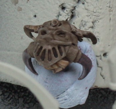
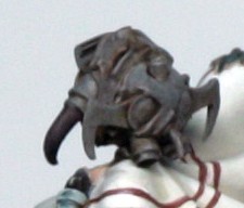
First paint coat was to use the Bastion/Coal black mix again to just tidy any blobs of wash, and establish where the highlights would go. After this I switched to a mix of the Bastion grey with some Trollblood base (a good and fairly desaturated pale turquoise blue). I applied a couple of thin coats of this, concentrating on establishing the highlights and creating the transition from the brown of the base colour (which is now effectively the shade) and the blue of the metal mid-tone.
The next mix was the trollblood base and some trollblood highlight. Never at any stage with this NMM would I use the coal black or trollblood base on their own as they would be too strong a colour, and I want to keep the “stormy sky” palette going. I will be using the more high contrast look later on…
So a couple of smaller thin coats of this new mix were applied, being careful now to fully establish the highlights while not getting paint into the shaded recesses so that the effect builds up nicely.
I felt that the helmet was looking a bit too blue after this, so I did a careful glaze coat of trollblood highlight with a dot of glaze medium, to smooth the transitions up to this point and knock back the blue a touch too where I felt it needed it – not everywhere, as you can see.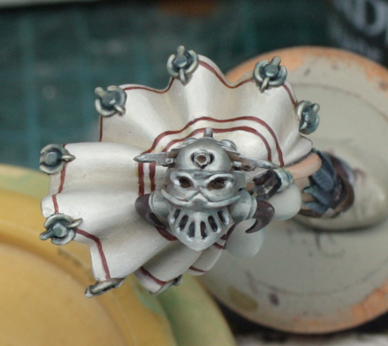
Moving into the real highlights now, I mixed some silvergrey and trollblood highlight and started to place the finer highlights and light spots. Also I established the edge highlights to the cylinders around the helmet and along the blades either side. These were done using the side of the brush again, and because I was using quite wet paint I allowed it to spread a little on to the top surfaces so that I could add the finest highlights to this later.
The penultimate highlights were done using a couple of passes of thinned silvergrey. It was important to keep this reasonably thin and build it up as it avoids that harsh “lumpy” edge highlighting that is often seen in mini painting.
At this stage I took a good look at the helmet and figured out where I needed to tone back the colours, or increase colour, and of course tidy up any rough bits where I got highlights where shades should be!
I quickly painted the tassels before I glued the head in place, using the same colours and processes. I tried to make the circles in the middle of the tassels a bit gem like, but they are tiny, so I didn’t spend too long mucking around with them, just get the overall colour right, with the shades and highlights in the right places!
With that done I glued the head into place and, once dry, I did the bits of toning and sharpening of shades. Once happy with that I took my brush with the finest tip (a size 1 out of interest rather than a more likely size 0 or smaller even) and touched in the final highlights in white, which are the top edges everywhere, some bottom edges, and the appropriate edges of the mouth grille. The very, very final thing that I did was use a tiny glaze of the white towards the very front of the mouth grille part that is acting as like a visor above her face. This was done purely to create a touch of additional focus on the face. You might also notice that the highlights on the parts holding the helmet horns pretty much line up with the halo line of the hair. This is not an accident – Because she has such heavy eye makeup, I didn’t want the eyes to get lost on the model, so the highlighted skin under the eyes coupled with this line of halo and metal highlight create interest. The final bit to the visor is the cherry on the top in terms of focus! ☺
The bracelet was treated in the same way as the cylindrical parts of the helmet, working up to a fine white linear highlight at the top. The toecaps were done in the same way as the tassels because they were so tiny.
The blade of the weapon was actually done after the arm and rest of the weapon, but I’ll explain it now purely because I used the same colours…
I decided to make the blade more shiny looking, but I didn’t want it to look too much like classic metal, while maintaining the “stormy sky” colours.
First of all I painted the blade completely in a 50/50 mix of Bastion Grey and Trollblood highlight. While waiting for this to dry I decided to break up the blade into a smaller underside edge and larger top section – like some kind of bird’s beak – as there is some definition in the sculpt to do so, and then paint in a light to dark transition on top, with the opposite underneath. Then I would reverse this procedure to the back face of the blade.
This is a slight break from the look of the concept art, but the position of the sculpt meant that the blade was tilted at a slight angle. Now I apply a principle with much of my shiny NMM that the darkest part of the metal is closest to the light and vice versa, and then the edges get fine highlights and flare spots can be added if appropriate. It is kind of counter-intuitive, and in theory conflicts with what I did with the helmet, but this is where I am differentiating between shiny and satin metals.
Anyway, back to the paint…
The base colour is now dry, so I painted in the first shade of 75/25 Bastion to TB highlight. This was thin and covered the whole of the area that I was shading, working from the mid-tone into the shade in decreasing strokes until I had established a shade position. The paint here needs to be really thin, so I did use a dot of glaze medium to help avoid puddle stains. Also, the brush needed to be almost dry when applying, as too much paint will stain the area and require more repairing later.
Next colour was solely Bastion grey glazed on in a decreasing area in 3 or 4 passes, allowing it to dry well between passes as this colour darkens as it dries.
I applied a couple of glazes of 50/50 TB highlight and TB base as a toning colour at this point, but I wanted to use this to emphasize the highest part of the shade, rather than the deepest part, as if it is reflecting a bit of the sky.
Next shade was 75/25 Bastion to Coal Black, working into the deeper shade, then 50/50, 25/75 and “finally” pure coal black right into the shade.
This wasn’t actually the final shade as I added a little extra shading using the VGC dark flesh used earlier on in the skin. I first took a really really thin glaze (basically a dot of paint onto a really wet brush quickly swished on the palette and then blotted before applying to the model) of the dark flesh on its own and painted 2 or 3 layers over the whole of the shade area, starting just inside the mid-tone area and into the shades. Allowing it to dry thoroughly between strokes meant I could tell when there was just “enough” staining of the area.
After this I took a glaze of 50/50 dark flesh and coal black and applied this into the deepest shades. This gives a deep, rich black due to the interaction with the teal colour beneath. If I had used black it would have gone completely flat an undone the work done in the blending.
Highlighting was slightly simpler. First a broad glaze of 75/25 TB highlight/Bastion grey, again from the middle and now away from the shade. Care needed to be taken to avoid getting the highlight onto the shaded areas below and above, so the brush was blotted well in between strokes and pooling on the model was definitely avoided. I also tend to use the flat of the brush to drag the paint diagonally, causing the paint to gather against the midline of the blade, extending the finer part of the highlight, but pushing the majority of the highlight paint towards the tip of the blade.
Using this same technique, but in ever decreasing strokes I next highlighted in pure TB highlight, 75/25 TB highlight/Silvergrey, followed by 50/50 and 75/25 ratios and then a (not quite) final highlight of pure Silvergrey.
The final highlight on the edges was done in pure white. I also applied this along part of the midline towards the end of the blade and like the helmet I added a little glaze of white right at the tip and right at the inner curve detail where I had painted the handle in very darkly (for added contrast impact).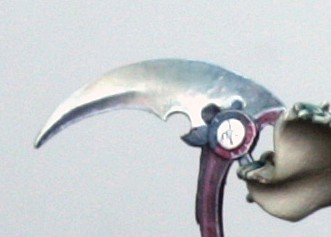
I unfortunately didn’t take many in between photos for this stage. This is largely due to the fact that the area is quite small, and because the colour changes in the red can be problematic to show.
The colours used for this area were: VMC Silvergrey, P3 Frostbite, GW Red Gore, GW Scab Red, P3 Coal Black and GW Nuln Oil.
First of all I painted the arm and handle with a mix of Scab red, Red Gore and a touch of Coal Black. This gave a deep, darkish red colour that I could reasonably easily work up and down from. A couple of thin coats went on nicely. I then glazed in a mix of coal black and Nuln Oil to the recesses and joins, just to pick out the details.
Looking at the concept art again, the metallic highlights are not so defined, but on the model it will need to be a bit sharper. The detail of the armour here is slightly different to the concept art (only so much space on a model!), so I’ve taken a hint of artistic license in the position of the reflections and shading.
First part of the highlighting was to place the reflections using Frostbite with a hint of Red Gore. I actually made this much larger than the final look, as I wanted the brighter red to blend up to the final highlights by glazing later. Red can be notoriously difficult to highlight, particularly if you want to make it metallic looking. What I have found is the best thing is to NOT to try and mix in the highlights too much, because you will get problems with pinks and oranges that you don’t necessarily want. Really what you DO want is a “brighter” version of the red and some specular highlights.
What was important though was that I had a sharp edge to the right hand side of the highlights. This was important because I was going to place the darkest shades up against that light edge to create the contrast needed to look shiny metallic.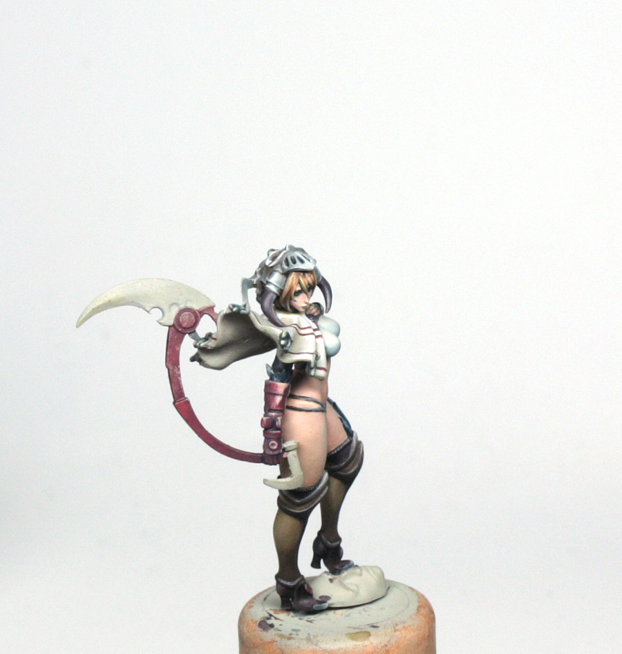
With that highlight placed, I glazed away from the sharp edge to the left using first pure, very dilute red gore, then scab red, then the initial base mix until I had a smooth blend.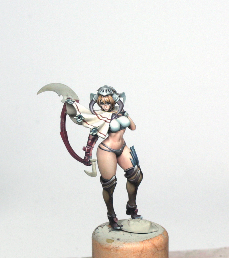
For the handle, I didn’t place the highlights, instead I used a 50/50 mix of Frostbite and Scab Red (it makes a less pink mix than the red gore) and very carefully painted in the lines on the top half of the handle and around the circular bit at the top that look like measurement marks. Once these were in place I glazed the whole area with pure scab red to dull it down and sort of merge the design into the surface.
The rest of the handle was highlighted using glazes of scab red and then red gore, with edge highlights of the 50/50 mix and then smaller finer edge highlights of pure frostbite.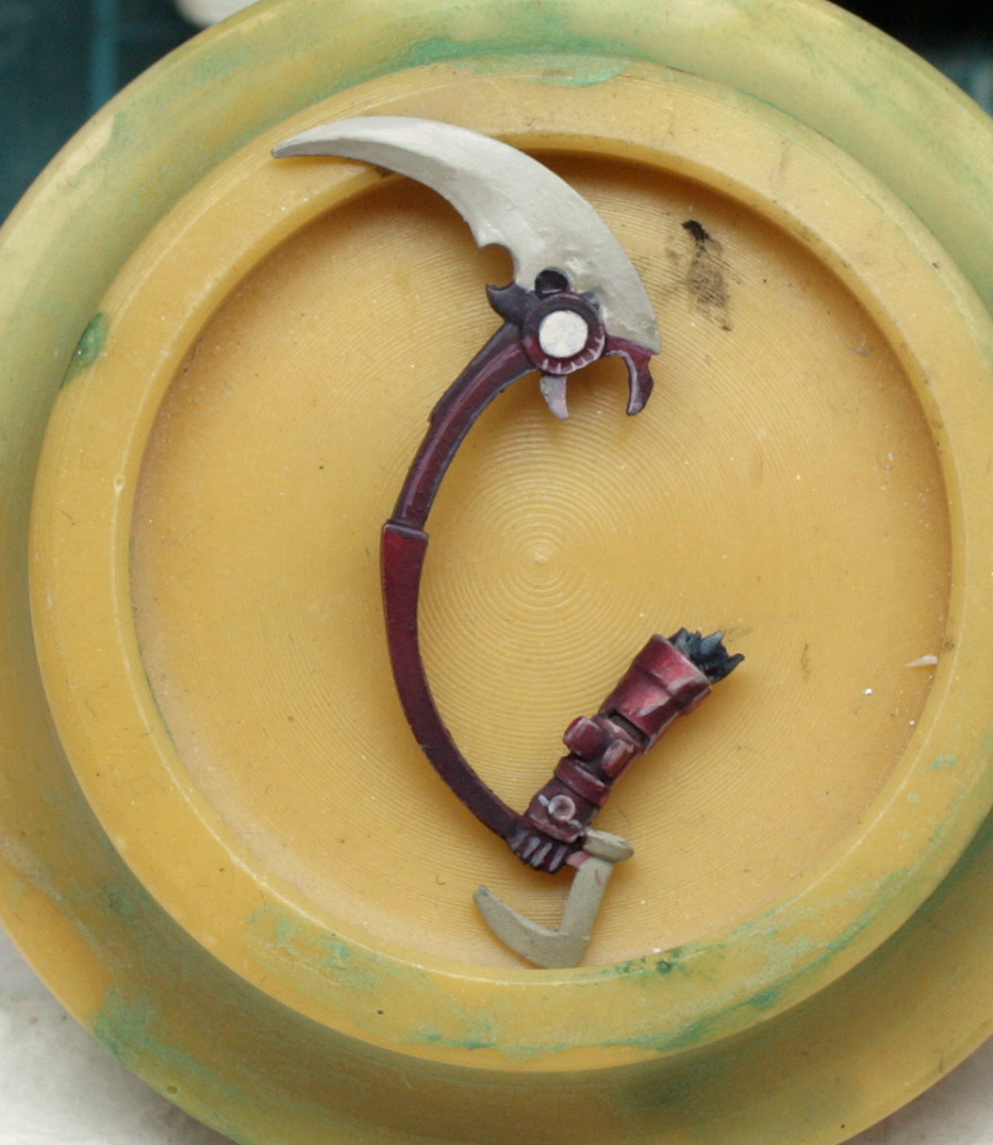
The shading was quite straight forward. First a 50/50 mix of coal black and scab red was glazed into the armour and the handle working from light to dark in decreasing strokes to build up the depth of the shading, next pure coal black glaze and finally a thin glaze of Nuln oil right into the recesses and in a thin line against the side of the reflections on the armour.
The last bit was a really fine line of silvergrey in the reflections and across any top edges that might need just that extra hint of brightness to the highlight.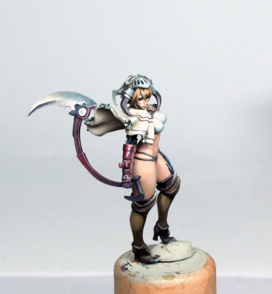
Done.
Painting – Finishing Touches
The Feathers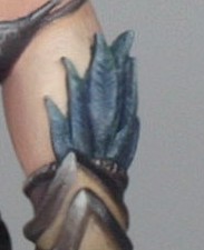
I mentioned earlier that I blocked in the feathers with P3 Coal Black. With all of the painting in the surrounding areas done, I tidied up the coal black and then applied a quick glaze of coal black and a touch of black to the recessed parts of the feathers, and in between.
Once dry, I re-fixed the base colour and allowed that to dry. Highlighting was a simple, but careful, process. First a 50/50 mix of Deck Tan and Coal black was made up and I drew in the stripes, using my fine tipped brush mentioned in the previous freehand article. Then I made up a 75/25 mix of deck tan/coal black but more dilute. Blotted the brush well and made tiny little strokes towards the edges until a highlight became visible. Finally I took some diluted deck tan and did the same, with a concentration on the edges and beside little recesses. I didn’t go any higher than this as it would have made the feathers look too shiny and head into the metallic territory!
The Shoe Hearts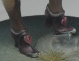
These little hearts are actually quite nicely detailed, so I used the colours from the arm armour. Base of scab red, quick shade of scab red and coal black glaze, final shade of coal black glaze. Quick highlights of scab red and final of scab red mixed with frostbite.
The Little Blade on the Weapon and Gloves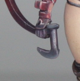
This I quickly painted by mixing coal black and black as the base colour. Highlighting was done by adding tiny, increasing amounts of deck tan up to about a 50/50 mix of base colour and deck tan. I didn’t go any higher with this as I felt that it was more a part of the handle than a separately defined blade. I shaded the area with a mix of black and scab red.
The exact same process was used for the gloves.
This is essentially the end of the painting of the model itself. I had a couple of tidy ups to do around the model, some additional dark lining here and there to define parts a little better – using either nuln oil or coal black, but be careful with the nuln oil as it can make stuff look dirty if you don’t control the flow properly. There are a couple of final additional freehand crosses and designs like the one in the circle part of the weapon.
The Base
Now, I have to admit to two things with the base:
I had an initial idea for colours which didn’t work and I had to start again.
The second version was done almost entirely using an airbrush. This means that some of the colours used in the base are really airbrush “only” paints. I’ll do my best to explain what the colours are so that if you are brushing on normally you can use normal model paints.
OK. Confessional over. Let’s get to what I did do.
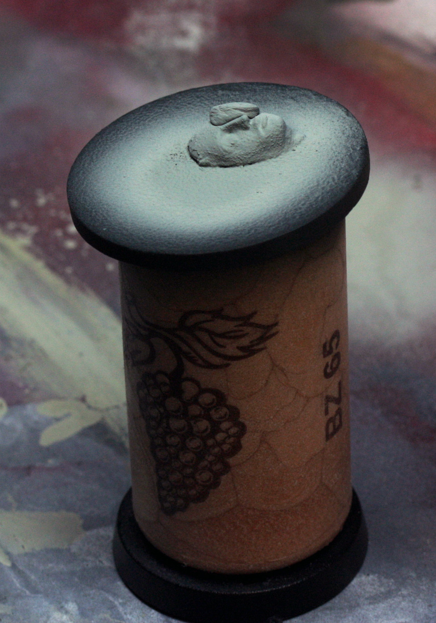
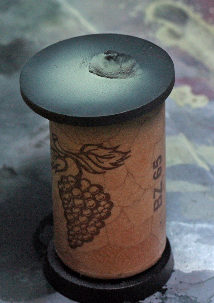
The brief for the base was to use the standard base, insert and the stone face that the Architect comes with. Simples.
So, first of all the stone face was removed from under her foot because there was no way I could mask the whole painted model to paint that area. I glued the stone face in position and covered the point where the foot and face meet with a dot of blue tac, so that the glue will take better later – gluing paint to paint isn’t going to make for strong joints, believe me!
Once glued on, I used some Tamiya concrete paste around the edge of the stone face, to close any gaps between the base and face, and to add a touch more texture to some of the surface.
When the sandy paste dried, I primed the whole thing with black.
Once dry I sprayed the majority of the top with a couple of thin coats of Tamiya Nato Black – a near black with just a hint of blue/grey to it.
Now, to start the highlighting process with such a flat surface I needed to create a point of focus. The solution for me was to infer that a fairly strong light source was falling in front of the model. With an airbrush this process is pretty quick. With a good sized brush this can be done relatively quickly too, and can be an ideal opportunity to try out wet blending.
So, 1st highlight was done using Tamiya Sea Blue (a very dark blue with a hint of teal – try VMC dark sea blue mixed with VMC dark Prussian blue). This was a circle laid down to cover approx ¾ of the area and sprayed directly down onto the base. Subsequent highlights required altering the angle to increase the highlight effect against the stone face.
2nd highlight was more Sea Blue but with a drop of Tamiya Deck Tan (just like VMC Deck tan… lol!), and placed at a slight angle so that the shadow started to form on the face. This needed 2 or 3 light sprays to build up the colour.
3rd highlight was approx ½ sea blue to ½ deck tan in a smaller circle and slightly heavier angle.
4th highlight was approx ¼ sea blue to ¾ deck tan in an even smaller circle with a final small highlight of pure deck tan.

Once this was done, in truth it was much too bright and nowhere near smooth enough (largely because I was pretty new to airbrushing and the Tamiya paints, which had a tendency to brighten up and go extremely matt as they dried. Not a problem though, as this is not really any different to what I would do with a normal brush where I often will tone back colour shifts using glazes.
So, I just worked backwards form the above, but much more dilute – the original colours were approx 50/50 paint to thinner ratio, but the glazes were more like 20/80 paint to thinner, and have to be careful not to load too much at a time and allow the thinner to dry well between passes. In fact, I got bored waiting for the glazes to dry and painted the underside of the outer base for fun!
Once I was happy with the transitions, I had a nice shift, but it was a little bit stark looking, so I took some GW sepia wash and sprayed the whole area lightly which added a bit of warmth to the area.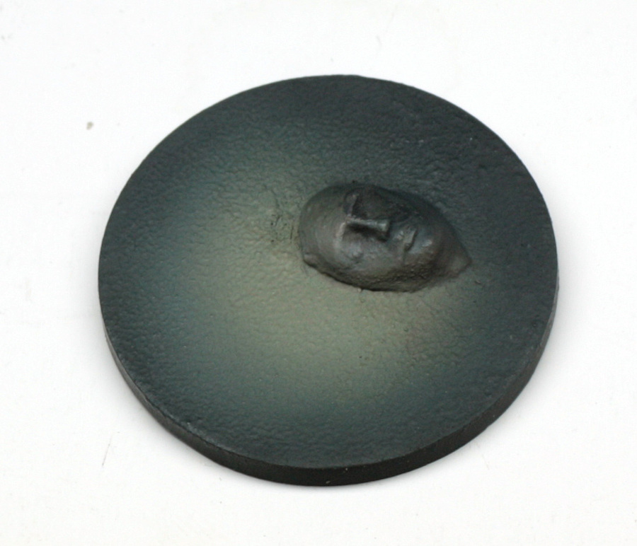
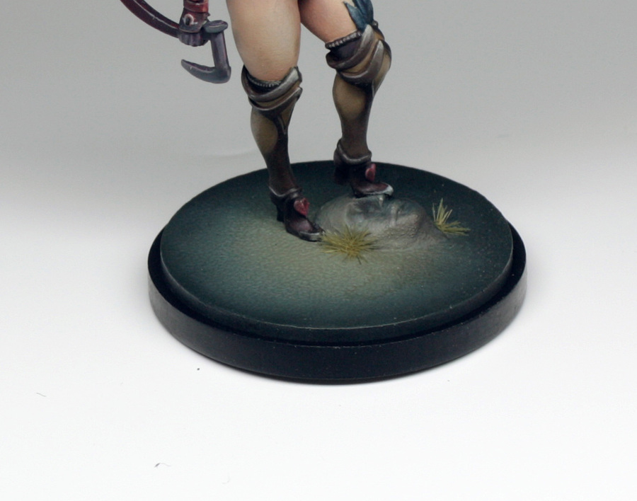
Once dry, I considered the painting completely finished, so it was time for the absolutely final parts, which were to glue the model in place, glue the outer base to the inner base and just add a couple of tiny Silflor tufts around the edges of the stone face.
And that is that! ☺ This has been a really enjoyable model to paint, with plenty of challenges and a decent bit of planning ahead needed, but I have been very pleased with how close I did manage to get the colour scheme to the concept art. If you have stayed with me right through then thank you, and if you have painted her in the same way, I hope that it works out well for you and I would be very pleased to see how you got on.
Cheers all,
Scott ☺
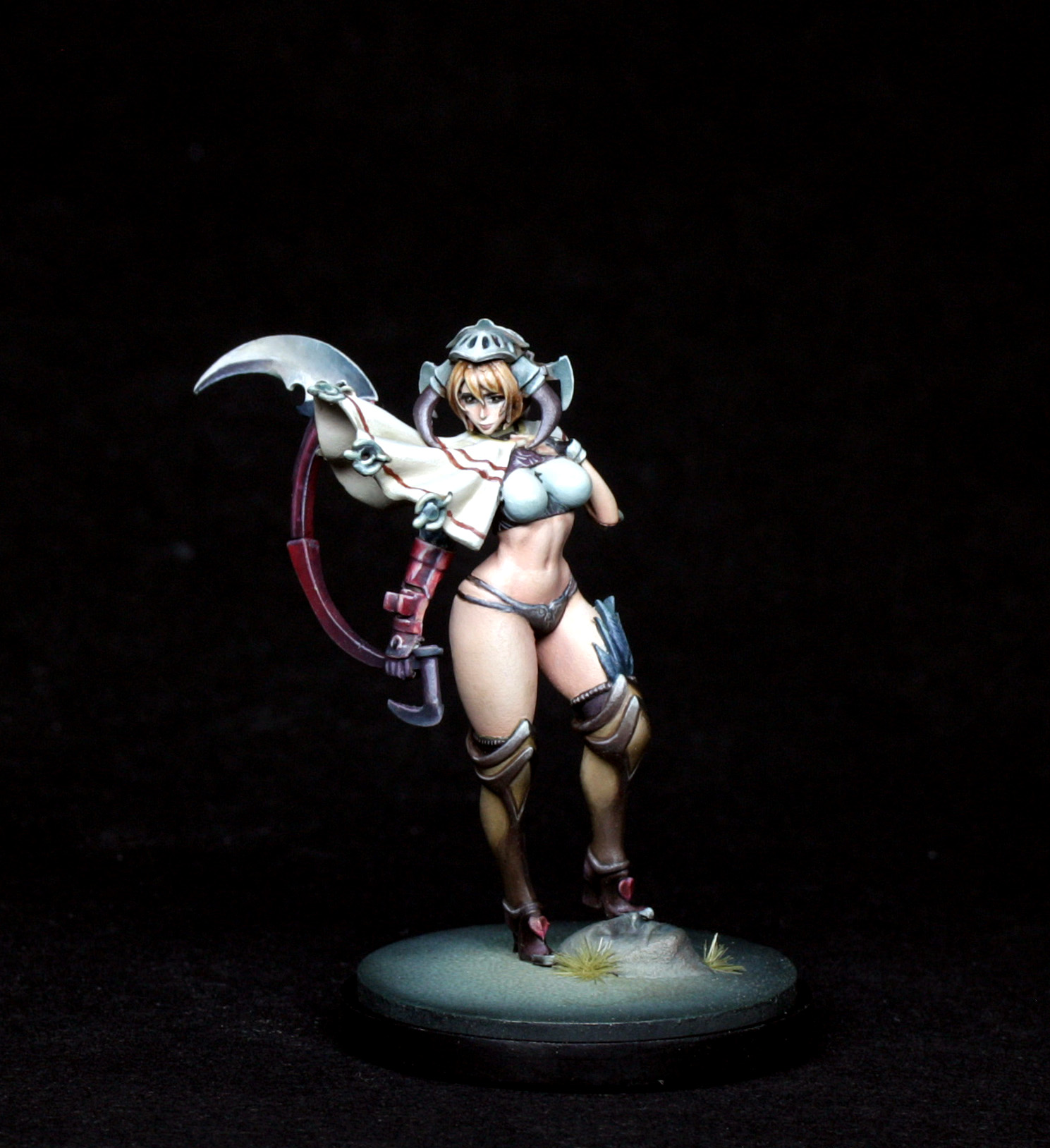
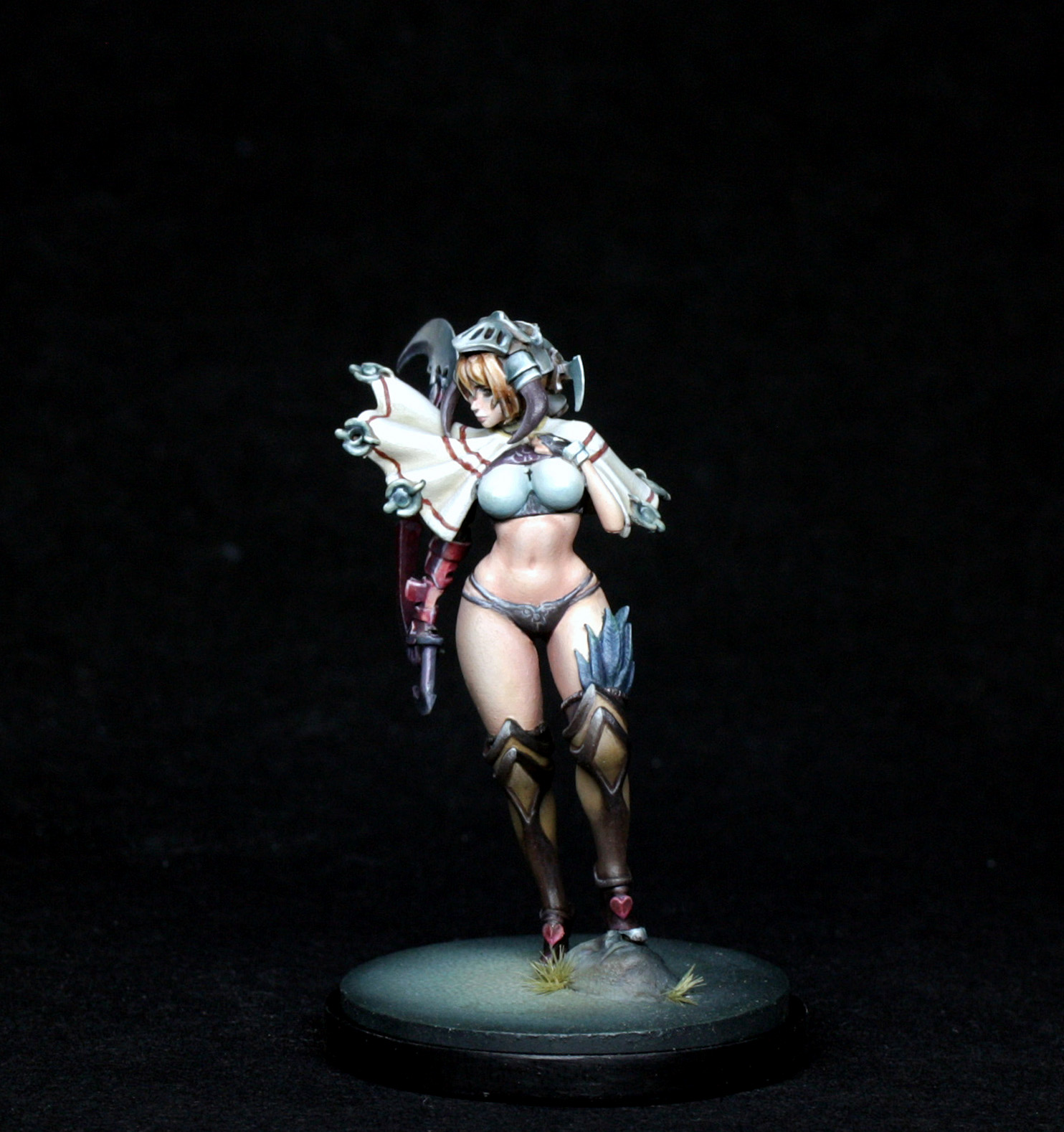
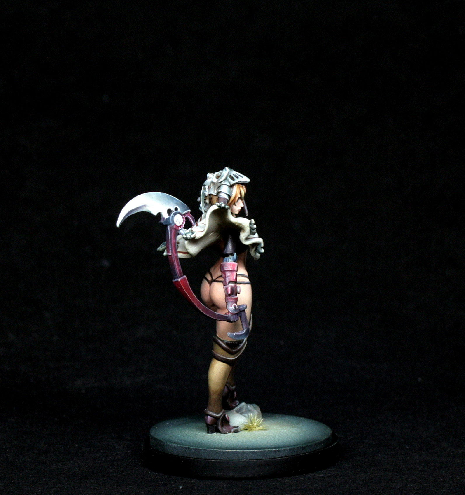
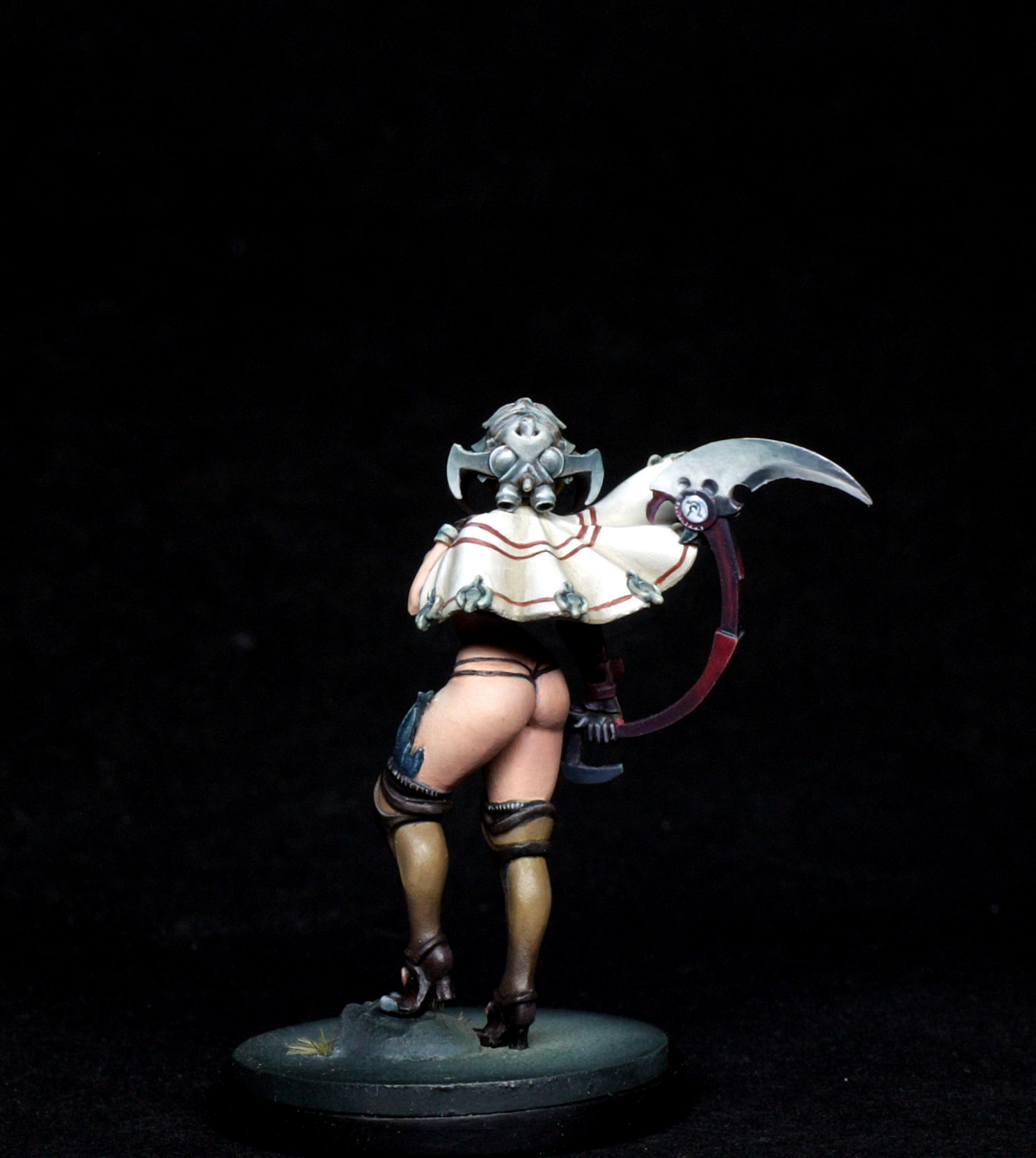
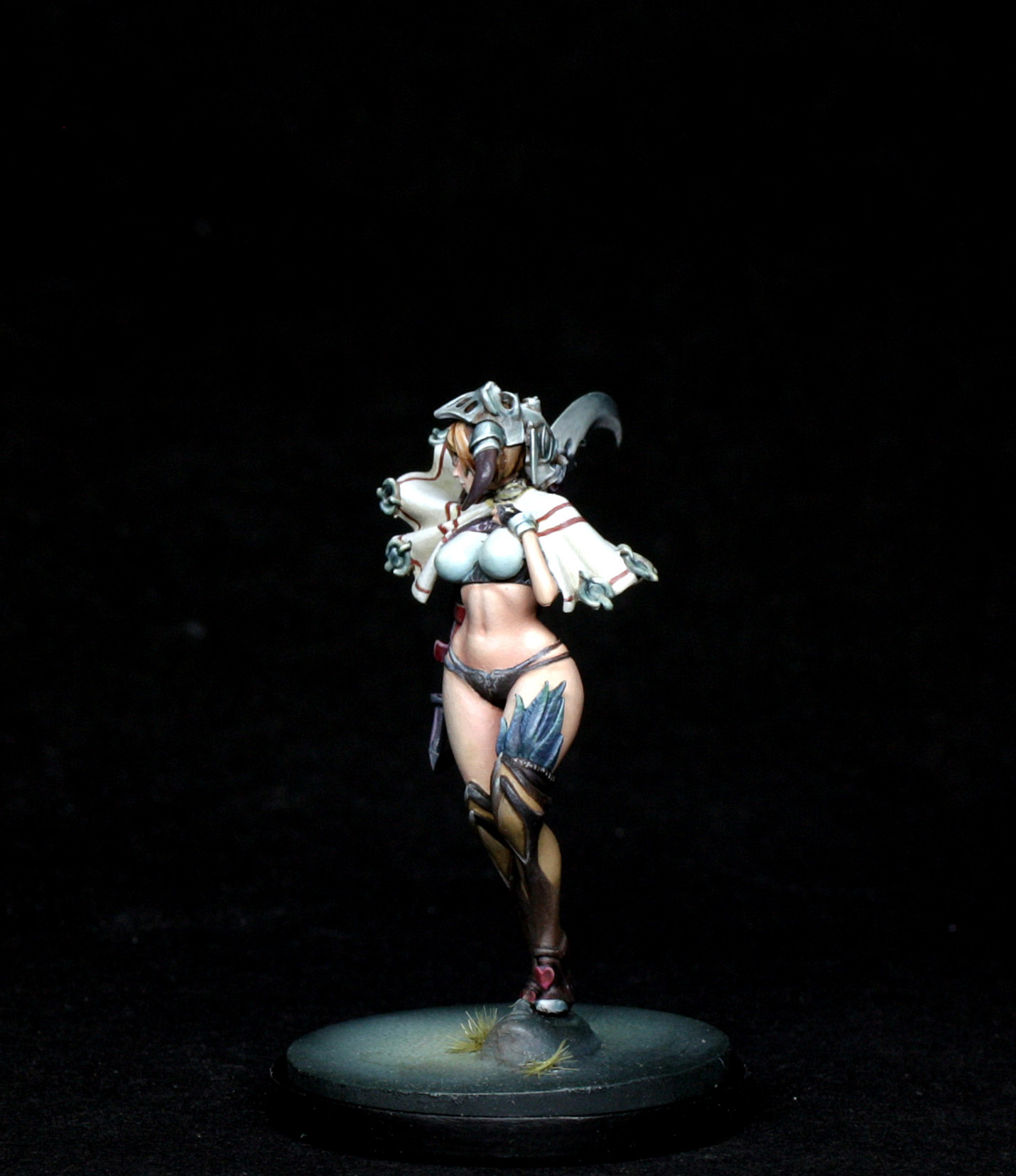
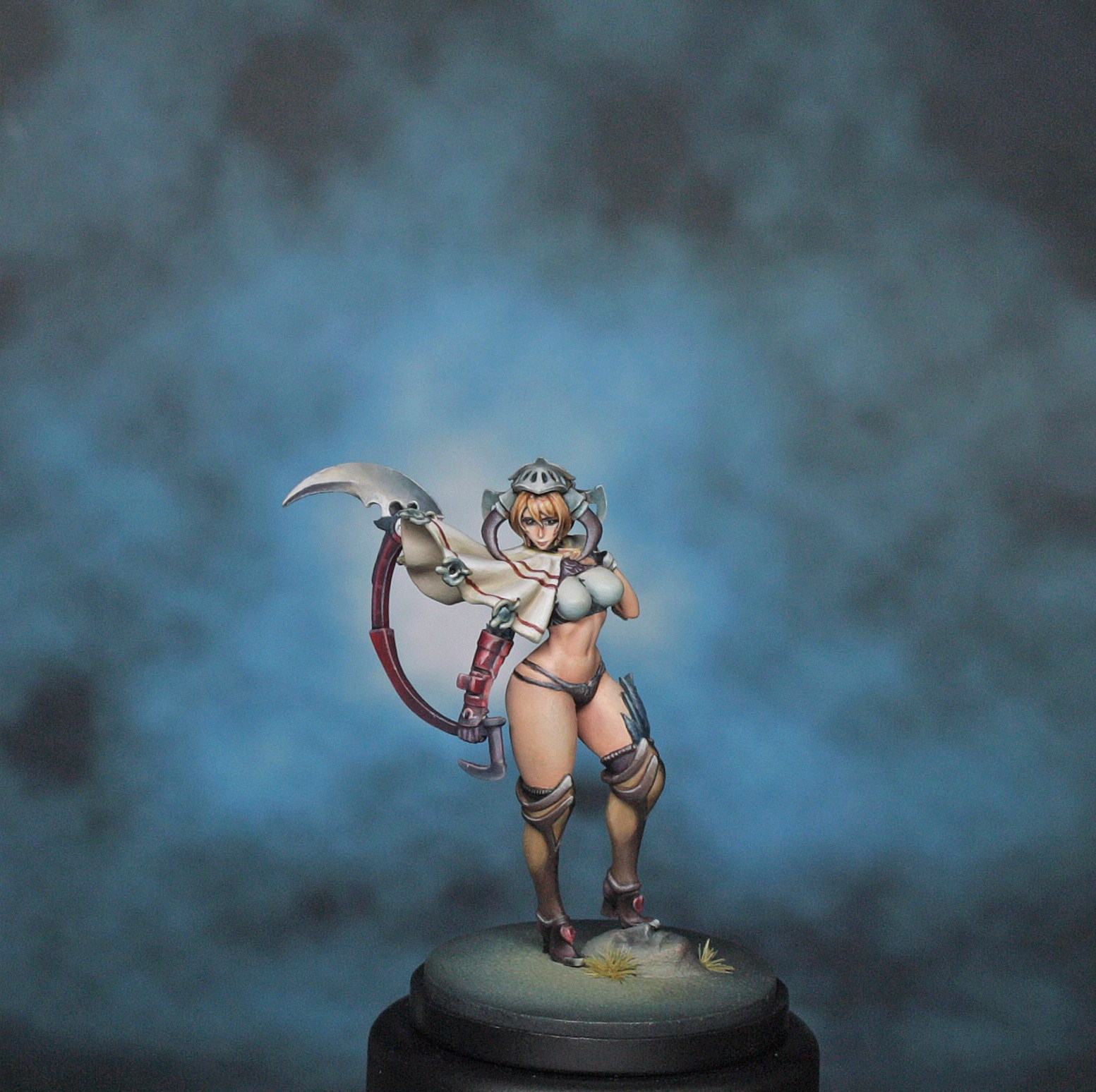
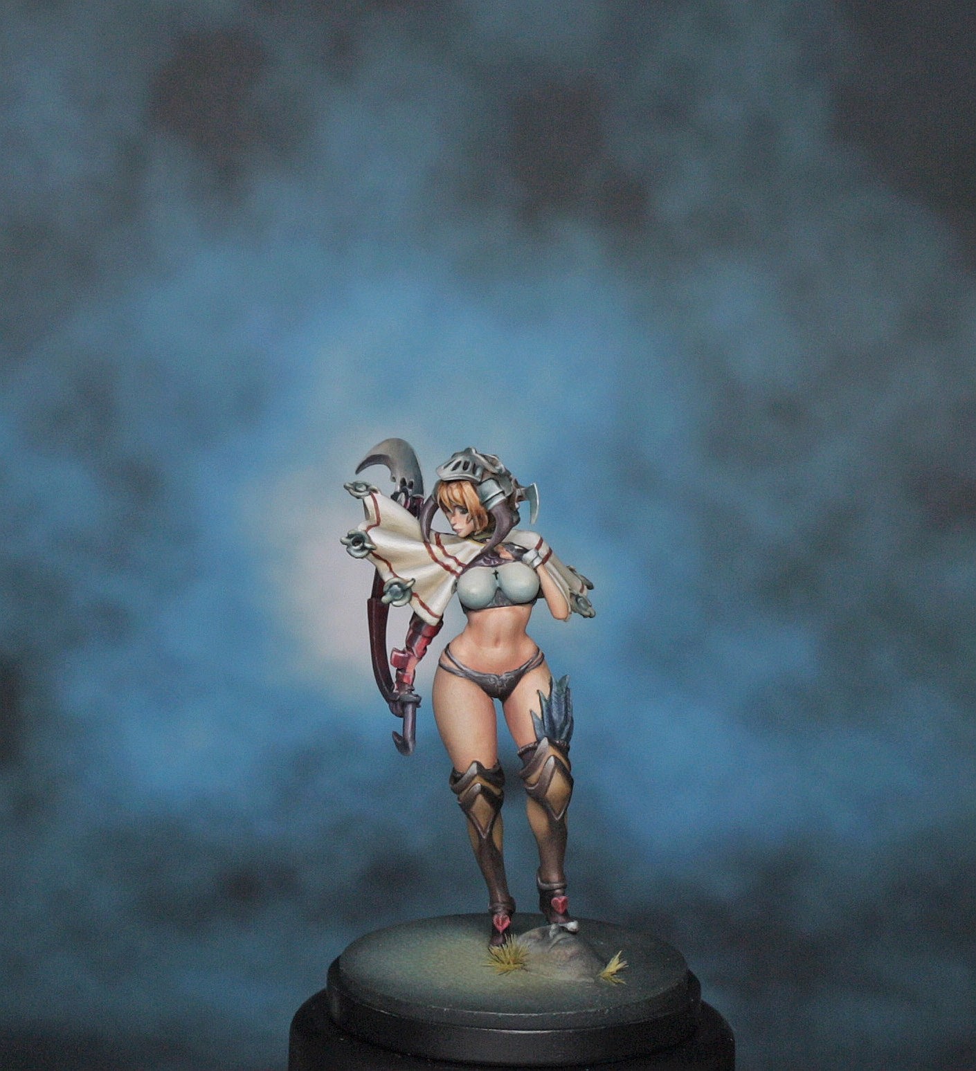
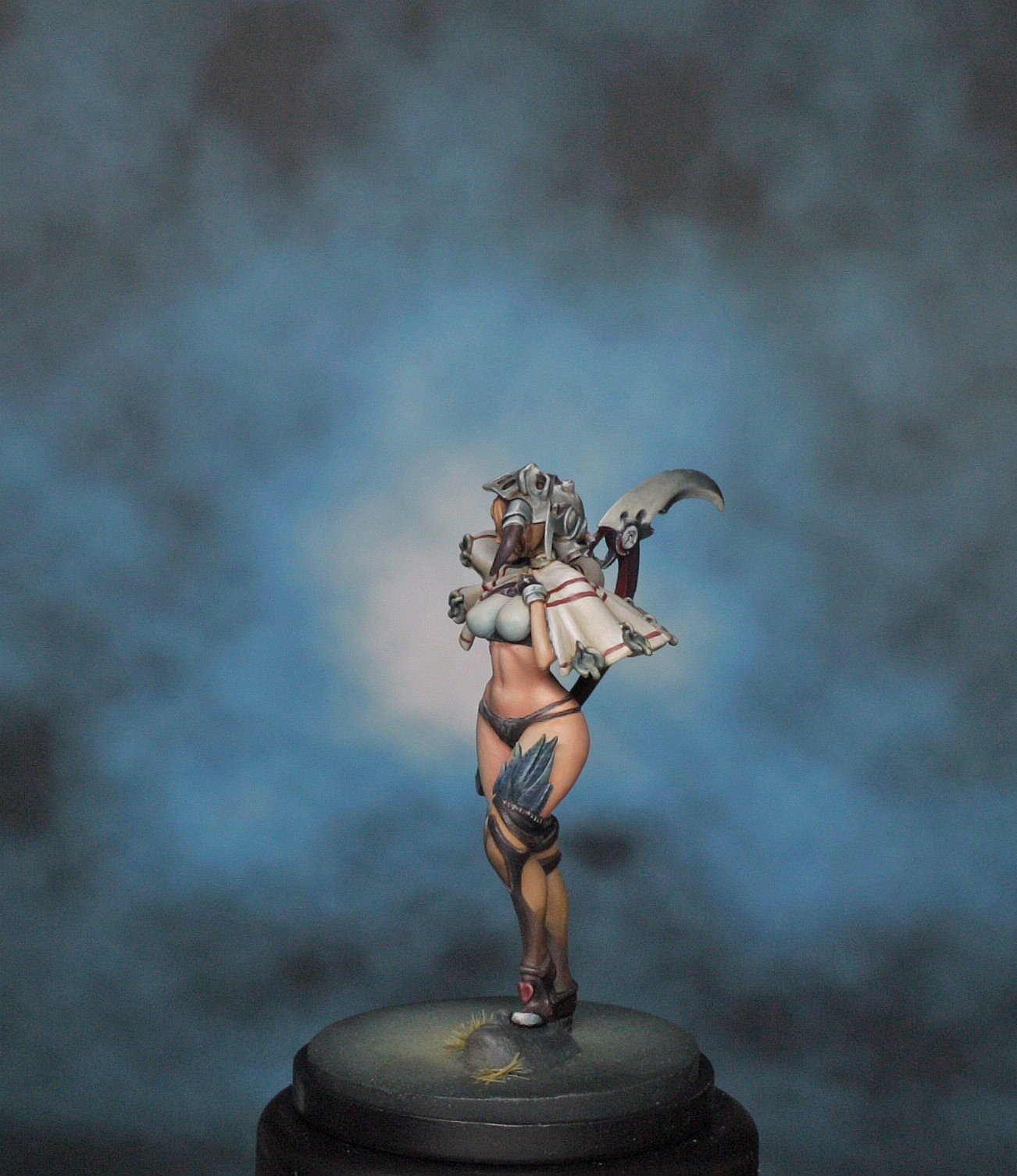
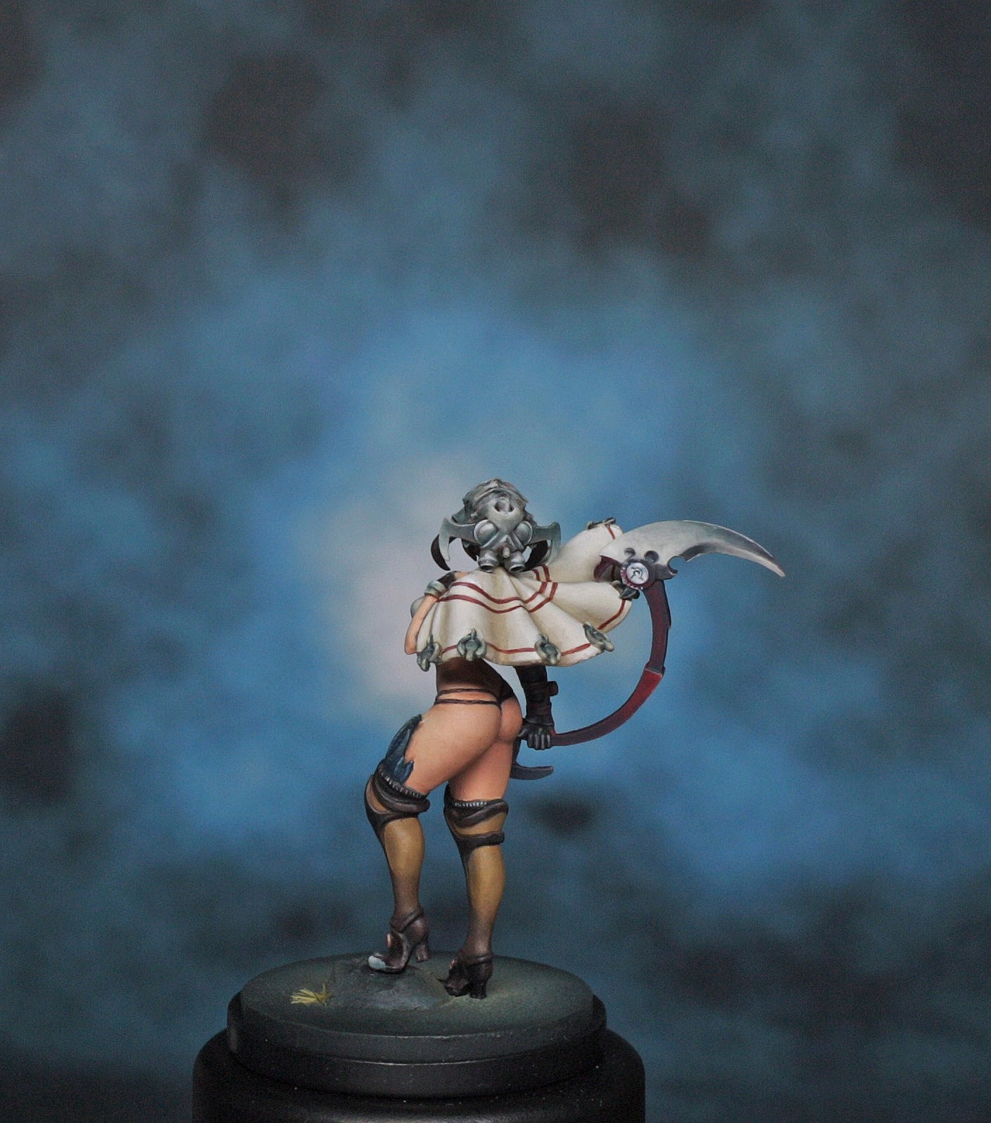
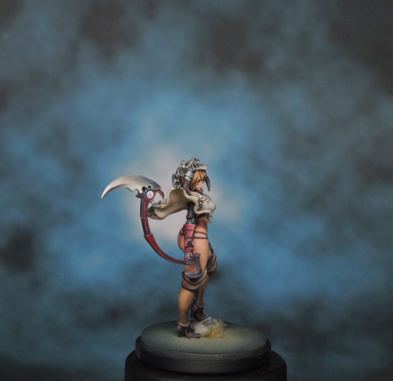
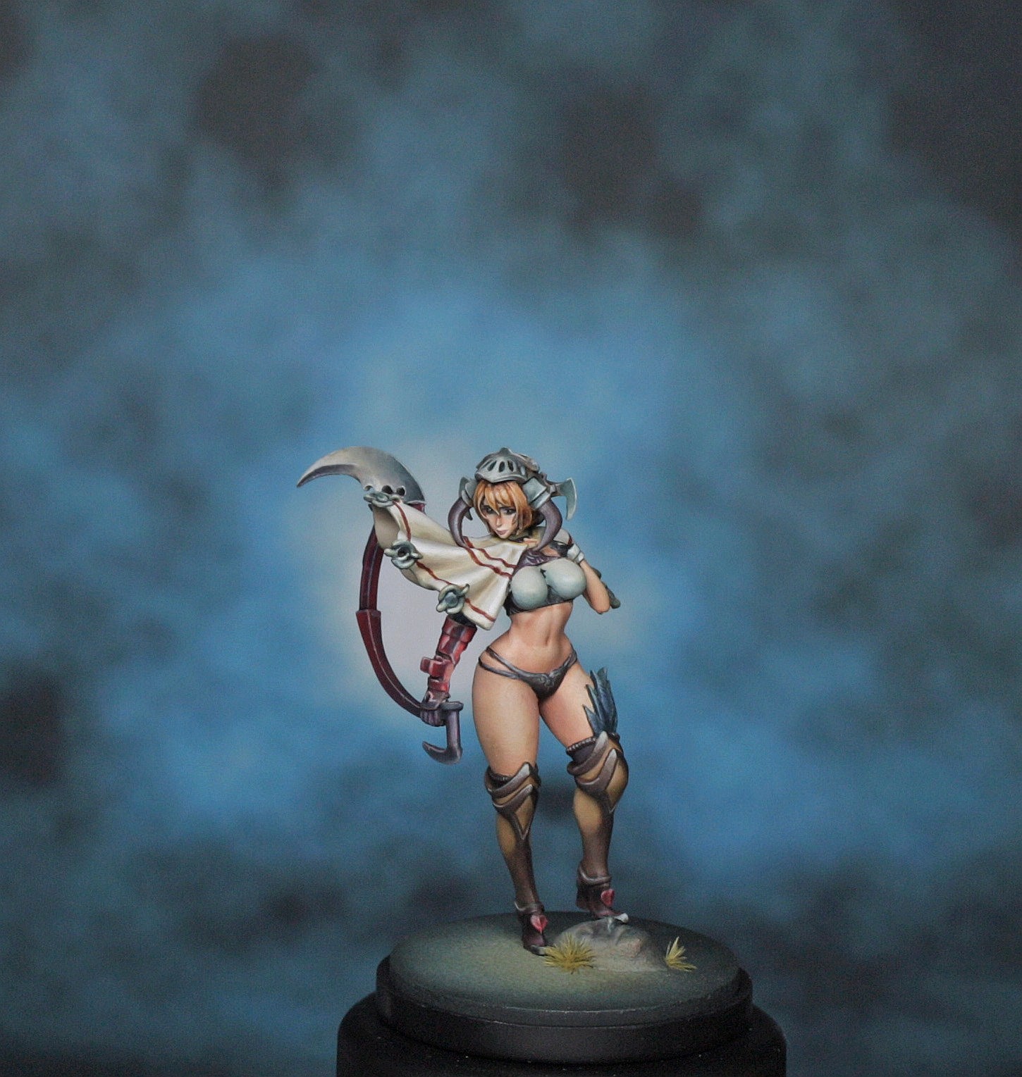
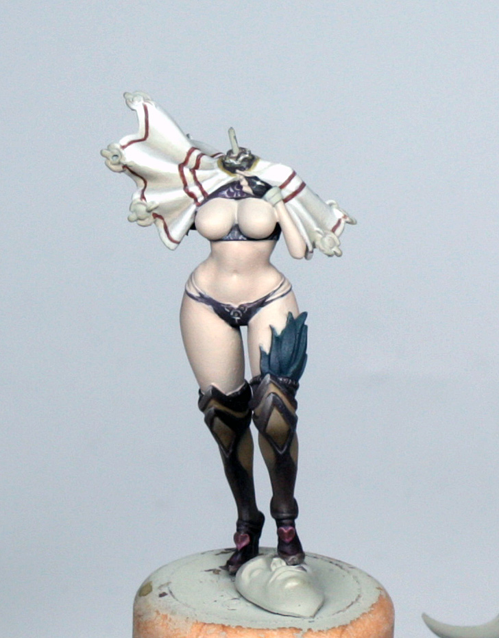
The Finished Model