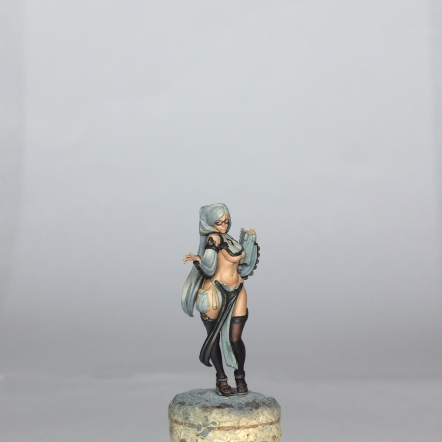
Pinup Preacher Painting Guide
Scott Hockley
Hi all,
This is a third installment of pinup painting guides. The style of this guide will follow that of the Forsaker, and again I would say that if there is any techniques mentioned that you are not sure about , then it would be best to take another look at the full guide for the Architect.
Preparation
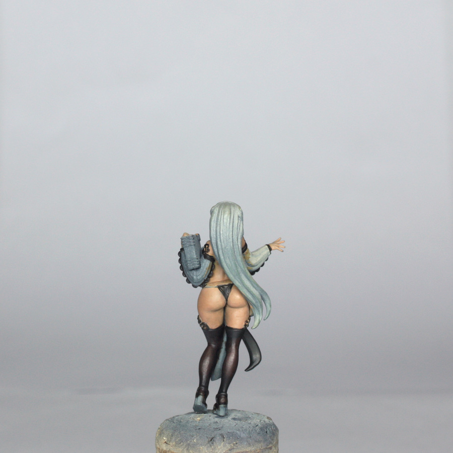
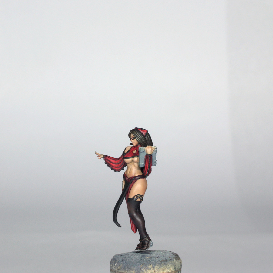
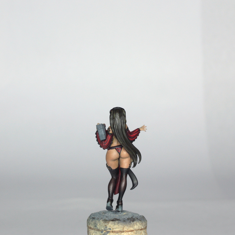
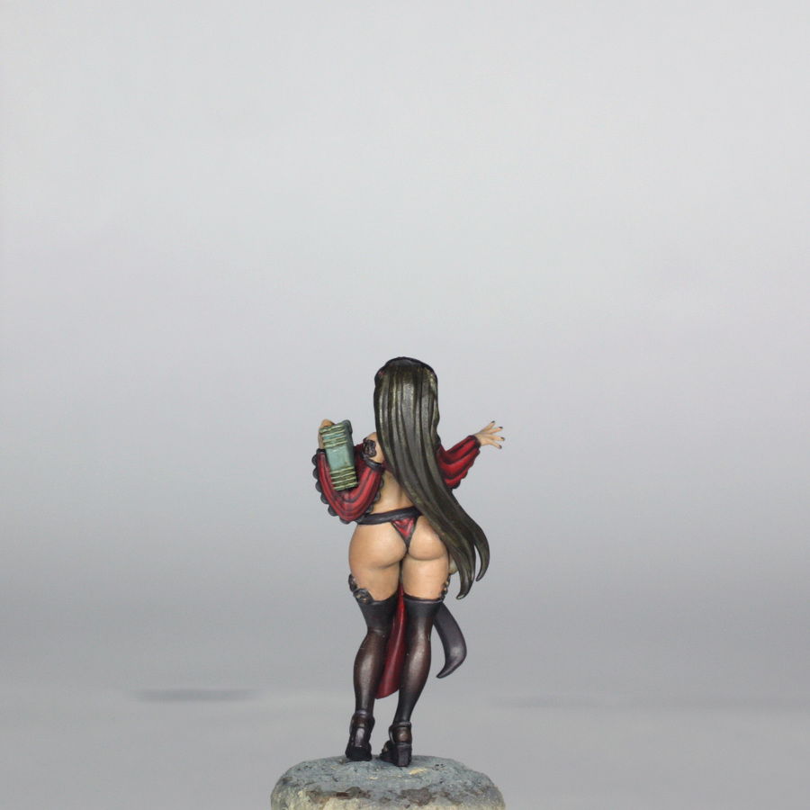
This new plastic model is the Preacher, a simpler sculpt than the Forsaker, with more of an emphasis on smooth area of skin, clothing and hair. I clipped the Preacher sprue off and set the rest aside for later as before. The individual parts of the model were in turn then removed from the sprue and popped into a little box (see previous guide about losing bits!!). Each part was then trimmed with a knife to remove mould lines, and lightly sanded with some fine sandpaper/manicuring board. The right foot was then drilled to accept a 0.5mm pin in order to allow easier fixing to the base later. Again, the rest of the model doesn’t need pinning because I am gluing the majority of it together prior to any painting.
For these models it is best to use plastic glue.
For the assembly of his model, I completely built the model, leaving only the hammer loose to attach later.
I airbrushed on a grey primer (just like the previous models), and then airbrushed a light covering of Tamiya Deck Tan to model as this is a much lighter model than the Forsaker.
Colour Scheme
We are working to the concept art again for the Preacher, and I used the MS Paint hack that I showed in the Forsaker guide to help pick out the colours for this model…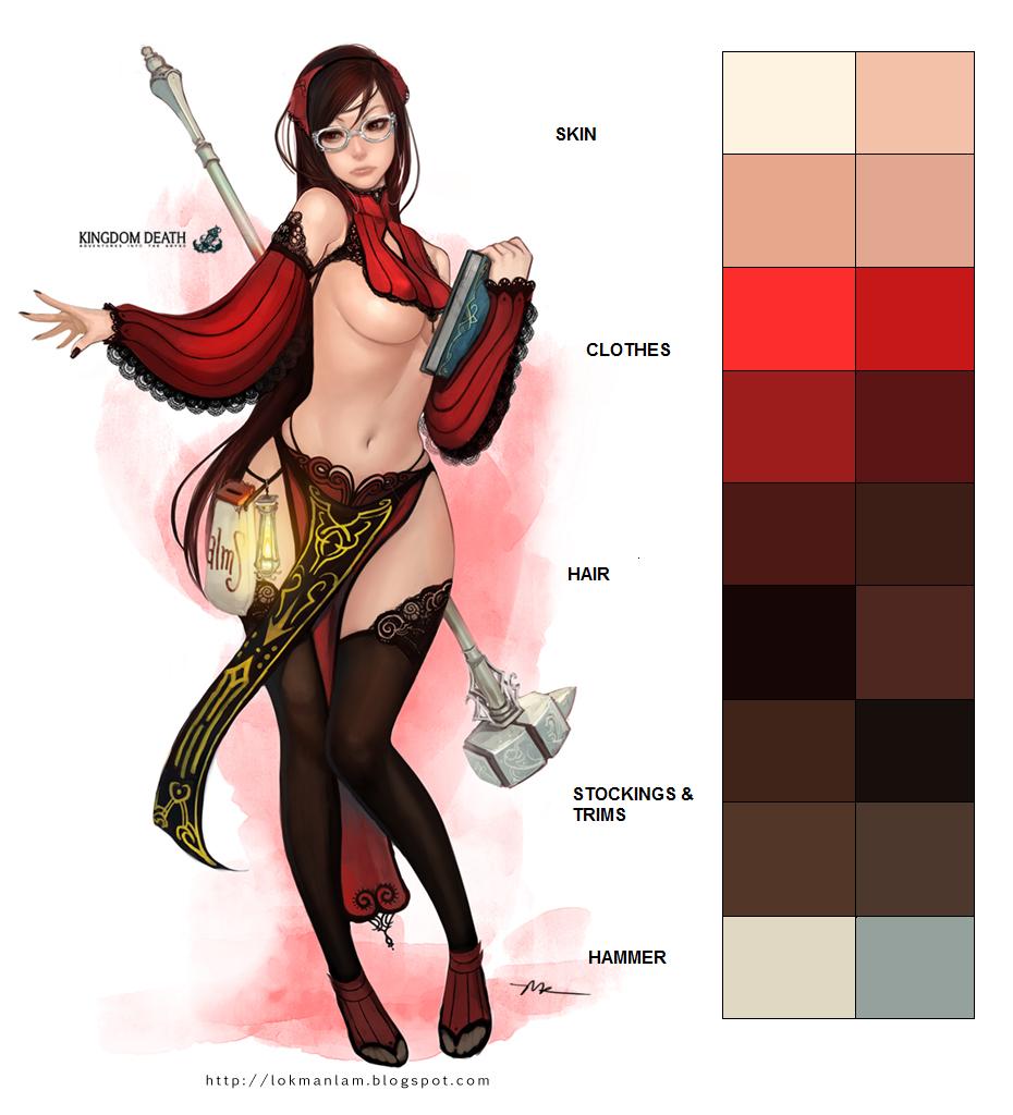
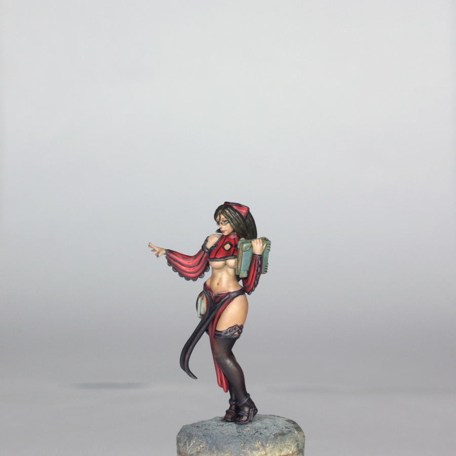
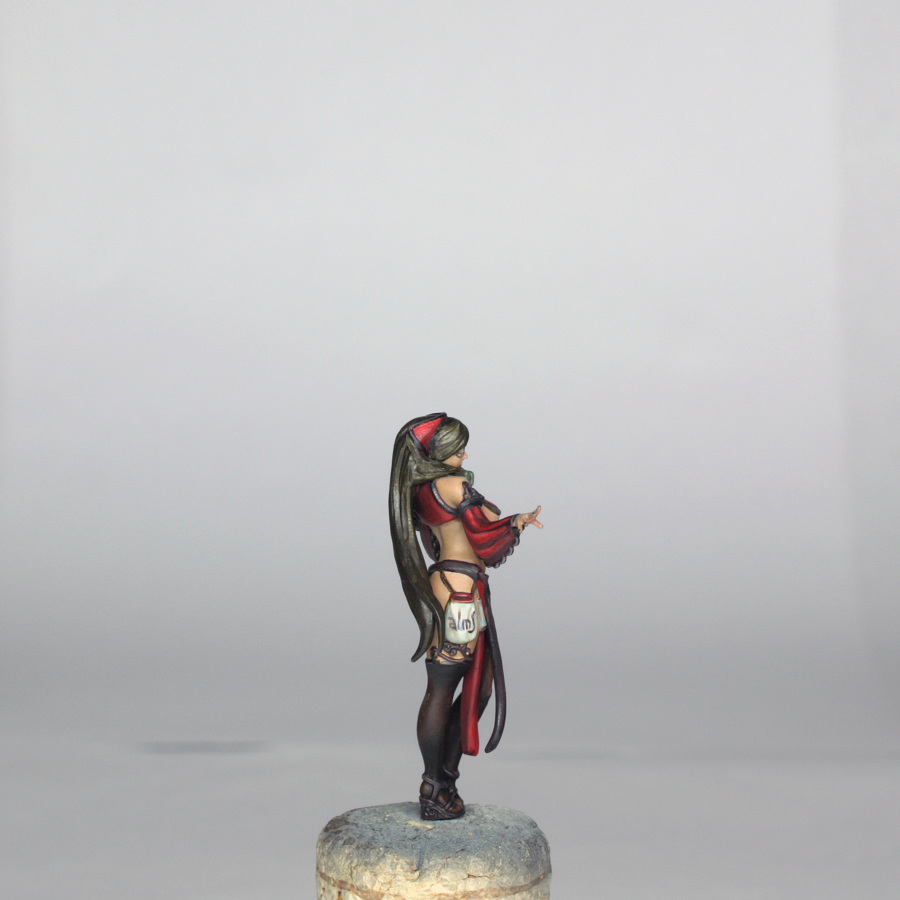
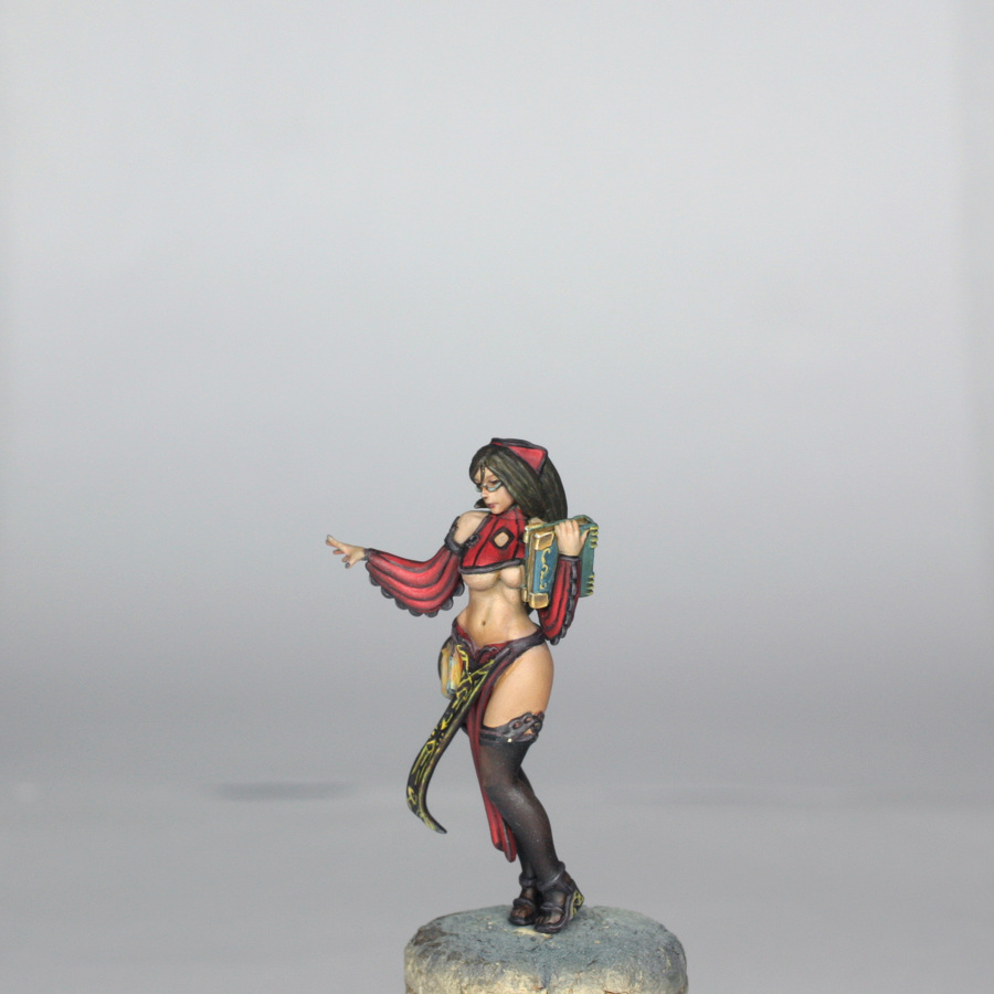
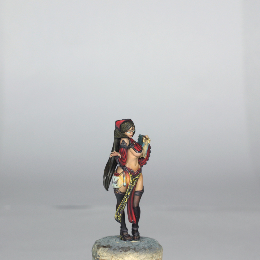
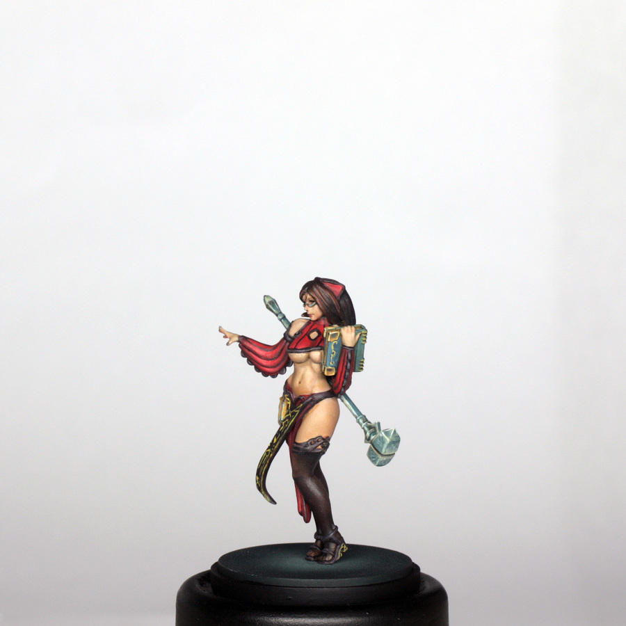
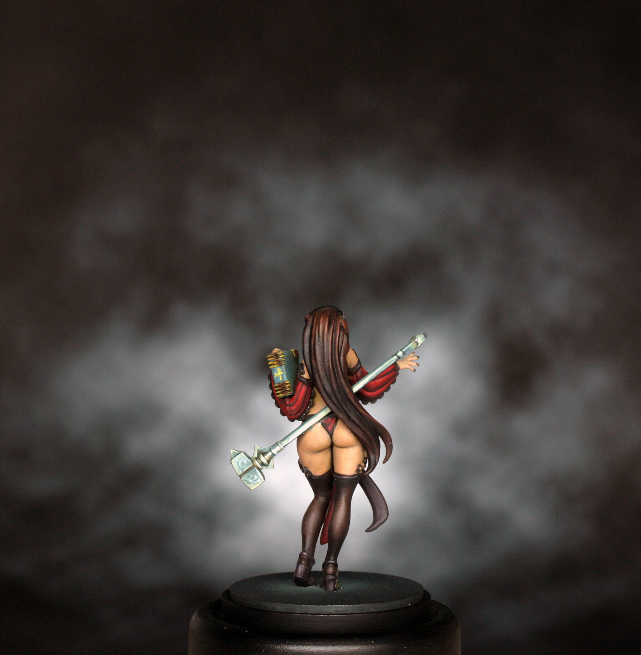
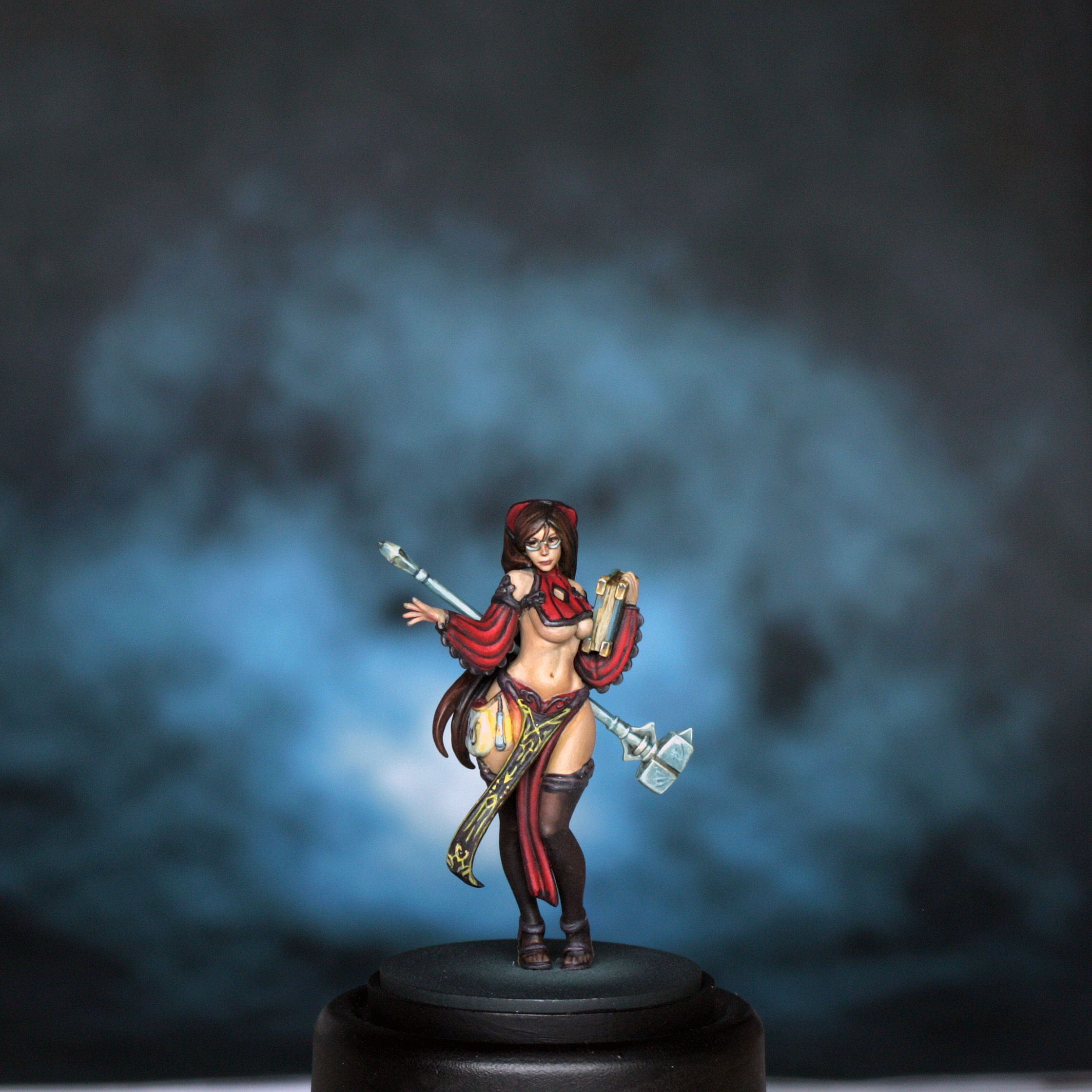
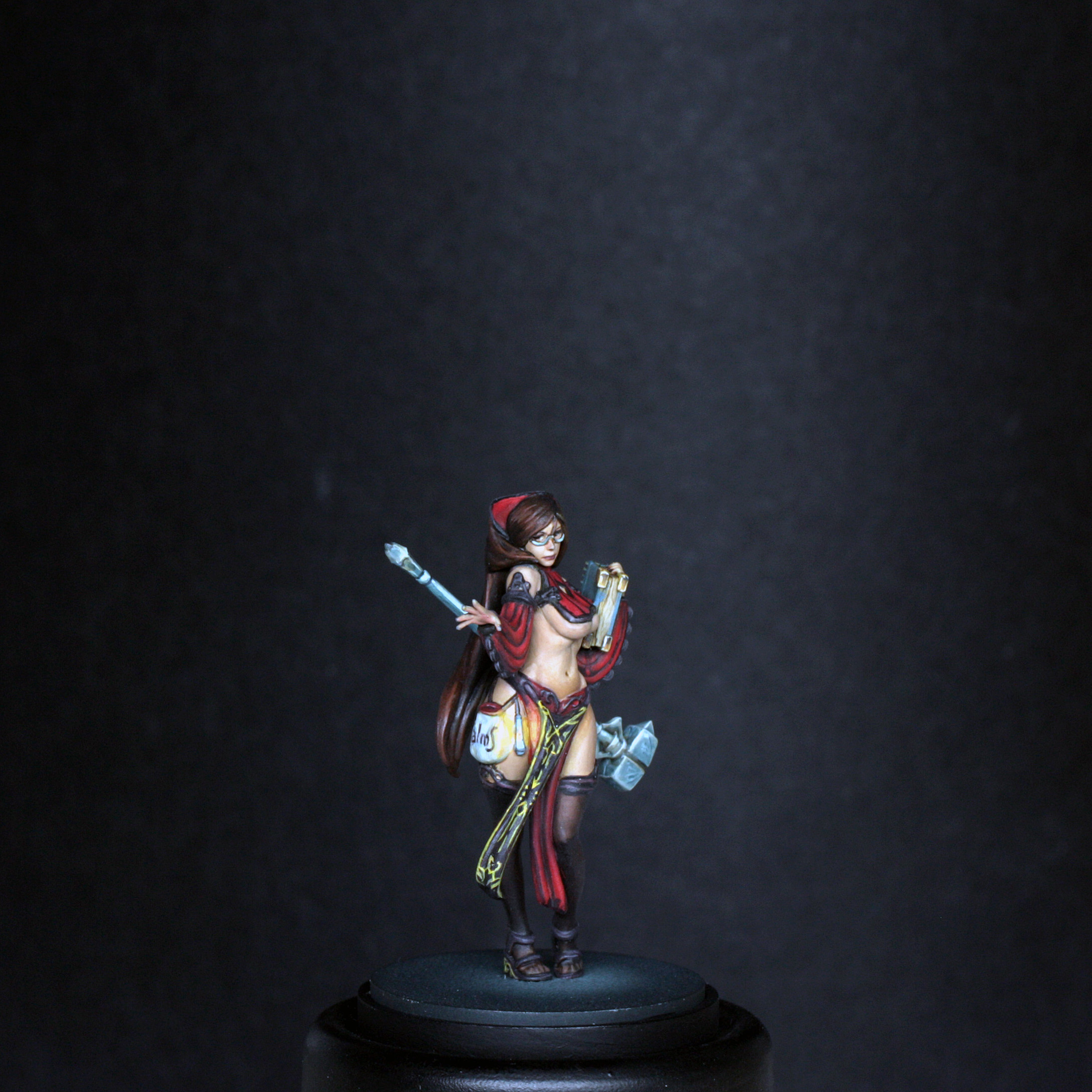
The Preacher is much more colourful than the Forsaker, with the strong red dominating the scheme, a nice pinkish peach skin tone, yellow design on the tabard and then the shades are all “warm” black-brown colours. There is also the hint of teal to the hammer and book, just as points of interest.
Painting Preface
I will mention GLAZING a lot throughout the article. Generally my glazes are around 1 part paint to about 4 or 5 parts water, and often with a drop of glaze medium to keep the blends smooth. Stronger colours are generally MORE dilute in glazing, weaker colours LESS dilute. You can read more about glazes in the Architect guide.
I also mention SPRAYING with my airbrush. You will have your own feel for dilution of paint if you have an airbrush, but I tend to work around 1 part colour to 2 parts water and 2 parts thinner. Just like normal brushing, it is always better to have 2 or 3 thin coats to cover nicely than 1 thick coat, and you are less likely to clog your airbrush!
If you don’t have an airbrush, just brush on as usual. The airbrush just helps to speed up some of the less enjoyable base coating…
Painting the Base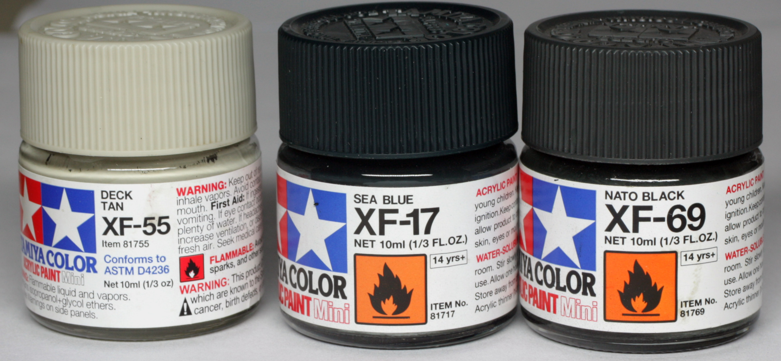
The base was painted in exactly the same fashion as the Architect and Forsaker models, with a point of light slightly in front of her feet. The lightest point was sprayed with deck tan, shading done by successive thinned sprays of sea blue and then Nato black around the edges. The outer rim was just painted in black.
Painting the Skin
The colours used for the skin are shown below…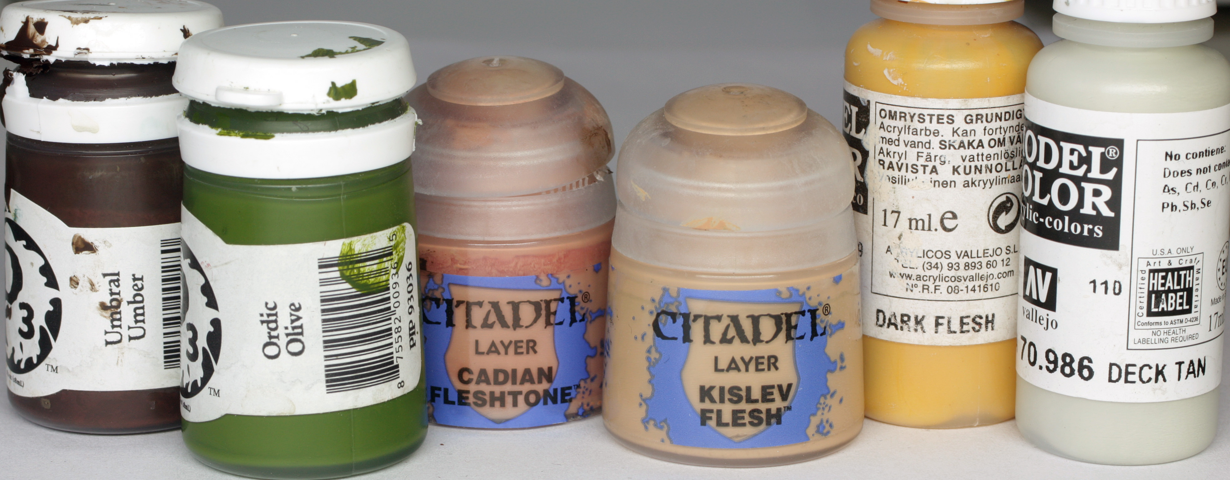
Painting the skin is not something that I like to do too often, especially when dealing with such strong colours elsewhere on the model. However, there is a lot of skin to the model, and very few difficult to access parts, plus the separation of skin from the other details is mostly very good.
With that knowledge I pressed on with painting the skin as follows…
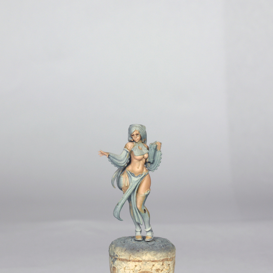
The base colour was a mix of GW Cadian Fleshtone, GW Kislev Flesh and VMC Dark flesh, with just a touch of deck tan and P3 Ordic olive. This gave a nice peachy colour which I applied to all skin areas in 3 or 4 thin layers until I had a nice flat tone all over.
Shading for this model is reasonably subtle, at least in the visible areas. I started shading by taking the base colour and diluting it into a glaze, then adding small amounts of ordic olive and umbral umber. The emphasis on shading here was under the boobs, under the buttocks, in between the legs behind the tabard, the mid back and armpits. The stomach shading was kept very subtle, mainly just down into the pelvis and left side of stomach, away from her little lantern. The creases under the buttocks got the deepest shade, but this was still nowhere near pure umber.
Highlighting was done using the base colour as a glaze again (which I quickly used to tidy up the shading first), then I added increasing amounts of deck tan and just a touch of dark flesh. I didn’t want her to go yellow, so the dark flesh was used very sparingly. I then built up the highlights, concentrating on the shoulder, boobs, front of her left leg, belly, right hip and face. I also highlighted the little area next to the lantern, as this will get a glow later. The palm of her right hand was painted slightly more pink than the rest of her skin and I did add a little more pink tone as a final glaze made out of cadian fleshtone to the sides of her nose, bottom lip, cheeks and just around the edge of the highlighted part of the belly.
At this stage I also painted in the eyes. They are quite deep set, which I though may be an issue. However, I filled the eye with a small amount of deck tan for the white of the eye, and then used Umbral umber with a touch of black to do the iris. She is looking towards her right hand, so positioning the eyes is slightly easier, and any tidying up is simple enough. I used the same colour from the eyes to thinly draw in her eyebrows too. The sculpt had a natural ridge to draw the side of the brush along. Similarly, I used some highlight skin colour to draw a line just between the lower eyelid and the glasses.
The final thing that I did was paint some skin tone onto the parts of the stockings that would be showing as “sheer” later on.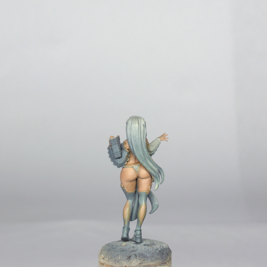
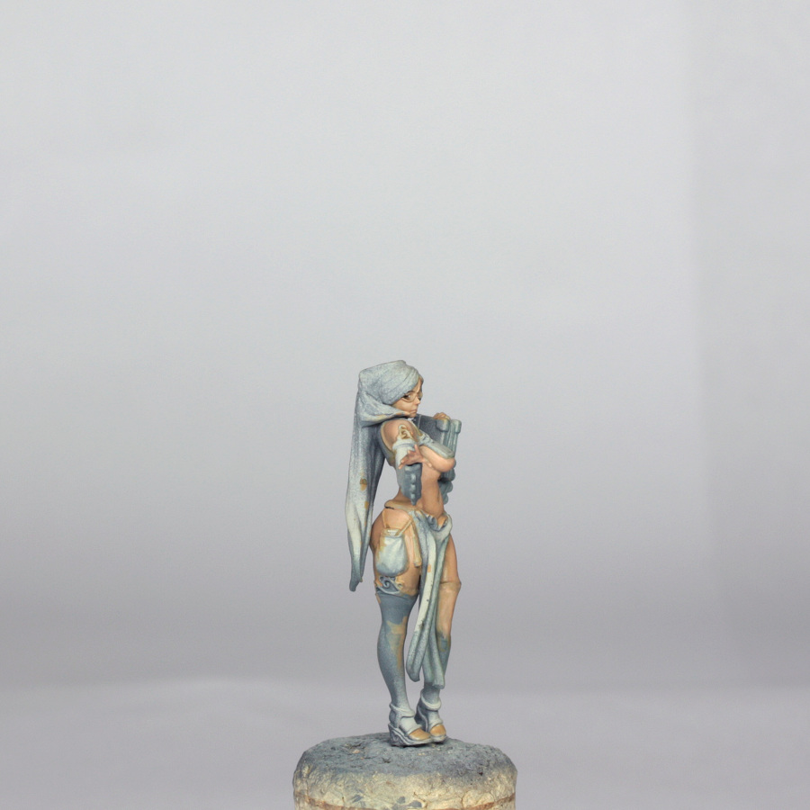
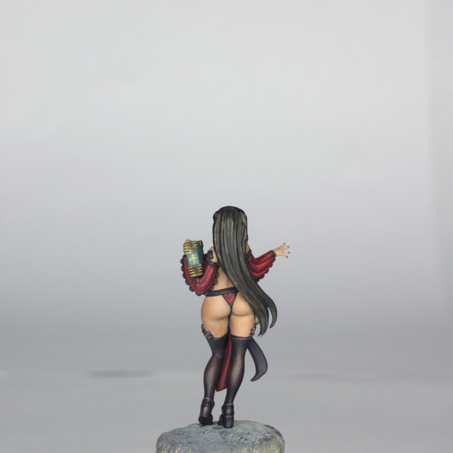
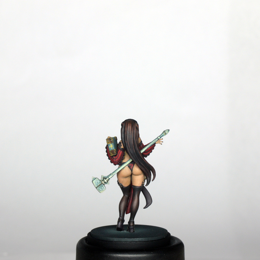
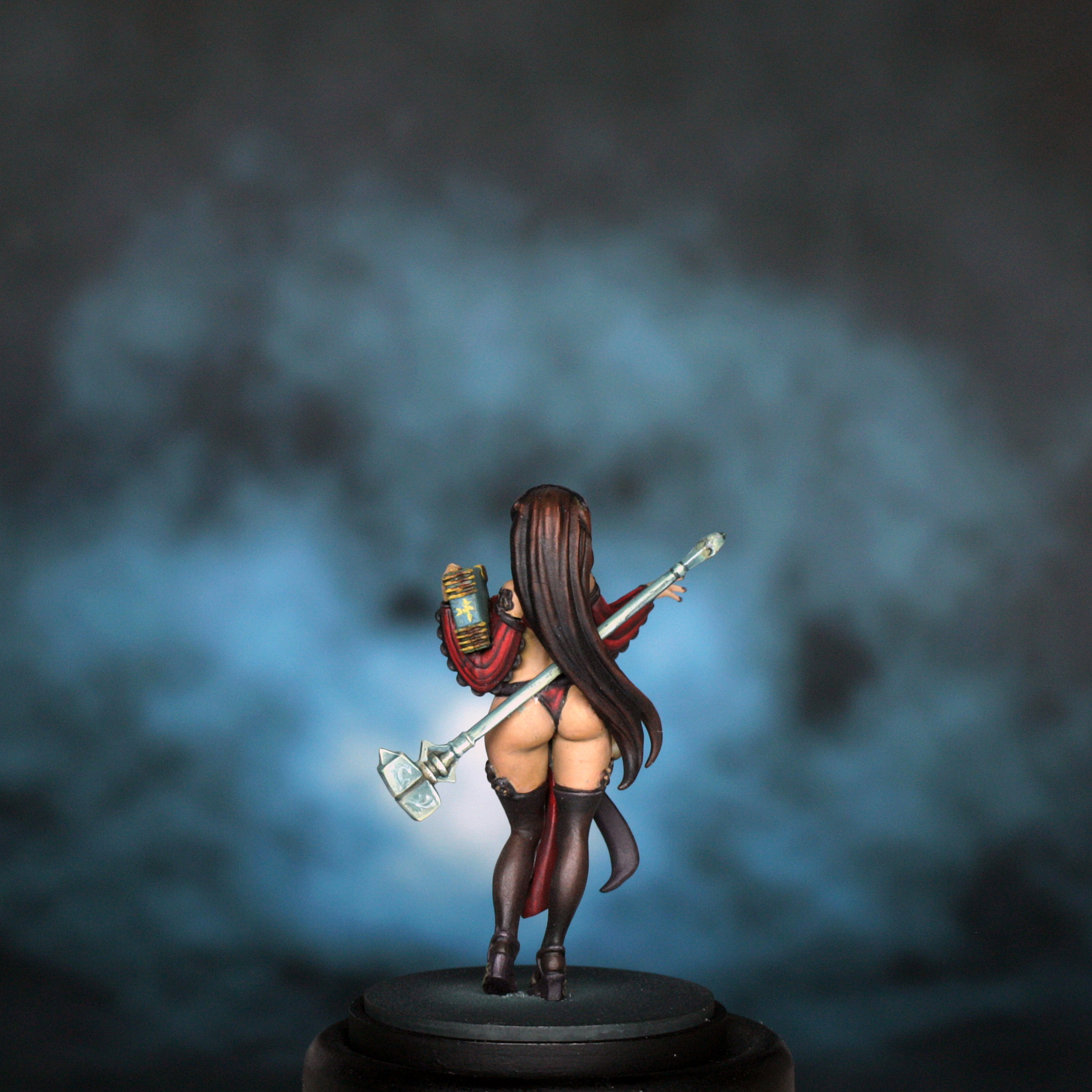
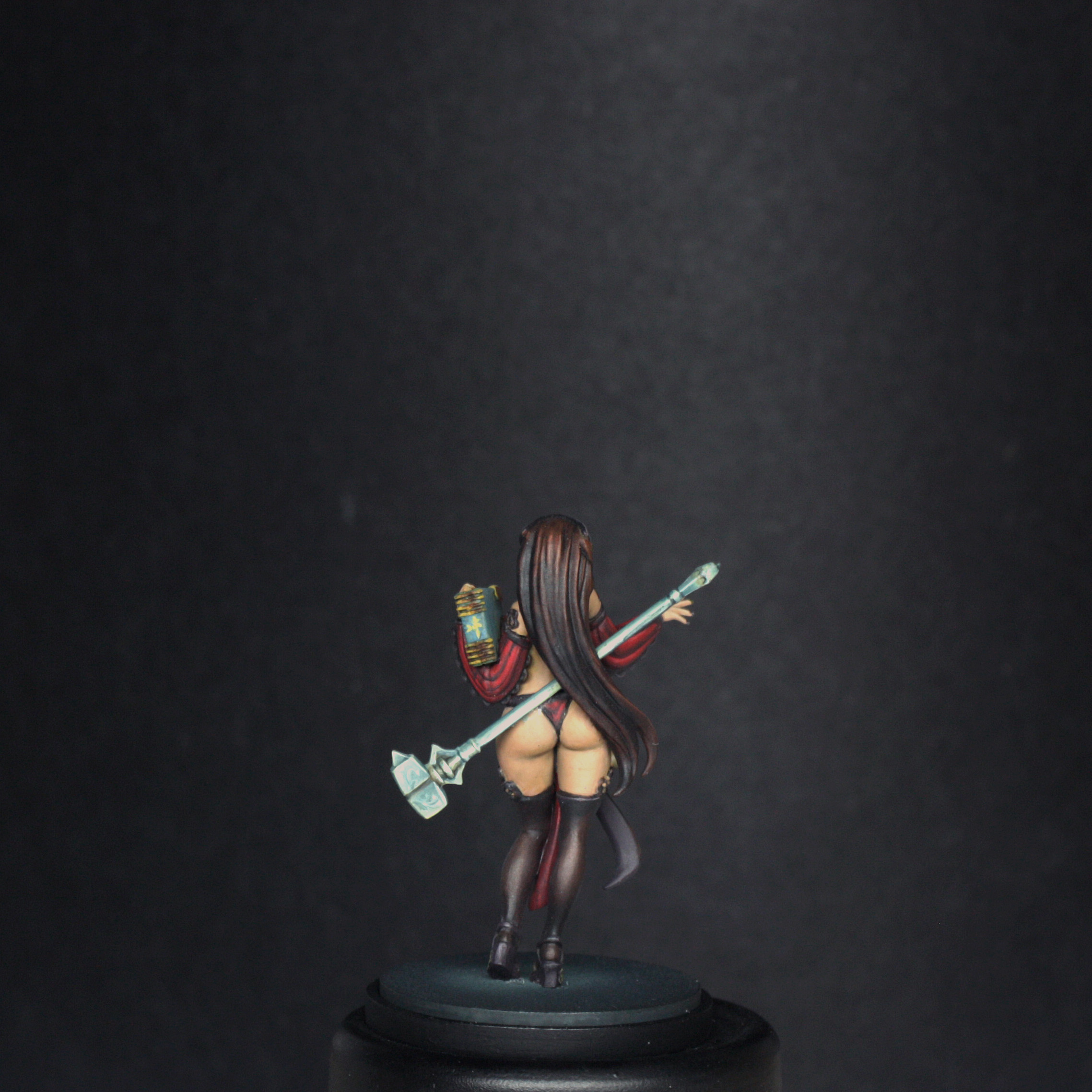
The Stockings and Lace Trims The stockings introduce another technique that I have not covered before, which is creating a sheer effect. First of all, the colours used for the stockings were as follows… The idea of painting a sheer effect is to have the skin colour peeking through the material in question. This is sometimes done to create an effect of wet clothing, but more often is used like this for translucent stockings. I started off by mixing up a glaze of Khardic flesh and Umbral umber, with a touch of Ordic olive. This pinkish brown was glazed in over the entirety of the stockings, including over the flesh coloured parts mentioned above. I had decent coverage of the skin areas after 2 or 3 thin layers. The skin colour underneath “brightened” up the colour and once I had painte the rest of the stockings with 2 or 3 more thin layers I had a nice smooth transition without the need for any further highlighting. Now I could concentrate on shading, which was done by adding increasing amounts of olive and some black. I then glazed this into the shaded parts, particularly getting a shadow just under the left knee to emphasise the highlights of the mid thigh. The other heavily shaded areas were around the ankles and feet – but not the toes, which were painted in the sheer colours – and the backs of the thighs and into the knee creases.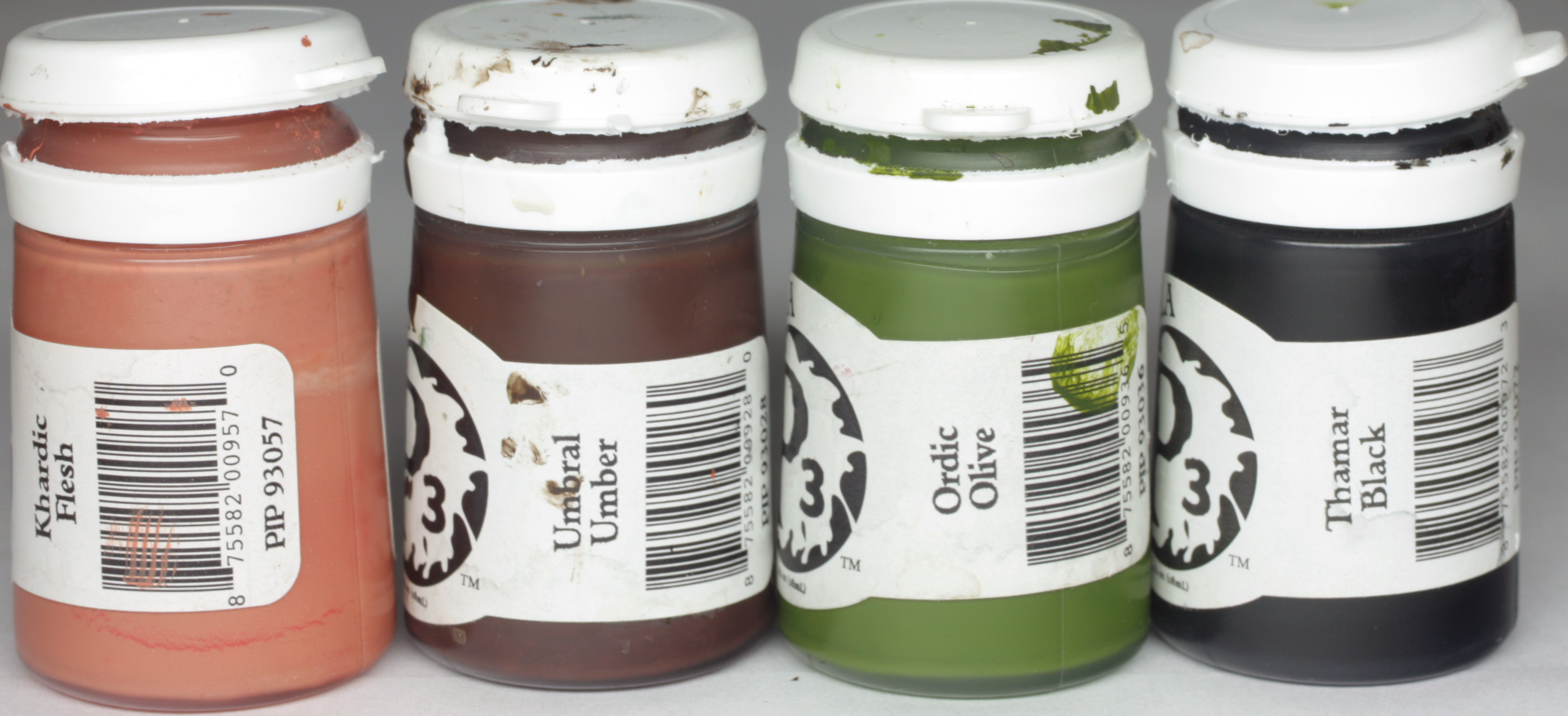
Once happy with this I painted in the lace parts. The colours for the lace were as follows…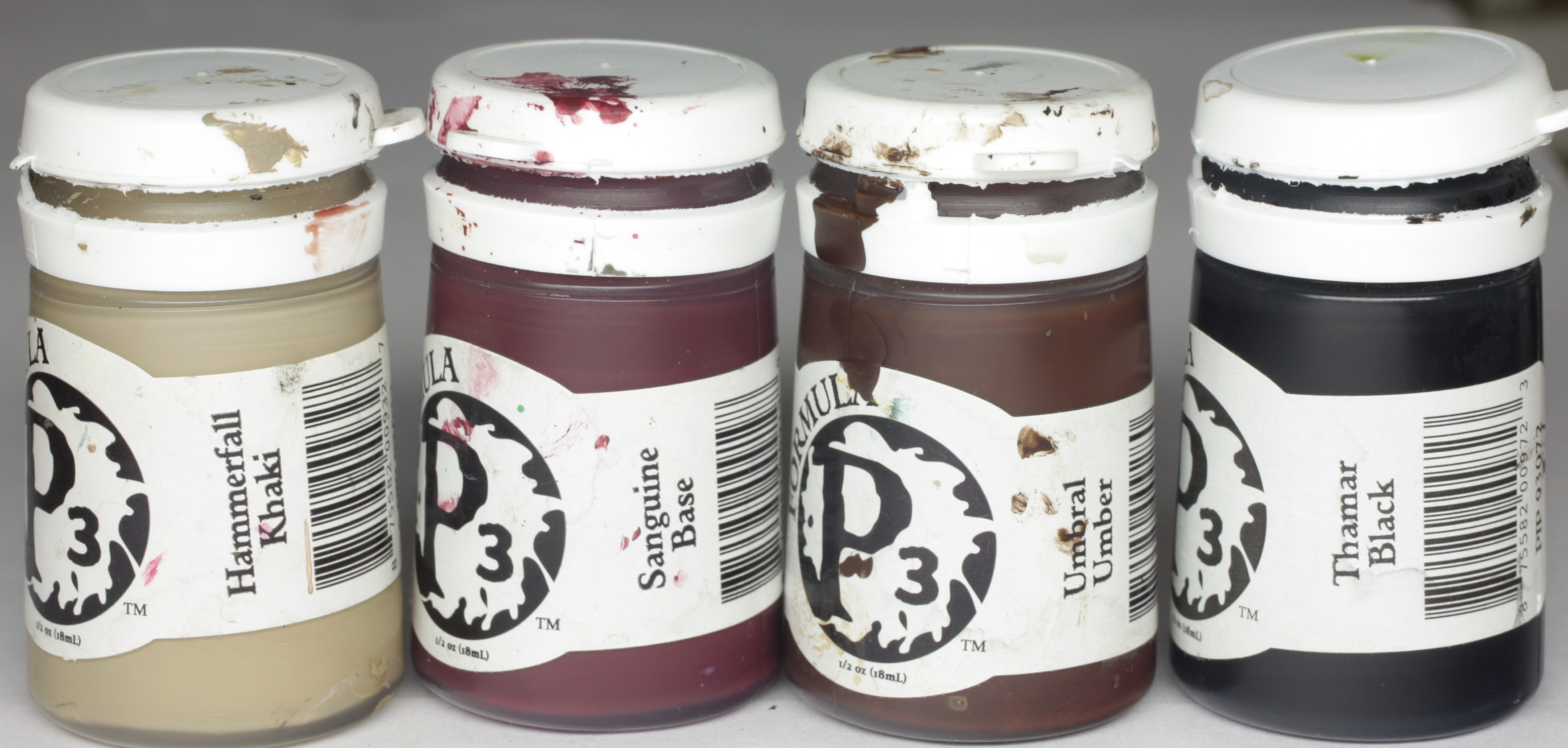
The basic lace colour was a dark red brown made from the Sanguine base, Umbral umber and a touch of both Hammerfall Khaki and Thamar black. This I painted onto all of the trims, shoes, front section of the tabard and the waist band of the tabard/panty combination. I painted some basic skintone into the holes in the stocking tops and carefully shaped the detail of the lace after this. This required a little patience, but is extremely effective when finished.
Highlighting was done by adding a little khaki to the base mix and lightly painting the edges of the details. I didn’t want to go over the top with this highlighting as it gets chalky and becomes difficult to get the transitions right in such small areas. A couple of passes builds up enough highlight in most areas.
Shading was simply a glaze of black and umber together, which was painted into the recesses (other than those in the stockings!), and concentrated on the undersides of the details. I also created a kind of double band around the tops of the stockings at the front by painting a dark line through the highlighted area. Last thing that I did was block in the shape of the glasses with the shade colour. This needed to be done VERY carefully, so as not to ruin her face!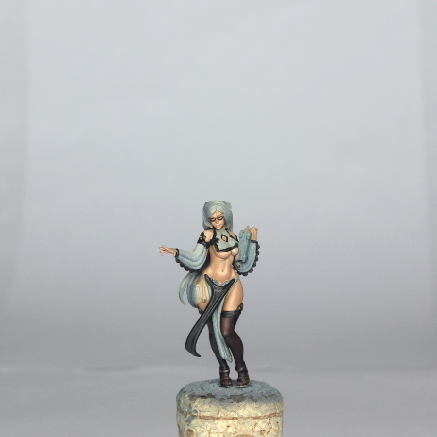
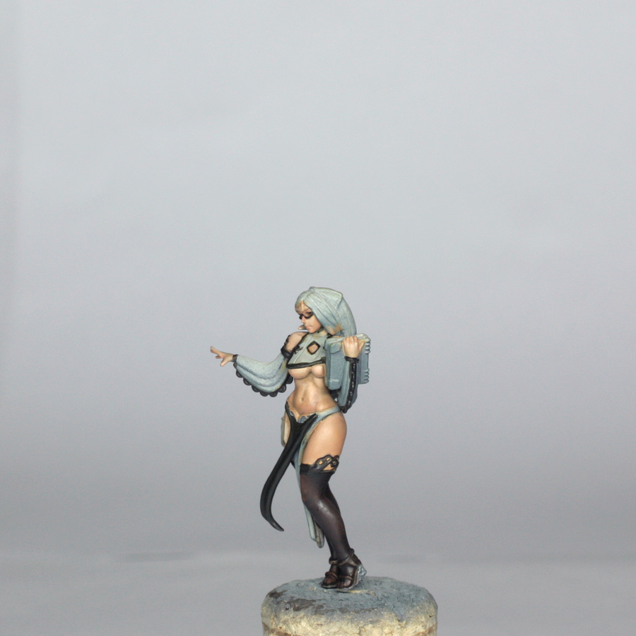
The Clothing
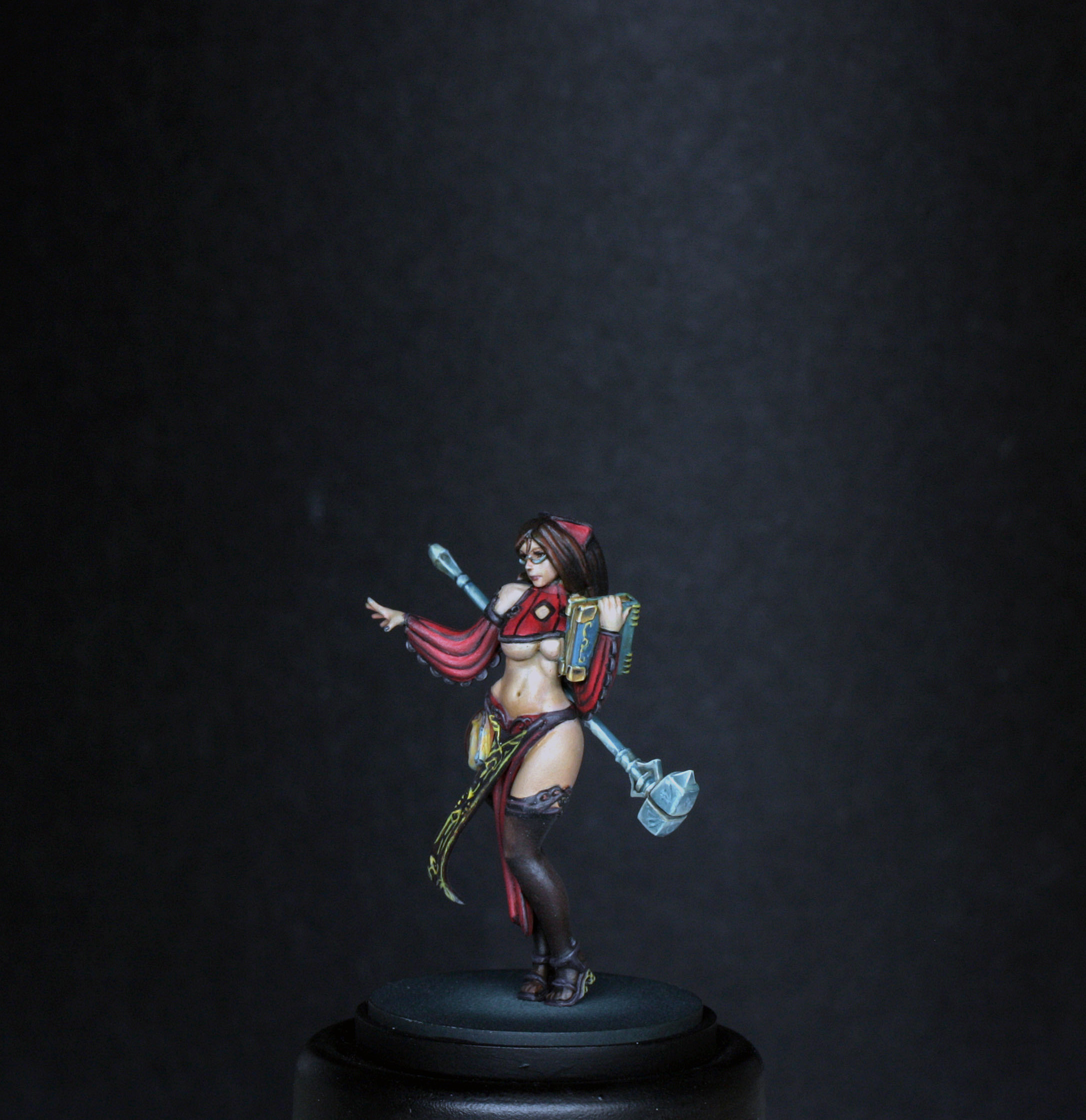
Red is an old favourite of mine to paint, but it can be a bit unforgiving, so patience is needed when shading and highlighting.
The colours used here are below…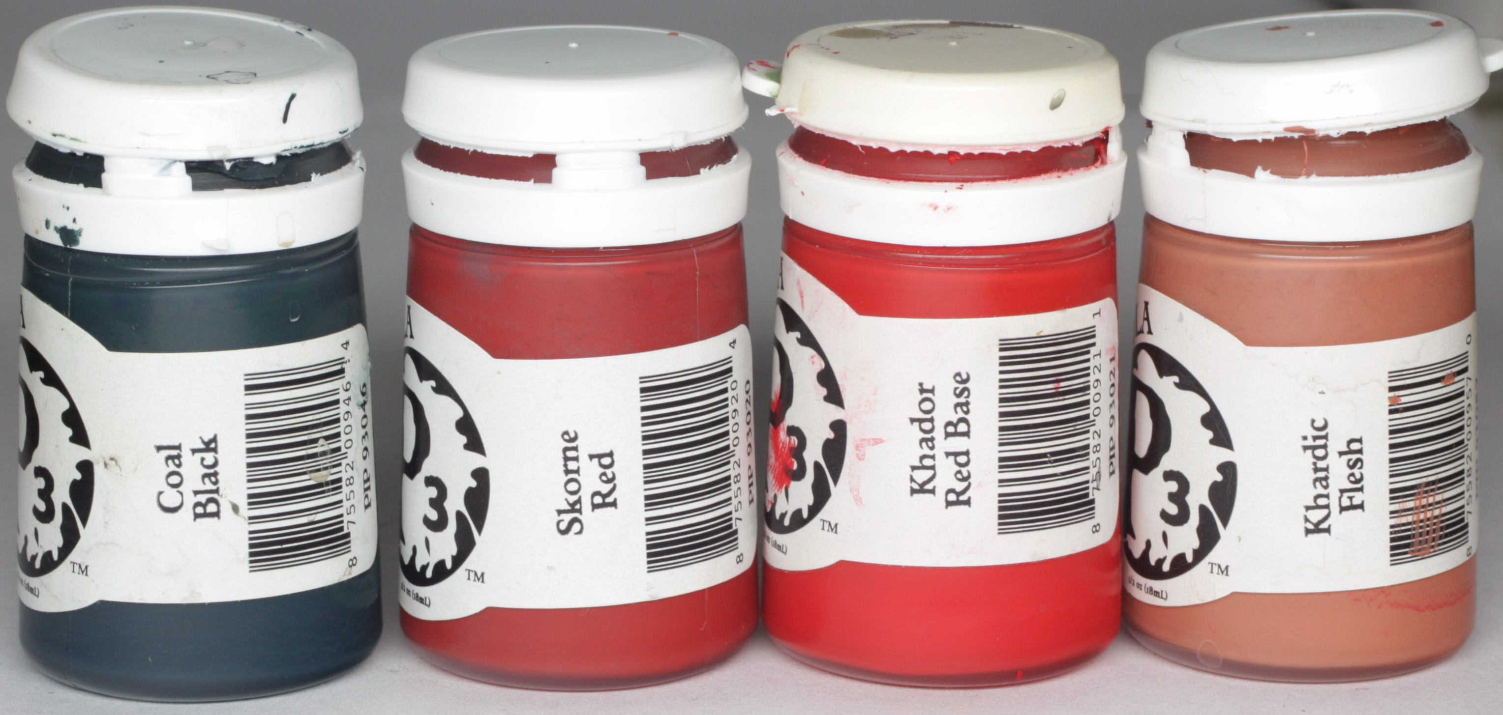
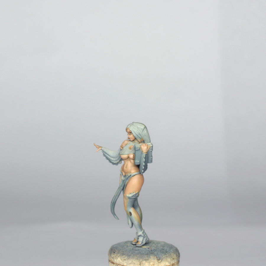
The base mix I made up was Skorne Red with a touch of Khador red base. This I painted over all of the red areas in several thin layers until I had a good even coverage.
Next I shaded the red by making up a glaze of Skorne red and adding a touch of coal black. I built this in 3 or 4 passes before I increased the amount of coal black in the mix. If you just keep adding shades, rather than actually building the depth of the shading with red it will just look grubby. So, smooth, slightly increased shades are the way to go. The recesses in the panels got the most shading, along with any folds in the tabard, and at each end of the sleeves. A final shade of approx 1:1 coal black and Skorne red was used in the actual lines in the panels and sleeves using a very fine brush.
Highlighting was done by first glazing a 1:1 mix of Khador red then increasing the amount of Khador red in about 4 or 5 quick passes. This was enough for the majority of the clothing, but where I needed a bit more highlighting I added some Khardic flesh to the glaze and this was painted onto the areas over the boobs, and to the uppermost edges of some of the sleeve panels. Care was needed not to go too pink, and where I wasn’t quite happy I just glazed back with the 1:1 mix used at the start of highlighting.
At this stage I also quickly blocked in the hair with a mix of Umbral umber, Ordic Olive and black, just to help me see what was going on.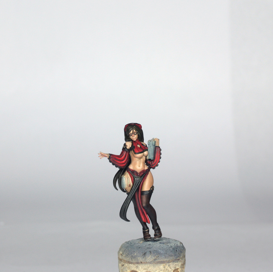
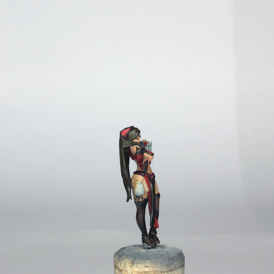
The Book, Glasses, Alms Purse and Lantern
I now had the majority of the model painted, so it was time to do the fiddly parts.
First I worked on the book. The colours used here are below, plus I also used some GW seraphim sepia wash…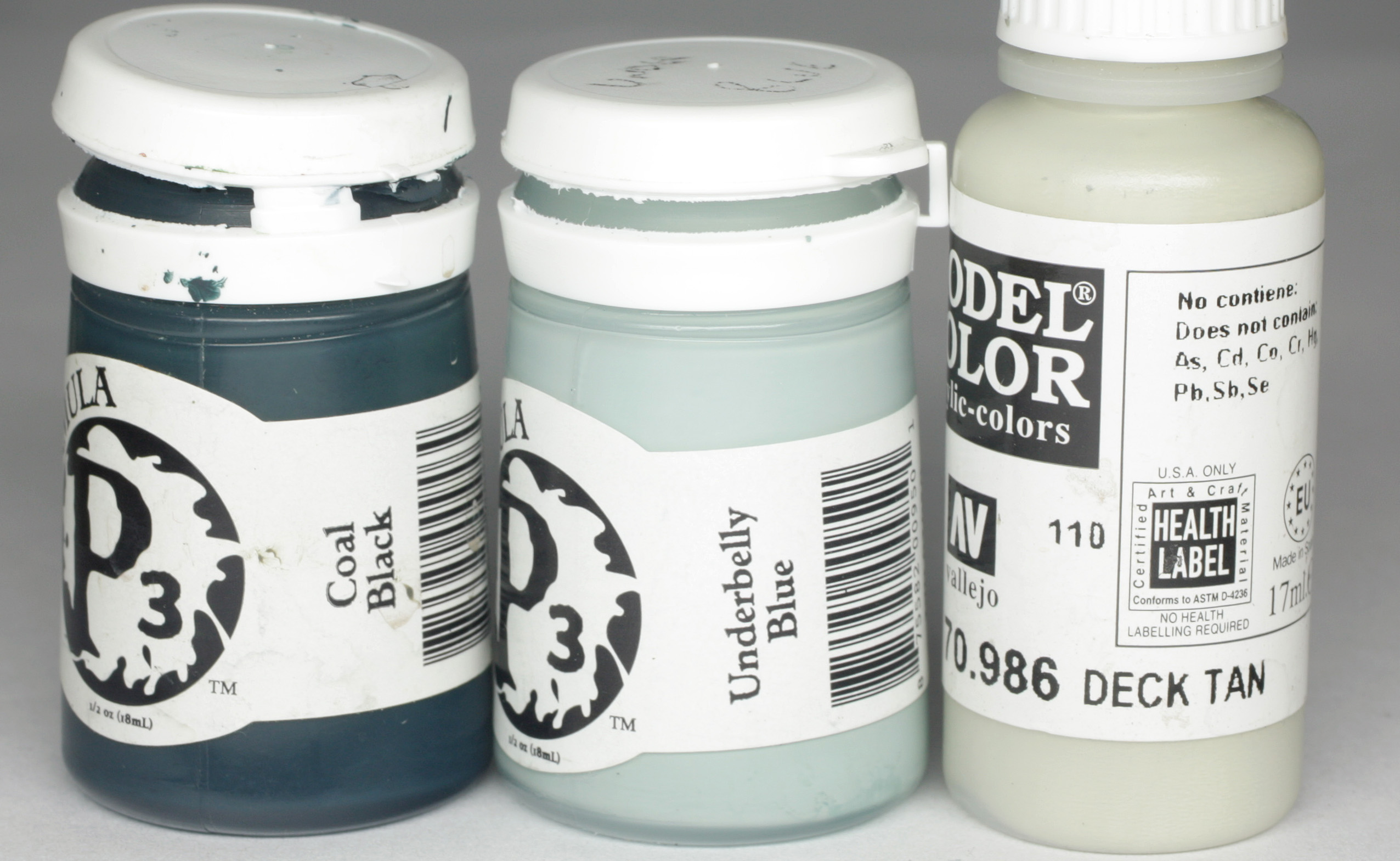
The book was painted completely with deck tan, and then the cover was painted in an equal mix of deck tan, underbelly blue and coal black. This was very quickly highlighted with a mix of just underbelly blue and deck tan. The whole of the book was then washed with sepia wash to give it an old, weathered look. Nothing more was done at this stage, as I needed to add freehand designs later. The sepia picked out the pages nicely and needed no more work.
The glasses and alms purse were painted with the following colours…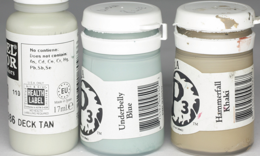
For the glasses, they were already picked out in black, so a shade wasn’t needed. As a result I concentrated only on the upper surfaces (they are tiny, so the undersides wouldn’t be possible to blend in anyway!). The basic colour was a 1:1 mix of Underbelly blue and Hammerfall Khaki. This wasn’t too dilute, as I didn’t want the paint to bleed, and was painted on with the flat of the brush rather than the tip. A first highlight of pure underbelly picked out the areas shown below (bridge of the nose and under each eye effectively). A second highlight was a smaller pass of underbelly and deck tan. Final highlight was pure deck tan in a dot to the centre of each highlighted section.
The alms purse was painted in the same base mix of Khaki and underbelly blue. The highlight was done by adding deck tan and concentrating on the raised folds and corner of the purse nearest the lantern. A final highlight of pure deck tan was applied just to the corner by the lantern.
The shading was just a glaze of underbelly with a hint of khaki.
The top of the purse was painted with skorne red, quickly washed with some really thin coal black and highlighted with some Khardic flesh, just on the edge closest to the lantern.
The freehand of “alms” was painted carefully onto the purse using skorne red and umbral umber. I have covered the principles of freehands in the big Architect article, but essentially the paint used was slightly thinned with water and glaze medium, and my finest brush was used to carefully paint it on. I painted the “S” first and worked back from there, and tested this on a piece of card first.
The little lantern was blocked in with underbelly blue (the top and bottom were done with the colour of the lace details, as was the string of the purse and lantern itself) and highlighted into the middle with a glaze of deck tan. Nothing more at this stage as OSL would be added later.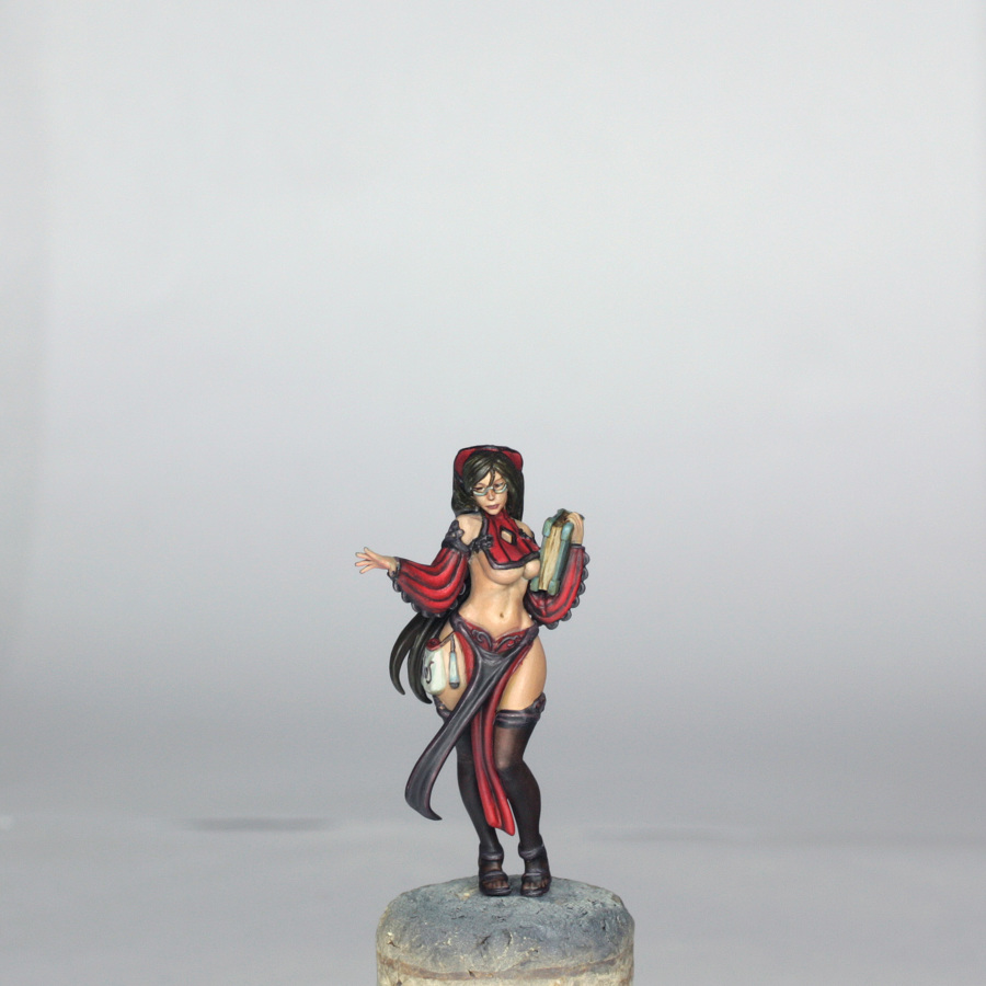
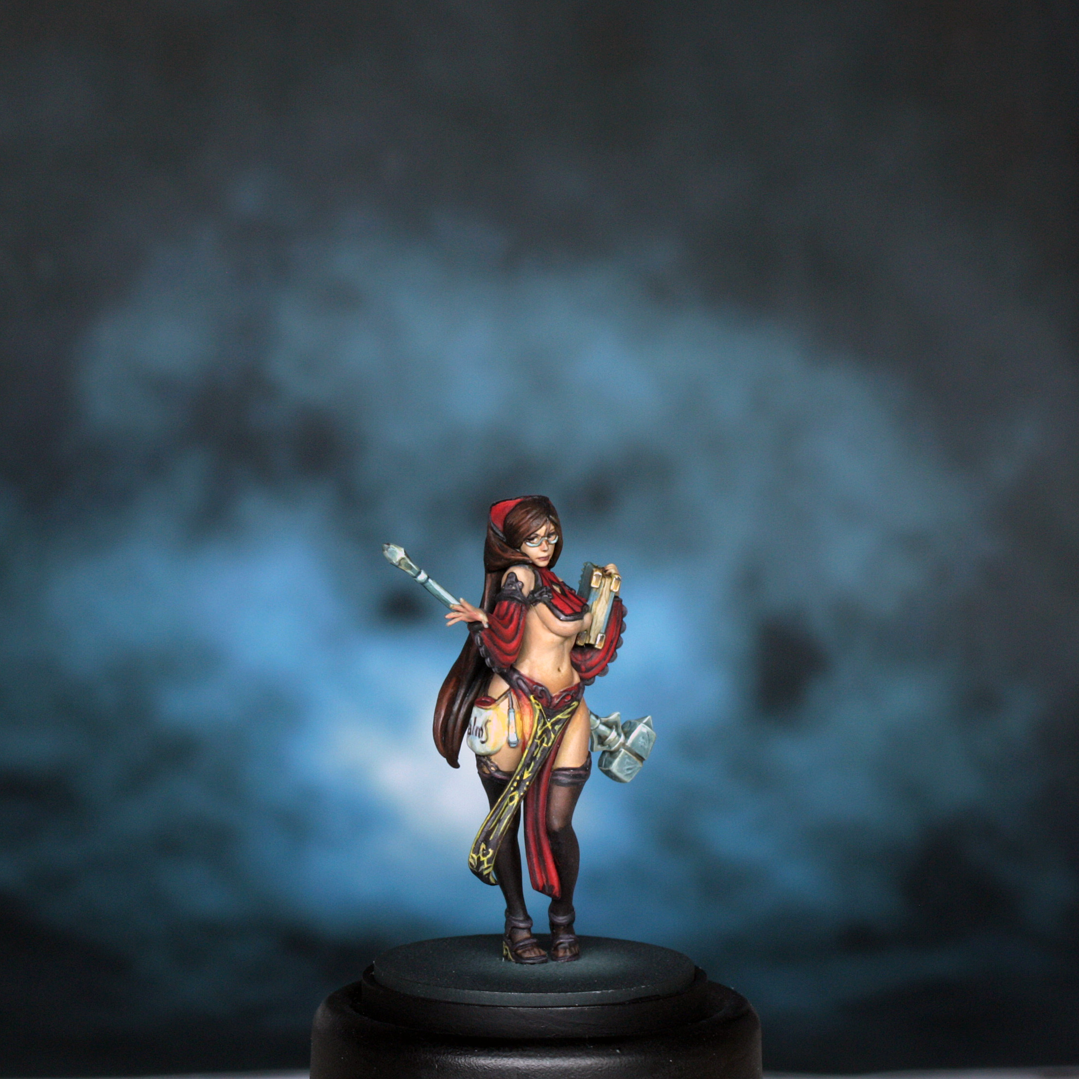
Freehands, OSL and Book Corners
The colours used in the freehand are below…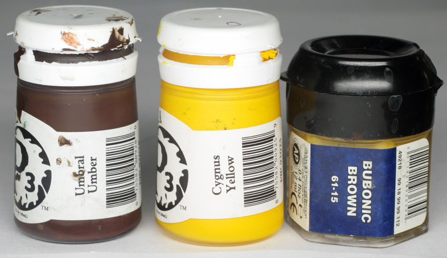
There is no easy way to paint this particular freehand to her tabard, as it is rather complex, but this is what I did.
First of all I mixed up bubonic brown and umbral umber and painted the arrow and diamond in the middle of the design. This allowed me to plot out the rest of the panel. Next I painted the fine straight lines inside and all around the panel. The criss cross section at the top and the fairly detailed bit at the bottom were also then sketched in.
I was reasonably happy with the shape of the design, so I painted over the lines with a final mix of Cygnus yellow and bubonic brown. I refined the design, and any stray brush strokes with umber mixed with black. Some sections came together nicely, others took 3 or 4 attempts to get to where I was happy with them.
The same method was applied to the designs on the book, only with a much simpler finished look. I then tidied up the book with a thin glaze of underbelly blue and coal black.
The OSL (Object Source Lighting or glow) was painted in using the following colours…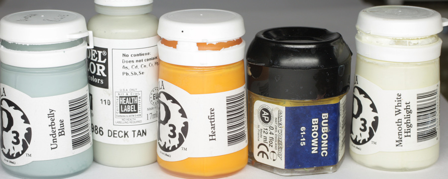
First of all a thin glaze of Heartfire and bubonic brown was mixed up, and applied thinly to the affected areas. At this stage I just wanted to establish the shape of the glow from the lantern and the little flame in the lantern itself. This is a smaller area than most lanterns that I have done for Kingdom Death models, but correct with the artwork.
The first highlight was a thin glaze of the first mix with some menoth white highlight added. This was mostly just added to the glow inside the lantern and the edges of the purse.
The final detail of the glow was a dot of pure heartfire inside the lantern to signify the actual little flame.
I then did little highlighting and shading of the lantern using first a REALLY thin glaze of underbelly blue and deck tan over all of the “glass” faces of the lantern, with a bit more underbelly blue just under the flame itself and right near the top of the lantern, and then some pure deck tan thinned out and glazed towards the bottom of the glass and to the area immediately above the flame. The actual frame corners of the lantern were painted on using the lace colour and kept extra fine by using the flat of a well blotted brush along the edges of the details.
The brassy corners to the book were painted using bubonic brown, menoth white highlight, umbral umber and coal black.
They were base coloured with bubonic brown and shaded first with umbral umber and then a hint of coal black. This wasn’t done in super smooth blends as the areas involved are so tiny. Just a case of thin paint on a well blotted brush, brushing from light into dark in smaller and smaller strokes.
The edge highlights were done with first a 1:1 mix of bubonic brown and Menoth highlight, then pure Menoth highlight at the brightest final spots.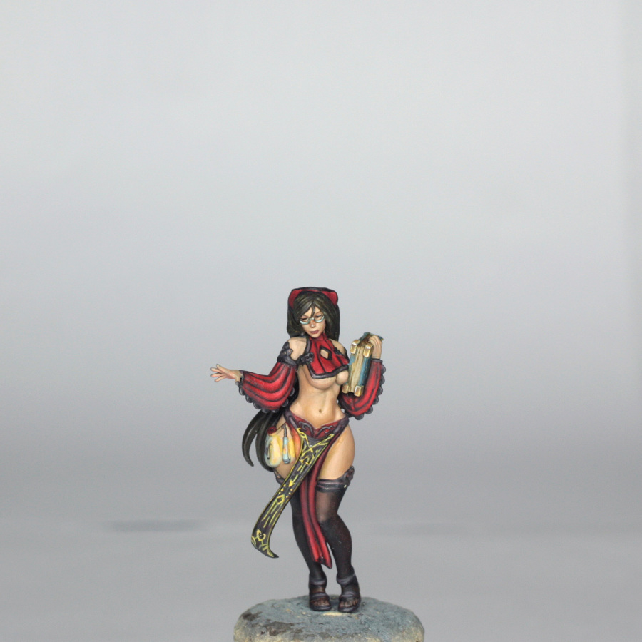
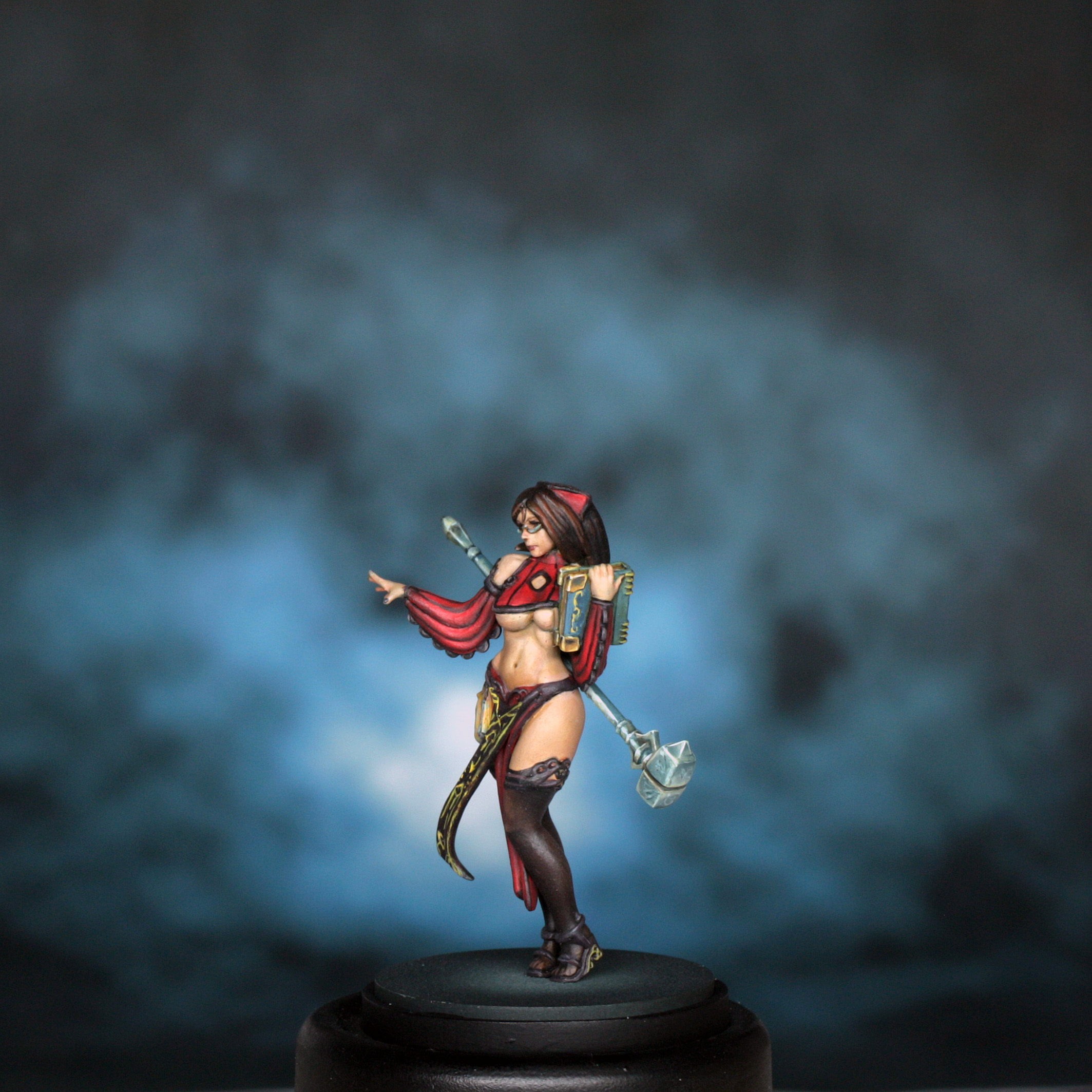
Hair and the Hammer
The hair was painted with the colours below…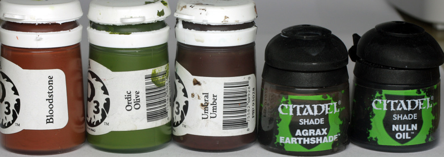
The hair had already been blocked in, but I painted over this with a new base coat mix of Bloodstone, Ordic olive and Umbral umber (approx 1:1:1) which gave quite a rich dark brown. I shaded the folds with umber first, then increased the shading with agrax earthshade, adding additional shading to the centre parting and around the bandana. A final shade of Nuln Oil was applied to the darkest areas and into the middle of the parting.
Highlighting was done by adding increasing amounts of bloodstone to the base colour and applying the “halo” theory of the Architect article. I didn’t paint bright highlights to the hair as the artwork had kept the hair very muted, so only went as far as pure bloodstone. I actually then shaded this all back a touch with one pass of thinned agrax earthshade over the whole of the hair to finish.
The Hammer was painted using the following colours…
The actual base colour of the hammer is a slightly odd one, as it is a kind of yellow silver colour. I decided to start off a bit darker, shade it, then glaze the midtone back in before highlighting and adding the freehand swirls.
The base colour was a mix of all 4 colours at approx equal ratios. This was painted over the entire hammer to leave a solid base tone. I then added increasing amounts of coal black and made this into a glaze. For the hammer head, I glazed the sides so that the shades were in the middle, and then the top and bottom were shaded in opposite to this with the shades towards the outer edges. The highlights were a glaze of dark flesh underbelly blue and Menoth highlight, with edge highlights of first pure dark flesh, then pure Menoth highlight.
The haft and sort of pommel at the other end were painted using the same colours. When I paint cylindrical areas like this I tend to paint a final highlight onto the base colour in a fine line (using the side of the brush) to the front and back. Then I do the same right beside the highlight in the darkest shade colour. I then blend from dark to light using first a glaze mix of the base colour and shade together, then once dry a glaze mix of highlight colour and base colour. If the glaze is correctly thinned it will blend the area quite nicely within a couple of passes.
The pommel bit had a the same principles applied as the head.
The freehand was sketched on with pure Menoth highlight, then underlined with thinned coal black to give an embossed look. This had to be extra thin so as not to overpower the colours in place. I then took a really thin glaze of the base colour and painted over all of the hammer head to incorporate the design “into” the surface.
Final step was to just place a shading glaze of Agrax Earthshade into the recessed band around the hammer head.
After this, I glued the model to the base, and the hammer to the model ready for final touch ins and corrections…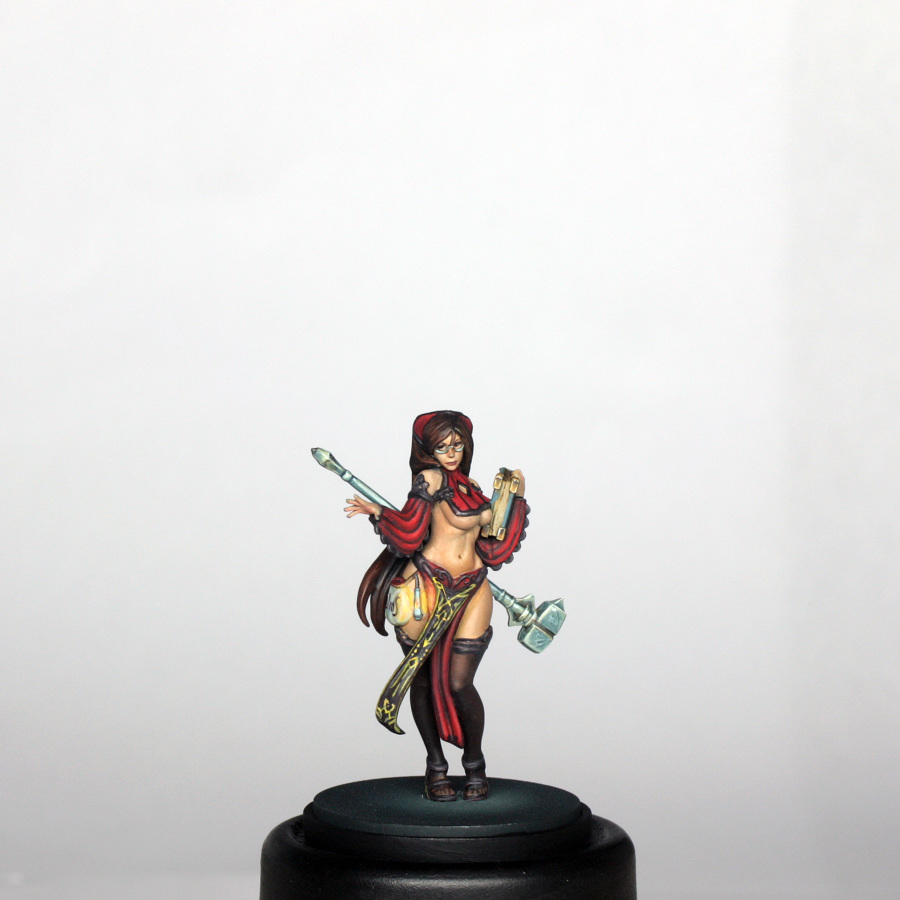
I fixed where the glue spread a bit to the panties, a chip out of the toe and added some eyeliner to her top lid before a final spray of matt varnish, ready for final photography…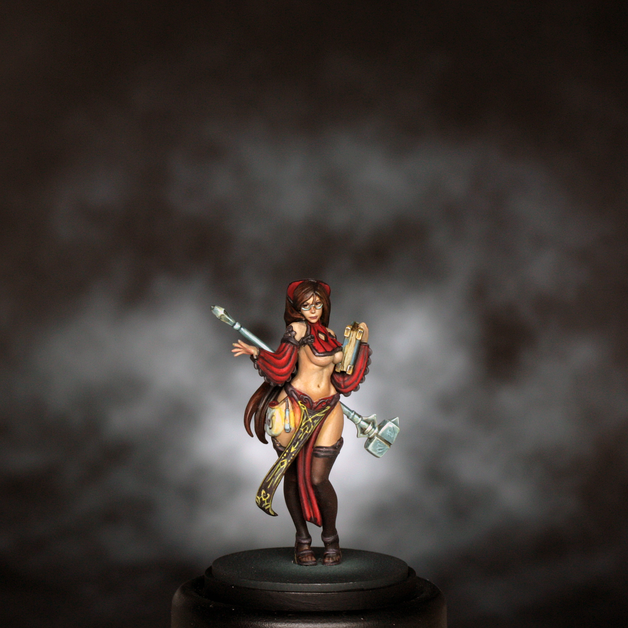
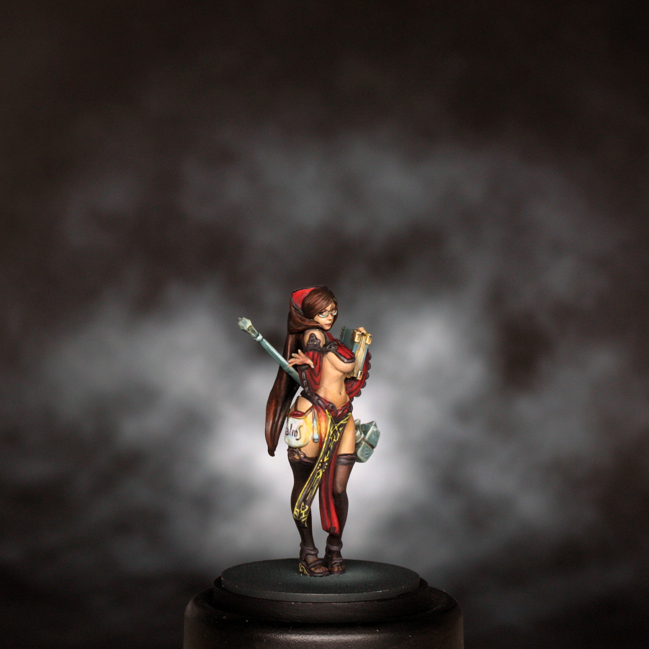
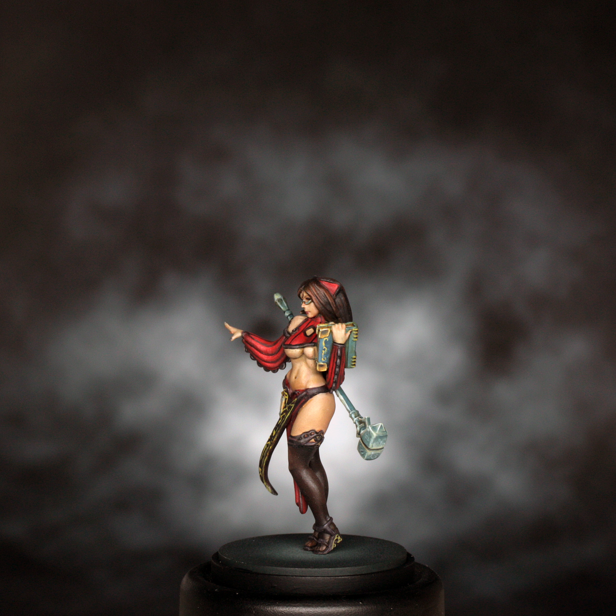
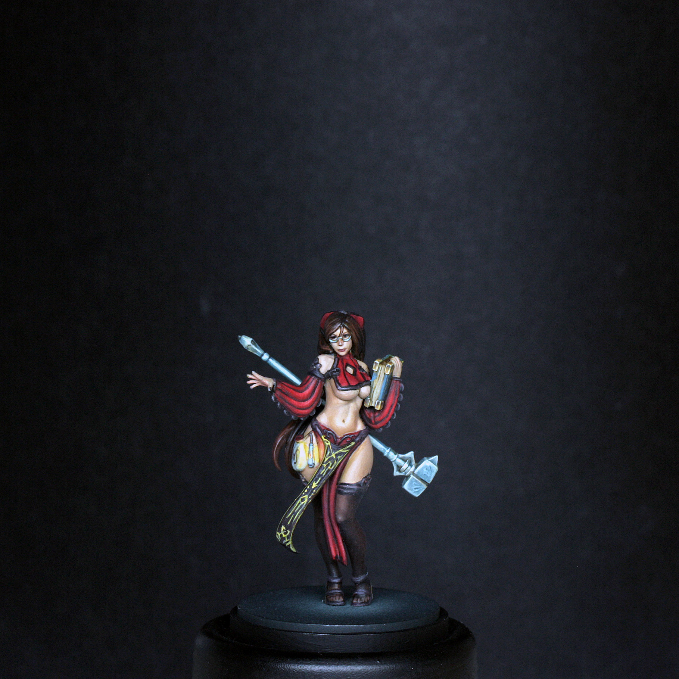
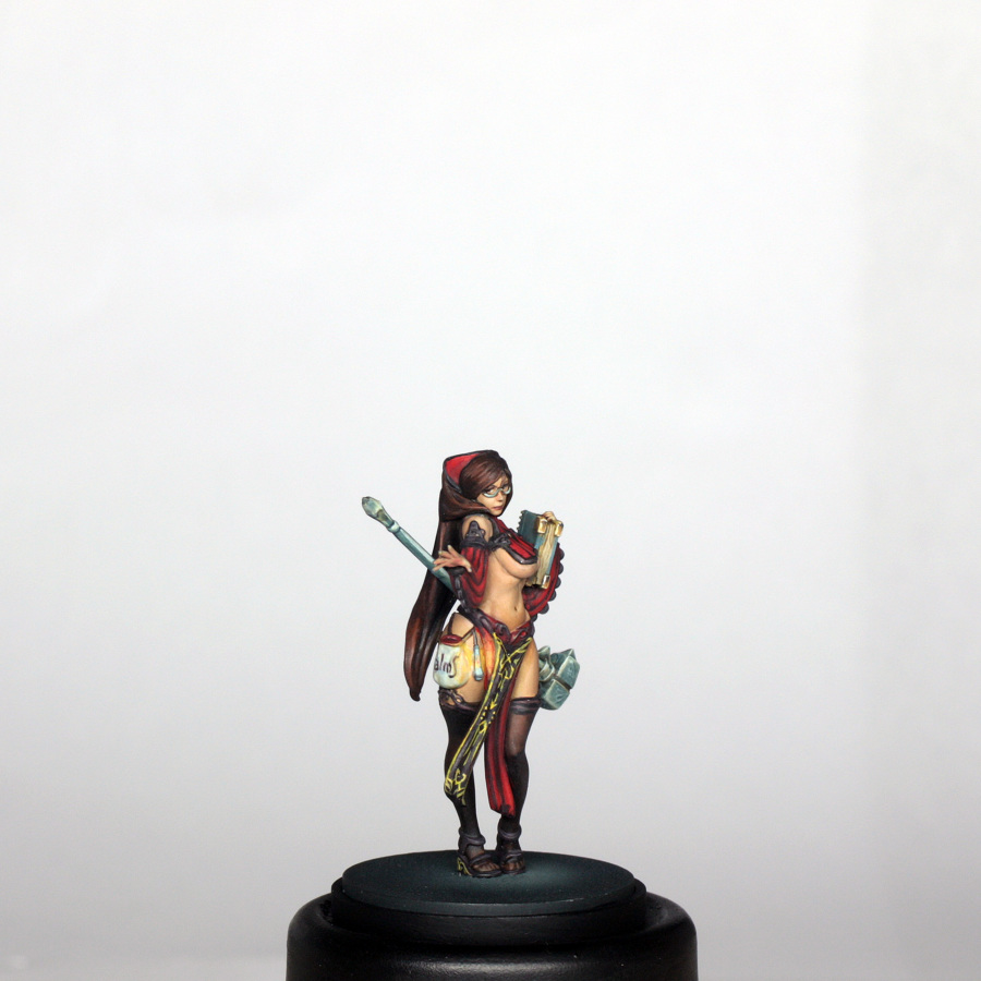
This model was a nice contrast to the technically challenging Forsaker, but no less enjoyable to paint, not least because I don’t tend to paint as much “true” red as I used to. This digital version of the sculpt is just as impressive as the original resin, with near invisible joins once fully assembled, and the head without glasses would work just as well as the version above. I wonder which pinup will be next…? 😉
Cheers all,
Scott