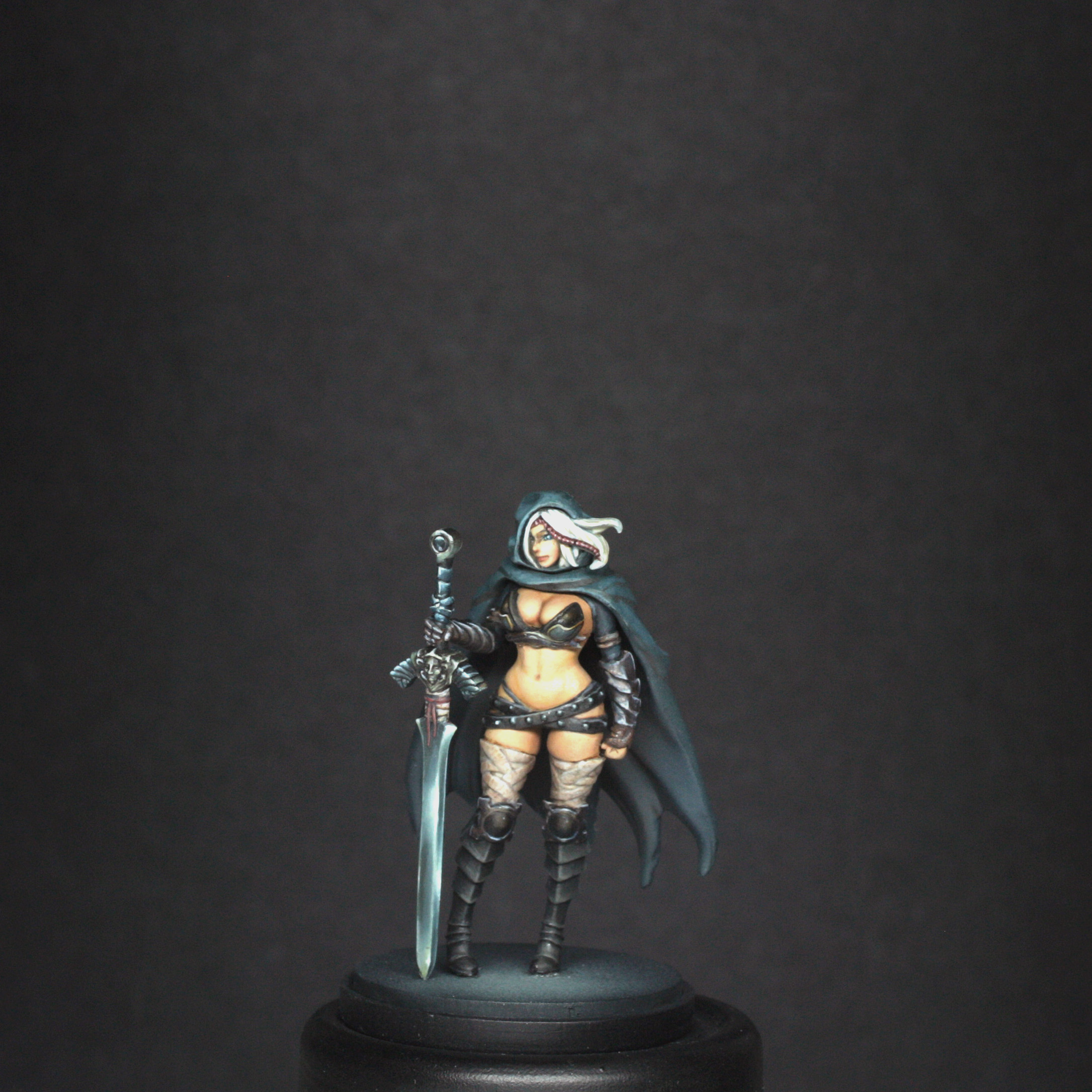
Pinup Twilight Knight Painting Guide
Scott Hockley
By Scott Hockley
Intro
Hi all,
This is another episode of pinup painting guides. The style of this guide will follow that of the last two, and again I would say that if there is any techniques mentioned that you are not sure about , then it would be best to take another look at the full guide for the Architect.
Preparation
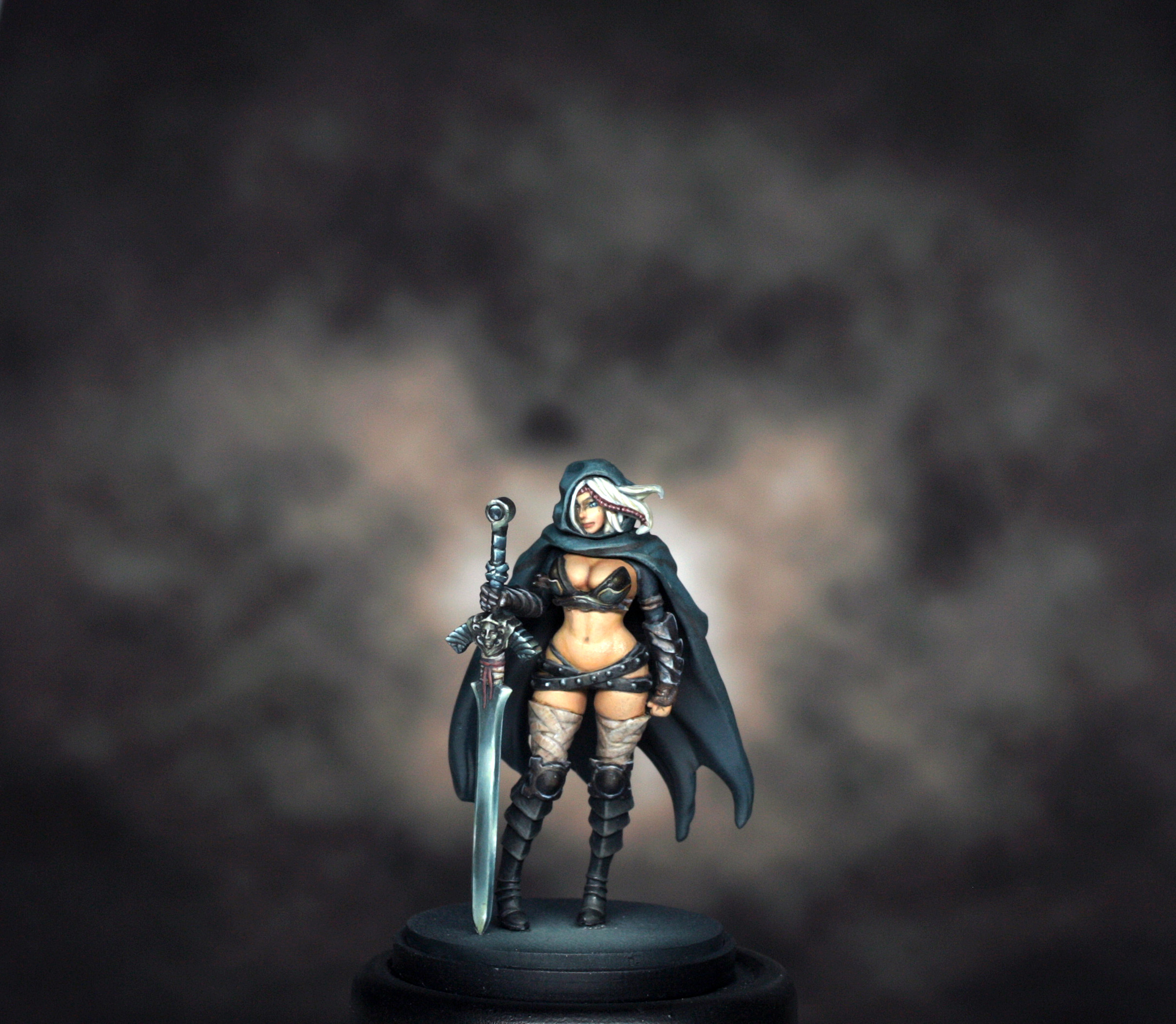
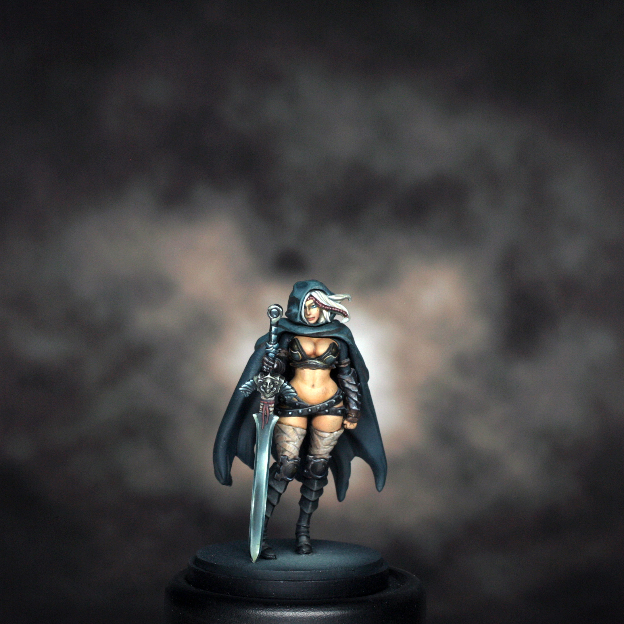
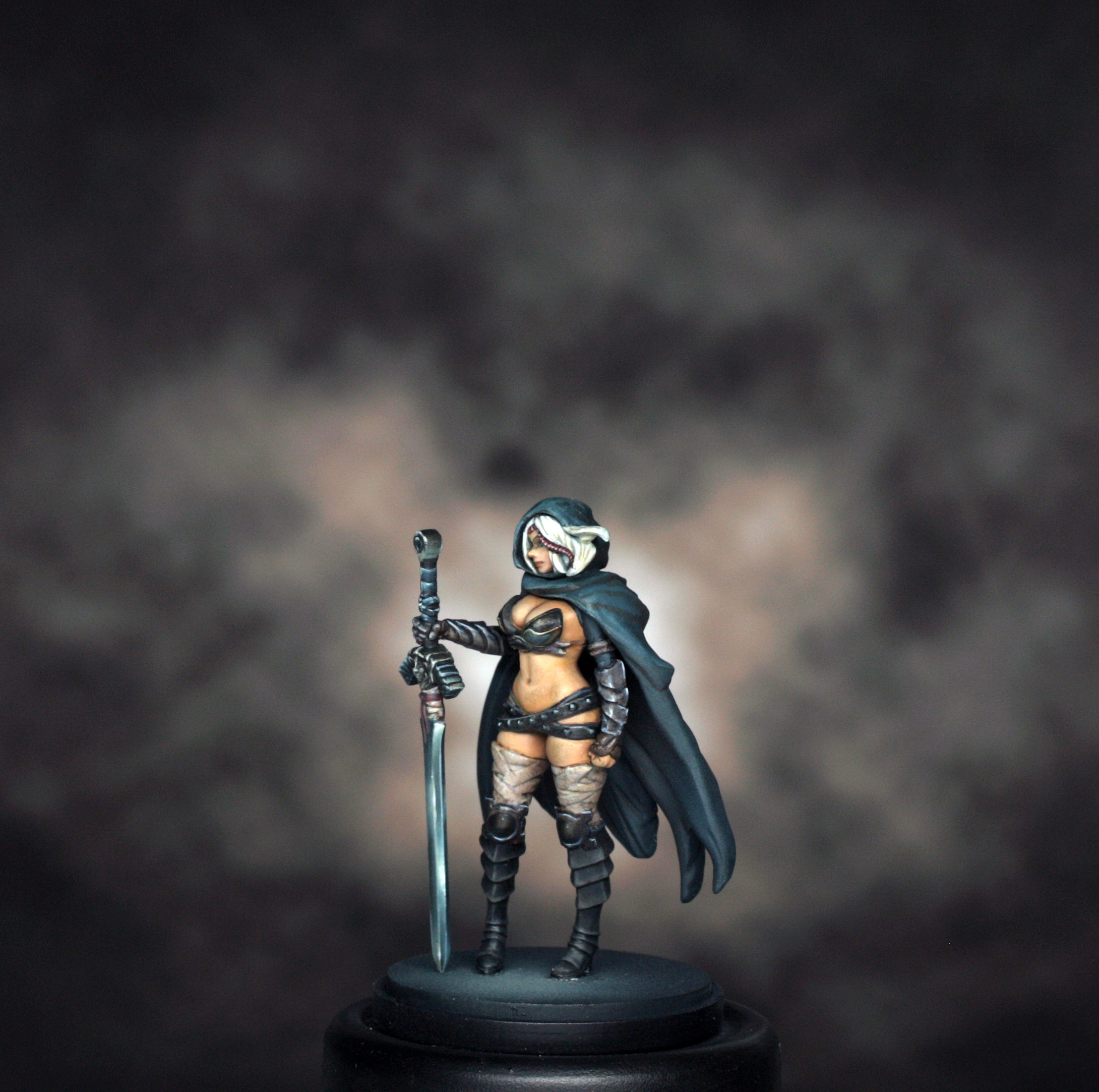
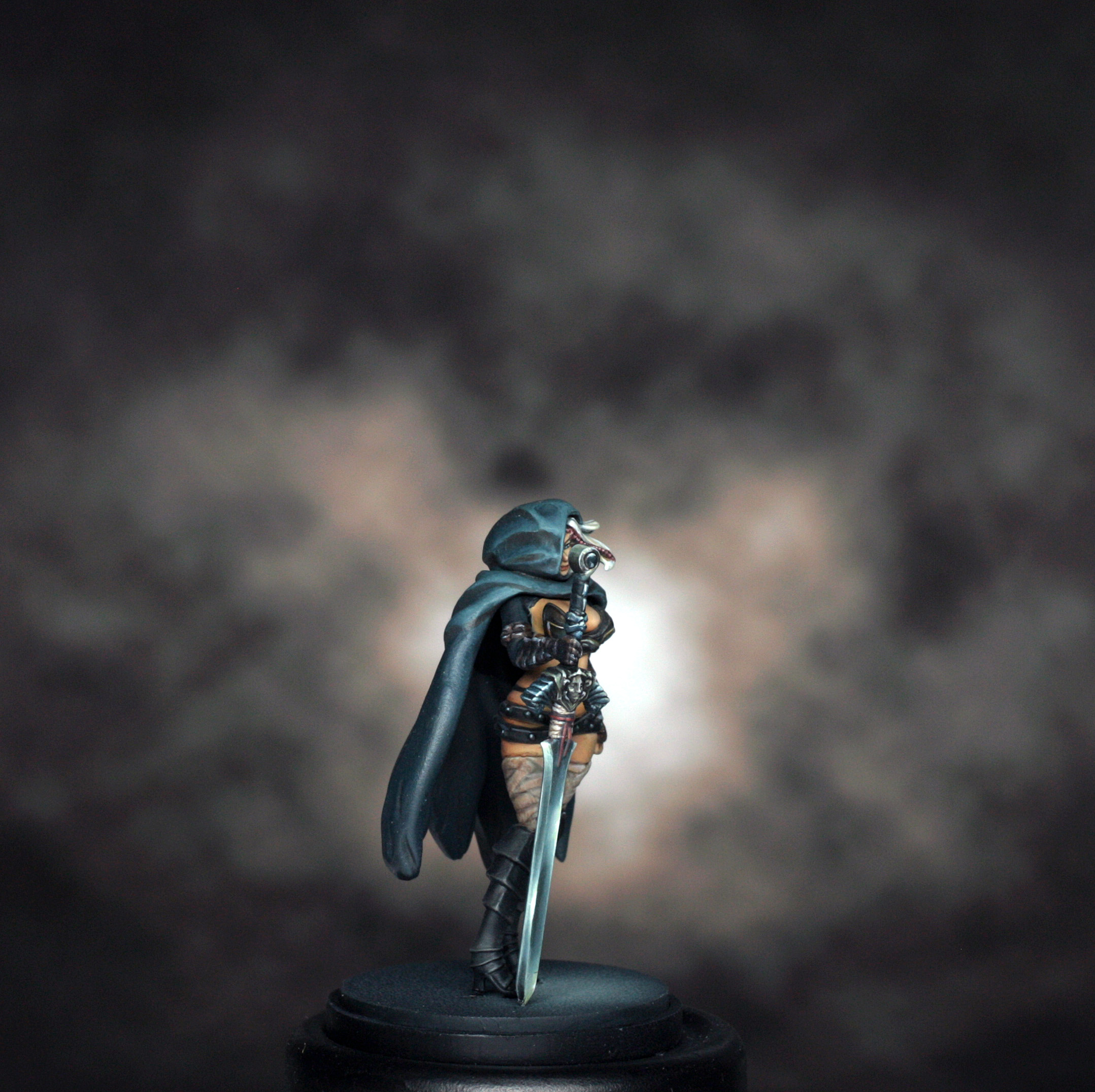
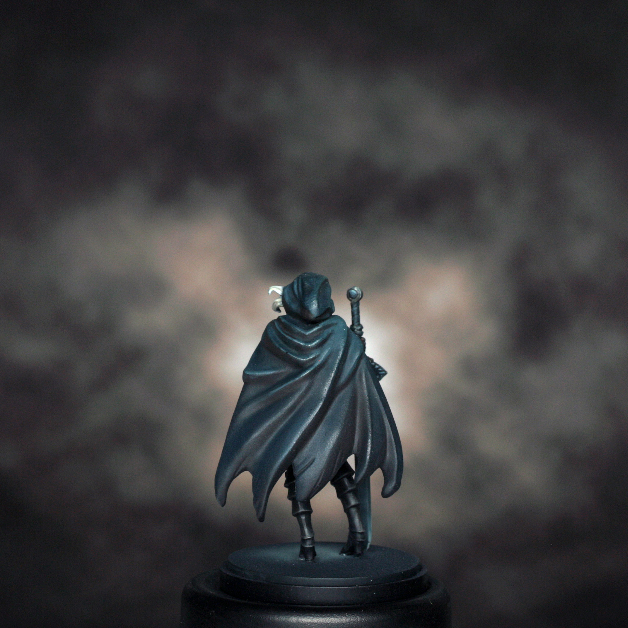
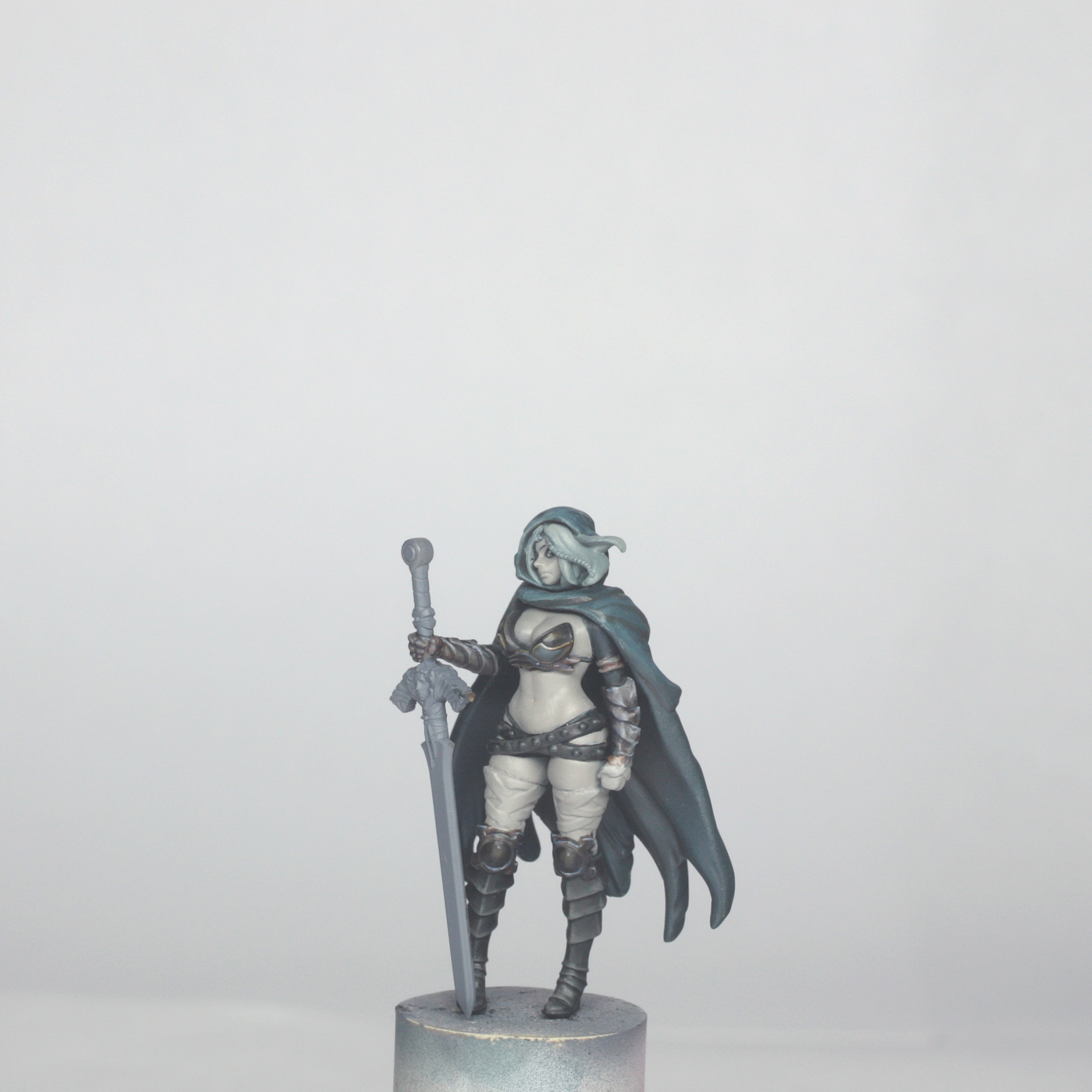
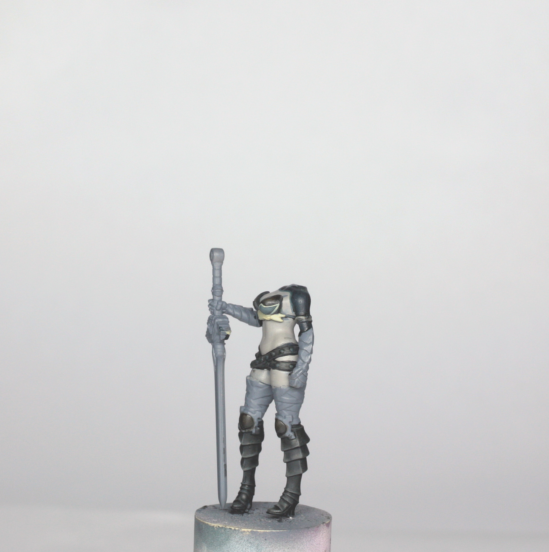
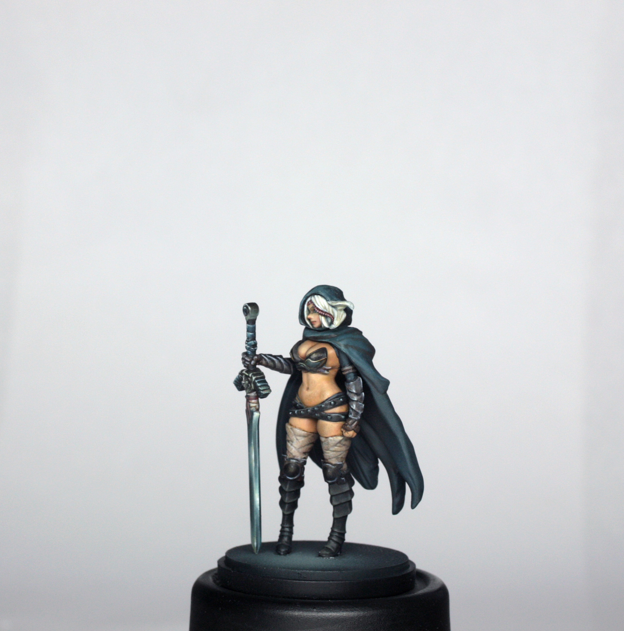
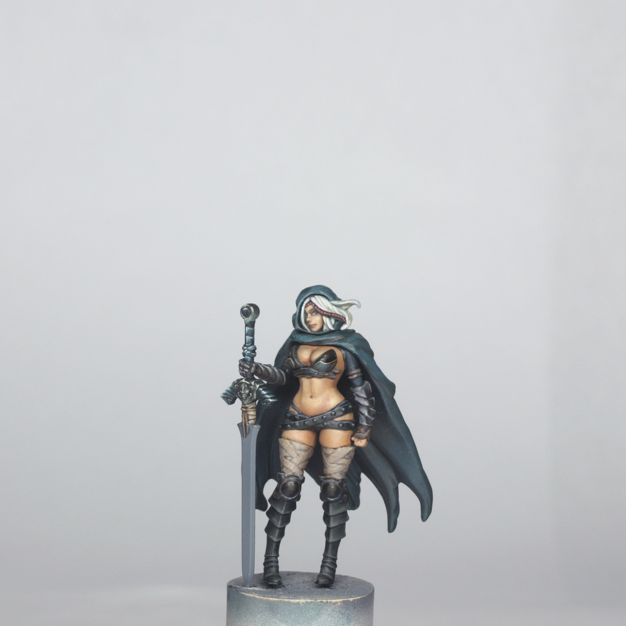
This new plastic model is the iconic Twilight Knight. It has had a few minor alterations to the resin version, namely the cloak now has more folds and some more movement too, and the original sword from the concept has been changed for the “official” Twilight sword.
I clipped the model parts off of the sprue and popped them into a little box (see previous guide about losing bits!!). Each part was then trimmed with a knife to remove mould lines, and lightly sanded with some fine sandpaper/manicuring board. The feet were then drilled to accept a 0.5mm pin in order to allow easier fixing to the base later. I also drilled and pinned the neck so that I could paint the cloak separately and access all parts of the model before final assembly. I also found that once the cloak was in position and the head pinned in place that there was a small gap around the back of the neck. I fixed this by first gluing (plastic glue) the cloak and hood together in the correct position, and then once dry I filled the gap with a small amount of Milliput
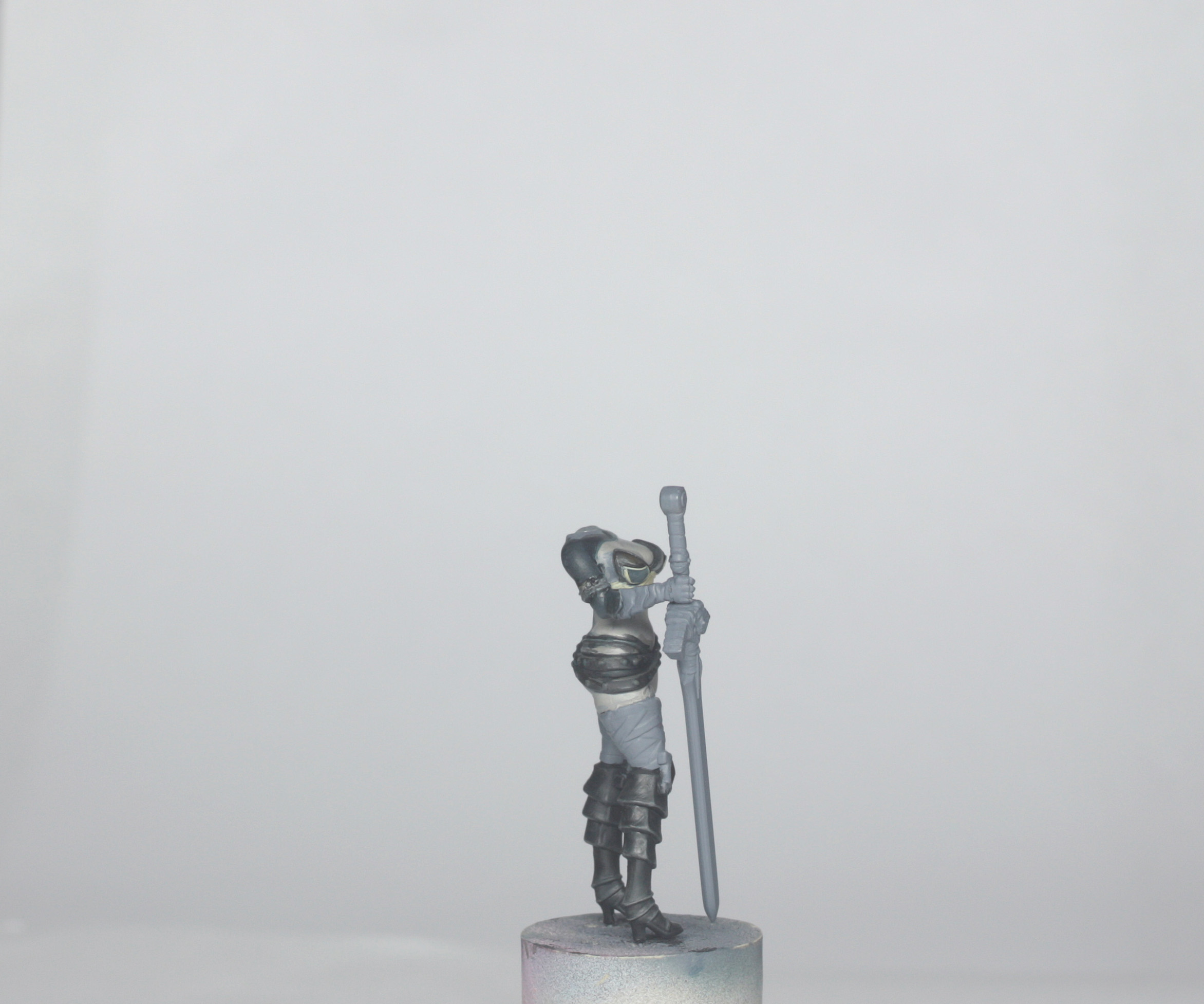
With the assembly ready for painting, I then built the rest of the model and inserted a pin into the neck, ready to paint entirely separately, as mentioned above.
I airbrushed on a grey primer (just like the previous models), but didn’t do the deck tan pre-shade this time, for reasons that will become apparent later – but essentially it is because the majority of the model is very dark, and I want to make it easier to paint like that.
Colour Scheme
We are working to the concept art again for the Twilight Knight. The cloak is a cool green/blue with warmer shadows, as are the boots, belts, bikini and sleeves; there are some dark golden browns to the knee pads, piping to the bikini, and wrist straps; the skin is pale and creamy, and then there is the pale grey colour of the bandages on her legs and her hair; the sword is metallic green and blue, though I worked it slightly differently to the concept as the sword itself is very different now.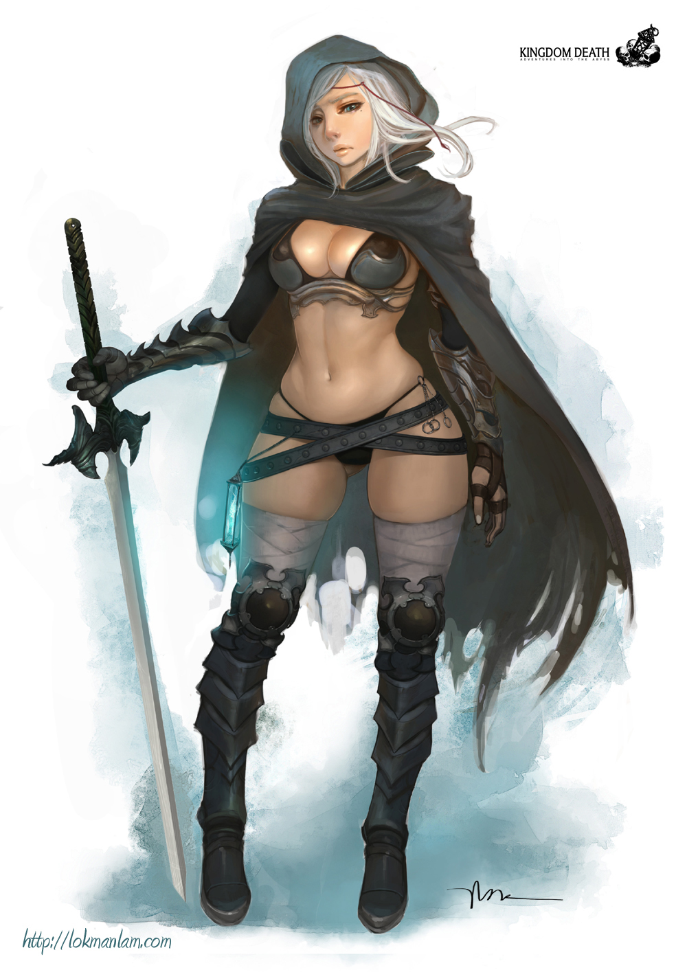
Painting Preface
I will mention GLAZING a lot throughout the article. Generally my glazes are around 1 part paint to about 4 or 5 parts water, and often with a drop of glaze medium to keep the blends smooth. Stronger colours are generally MORE dilute in glazing, weaker colours LESS dilute. You can read more about glazes in the Architect guide.
I also mention SPRAYING with my airbrush. You will have your own feel for dilution of paint if you have an airbrush, but I tend to work around 1 part colour to 2 parts water and 2 parts thinner. Just like normal brushing, it is always better to have 2 or 3 thin coats to cover nicely than 1 thick coat, and you are less likely to clog your airbrush!
If you don’t have an airbrush, just brush on as usual. The airbrush just helps to speed up some of the less enjoyable base coating…
Painting the Base
The base was painted in exactly the same fashion as the Architect, Forsaker and Preacher models, with a point of light slightly in front of her feet. The lightest point was sprayed with deck tan, shading done by successive thinned sprays of sea blue and then Nato black around the edges. The outer rim was just painted in black.
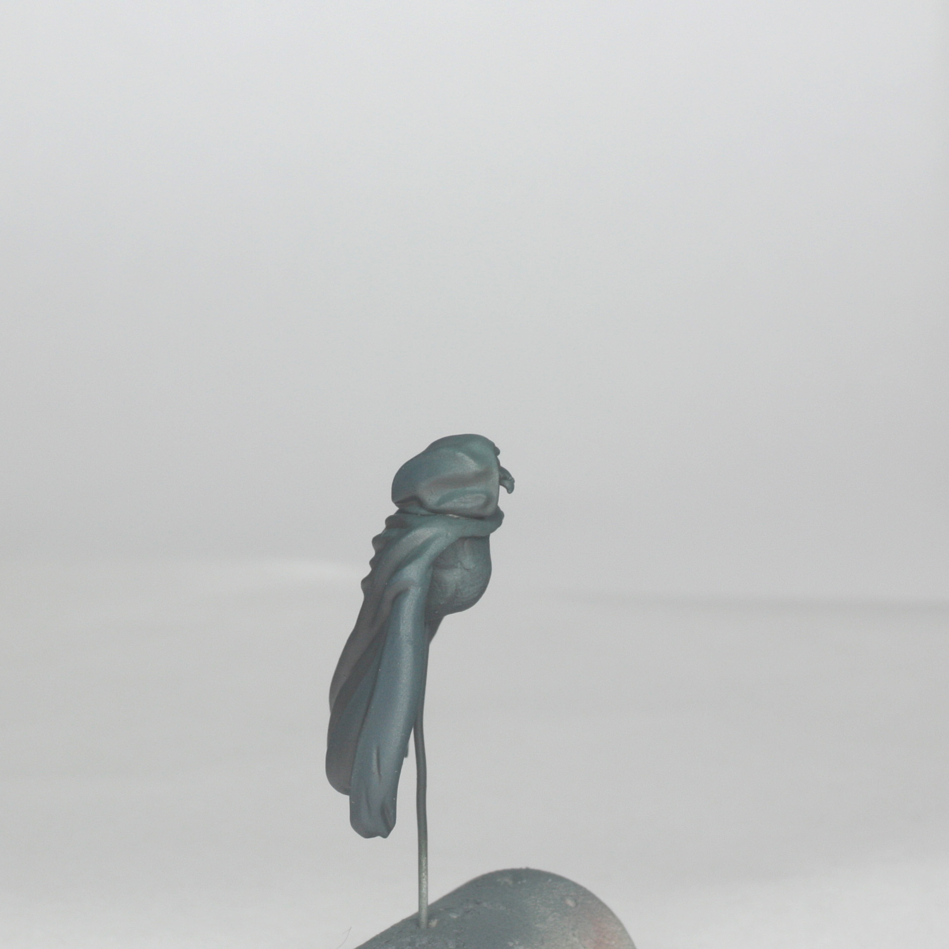
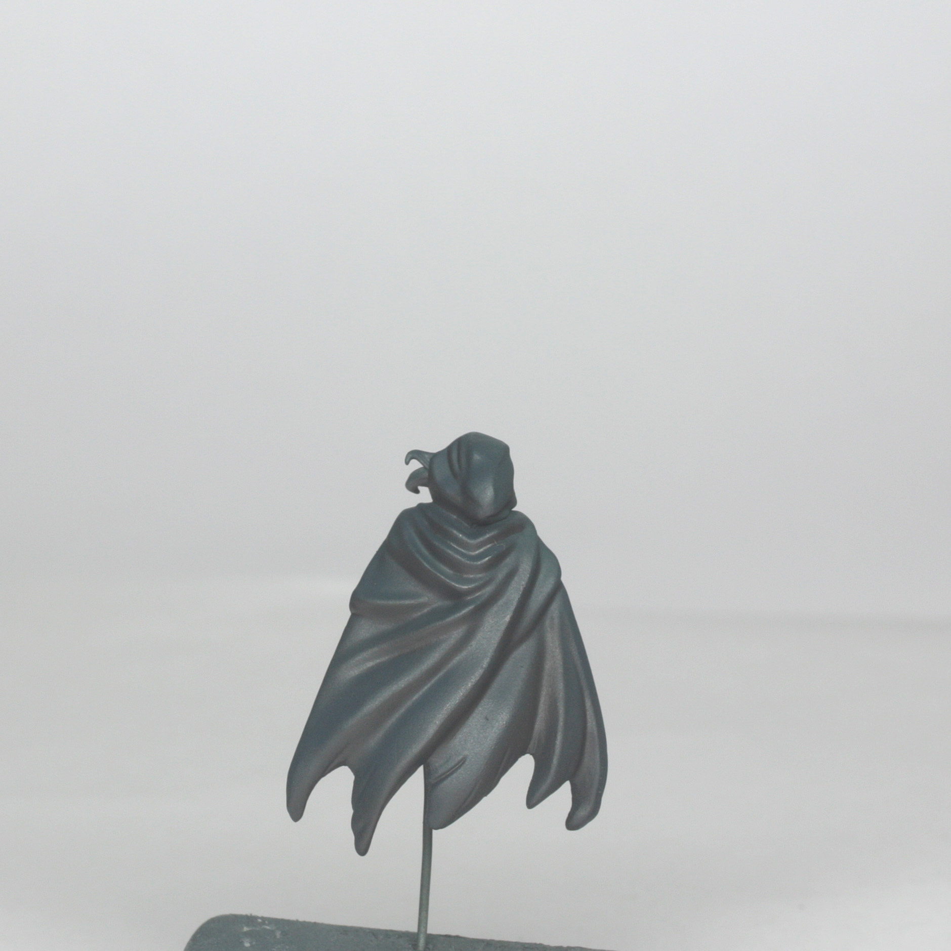
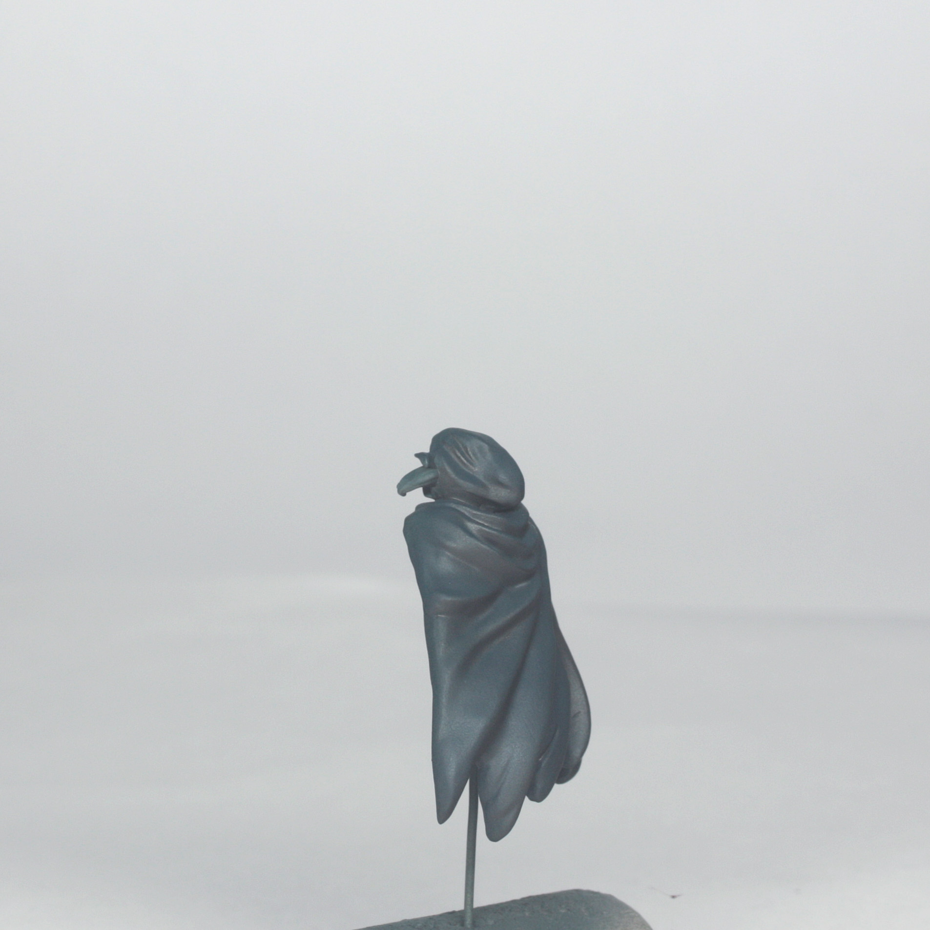
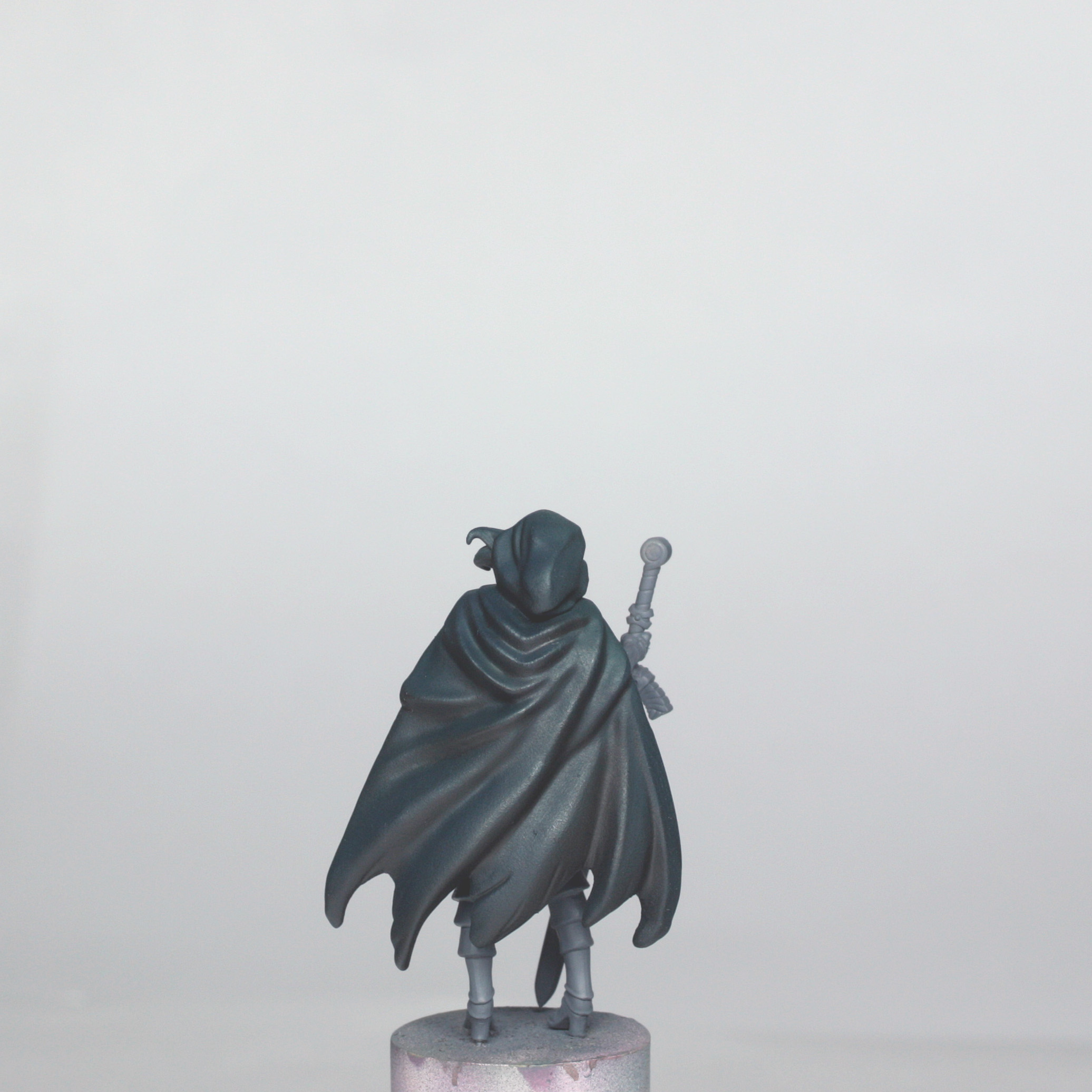
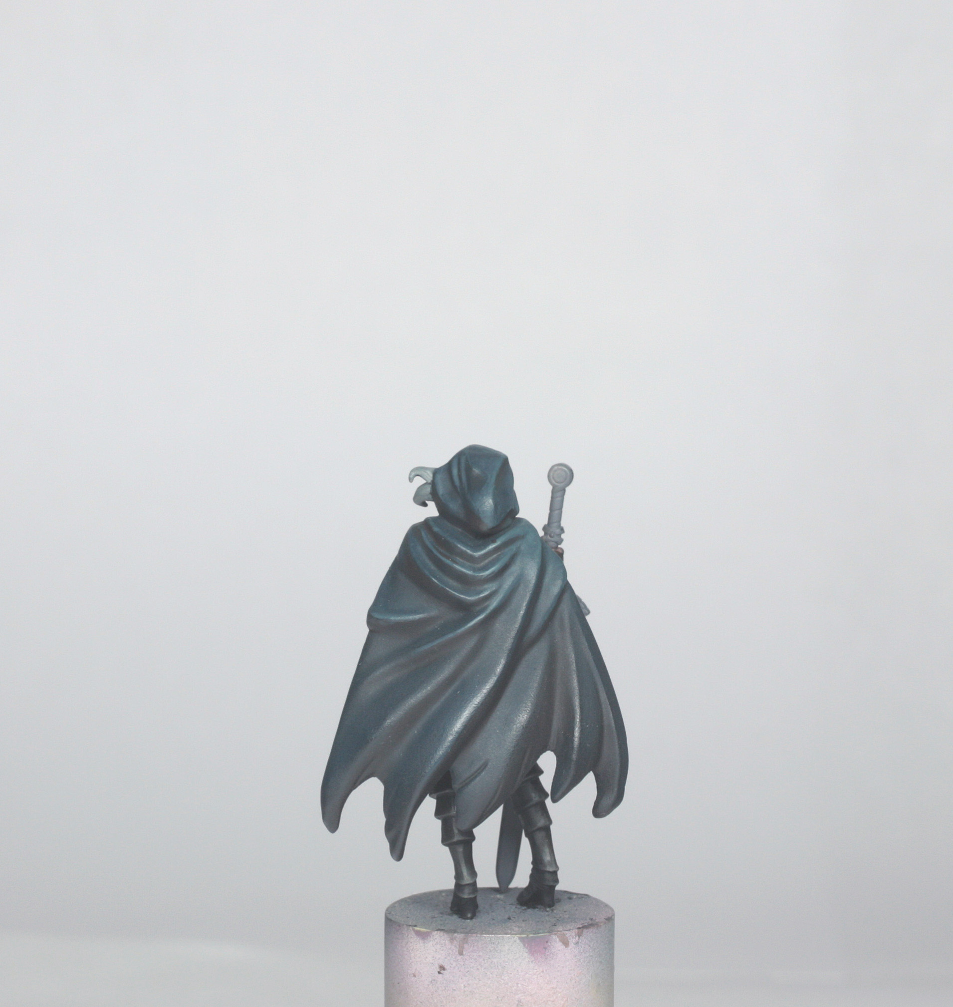
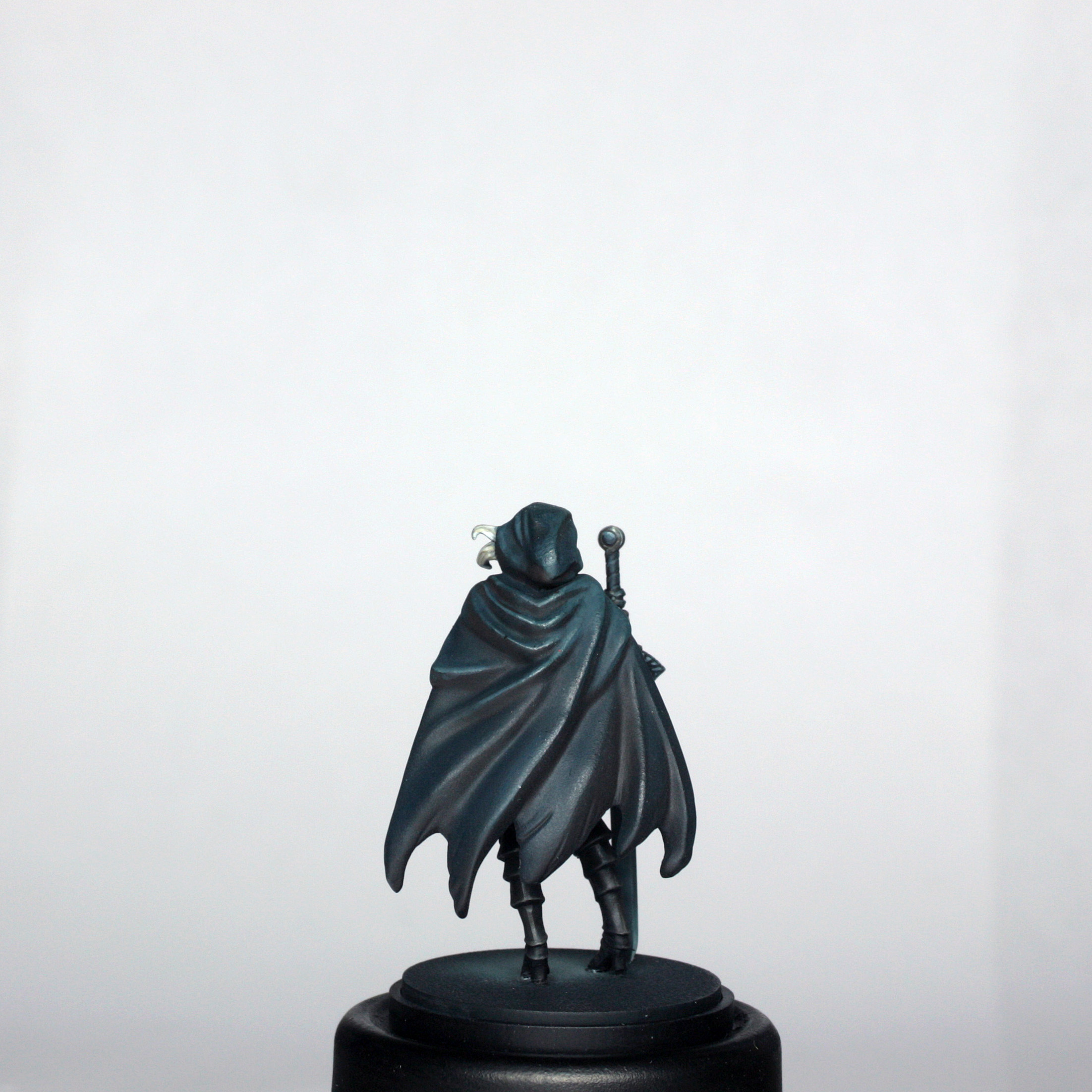
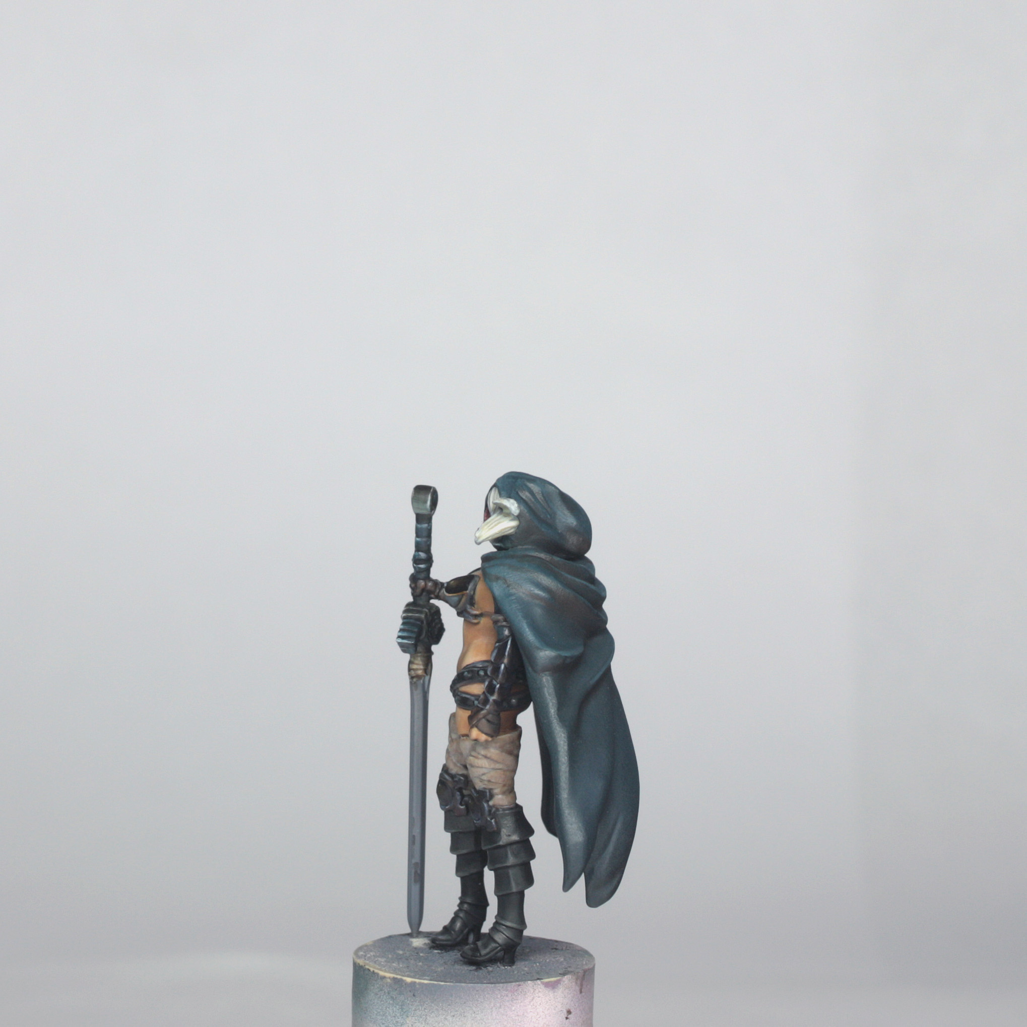
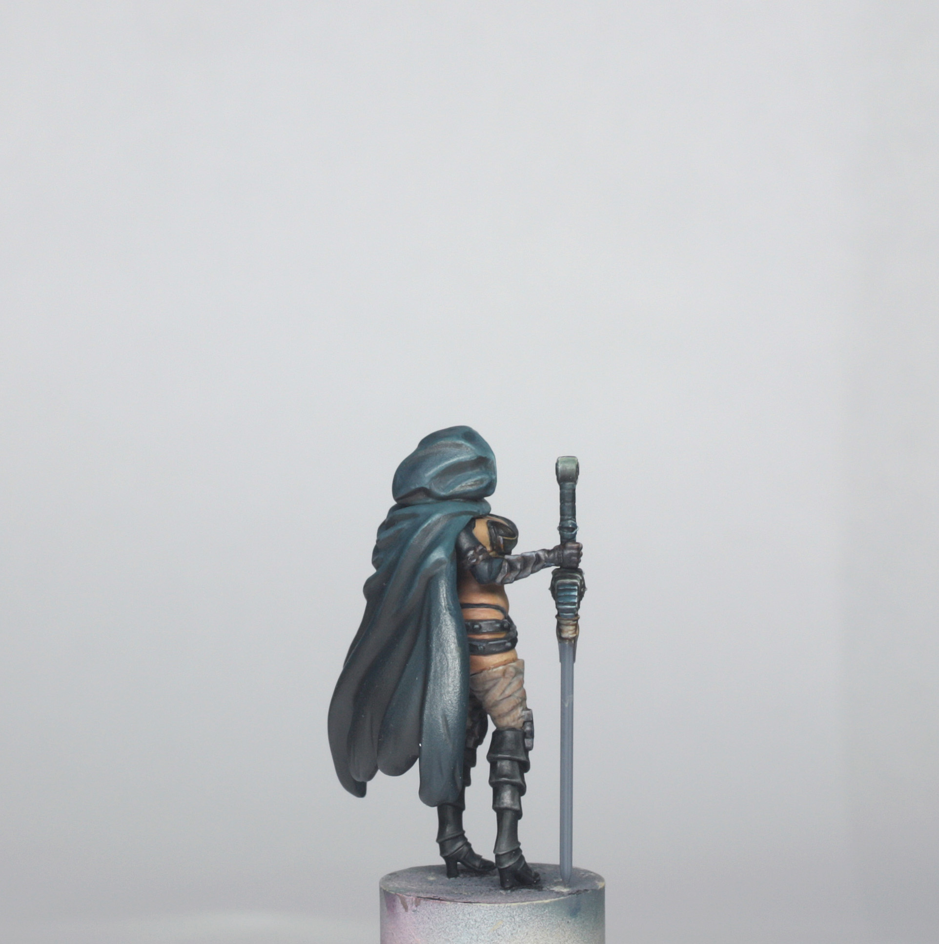
Painting the Cloak
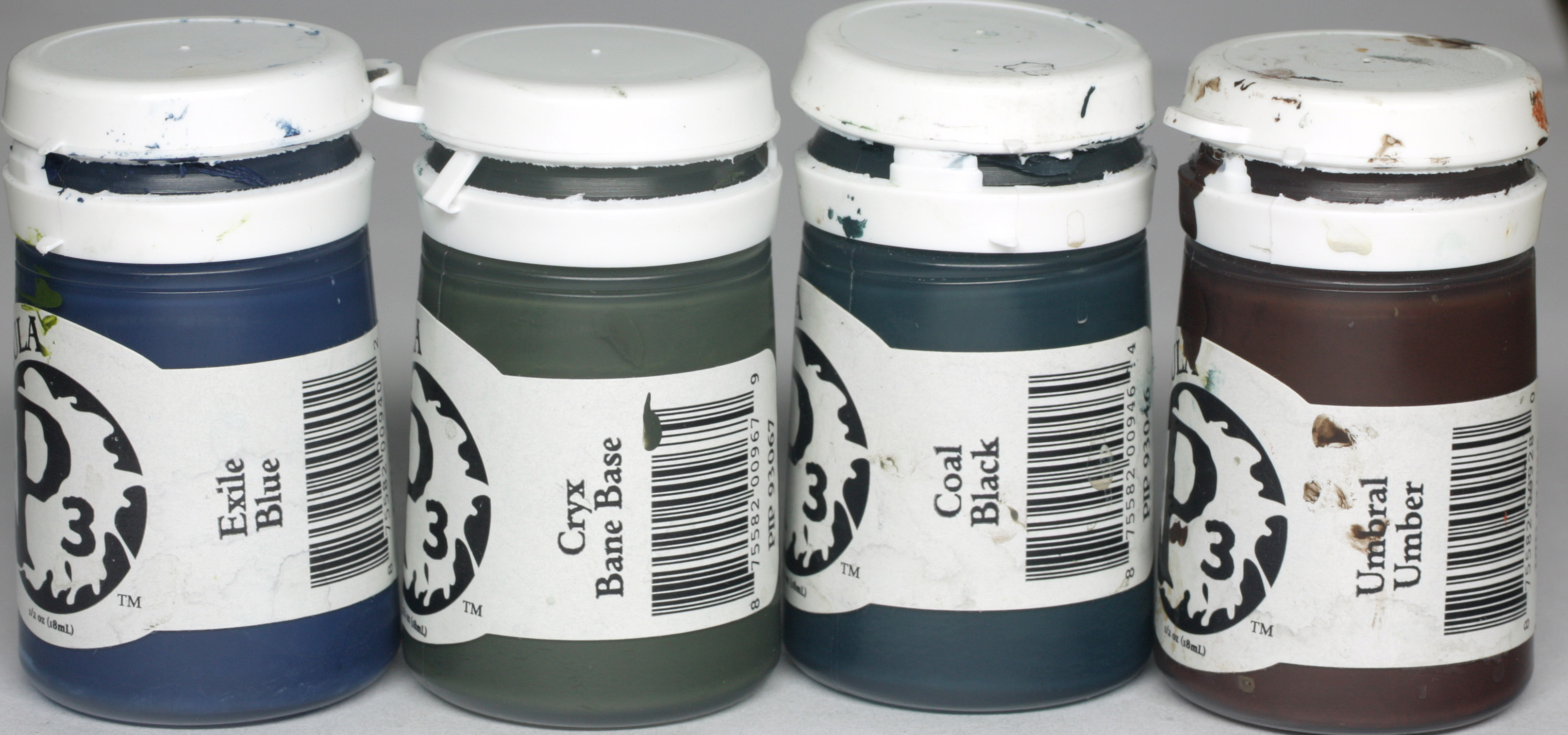
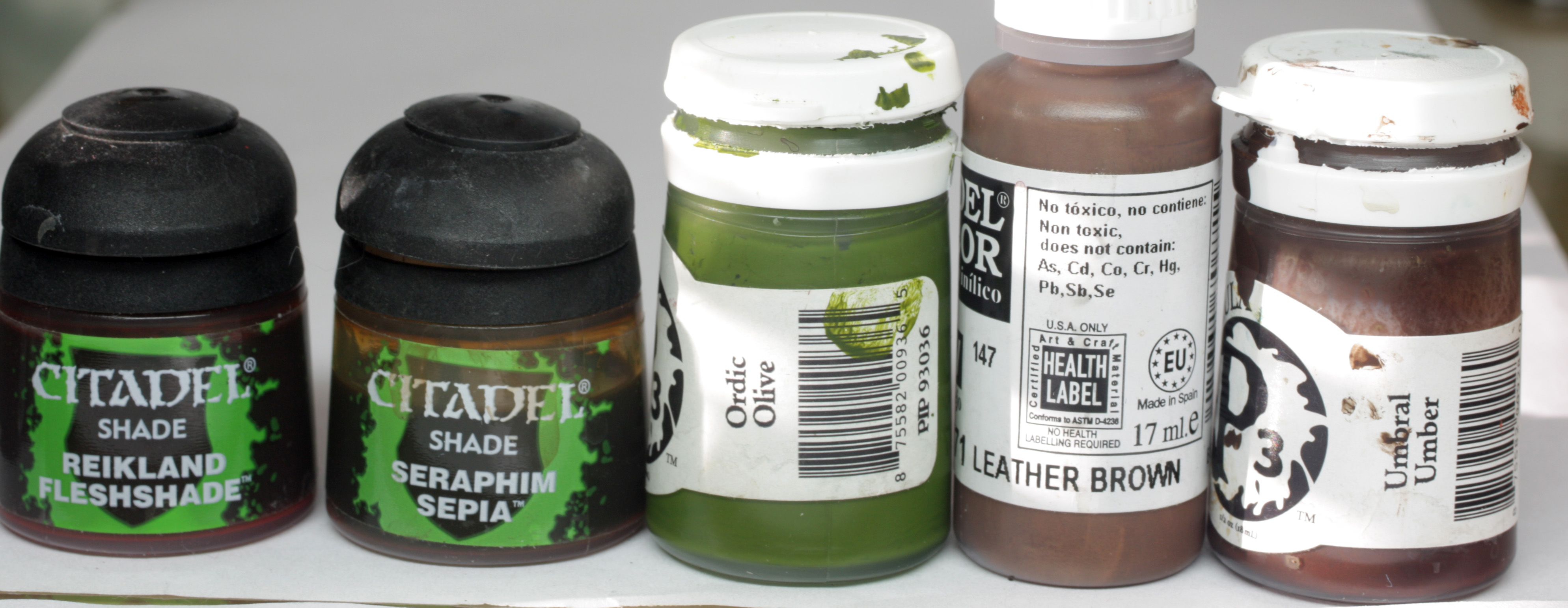
The colours used for the cloak are shown below…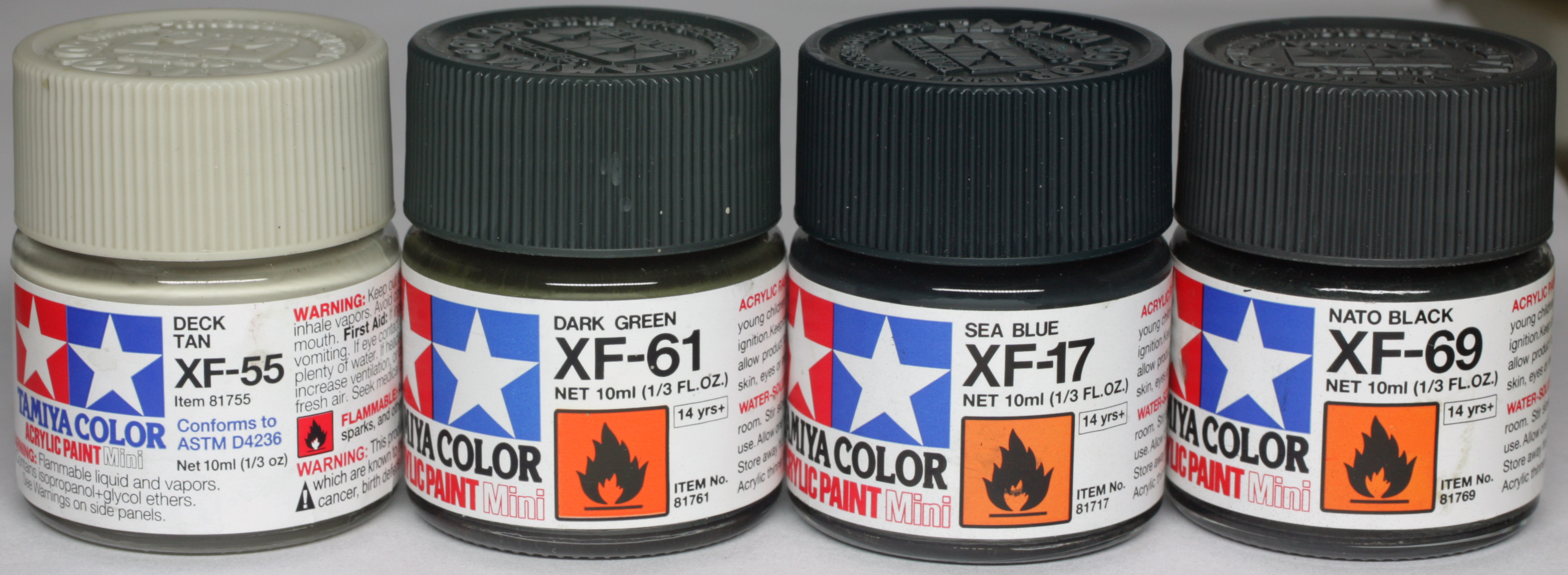
First of all, I airbrushed the whole cloak with a mix of the dark green and sea blue in the first photo. To this mix I added a little deck tan and sprayed the upper surfaces of the hood, cloak and folds, with the emphasis of the light effect falling on the left of the hood (as you look at it), and that same shoulder.
Then I turned the cloak upside down and sprayed the underside of the folds, and all of the inside of the cloak with Nato black and a hint of the green and blue mix.
When the airbrushing was complete, the highlights were too bright, but this was intentional (sorry, I don’t have photos for this, but I shall explain…), as this brightness was used to allow me to glaze in tones to the cloak to add interest.
The first bit of painting that I did with a brush was to make up a glaze of coal black and umbral umber, which I painted into all of the undersides of the folds, increasing the depth of the shadows where I had already airbrushed, but also getting to the areas around the neckline that the airbrush could not reach. Once I was happy with the shading I could bring everything together with glazes.
The “lighter” glaze that I made up first was a mix of Cryx bane base and exile blue – roughly 2:1 of Cryx to Blue – which I made nice and thin. I then painted all of the upper surfaces of the cloak in several thin coats until I had a nice consistent look. I then increased the depth in some of the folds as they went into shadow, and to the lower sections by adding some coal black first to the glaze mix, and then a bit of umbral umber. The inside of the cloak had a little highlighting added by using the first glaze mix on any forward facing surfaces that would be visible once the model was fully assembled.
That was essentially all that was needed for the cloak, as it isn’t a reflective material, so additional edge highlighting would make the material look wrong.
At this stage, I very quickly placed some P3 Trollblood highlight over the face and the body where skin would be visible once the model was built. This was just so that I didn’t waste my time blending areas that would never be visible, and certainly not accessible, once the model is completely built.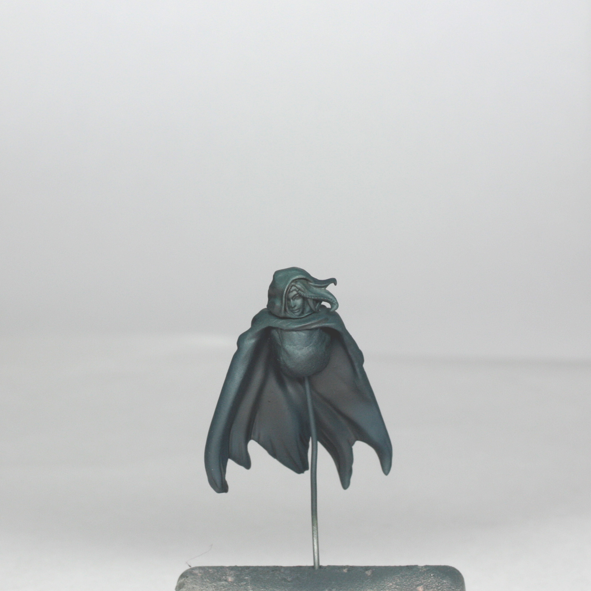
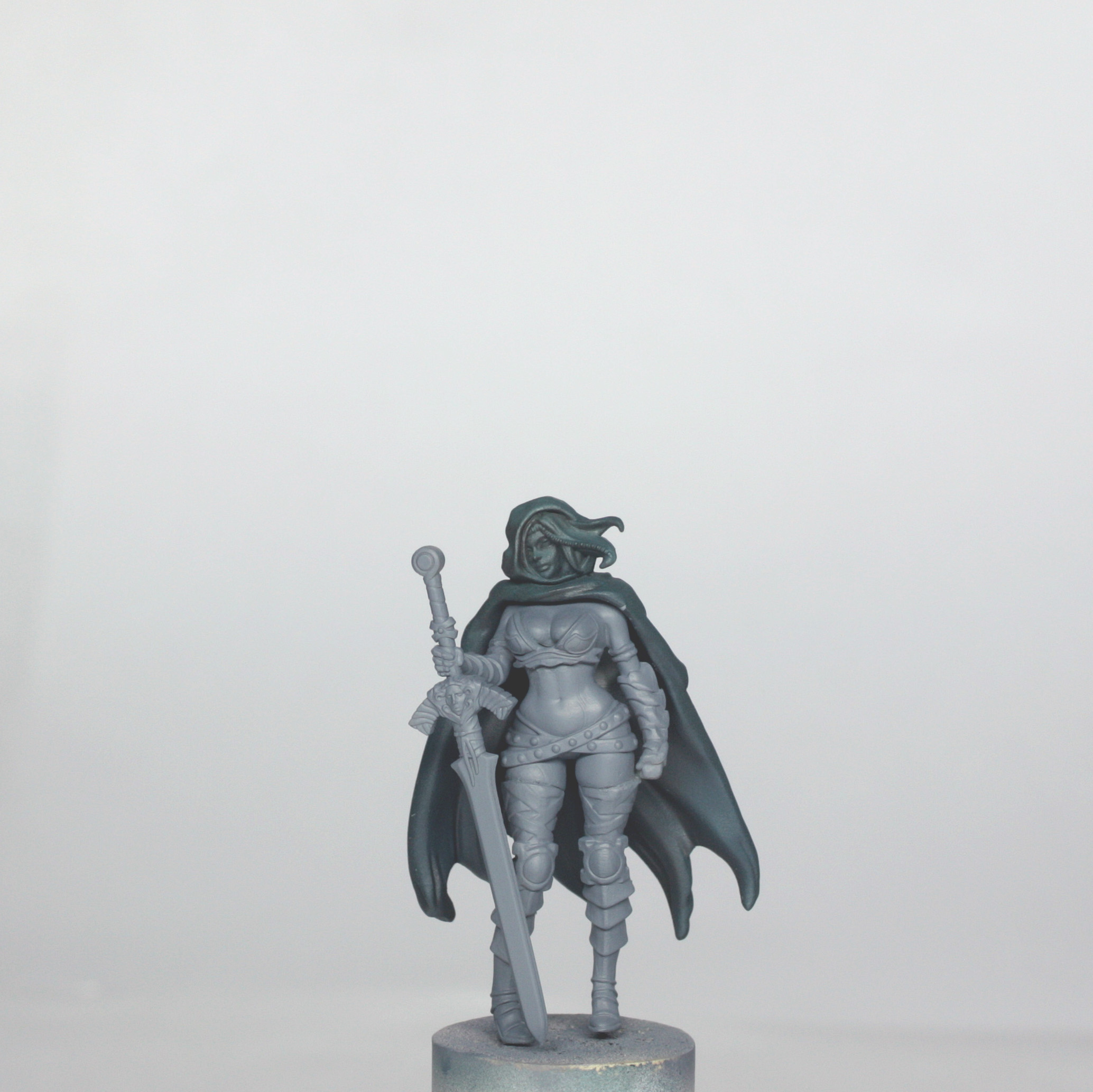
Painting the Boots, Bikini, Belts and Sleeves
These were all quite quick things to work on, which were more about careful, neat painting and less about clever colours, as such. I have mentioned previously that I prefer to paint dark and difficult to access areas before lighter areas, as fixing them is easier than fixing large areas of skin if I splash paint in the wrong places later.
The boots were the largest parts here to work on and the colours used are below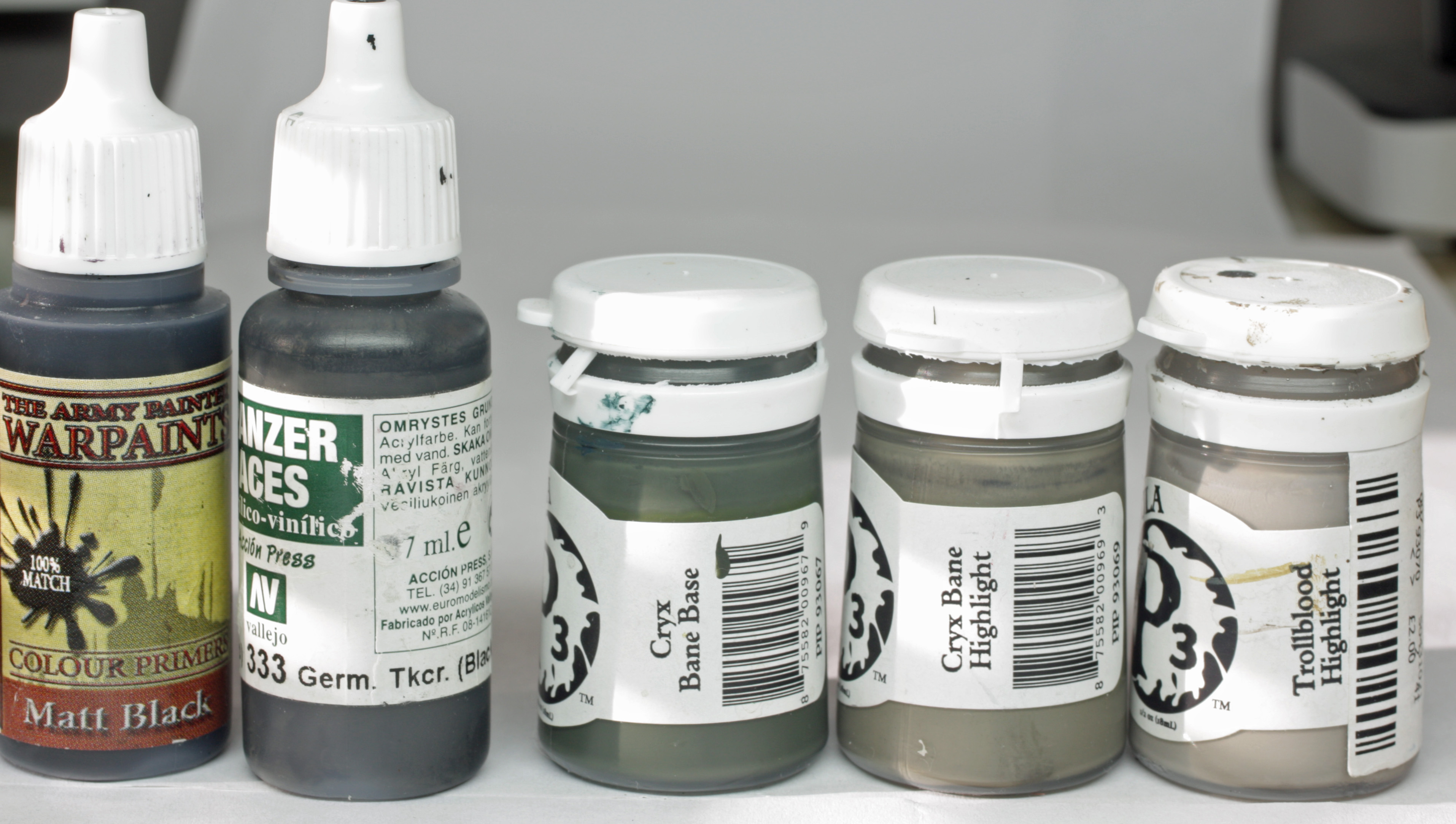
The base colour was a mix of the VMC German Tank Crew “Black” (A very dark grey brown) and Cryx Bane Base, which I painted over the whole of the boots. I then shaded with a glaze of the Tank crew black and then with pure black in the folds of the boots and where they meet the knee pads above.
Highlighting was done by concentrating on the front and outer sides of each boot. First I glazed pure cryx bane base, then pure cryx bane highlight, fine edge highlights of trollblood highlight and then a VERY thin glaze over all of the highlights with cryx bane base, making sure that I used a well blotted brush and working from light to dark so that I didn’t get any pooling against the edges of the details.
The arm greaves were also painted using the same colours and same process. The only difference was that there were some slightly larger areas of highlighting, as the final look would make them look like a kind of dark metal.
The bikini thong was painted using the same colours as above too, but the fact that they are so small meant that it was essentially base colour, careful shade to under sides of the string, quick highlight of string on the hip and done.
The bikini bra was painted in two tones, with some golden brown piping. The darker part was painted using the colours below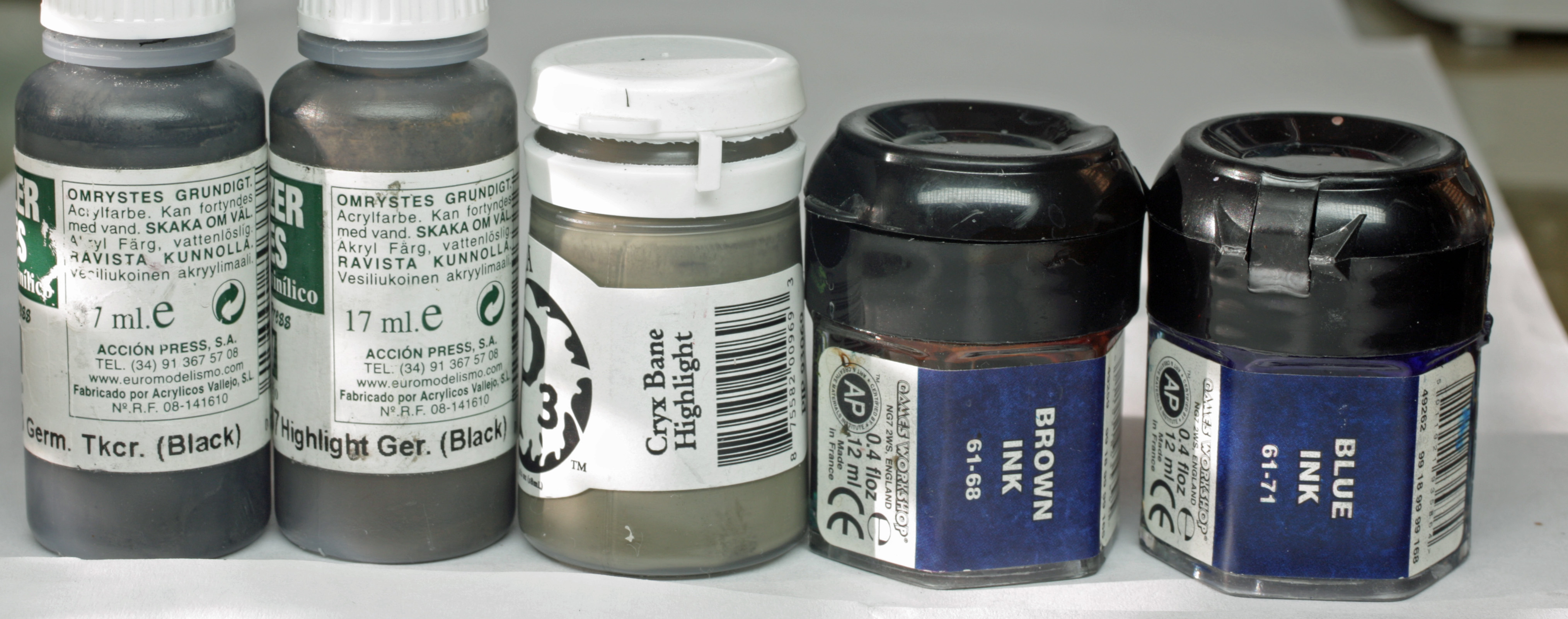
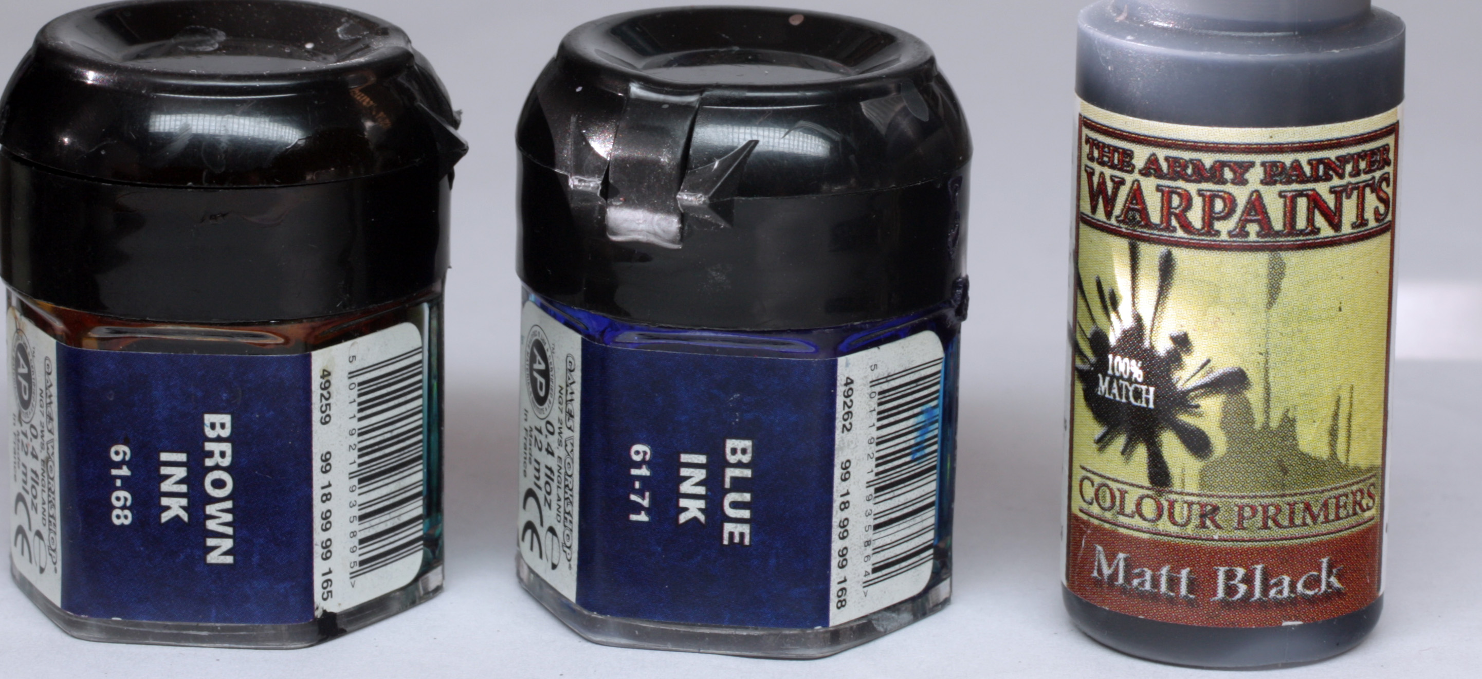
The base colour was a mix of the VMC German Tank Crew “Black” and VMC German tank crew “highlight”, which was quickly shaded with pure tank crew black. The edges and highlight spots were highlighted with cryx bane highlight. Next I wanted to get some real depth into the overall colour of the bra, both to emphasise the difference between the darker section and lighter section, but also to distinguish the look of the material of the bra from the boots and the other dark parts of the model (of which there are many…). So, I took some brown ink and diluted it, and then painted the whole of the dark section of the bra in about 3 layers. Once fully dry, I then used some diluted blue ink and painted this into the shades and against the edges of the details to give a deep black look, while the lighter part had quite a rich brown over the colours already painted underneath.
The knee pads were painted in exactly the same way as this part of the bra too.
The belts were painted with the same base colours and highlights as the knee pads and bra too, but I used first coal black and then brown ink to shade. The studs of the belts were dotted in carefully using a mix of coal black and cryx highlight.
Once all of these areas were done, I decided to add a little more sharpening and deepening of the shades to the boots and arm greaves, so I added some GW agrax earthshade, and then some brown ink to the darker parts. I avoided the blue ink so as to not look the same as the bra.
The blue part of the bra was painted using the following colours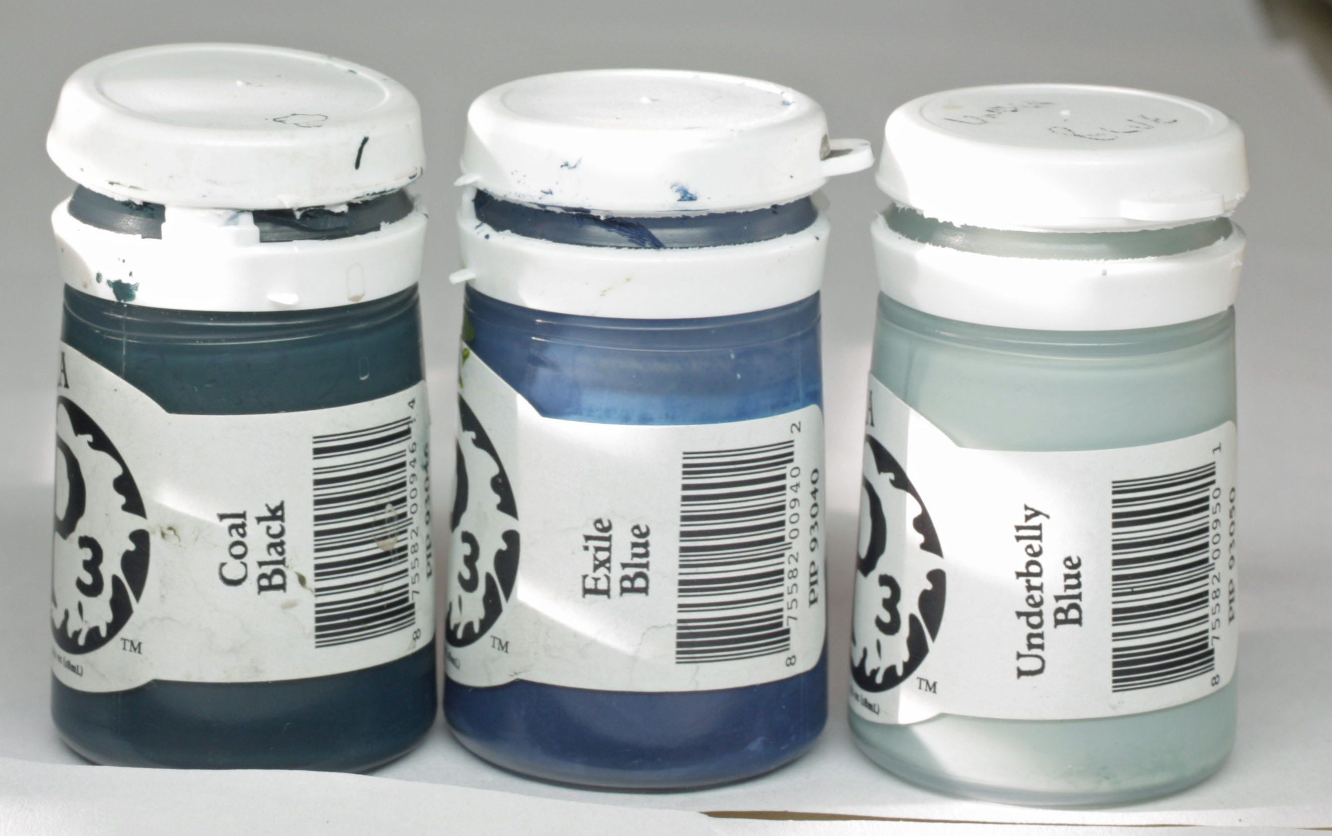
The base colour was a mix of all three paints, then I highlighted with additional Underbelly blue. After this I glazed very thin pure exile blue over the whole area before shading the underside with pure coal black. Done.
The piping of the bra and the bands around her arms was painted using the following colours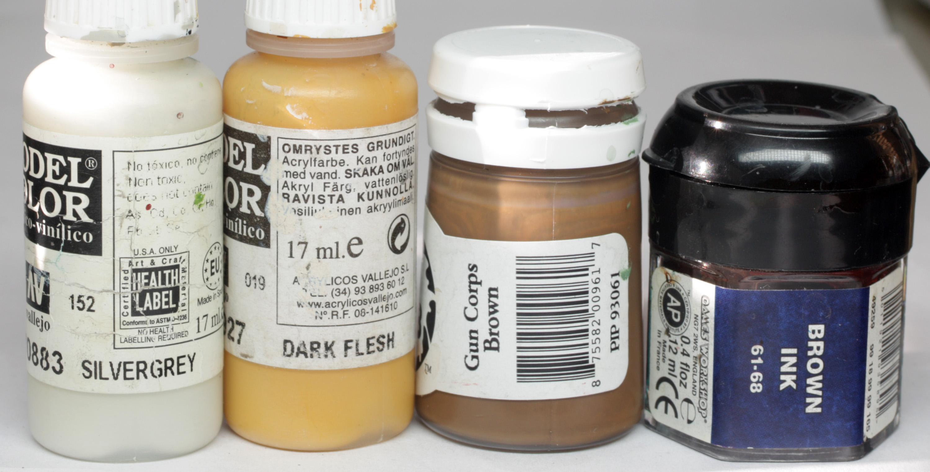
A base mix of equal parts VMC silvergrey and VMC dark flesh was painted all over the bands and piping. A thin glaze of P3 gun corps brown was then painted over all of the areas, with additional layers built up to the undersides, shaded parts and into the lines. Once dry I then continued to shade the darkest parts with diluted brown ink.
Final part for this section was to paint the sleeves on her upper arms. This was simply a base coat of P3 coal black, shaded with some GW agrax earthshade and highlighted with a touch of underbelly blue added to the coal black. This section is nearly invisible when the model is fully assembled, and not actually sculpted on the model, so I had to create a faux hem around the armpits and up across the top of the chest where is disappears under the cloak.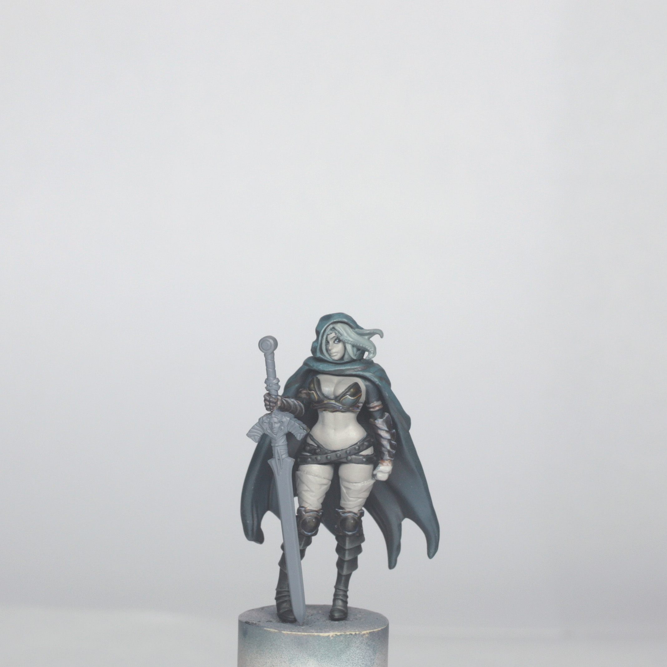
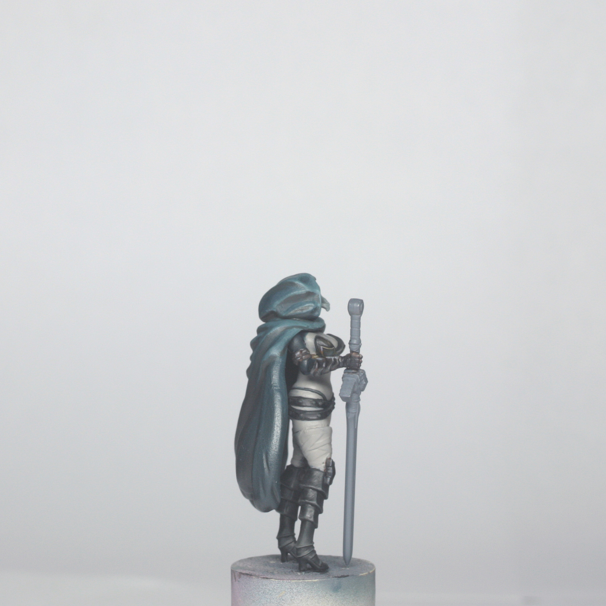
Just to note here, the cloak is not glued in place yet, just pushed into place to make more sense in the photos.
These are a couple of more WIP photos without the cloak to show where I was leaving sections and to show that where I made mistakes in painting the dark sections, I could just colour the basic tone back in to tidy up before actually painting that area…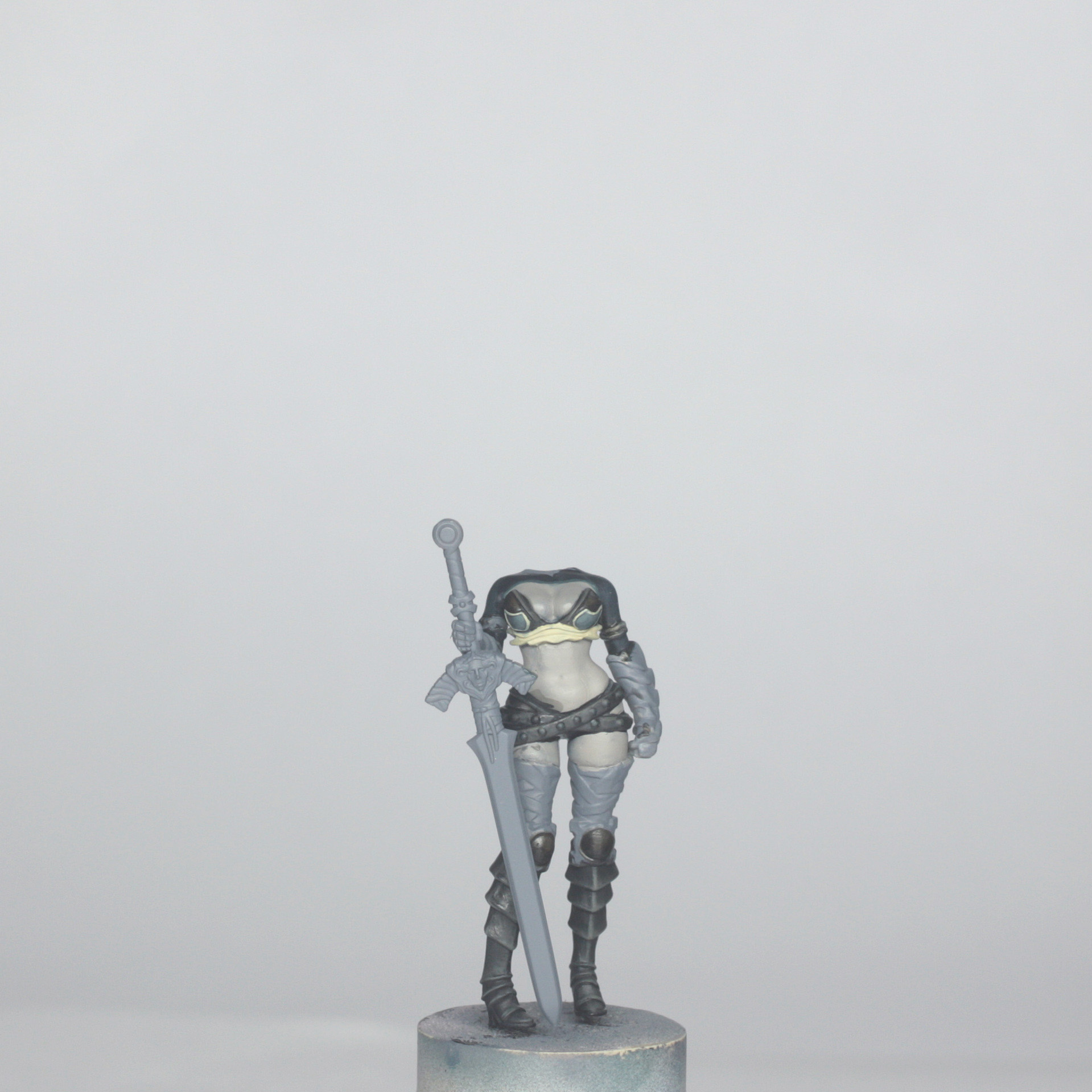
It shows that the odd loose brush stroke can easily be corrected. It also shows that I was hopping around from one area to the next at this stage without necessarily finishing one part before moving onto the next. It is fine to be quite rigid about working section by section, but I do find that I often come back to parts with colours used elsewhere and add extra tones, or additional edge highlighting as things progress.
(Remember, this is a painting guide, not an instruction manual! ^_^ )
Painting the Skin and Hair
The colours used for the skin are shown below…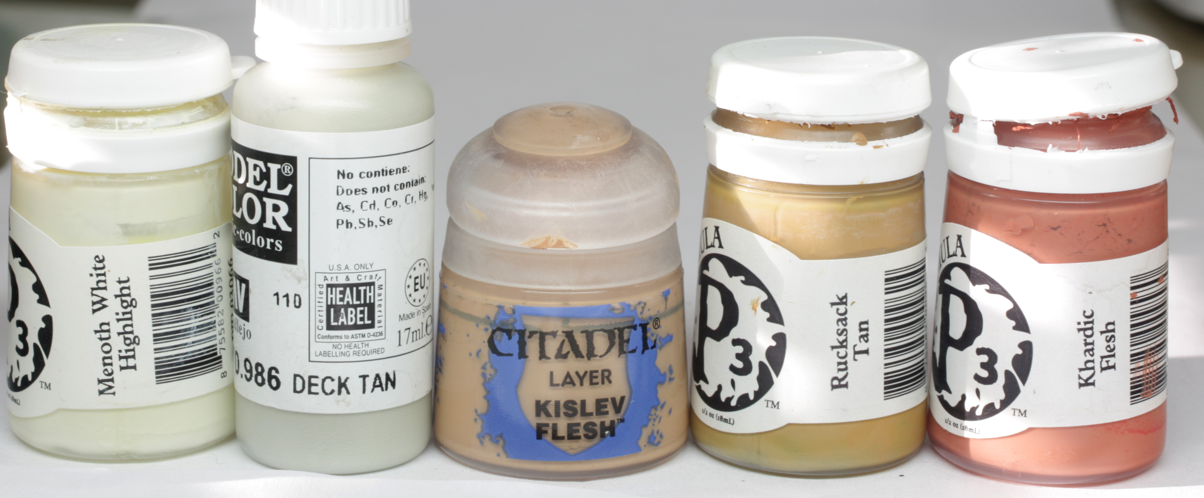
For her skin, I tried to try to keep this fairly low contrast to the front, and largely a kind of pale tan colour. The back, however, was a different matter, so I painted that very dark as it wouldn’t be visible on the finished model.
I used a 10 well palette for her skin, just like the Architect model and created a glaze mix of 1 part glaze medium, 1 part matt medium, 5 or 6 parts water and then I added the paints. The paints in the wells from light to dark were as follows:
Pure menoth highlight, pure deck tan, 50/50 deck tan and kislev flesh, pure kislev flesh, 50/50 kislev flesh and rucksack tan, pure rucksack tan, 50/50 rucksack and VMC leather brown, pure leather brown, 50/50 leather brown and umbral umber, and finally pure umbral umber.
I then decided to add a very small amount of khardic flesh to every paint well. The reason for this was that I felt that the skin was too yellow when I patch tested it, so it needed more “life” to it.
Once I had done this, I painted all of the visible skin areas with the 50/50 rucksack tan/kislev flesh mix in 3 or 4 thin coats, to get a nice even coverage.
Once dry, I started highlighting, working through the pure kislev and right up to the pure deck tan. This was only on the fronts of the thighs, prominent parts of her hips, stomach and boobs, plus her left hand. Once this was done, I quickly glazed some more of the pure kislev colour over the highlighted areas, but I diluted this glaze some more first, so that it was really thin, and just brought the layers together nicely.
There were two different types of shading done to the skin. On the visible areas this was much more subtle and just about enhancing the volume of her curves. However, the blend into the back was all about getting nice and dark, but without a sharp transition.
For the visible shading, I made up a thin glaze of Ordic Olive and used a touch of this with first the pure rucksack glaze, then again with the rucksack and leather brown mix. I had to be careful not to get too dark with this last shade, so I did have to glaze the base skin colour lightly over the top, and I also decided to make a very thin glaze of the khardic flesh which I added in to the shading of the underside of her boobs, into the armpits and the lower part of the stomach just above the belts.
As a final touch, I used the pure leather brown to VERY CAREFULLY dot in her belly button and to help define the cleavage and under the boobs.
Once I was happy with this I moved onto the transition to the back. For this I painted almost the whole shaded area with the pure umbral umber first, leaving a small gap to the visible skin in which to blend, I then glazed the leather brown/umber mix in to this section, followed by the pure leather brown and the leather brown/rucksack mix. The final blend was the pure rucksack mix, with a bit more khardic flesh added, which I glazed over the edge of the finished skin and the shaded skin to bring it together. This is something I usually do with zigzagging up and down strokes, using a very well blotted brush, while keeping a damp clean brush handy for tidying up any harsh transitions. It is kind of like 2 brush blending, but I would call it more 2 brush tidying! ^_^
Finally, I used the sepia and flesh shade washes in the shaded area to deepen the shadows and emphasise the crease under the buttocks. I did also use a mix of the washes to just edge shade the skin where it touched the leg bandages, bikini and belts.
The face was next. I painted in the eyes first by painting the whites with deck tan, then the pupils with black paint. I added mascara to the top also with black paint. Once happy with the shape, I dotted in some VMC andrea blue to the pupil and a highlight dot of andrea blue and p3 frostbite.
The actual face was painted with the same base colour, and highlighted the same too going right up to pure menoth highlight, with emphasis on the nose, forehead and cheekbones. I shaded with a mix of the base colour and some khardic flesh, to give it a slightly more pink tone, especially to the sides of the nose and the cheeks. Care needs to be taken not to make her look like a clown when making the cheeks pink though! Keep the paint thin and work up and down if necessary.
The lips were painted with pure khardic flesh and a small shade in the middle of flesh shade. The tiny mole on her cheek was done EXTREMELY carefully with a mix of flesh shade and black on my finest tipped large brush. I used a large brush so that the paint stayed wet on the brush without needing to dilute it further, but the brush was still well blotted. If you are attempting this I would suggest that you test it on your hand first, because it can be really frustrating to fix!
The edges of the hair where it touches the skin was then painted with a mix of trollblood highlight and flesh shade. I did it this way round because I didn’t want the flesh shade to bleed onto the face itself.
The little beaded hair band was painted also at this point. I base coloured it with P3 Skorne Red, then highlighted with a mix of skorne red and khardic flesh. I finally shaded it with flesh shade, to pick out the beads and separate it from the hair and face.
The colours used for the hair were as follows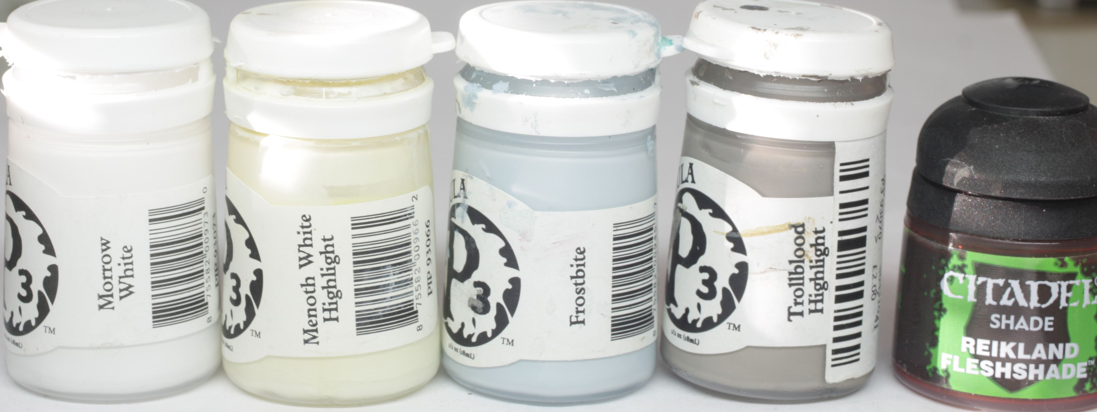
The hair was first painted all over with a mix of frostbite and trollblood highlight. Then I shaded it with pure trollblood highlight to the undersides of the hair and into the folds, then a mix of trollblood highlight and flesh shade in the deepest folds and where the hair comes into contact with the hood and face.
I highlighted first with a mix of menith highlight and frostbite, then thinner lines of pure menoth highlight. Final edge highlights were done with morrow white, mainly just to the front fringe though.
(You can see a couple of tiny loose dots of colour in the close up of the face. I fixed these later.)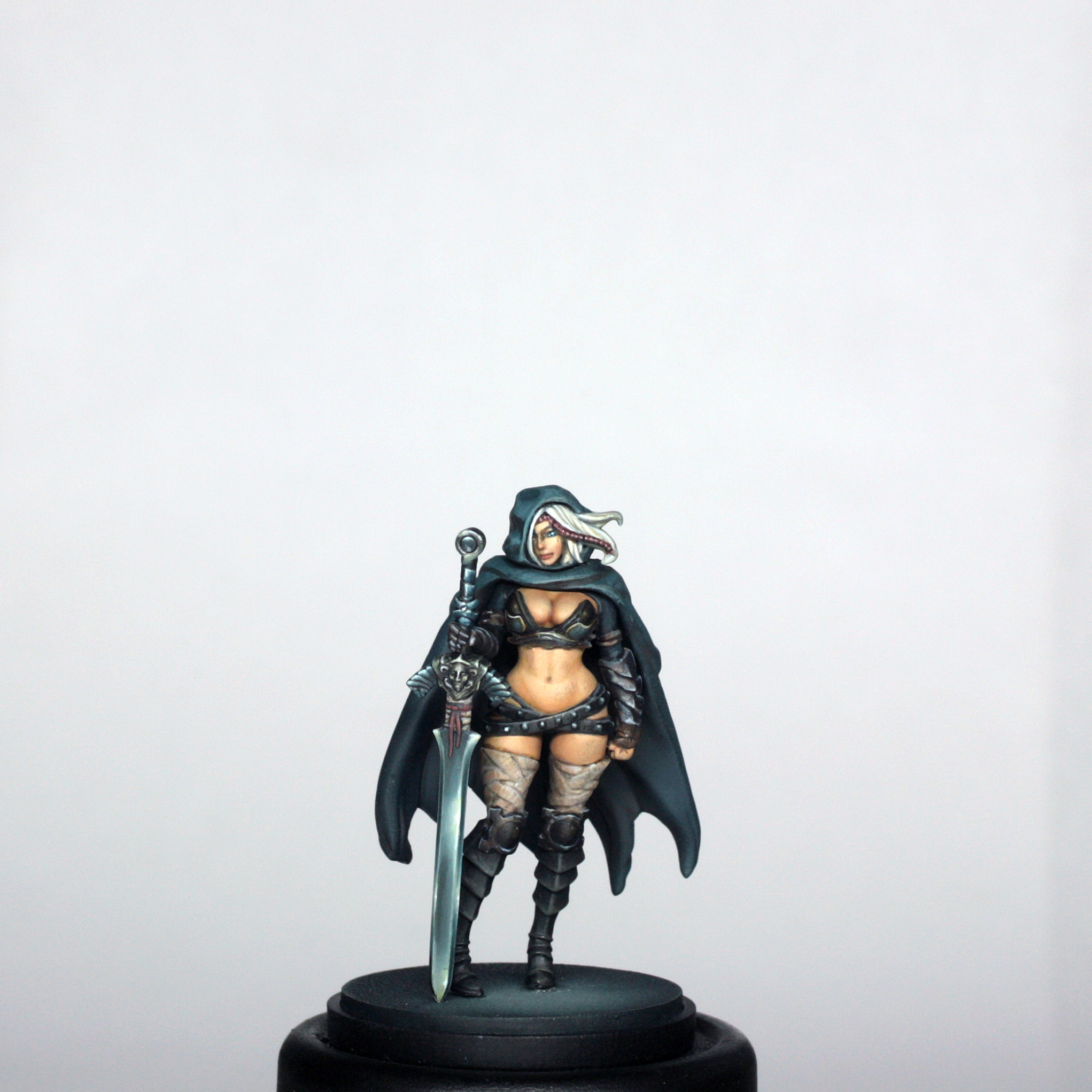
The Bandages
I don’t know if these should be called bandages, I guess that you could call them strapping, but they are wrapped all around her thighs, and there is some similar wrapping around the sword near the handle.
For these sections I used the following paints
I made up a base colour of 2:1 deck tan and leather brown, which I painted over all parts of the bandages. I then shaded everything with a wash of flesh shade before painting earth shade into all of the folds. I then re-established the base colour in thin glazes, concentrating on the front of the legs. I added final highlights to the front and top edges using pure deck tan that I thinned to a thick glaze.
Once this was done, I used the flesh shade and added lots of tiny thin lines to the bandages to give a textured look. I built these up a little in places with additional lines of earth shade, and that was the bandages complete.
It was important to keep the lines extremely thin and not use much of the flesh shade or earth shade as I wanted a texture effect, not candy stripes!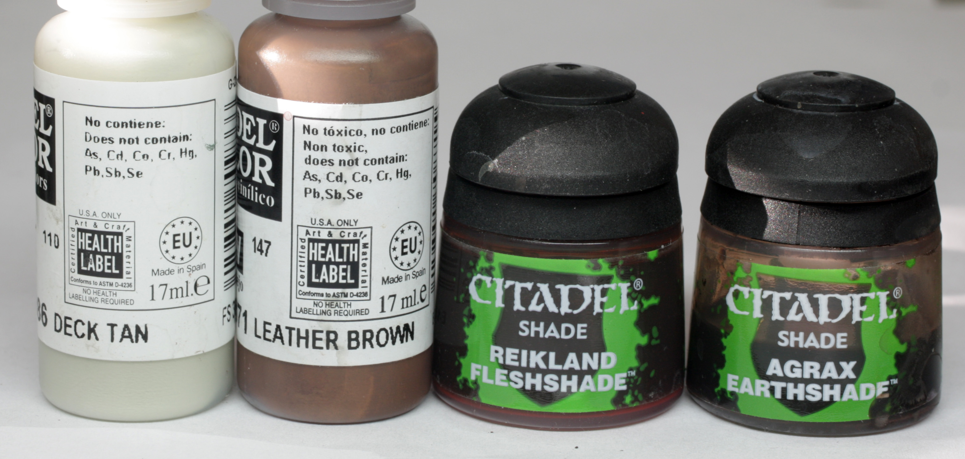
The Sword
The sword was essentially painted in two distinct parts, which was the hilt/handle/pommel and the blade. The blade was painted in a “blue” steel and the rest was either the same or in a kind of bronze colour.
The blue steel was painted using the following colours…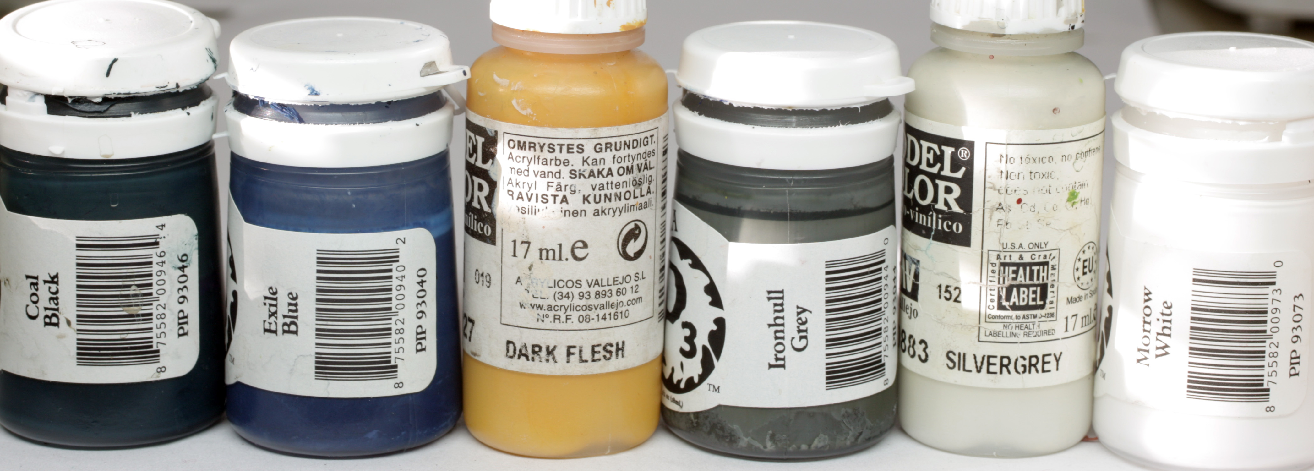
The bronze was painted with the following colours…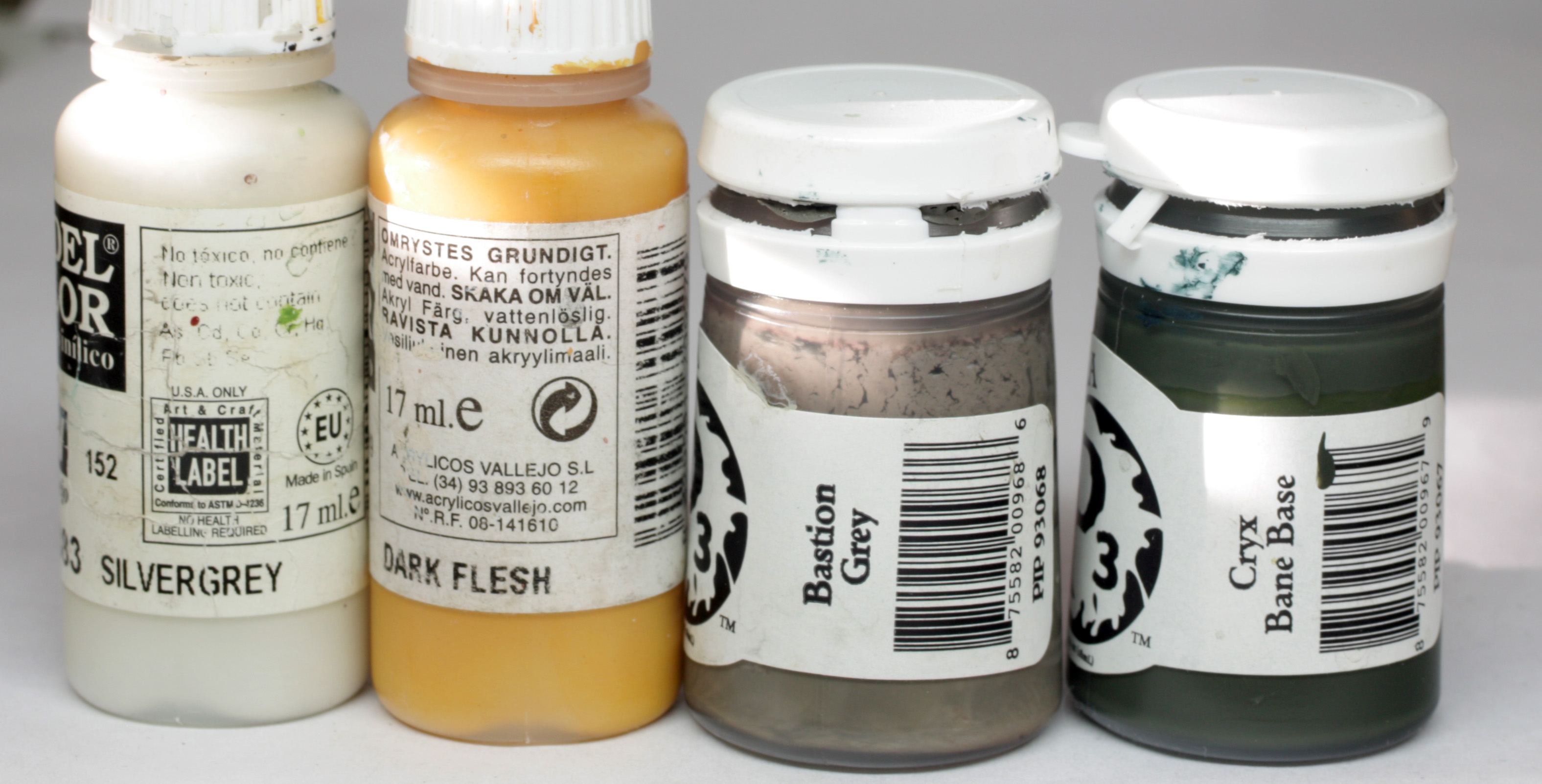
I had a little reference image for the Twilight sword, because this was different to the concept art, and I wanted to make a feature of the sword, seeing as it is iconic to the sculpt and kind of iconic to Kingdom Death too.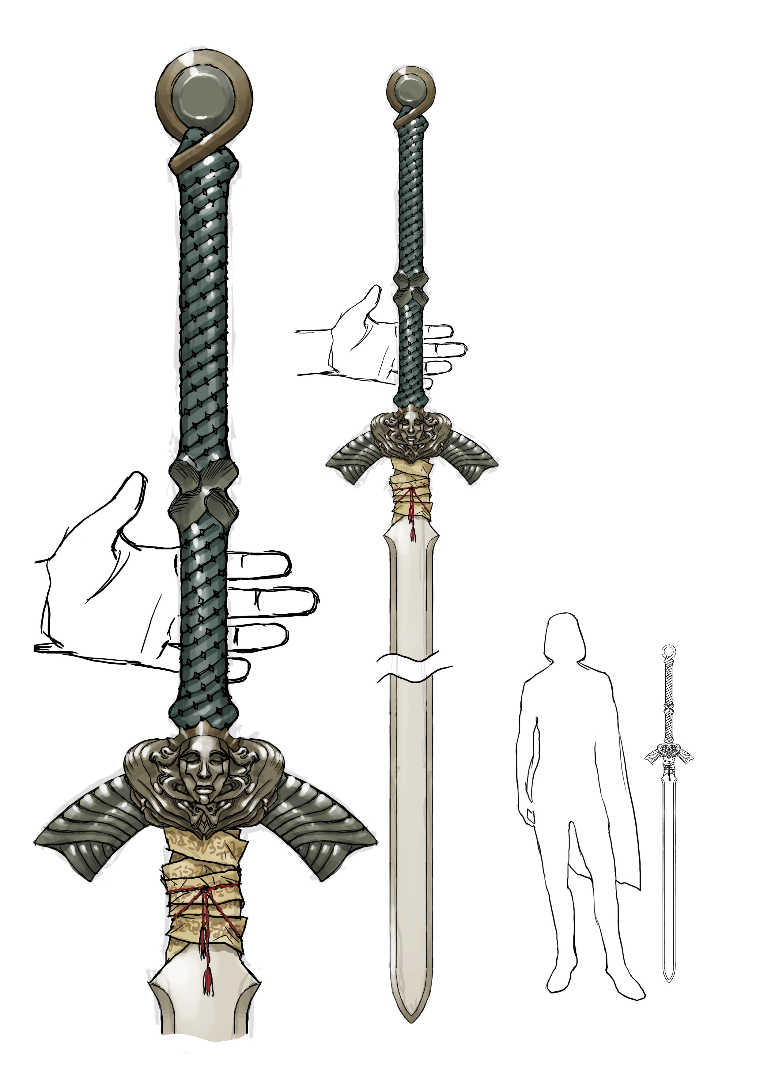
A particularly useful part of this image is the placement of reflections and specular highlights. So, I first painted the hilt part of the sword based on this image.
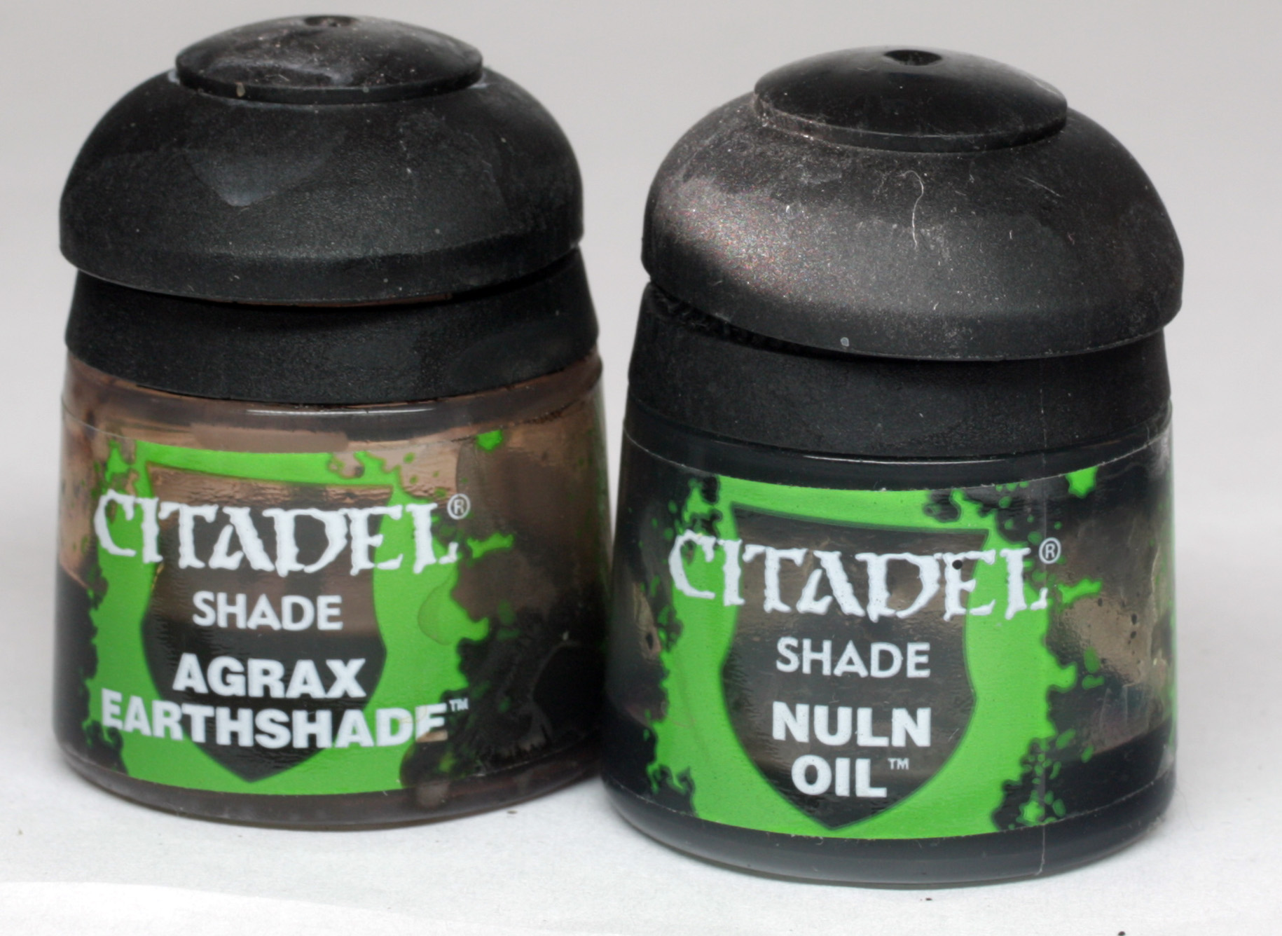
The base colour of the bronze parts was a mix of Cryx Base and Bastion Grey, highlighted with bastion grey, VMC dark flesh, silvergrey and then final edge highlights of white.
These are such tiny areas that any blending is near impossible, so just thinned successive tiny layers were used.
The creases were shaded then with first Agrax Earthshade then Nuln Oil.
The base for the steel was Ironhull grey mixed with a little Exile blue, then highlight of Ironhull with some VMC dark flesh, then dark flesh mixed with white, and finally pure white.
Shades of exile blue mixed with black, then a mix of blue and brown ink.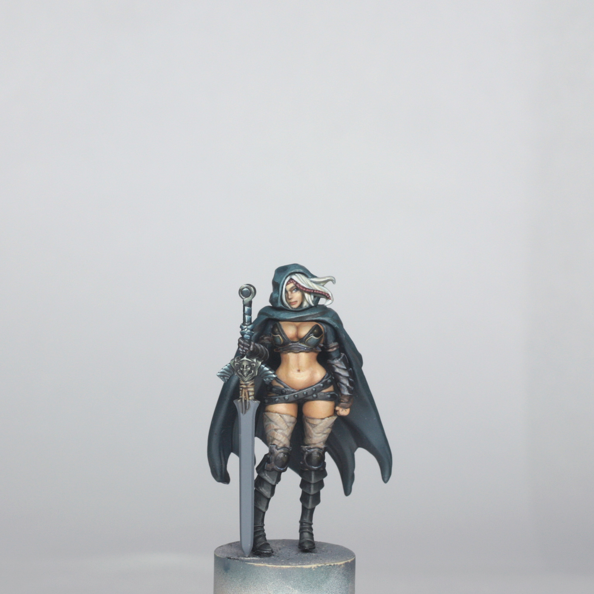
The blade was an exercise in patient blending and glazing. I painted the base colour of the blade in the same as the other steel parts and then I decided where I wanted the reflective points to be on the blade both on the front and on the back. I then slowly built these highlights up, right up to pure white. Once happy with these I reduced the highlight area a little with some really thin base colour, then shaded with more blue, then adding black, down to pure black. This black looks flat though, so again I added some more shading with the blue/brown ink.
I had to tweak the contrast back and forth until I was satisfied, and then the painting of the model was complete.
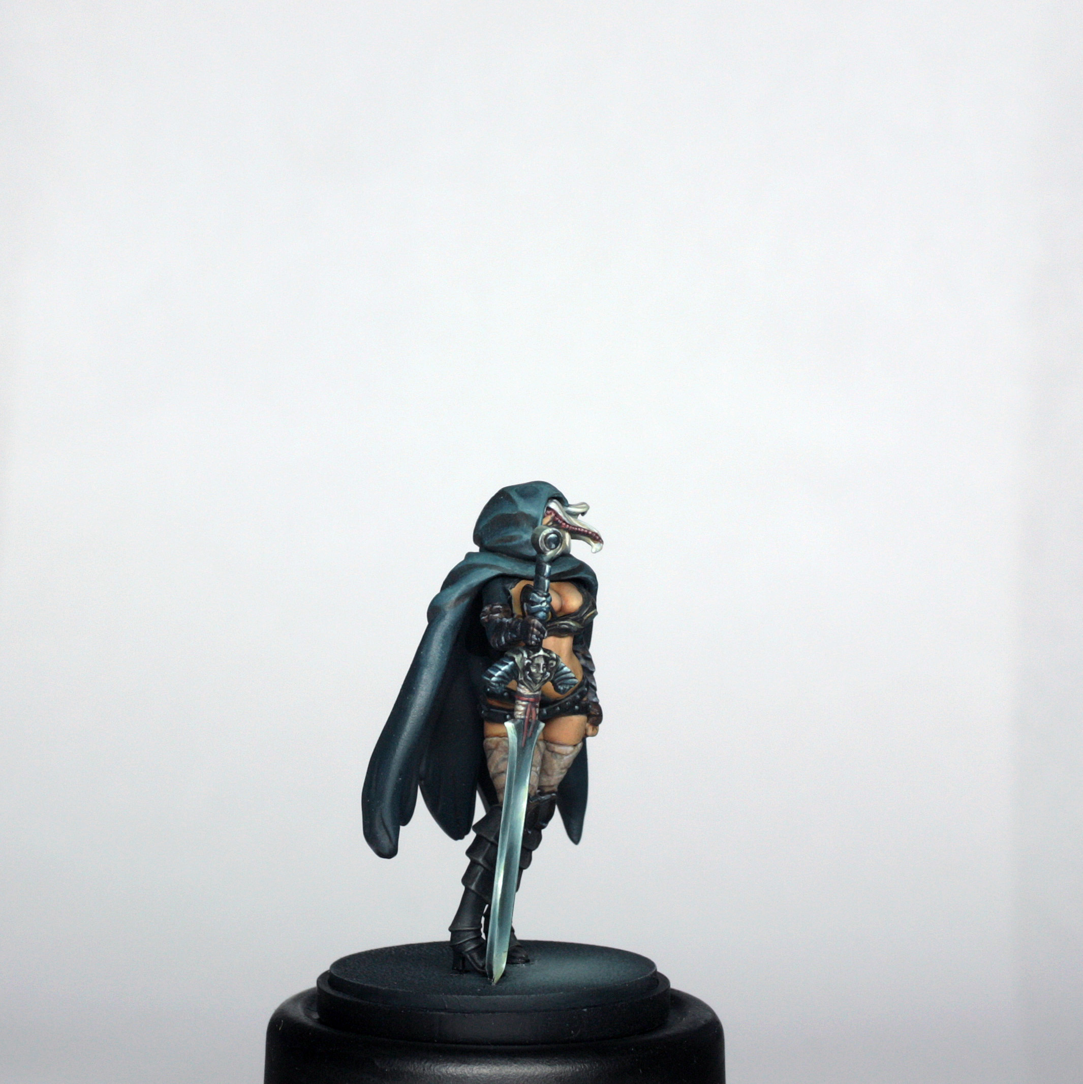
I finally glued her to the base and she was ready for final photos…